Learn / Guides / Website redesign guide
8 expert tips to make your redesign as smooth as possible
When researching this website redesign guide, we heard quite a few horror stories (including our own ones) about what happens when people do not follow a redesign process: terrible results include broken websites, plummeting conversions, or de-indexed pages. We decided to share the lessons we and other pros learned, so you can be warned about some of the most easily avoidable mistakes.
1. DO NOT do a hard reset on your existing design
A lot of companies treat a redesign like a hard reset. They don't try or think about learning lessons from the past. That’s the mistake: even if you plan to completely change the aesthetics of your website and even if you plan to reorganize the structure of it or introduce new pages, there is still a lot of insights on your existing site. There are so many lessons that you can take from how your customers behave and interact with the design and the copy you have now and translate that over to a new site.
But a lot of companies, they're so eager to burn the old site down and so excited and just almost salivating at the process of having this flashy new design that they don't stop to learn from what's going on right now. They don't make the connection between behavior today and behavior tomorrow, and so they replicate a lot of the same problems in the new design.
Joel Klettke, Conversion copywriter and CRO consultant
2. DO investigate what brings people to your site
Perhaps the most powerful thing you can do as part of a website redesign is get to really understand why people come to your website, and make sure you’re both meeting their needs and removing all obstacles for them.
(Think about how you’d feel if you landed on a site that wasn’t what you wanted. You do a Google search for “best CRM software,” and land on a sales page from HubSpot. But what you were really looking for was a comparison of the best software, reviewed by a third-party. The same thing could be happening with your design.)
For example: if someone lands on a page and the only thing they’re interested in is pricing information, the best thing you can do is to give them that. They don’t want to convert. That’s not on their mind right now. So don’t try to force them to buy—simply provide them with the information they want.
You can use the LIFT model to do this:
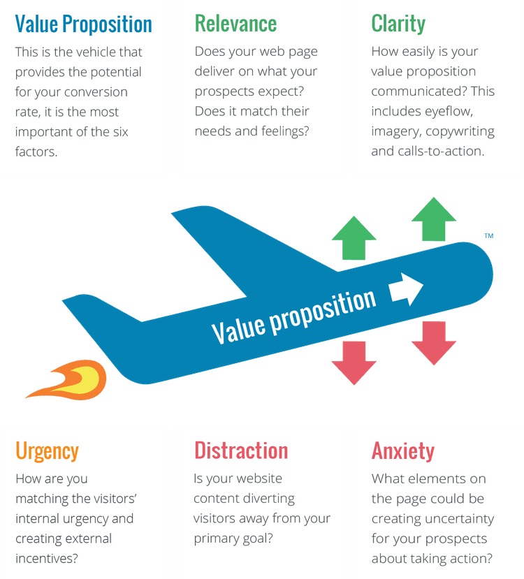
Your value proposition will be uncovered through your surveys and customer interviews (see how to do it in a step-by-step research process). Try to show off that proposition through your design; then, add a sense of urgency to it, reduce distractions around it, and remove any anxiety-inducing elements that work against it.
You’ll need to back this up with general web design principles, like:
Giving before you take—usually in the form of free content
Building commitment with small asks, like a call to action (CTA) that asks visiotrs to sign up to your email list for a coupon instead of diving straight in with a purchase
Using scarcity tactics, like countdown timers or 'low stock' notifications (but only if these are true—do not try to trick or scare your customers into a purchase.)
Louis Grenier, Senior Marketing Strategist at Hotjar
3. DO redesign with your customers in mind
It’s a common mistake to be so impressed with your own product that you want to tell the world everything about it. Your redesign plans include an extensive list of features and specifications… but that might not be what your customers want. The biggest problem you can face during a redesign is customer blind spots: not serving customers, not collecting data from customers, being very product-driven as opposed to customer-driven. It's hard to send out a survey, let alone process all the resulting information. But that’s what you need to do to avoid customer blind spots.”
Ben Labay, Research Director at CXL
4. DO NOT use a design-first approach
More often than not, a company going through a redesign will get excited and launch straight into mockups, wireframes, and color palettes without thinking about the words that will be needed on the page. They’ll design elegant solutions with blocks of Lorem Ipsum text in them, and loop in a copywriter or content person at the end of the process—when all this person can do is either hope they can find good words that fit the given frame, or settle for sub-par copy.
The best workflow usually brings copy and design together from the very start:
A marketing team (with representatives from both content and design) come up with the general idea about the page/website they want to redesign
The same team runs customer and market research, understands trends and pain points, and uses them to refine their initial ideas
Based on research, the copy person (copywriter, content writer, content strategist) produces the copy that will live on the page
The copy gets reviewed and approved by the team
UX designers, creatives, etc. lay out the copy and create wireframes, graphics, illustrations, etc.
If you launch into a design-first process, you forget a basic point: if the most wonderfully designed page uses weak, unconvincing words, it may actually underperform compared to a slightly uglier one where the copy is thoroughly persuasive and helps people do what they came to the site for.
Fio Dossetto, Senior Editor at Hotjar
5. DO NOT use vanity metrics to measure success
A popular metric for a website redesign is bounce rate. Designers often have a goal to lower the percentage of people who leave the website after viewing just the page they landed on; that difference often becomes the metric people use to compare an old site to a newly redesigned one.
But you have to ask yourself this: if the goal of your redesign is to give people what they’re looking for, they may now find it on the exact page they landed on so they don’t have to keep going through multiple pages. Your bounce rate will, therefore, go up. But isn’t this a sign of success?
Here’s another example of picking the wrong metric. When I led a website redesign for a client, my team and I focused on increasing the number of sales demos booked through the site itself. Post-redesign, the number dropped and the redesign was seen as a failure. But there’s more to the story: my client had been used to giving demonstrations to people who weren’t actually ever going to purchase, whereas our redesign encouraged only the highest quality customers to book a demo. Had we focused on a revenue-related metric, we’d have seen that. But everyone was on the wrong page about what to track, making the entire redesign look like an epic failure.
Louis Grenier, Senior Marketing Strategist at Hotjar
6. DO clean up SEO clutter and promote accessibility
When doing a large website redesign, take the opportunity to clean up any clutter — consolidating content where it makes sense. 301 redirect any popular pages and don’t sweat the smaller ones: Google can figure those out in due time. Use the right keywords in the URLs, especially for current URLs that use abbreviations: oftentimes, you’re missing out on some great keywords by using abbreviated versions in your URLs. It’s also a great place to use keywords that you can’t use in content. Lastly, make sure the site is accessible to ensure your site works well for all users. It’s a lot more work but well worth the effort because Googlebot is your biggest blind user—meaning it’ll help your SEO efforts as well while proactively avoiding potential lawsuits.
Kevin Call, Web Developer at East Tennessee State University
7. DO stay alert when your redesign includes a tech change
Be very careful when changing both the underlying technology and the design when doing a site or app relaunch. When doing just this, we launched a new version of the website that was hosted on another domain, and that meant that neither the ‘stay logged in’ functionality nor any browser-saved passwords carried over. This led to a very large number of customers forgetting their credentials and not being able to log in.
To make matters worse, the new system had some issues dealing with all the forgotten password requests; customers had to contact customer support, leading to even more frustration and internal operational chaos with our support team. In addition to starting everyone off on the wrong foot with the new site, it was difficult to really understand whether the users were having actual technical issues with logging in, just forgetting their password, not liking or having trouble with the new design, or any combination of the above.
In retrospect, it would have been a lot safer and easier to separate the technical and design changes, and ensure that the move from the old site to new is as frictionless as possible.
(The expert would like to remain anonymous)
8. DO lean heavily on user research to drive your redesign
I've worked on a couple of website redesigns where the user research in advance wasn't thorough enough or, worse still, the insight gained from user research was largely ignored in favor of other considerations such as competitor sites or industry trends. In one case when redesigning the website at a finance software company, we were too influenced by the design adopted by other software companies and the fact that we viewed our existing site as outdated. We were preoccupied with looking more like a modern, high-tech SaaS company.
The metrics and feedback showed that the resulting redesign was alienating to our ideal customer profile, who were accountants at enterprise organizations in industries like retail and construction and saw themselves as non-technical. They were looking for a trusted, consultative partner who would take the time to understand their processes and leverage technology to improve them. Many had been burned before by the latest tech innovation out of Silicon Valley and leaned heavily toward tried and true solutions. The lesson we learned was to be guided primarily by user research and make all redesign decisions with the user in mind.
Mike Cullen, Senior Product Marketer at Hotjar
DO NOT update everything all at once.
When doing a website relaunch, a lot of start-ups make the mistake of changing too much all at once.
Focus only on your website redesign. This is not the time to drastically update your lead funnel and flow, how you score leads, your email nurture (unless it is simple branding changes), etc. What you run the risk of doing if you update everything is 1) burning out your team 2) missing small details and important change management processes and 3) you won't be able to tell which of the updates is attributable is to your website redesign versus the changes in lead scoring, etc. Whether is is successful or not, you want to put some timeframes around a re-launch and give it a bit of time to build a baseline with the new site. Then, start tweaking and updating. Without baselines, you can't properly predict. And when you can't predict, you're not being a good leader for your organization.
Tracey Wallace, Head of Marketing at Eterneva, Founder at Doris Sleep
Your must-have during a website redesign
Sign up for a free Hotjar account, set it up, and find out what to keep and what to change on your website as you approach a full redesign.
