Learn / Guides / CRO glossary
CRO glossary: call-to-action
A call to action (CTA) is a prompt on a website that asks users to perform a specific action like signing up for a newsletter, downloading a demo, or buying a product.
A CTA can appear as a clickable button or as hyperlinked text, and is often seen directly on the page, in pop-up form, or in a digital marketing ad. When potential customers click on it, they’re one step closer to conversion.
Use Hotjar on your site to see what's really happening, identify problems, and increase conversions.
Common call-to-action examples
You’ve probably seen and clicked on CTA buttons like the following:
Sign up today
Get your free ebook
Try a 14-day free trial!
Download template now
Get 20% off your first order
Shop now
Learn more
Schedule a free consultation
Register for the free webinar
Add to cart
Add to wishlist
Buy now
Checkout
Follow us on Instagram
Share on Twitter/LinkedIn/Facebook
CTAs can also appear as hyperlinked text in action phrases, such as:
Want to know more? Read our post on XYZ!
Have you ever done XYZ? Tell us about it in the comments.
Love our business? Share us on XYZ social media!
Besides being directly featured on the same site where conversions happen, CTAs can also be found elsewhere—in a Facebook ad, or in the body of an email campaign.
CTAs are often paired with another piece of content, like an image or additional descriptive text, to further persuade visitors that following the CTA will benefit them.
Why are CTAs important?
An effective call to action is a key ingredient in the overall success of your webpage and, in turn, your sales funnel. Here’s why:
People are more likely to do something when you prompt them to do it. By making the step easy and obvious, you increase the odds that they’ll continue through your sales funnel and eventually convert.
A CTA can encourage users to interact more with your website. For example, a CTA at the end of a content marketing blog post can provide links for people to read more about the subject, or it can ask them to share their own thoughts in the comments section. By encouraging users to stay on your website, you invite them to become more familiar with your brand—which builds trust and opens the door for future conversions.
CTAs can also be used to collect contact information from visitors who aren’t ready to engage with your site now, but may want to in the future. Ask them to leave their email address or phone number so you can follow up with them later.
What a successful CTA looks like
If you research how to create a good call to action, you’ll find some strong opinions about which colors, fonts, or button shapes work best to convert, but those discussions often miss the larger point.
Of course, you want to choose a color that stands out so people are more likely to see it, but don’t waste too much time obsessing over it. The mark of a successful CTA is not whether it's green or orange, but whether it helps users achieve their goals.
What drives users to your website?
Every time someone visits your website, they’re looking to accomplish something or solve a problem—these are the drivers that brought them to your website, and if you can offer them a solution, you’re more likely to earn their conversion. The most compelling calls to action clearly address these drivers.
If you’re trying to get email newsletter signups, for example, explain the value your newsletter provides. What will visitors gain by giving you their email address, and how can it improve their lives?
Or if you want to increase conversion or click-through rates for your ecommerce site, you could use your unique selling proposition (USP) to build up to your call to action: what makes your business stand out from the competition? Why should prospective customers choose your company?

An example CTA with a USP lead-in from the Hotjar Engage product page
Rather than endlessly tweaking the size, shape, position, or button color, use action words to make your case in simple, straightforward language. If you do it right, the CTA button will become irresistible no matter what color it is.
Go through our checklist of CTA best practices for more advice on crafting compelling CTAs.
💡Pro tip: when appropriate, nothing stops you from having multiple CTAs on the same page for users who need more information to make up their minds—just make sure your main CTA stands out through color and shape. Here’s an example:
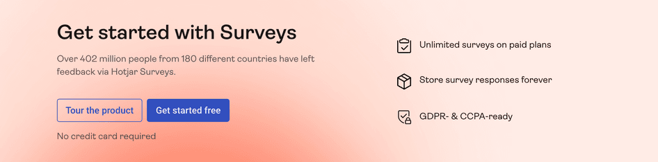
See how the Hotjar Surveys product page includes two CTAs? We give users:
The opportunity to ‘Tour the product’
The option to ‘Get started free’
The second CTA stands out the most visually and invites people who are ready to convert to dive right in, with the added selling point of ‘No credit card required’ to further signal they can get started right away without having to provide payment information. Anyone who’s hesitant is welcomed to try out the product before committing to anything
Start increasing conversions today
Use Hotjar to see how your CTA performs, so you can make sure it’s increasing (not decreasing) conversions.

How to write a CTA
There isn’t a one-size-fits-all formula for writing the perfect CTA copy for your business—in fact, there are plenty of different formulas you can try—but every impactful CTA is written in a way that grabs your audience’s attention, creates a sense of urgency, and compels them to take the desired action.
An example formula for writing a CTA is:
problem + solution + action
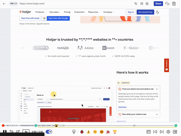
Here’s an example of that formula from our current homepage:

The problem: you want to know more about your website’s performance than what numbers and analytics can tell you
The solution: Hotjar tells you the why behind the numbers
The action: start free by signing up with your Google account (or email)
💡Pro tip: You don’t need to be an expert at copywriting to compose a solid CTA. Hotjar can help you improve your CTA copy and validate what words make your users most excited to convert.
Discover the most effective CTA for your business
A good way to figure out whether your CTA works is to test it against other CTAs—a technique called A/B testing. When you A/B test two elements, you send half your users to a landing page that features one CTA and the other half to another page with a different CTA.
Once you’ve got a large enough sample size, you can identify which CTA leads to the most conversions. Then you can test any future CTAs you create against the winner.
💡Pro tip: there are many landing page optimization tools that let you run structured A/B tests to determine the best call to action for your page. For example, Hotjar integrates with the digital experience platform Optimizely so you can further investigate experiment and campaign data gained from your A/B tests.
How to analyze the effectiveness of your CTAs
A big part of discovering which CTAs work best for your business involves understanding your website visitors and their behavior—how do they engage with your site? What expectations or reservations do they have?
You can turn to the following tools to help answer these questions and analyze how effective your CTAs are in the context of typical user behavior.
Heatmaps
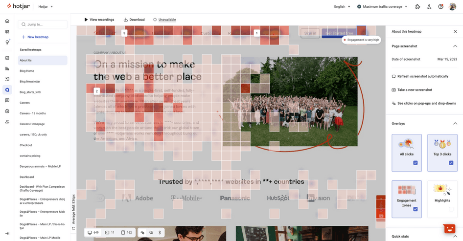
To start, it’s helpful to know whether people actually notice and interact with your CTAs. A quick and easy way to find this out is by using heatmaps to visualize what elements users see and try to click/tap on, sometimes in vain.
Scroll maps, for example, will reveal whether most people scroll down past the ‘fold’, or the content that’s immediately visible when they open a page—if they don’t, you’ll want to try displaying your CTA higher on the page so it’s one of the first things they see.
The scroll map showed that on mobile, 75% of users didn't see our main CTA. We moved it above the fold and saw an immediate increase in users landing on our key pages.
Click maps go a step further and show you where users tend to click or tap on a page, revealing what elements they expect to be able to interact with. If they’re trying to click on everything but your CTA, you’ll probably need to make it stand out more visually.
If you want to collect even richer data, Hotjar Heatmaps lets you combine visualizations from scroll and click heatmaps, along with mouse movement, to create one streamlined Engagement Zone map so you can understand what content your users find most engaging without having to analyze three separate heatmaps.
Funnel analysis and session recordings
Whether your marketing strategy is focused on bringing in prospective customers through email marketing or social media marketing campaigns, you’ll want to make sure your marketing funnel landing pages speak to your target audience and lead to conversions. If you notice a drop in your conversion rate, it’s worth it to know where—and why—users leave the funnel.
Funnel analysis is a powerful tool in the conversion rate optimization toolbox. It breaks down each step of your funnel to show you where most users drop off so you can know what pages and elements perform best at converting. If most users don’t make it past the first landing page and your main CTA is buried deeper down the funnel, you might consider relocating it.
Session recordings let you go beyond the funnel numbers so you can verify any hunches that users drop off because your main CTA is broken or ignored.
By recording live sessions of users engaging with your low-converting funnel pages, you can uncover more interactions that might confuse or frustrate them: maybe they keep trying to click on enticing words like ‘Limited Time Offer’, when those words aren’t actually clickable. Or maybe they’re frantically searching for a way to proceed through the sign-up process, while the button to move forward is broken.
You can be even more confident analyzing CTA effectiveness when you pair funnel analysis with session recordings. Hotjar Funnels integrates with Recordings to give you a 360° view of how users behave on your site.
If you see a drop after a certain funnel page and are left scratching your head as to why, click on the session recordings for that page to see what users are doing on it. If you notice that someone had issues clicking on your CTA in one session recording, hop on over to Funnels to see if other users experienced the same issue.
We had two CTAs, and it was clearly a little confusing. I’d watch Hotjar Recordings and see users getting confused. They’d hover over the CTA before leaving, or click on one before heading back and exiting the site.
Start increasing conversions today
Use Hotjar to see how your CTA performs, so you can make sure it’s increasing (not decreasing) conversions.