Learn / Blog / Article
Form design: 10 tips on how to design a form that brings in conversions
Web forms have become an integral part of most websites and the internet in general. Their primary purpose is to help both users and businesses achieve their separate goals by establishing a relationship or initiating a conversation between the two.
- Registration forms are what allows people to become members of online communities or services. Think of Facebook - their 1 billion+ users all joined through a registration form;
- Checkout forms allow transactions to happen through the web. Subscribing to a paid service and people purchasing products are a couple of examples which happen through a checkout form;
- Data submission forms are how people share knowledge, post information and communicate online. Forums, blogs, and social communities all rely on users posting these forms for their websites to grow.
Even with their extensive importance online, it is surprisingly common to come across very poorly made forms - which is a shame. Here are some simple guidelines which are a good foundation for most types of forms.
First off, let’s explore what elements a form is made up of and some best practices.

Labels
These literally label your input fields and tell users what information they need to provide in each.
Top-aligned labels are generally a safe bet and make it easier for different-sized labels and localized versions to fit easier within the UI;
Left-aligned labels are best when the form is short and ask very similar questions such as date ranges;
Labels are not help texts. Use succinct, short, and descriptive labels so users can quickly scan your form;
Labels are also not placeholder text. Unless you have real estate constraints try to avoid inline labels. If you think they are your best option however, consider these type of css3 / javascript adaptations;
Inline labels are best used for very short forms (between 1 to 4 fields), such as search or logins. In longer forms, they tend to hinder the form's usability;
HTML placeholders are good to type in examples for the users to see.

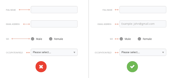
FIG 1: IF YOU DECIDE TO USE LABELS ON THE LEFT OF THE FORM, MAKE SURE THE LABELS' TEXT IS RIGHT-ALIGNED. THIS MAKES IT EASIER TO SCAN THE PAGE.
Input fields
Input fields are what allows your users to fill in the form. Depending on what information you ask, there are various types you can use - text fields, password fields, drop-downs, check boxes, radio buttons, date-pickers, and others.
Avoid drop-down menus with fewer than 4 options. Use radio buttons instead;
Visually group related details, such as first name and last name (even better: combine them into one field ‘Full name’);
Date of birth can be a single date-picker, not three separate dropdown menus;
Try to avoid optional form fields. If you cannot, a simple '(optional)' in the label is enough to differentiate it from the other fields.
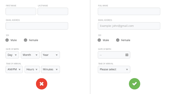
FIG 2: TRY TO MINIMIZE THE NUMBER OF ADDITIONAL FIELDS AS MUCH AS POSSIBLE. THIS RENDERS YOUR FORM LESS INTIMIDATING, ESPECIALLY WHEN YOU REQUIRE A LOT OF INFORMATION FOR YOUR USERS.
Action buttons
When clicked, these buttons trigger an action such as submitting the form.
Avoid generic instructions such as ‘Click here.’ Instead, state what actions the buttons do when clicked, such as ‘Create my FREE account’ or ‘Send me weekly offers’;
Avoid multiple action buttons since they might distract users from the goal at hand - in this case, submitting the form;
The Reset button is pure evil! This is generally more frustrating than useful to have;
Make sure action buttons look like buttons - style them in a way that makes them ‘pop’ on the page;
Action buttons not aligned to the input fields tend to be an eyesore;
Clearly indicate that the form is being processed after the user has submitted it (and disable the submit button at that point). This provides feedback to the user whilst also avoiding double posts.
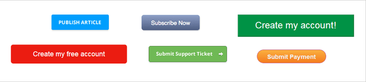
FIG 3: BUTTONS COME IN DIFFERENT SHAPES, SIZES, AND COLORS. CHOOSE THE STYLING THAT BEST FITS YOUR WEBSITE AND ALWAYS REMEMBER TO LABEL YOUR BUTTONS ACCORDING TO WHAT ACTION THEY DO. THIS WILL MAKE IT EXTREMELY SIMPLE TO UNDERSTAND WHAT THE FORM PROVIDED DOES.
Help
Provides assistance on how to fill out any input fields when the field labels alone are not enough.
Input fields that require help should be kept to a minimum or avoided completely - especially on mobile device;
A clean way of integrating help is to show it on the right-hand side of the field when the user focuses on it so that it is always in context;
If space is an issue, tooltips are a nice solution. If a lot of information needs to be provided either reveal a hidden area underneath the label or popup a new window;
Try to avoid help icons with a hover or click action. Instead use descriptive texts such as ‘What is this?’ or ‘Why is this information needed?’.
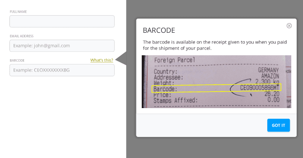
FIG 4: ALWAYS PROVIDE MORE INFORMATION ON FIELDS WHICH NEED IT. IN THE EXAMPLE ABOVE, IT IS NOT OBVIOUS WHERE THE USERS CAN FIND THE BARCODE. A SIMPLE MODAL HELPS THEM FIGURE IT OUT.
Feedback/Form validation
Your online form needs to be able to provide feedback. A form which cannot be submitted without informing its users why is worse than useless.
Users should always be allowed to click on the submit button. Disabling buttons because the form is invalid is a very bad practice and should be avoided;
Real-time inline validation is a good practice - especially when different input fields relate to one another;
When form submission fails, a top-level error message should appear with a double visual emphasis (typically red in color with a warning icon) above the form and indicate why it failed;
The erroneous fields (if any) should be highlighted and visually associated to the top-level error;
Validation text should be provided next to the erroneous fields giving an easy-to-understand solution on how to correct them;
To avoid confusion, reserve the red color and warning icons for error messages and destructive actions only.
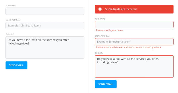
FIG 5: BE DESCRIPTIVE IN YOUR FIELD ERROR MESSAGES. 'USERNAME ALREADY IN USE' IS A MUCH BETTER MESSAGE THAN 'INVALID USERNAME' - IT DOESN'T HELP THE USERS AT ALL UNDERSTAND WHAT WENT WRONG.
Now that we went through some guidelines for form elements, let's explore how you can optimize and improve the form as a whole.
#1 Only ask what's indispensable
Every single field you add to a form will affect its conversion rate, so make sure you only ask what you really need. Do you really need to know their phone number if you will only contact them if they need support? Can't you ask for it when they request assistance? Do you really need to know their 'title' or whether they are Male or Female? Depending on your business you might need to, but you get the idea. Always question why and how the information you ask of your users is being used.
#2 Know when to ask for the appropriate information
Have you ever entered a clothing outlet and was asked to provide your credit card number before you tried something on? Probably not. If your form is about allowing your users to access a 30-day free trial, don't ask for their credit card information. By doing that, your users will immediately start thinking 'Oh, I thought it's a free trial, why do they need my credit card?'; 'Will they charge me after 30 days? What if I don't like it and forget about?' - This is exactly what you need to avoid - to get your users to question why you're asking for this information so early on in your relationship. Make sure you only ask for the information you need at the time and focus on making the free trial so awesome that users won't double guess whether they should pay you or not later on.
#3 Include trust factors
Trust is the amalgamation of beliefs and expectations users have of your company and is a key component in conversion. Gaining your users’ trust however takes time and it is therefore a good practice to introduce third-party trust factors which in turn help users trust you more. These vary a lot depending on your industry, but a checkout form usually has 2 or 3 security and privacy trust factors from reputable companies which reassure the user that your company conforms to their standards.
#4 Make it easy for your users to scan the form
The form title should relate to the goal it allows users to complete. Avoid using generic titles such as ‘Please fill in this form to continue’ and instead opt for a more descriptive one such as ‘Register for your free trial’ or ‘Join our community’.
All the different elements within the form should be visually distinctive from one another. Users need to be able to scan the form and immediately understand which is the submit button, which are the labels and which are the input fields they need to enter, and estimate how long completion time will take. Including white space will improve legibility and is always a must.
#5 Order the form logically
Details should be asked logically from a user’s perspective, not the database. Typically, it's unusual to ask for someone’s address before their name. For long forms, structure multiple fields by visually grouping them together in sub-sections such as: Account details, contact information, payment details, etc;
#6 Use smart defaults
Smart defaults are very good as they fill in fields for 90% of cases, resulting in faster fill-ins. A couple of examples: A language dropdown can default to browser language and country can default to the user's IP country using geolocation.
#7 Break complex forms in a multi-step process
For longer forms that cannot be shortened, your best option is to split the process into various bite-size steps. The multi-step form process can increase success rates and overall make your form less intimidating from a first impression. Make sure you split the requested information logically and that users are shown their progress within the process. This can be achieved by indicating the step they are on (example: Step 2 of 3) and by providing a visual cue such as a progress bar or a percentage - which is how survey forms typically handle it.
#8 Usability testing
Do not be frightened by the term - usability testing is indispensable in such a crucial part of your website or application. Very often, carrying out just two tests or simply asking a colleague or friend to go through a prototype of the form can give you ample insights in how usable the form is and what’s not immediately obvious by observing how they fill it out.
#9 Carry out A/B split tests
Although forms on different sites have a lot in common, it doesn't mean that copying Amazon's sign up form will work for your website as well. A/B split tests allow you to do tiny alterations to your form that gradually improve its conversion rate. Tests include altering the action button in text, size, and color, making trust factors more prominent, adjusting field positions, removing optional fields, finding unnecessary non-related fields, and many others.
#10 Conform to standards
Make sure users can jump through fields using the Tab key and that the tabbing is in a logical order. It is also important to conform to web standards by for example placing forms within HTML <form> tags. Occasionally, I come across sites which don’t and they quickly become a pain to use since my browser is not able to automatically fill in the details for me.
These simple tips create a far better user experience for your users, resulting in a higher completion rate for your form. Let us know if you don't agree with any of the above or if you have an experience you want to share. And don't forget to subscribe to receive notifications whenever we post a new article.
💡 Pro tip: you can use tools like heatmaps and session recordings to see how visitors interact with your forms—which can help you make decisions about how to improve the design of your forms based on real user behavior.
Related articles

UX design and analysis
Design a homepage that delights your users in 9 easy steps (with tips and examples)
While product, UX, and marketing teams help shape a website or app’s homepage, a more powerful group holds the reins: the users. Their needs and preferences are key deciding factors in locking in an effective homepage design.

Shadz Loresco

UX design and analysis
The anatomy of a stellar website: the dos and don’ts of design
Over the past five years, buyers have largely shifted their shopping habits to be primarily online. For brands wishing to remain competitive in the digital marketplace, this means an accessible and attention-grabbing website has become more important than ever before.
Consumers agree: respondents to Hotjar’s Coming in Hot report told us that they have higher expectations for brands’ websites than they did five years ago.

Hotjar team

UX design and analysis
Coming in hot: the power of first impressions
Consumers have more than their fair share of vendors to choose from when shopping online. When attention is split between different brands and devices, ensuring your online presence stands out from the crowd hinges on first impressions.
But catering to the ever-changing habits and preferences of digital buyers is no small feat. That’s why Hotjar surveyed hundreds of US-based consumers—to reveal the insights you need to guarantee your website exceeds user expectations.
Hotjar team