Learn / Guides / A/B testing guide
How to do landing page A/B testing (and learn a ton about your users)
When you want to optimize your landing page, A/B testing is the most practical way to evaluate your ideas for improvement. This guide shows you how to perform A/B tests, step by step—and learn a whole lot about your users in the process.
Summary
Landing page optimization helps you drive conversions, increase revenue, and decrease your cost-per-acquisition. But simply trying to ‘A/B test everything’ without a strategy in place takes up too much valuable time—and it doesn’t deliver results.
Instead, base your A/B tests on a carefully crafted plan, using this clear and repeatable six-step process:
Set clear goals: decide which metric you want to improve and what your benchmark for success is
Gather data: use quantitative and qualitative data to understand what’s happening on your page—for example, by viewing session recordings to find out where users get stuck
Create a testing hypothesis: based on your data, create a hypothesis for what changes would help you meet your goal
Prepare the page elements you want to test: add, remove, or adjust the page elements you want to test in your new page variant(s)
Set up your test: use an A/B testing tool to divert traffic to your page variants, and your behavior analytics tools to monitor what users do on each page
Review your test data: use your quantitative data to determine which page variant performed best and why. From here, you can decide whether to run further tests or move on to a different page.
Use Heatmaps, Recordings, Surveys, and Feedback to understand your users—and learn why winning landing page variants perform better.
How to do landing page A/B testing in 6 steps
Follow this sequence for each page you want to test, keeping logs of your decisions so that colleagues can learn from your tests, too.
1. Set clear goals
Start by deciding what you want to achieve with your landing page A/B testing and how it fits in with your business goals.
Why do you want to test? You might want to test because your page is performing below benchmarks, or because you’ve found an indication that users aren’t having a good experience. It’s also totally acceptable to test your page just because you want better results, but there’s a limit to how much you can optimize any one page.
What’s the primary metric you want to improve? Usually on a landing page, you’ll want to improve your key conversion, like ‘Add to cart’ or ‘Download now’ clicks. But depending on your reason for testing, you might want to improve another metric, like bounce rate or first clicks on your form.
When setting goals, it’s also worth determining what improvement you would be happy with. Otherwise, your page testing could go on indefinitely, while other pages need more attention.
Lastly, consider that A/B testing is only effective if your site has sufficient traffic for statistically significant results. Use an A/B test calculator to determine the sample size and test duration you’ll need to get reliable insights.
2. Gather data
There are countless things you could change on your landing page (we’ll look at some of them in a moment).
So, how do you decide which ones to implement? Randomly changing and testing page elements is not the answer: relying on guesswork is an inefficient way to optimize your page—and even if you get lucky with a test, you won’t know why users preferred one variant over another.
Instead, gather data about user perspectives and behaviors to inform your strategy:
Use your preferred analytics tool to check key metrics on the page
For instance, looking at the ‘Time on Page’ metric in Google Analytics 4 tells you if users actually consume the content on your page, or land on it and quickly leave. You can also compare other metrics—like your conversion rate—to see if the page is performing above or below your site’s benchmarks. These metrics help you understand what’s happening on the page before you look at other data to understand why.
Learn how users are behaving on the page
This is where a behavior analytics suite like Hotjar (hi!) comes in handy. For instance, use Hotjar Heatmaps to see where users tend to click, move, or scroll to. Do they stop scrolling before reaching important areas, or click on non-clickable page elements? These close-up insights reveal if your page is intuitive and helpful to users.
Dive deep into users’ perspectives and experiences
For any conversion optimization project, you need a deep understanding of your users’ needs and perspectives. In particular, you need to get familiar with
Drivers that bring them to your website
Barriers that make them leave
Hooks that persuade them to convert
If you haven’t already carried out this kind of research, it’s a good idea to speak to your users about the products in your campaign. For instance, use Engage to recruit participants from your target audience and conduct user interviews.
Back this up with surveys asking focused questions around users’ drivers, barriers, and hooks. You can embed these surveys across your website—but ideally not on your campaign landing pages, where they could distract users and reduce conversions.
🏆 Optimize like a pro
User Attributes in Hotjar give you custom insights by cross-referencing data from other platforms like GA4.
This means you can do cool things like generate heatmaps to visualize behaviors of users who converted vs. those who didn’t convert, and view recordings to see how journeys were different for users who converted compared to those who left the page without taking action.
3. Create a testing hypothesis
Now that you’ve gathered a range of data, you hopefully have an idea of user behavior and perceptions related to your page. It’s time to create a hypothesis for what might improve the page.
Useful hypotheses are testable and based on reliable data or observations. They involve proposing a solution and predicting an outcome, with reasoning based on your understanding of your users.
For example, they might look like this:
If we remove the buttons that are not relevant to users’ primary goal on this page, conversions will increase because users will have fewer distractions from the main CTA.
Your hypothesis should be based on the insights you’ve gained in the previous steps. In other words, you should be somewhat confident that you know how to improve the page—your A/B test is the final step in the conversion rate optimization process.
You’ll usually end up with one or more elements that you want to add, change, move, or scrap altogether.
Hotjar 🤝 re:member: creating a winning hypothesis based on user insights
A leading Scandinavian credit card, re:member, was driving traffic to its credit card application page from affiliate websites.
Data from traditional analytics tools like Google Analytics revealed high bounce rates on the application form. These users arrived on the page directly from affiliate sites comparing credit cards, and should have been ready to convert.
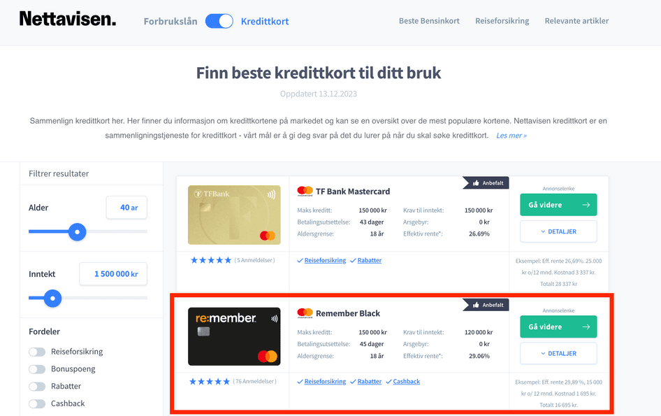
An example of a Norwegian affiliate site promoting re:member’s credit card
To investigate further, re:member looked at heatmaps and session recordings in Hotjar. They found that users were
Scrolling up and down the form without filling it out
Clicking on (unclickable) bullets, hoping to expand them for more information
Hovering over the ‘benefits’ section
re:member hypothesized that users didn’t fully understand the offer, and that additional information would help them to convert.
The company tested a new version of the page, putting features near the top and adding expandable bullet points. As a result, re:member’s conversion rate improved by 43% from affiliates, and 17% overall.
4. Prepare the new landing page elements you want to test
Usually, you’ll want to change some of the landing page elements listed below—but theoretically, anything on your page could affect conversions.
⚠️ Remember, the more elements you change in any one test, the less you’ll understand which change impacted test results.
Headlines
An effective headline immediately hooks visitors into reading on by making a promise or solving a pain they care about. What’s more, it sets the context for the rest of the page, presenting a narrative that everything else flows from.

This landing page headline from Planable makes a clear promise about what the product delivers
Test your headlines if
Your research shows that your current headline doesn’t resonate with users—or isn’t connected with their motivations and pain points
Your analytics reveal low time on page, suggesting that the headline doesn't ‘hook’ users into reading on
Subheadings
Users will often scan a page rather than reading every word top to bottom. That means your subheadings need to tell the most important parts of the story and highlight key sales arguments.
If your subheadings aren’t clear or persuasive, consider testing new versions in line with your testing hypothesis.
Subheadings are almost as important as your main headline. If your landing page has placeholder subheadings that say something like ‘Features’ or ‘Why us’, consider testing subheadings that work harder to sell your product. For example, a subheading that just says ‘Features’ could become ‘Automate your workflow from start to finish’.
Every subheading should either convey important information—like a key benefit—or entice the user to read more.
Body copy
Your body copy is responsible for explaining the finer details of your offer to users who are invested in learning more. While marketers tend to A/B test body copy less frequently than other elements, the right sales arguments can improve your conversions. Consider changing
Length
Readability (e.g. changing a long sentence into bullet-point format)
Focus (i.e. the feature your body copy talks about)
Images and video
Images and video are an effective way to grab your users’ attention and convey important information about your product.
If your data suggests visitors are not staying on the page for long, add a video near the top of the page to pique their interest
If your page is mostly text, consider adding images that would help users scan and understand the page
If your page already has images, consider changing them—heatmaps can help you understand how users interact with them
🏆 Optimize like a pro
Heatmaps showing that users often click on non-clickable images suggest your audience wants to know more. Consider adding more information on the topic or turning the image into a video in your new page variant.
Pricing and information tables
If your data suggests that users need more logistical information, consider adding a table or making your existing one more prominent. Alternatively, if your research suggests that users are getting distracted, give them the option of displaying a ‘hidden’ table by clicking a button.
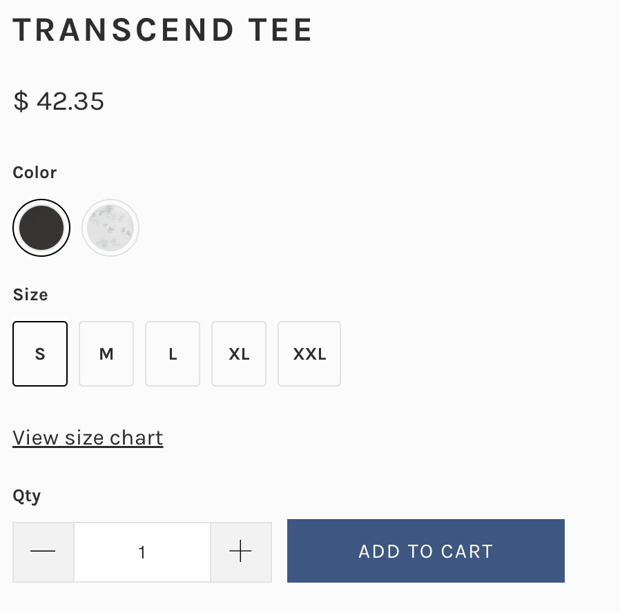
Ecommerce store Katin hides its size chart behind a link on its product pages
CTA buttons
Your CTA buttons might be only a small part of your page, but they’re arguably your most important conversion elements.
Consider testing their
Color and shape
Position on page
Wording
Quantity (multiple different CTAs vs. one repeated CTA)

HubSpot uses an attention-grabbing orange color and simple wording on its CTA buttons
Trust factors
Client logos, awards, and testimonials all affect whether visitors trust your page. But too many can also make your page cluttered—so if your data suggests that users find them distracting or overwhelming, consider narrowing down your selection.
Forms
There are countless conversion studies showing that the UX design of forms makes a significant impact on conversions. Reducing any friction in the user’s journey when finding or filling in the form can go a long way.
Consider testing
Number of form fields
Field labels and label positioning
Trust signals (e.g. security and credit card logos)
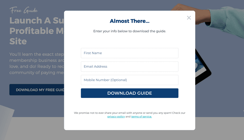
On Membership Workshop, the form is hidden until users click the page’s main CTA button
Page structure
Even when your page has all the right ‘ingredients’, you might want to A/B test a new variant that presents them in a different order.
Consider changing
Sequencing of key sales arguments (such as feature descriptions)
Positioning of forms and CTA buttons
Positioning of special offer information
By looking at scroll maps, you’ll get an instant overview of how far users typically scroll—and find out if they see key page elements.
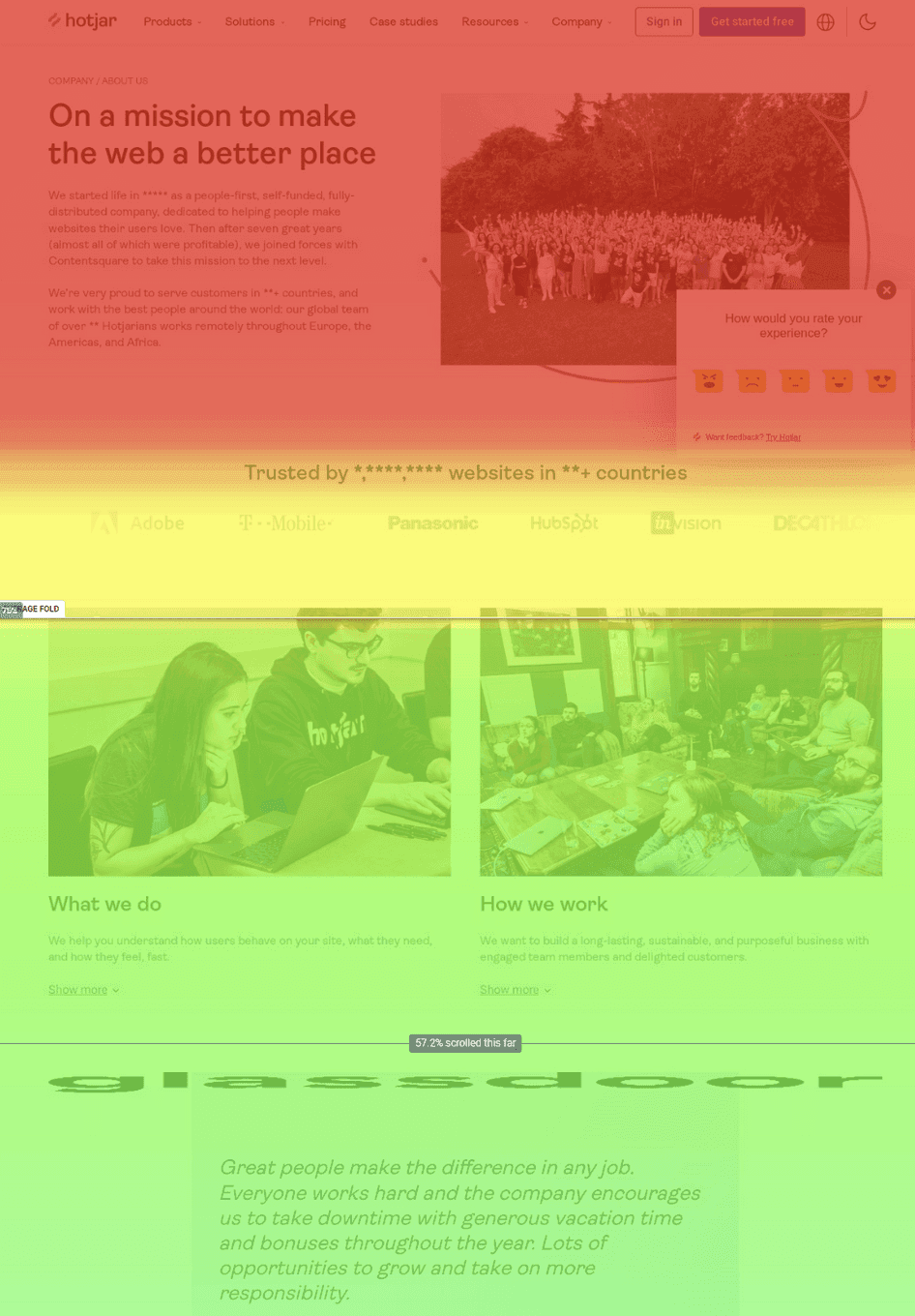
On a Hotjar scroll map, ‘cooler’ colors represent fewer users scrolling down to that part of the page
5. Set up your test
With your new page elements ready, you can now create a ‘B’ variant in your landing page builder. You could also create multiple page variants if you have enough traffic for multivariate testing.
Depending on your tech stack, you’ll likely want to connect an A/B testing tool, like AB Tasty or Optimizely. These tools make it easy to ‘split’ your traffic and measure the performance of each page variant.
Finally, set up a user behavior suite like Hotjar. With tools like Heatmaps and Recordings, you can take a closer look at what users are doing on each page variant, bringing a qualitative understanding to your quantitative data.
🔌 Integrate your A/B testing data with Hotjar
Learn why one page variant outperformed another by integrating Hotjar with testing tools like Unbounce. For instance, using our Unbounce integration, you can instantly filter Hotjar sessions to see relevant heatmap, session recording, and Trends data for each page variant.
Hotjar also integrates with other popular testing tools, including Optimizely, AB Tasty, and Omniconvert.
To ensure a statistically significant test, you’ll need to let it run for enough time. If your test runs too short, you won’t capture enough data, and your tests may have too much ‘noise’ for the results to be meaningful.
(💡 If in doubt, check the recommendation from the A/B testing calculator you used in step one.)
6. Review your test data
Check your A/B testing tool to learn which of your page variants ‘won’ in terms of achieving higher conversion rates (or whatever key metric you’re trying to improve).
If your new version beat the original by a significant margin, you might want to replace your original variant with it and move on to optimizing other landing pages. Alternatively, keep the winning variant as your ‘A’ variant, and run another test with a new ‘B’ variant.
Remember: if you’re going to keep running A/B tests, it’s important to understand why your new variant won. This is where analyzing your qualitative data helps you get a full picture of the results.
For example
If you changed your CTA, did the new version get more or less attention in the page variant?
If you moved your CTA to a new position, do your heatmaps indicate that users are scrolling to or engaging with the new location?
What happens if your test isn’t successful?
If your ‘B’ variant doesn’t beat the ‘A’ variant, it doesn’t mean your test was a failure. Your hypothesis was proven wrong—so you still learned a valuable lesson about what your users respond to (or not).
So, to get the most out of each test:
Keep records of what you changed in each variant, and what the results were. This way, other members of your team can refer to past tests in future.
Analyze your page metrics and user behavior data to learn why your page didn’t perform better. Do recordings suggest that users were confused or distracted by a new page element? Do heatmaps show users weren’t scrolling down to your new CTA button?
In many cases, the answers are waiting in your data—and doing a little ‘detective work’ can be what makes your next A/B test more successful.
🔎 Dig deeper into user behavior
If users aren’t telling you why they preferred a particular variant, their behavior probably will. Use heatmaps to understand where users clicked and scrolled, and view recordings to replay journeys from specific audience segments.
Put your users at the center of your A/B testing process
A/B testing is an exciting process, and there’s nothing better than seeing your new page variant smash your previous conversion rates. But it’s easy to see A/B testing as the end in itself, and lose focus on the real goal: creating better user experiences.
After all, what your users want isn’t a perfectly optimized landing page—but a frictionless way to get the products and services they need. So when you’re optimizing your landing pages, start (and finish) by learning about your users. The more you understand their drivers, barriers, and hooks, the better equipped you are to make the right A/B testing decisions.
Find out what’s hurting your conversions
Understand customer journeys, run user interviews, and spot user behavior trends on your landing pages with Hotjar.
