Learn / Case Studies / Brand24
How Brand24 increased conversions by nearly 300% with a few small changes
Mike Sadowski is the founder and CEO of Brand24, a popular social listening platform. Mike realized Brand24’s conversion rates were significantly lower than the industry standard. Here’s how he fixed the problem in only 12 hours.


High bounce rate + low conversion rate = a leaky funnel
Imagine making a few tweaks to your site and tripling your growth in sales as a result.
That’s exactly what Mike did. And after you hear his story, you’ll feel inspired to try it for yourself.
Brand24 is a social listening platform that lets users monitor their brands online. Companies like Twitch and Uber, along with medium-sized businesses, rely on Brand24’s software to monitor sentiment around their brands.
Like most SaaS companies, Brand24 relies on product-led growth and encourages users to sign up for a free trial to test drive their software.
When Mike built the sign-up form for Brand24’s free trial, he pictured users flowing through with no issues: “We imagined this process as people just filling the data and then clicking sign up.”
Unfortunately, the numbers told a different story. The metric that jumped out was the bounce rate for users landing on the form from the homepage:
“We saw that we had a huge bounce rate on the sign-up form. It was much, much larger than you could imagine.”
Mike was determined to figure out why people were leaving—and encourage them to complete their sign-up.
Two surprising culprits were causing the high bounce rate
Mike couldn’t rely on analytics alone to uncover why people were bouncing from his site. He needed an easy way to watch people as they tried to use the sign-up form, so he turned to Hotjar’s Recordings.
Here is what he found:
1. A promo code field was confusing users
As Mike began watching Recordings, he noticed no major issues at first.
“We saw the clients had no issue with filling out the name of the account and the name of the company.”
But then, Mike noticed something interesting: “The recordings suggested that the huge abandoned rate was happening at the promo code.”
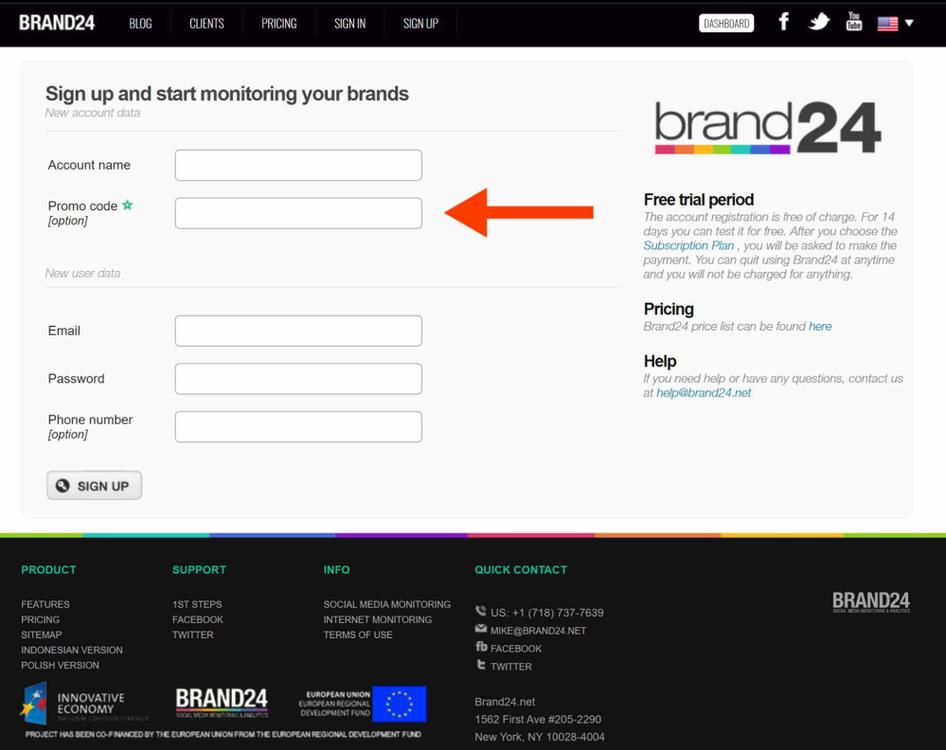
Brand24’s old sign-up form.
Brand24 required the promo code field as they provided promo codes to select partners. But it appeared the field was causing lots of confusion for people who didn’t have promo codes to use.
As Mike continued to watch recordings, he noticed not all users abandoned the form right away. Activity on the recordings stopped altogether, and Mike speculated that users were opening another tab within their browsers to look for a promo code they could input. As Mike says, “Who wants to pay full price if there's a promo code?”
2. Users were clicking around chaotically
The next surprise Mike discovered within Hotjar Recordings was the large amount of clicking from users.
“We saw users clicking all over the place. They were visiting the blog. They were looking into pricing again. They were hovering over links.”
Mike hypothesized that the sign-up form had too many distractions. “We thought that was a pretty good indication to simply remove all the distractions from the sign-up form.”
Brand24 designed a sleek sign-up form with no distractions
Mike and his team spent a total of 12 hours redesigning the form. They stripped it down to include only two fields: a business email and a password. They also got rid of unnecessary links by removing the header, footer, and sidebar.
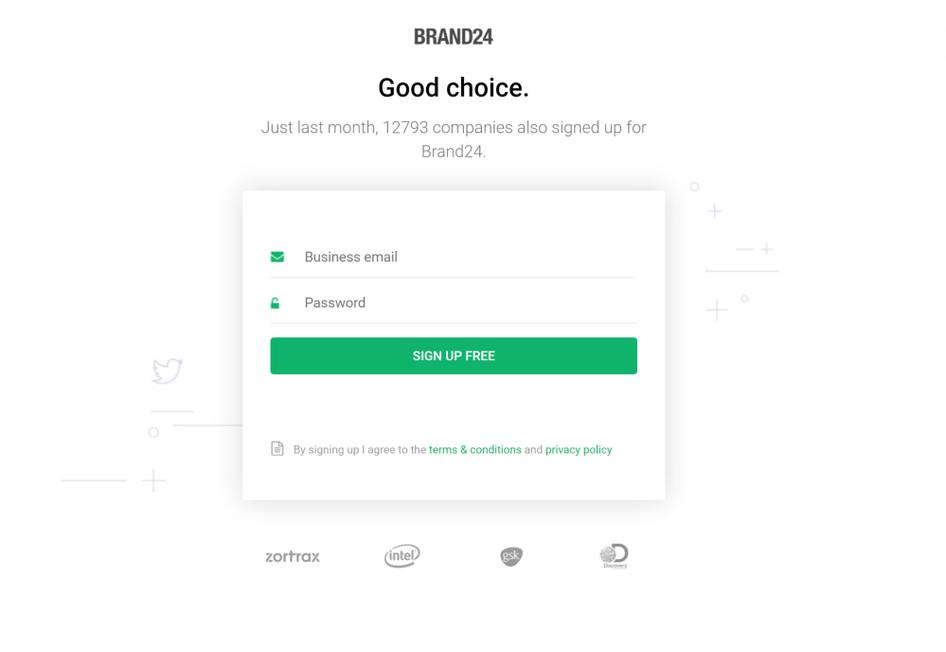
Brand24’s new sign-up form.
To add credibility to the form, Mike included social proof by showcasing the number of sign-ups over the past 30 days. (A tip, he says, he learned from Hotjar’s blog.)
The new form was an instant success. Conversions went up from 2.56% to 7.42%—a nearly 300% increase—which then trickled down and tripled sales.
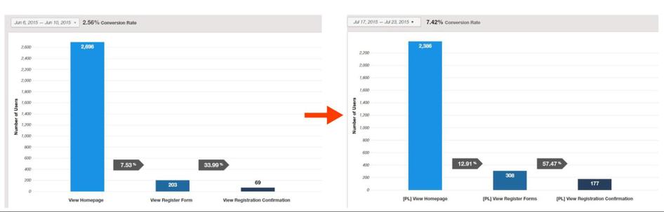
“Three times more sign-ups with just a simple tweak. But you have to know what to improve.”
As Mike points out, you can’t improve what you don’t know. And that’s where Hotjar comes in. Hotjar helps put more context behind your analytics. Like Mike, you can figure out why people are bouncing and what’s stopping them from converting.
“The biggest benefit in Hotjar for myself and for our team is providing context. We have our own data warehouse, we import data from CRM and marketing automation tools, and we know as much as one can know about their clients. But with all the statistics, we still feel like there's a huge benefit in the context of just watching actual sessions from actual clients—just like I would sit behind them.”
Discovering more ways to increase conversions
Mike knows the value in iterative design, so even though the new forms were a massive success, he continued watching recordings to see what else he could learn about users.
Mike applied the new form design to the sign-up forms users landed on from blog posts. These forms followed the same minimal design as the others, but had different copy for the heading and subheading.
While watching recordings, Mike noticed users hovering their mouse over the term media monitoring. After hovering, these users weren’t converting. Something about the phrase “media monitoring” caused confusion.
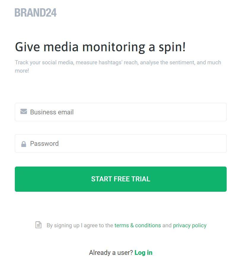
“By actually talking to users, we realized they were pretty confused about media monitoring because some of them found out about our product through content that emphasized different aspects of our product.”
He explained how someone, like a product manager who was reading content about product insights, might be confused after landing on a sign-up form that mentions media monitoring.
💡 Tip: If talking to users isn’t something you have the time or budget for, use Surveys to get additional context to your burning questions.
Brand24 decided to create separate sign-up forms for various blog posts—around 30 in total—that each use slightly different language depending on the topic of the blog post. This way, users don’t feel a disconnect between what they just read on Brand24’s blog and what they’re signing up for.
“By creating separate sign-up forms for specific articles, we've increased our conversions by roughly 20%.”
Again, Mike proves how much you can learn by taking a few minutes every day to observe users in the wild.
Getting valuable data is a breeze
Mike has been using Hotjar for over eight years now. His favorite thing about Hotjar is how easy it is to collect valuable data:
“Hotjar can give me information without putting my pants on, essentially!“
Want to discover which quick fixes can increase your conversions? Try Hotjar today, for free!
Brand24 increased conversions by 300%
Brand24 identified what was blocking users from completing their sign-up form. They spent a few hours redesigning the form and conversions shot up by 300%.
Ready to increase your conversions? Sign up for a free Hotjar account and get started today!
