Learn / Case Studies / Hubspot Academy
How HubSpot Academy used Hotjar Surveys to boost signups by 10%
HubSpot Academy is the worldwide leader in inbound marketing and sales education. Since 2012, HubSpot Academy has been on a mission to transform the way people and companies grow, offering online training for the digital age: courses, projects, certifications, and software training.


We recently had the pleasure of catching up with Eric Peters, Senior Growth Marketer at HubSpot Academy. We discussed how Hubspot uses Hotjar website feedback to understand why visitors abandon the course registration page, and how the team acts on feedback to make user-driven decisions for winning page redesigns.
Nick: First of all, tell us about the Hubspot Academy, how it started, and who it is for.
Eric: The Academy provides inbound marketing & sales education, with about 10k people signing up every month. HubSpot started making courses back in 2012-2013, initially for our customers only. We knew that making our customers successful meant more than just teaching them how to use HubSpot software: it was about teaching them how to be great marketers. At the time, there was a pretty big gap between what students were learning in college and what they actually needed to know to do their jobs; and that was also true for veteran marketers who had been practicing old-school marketing for years, and all of a sudden needed to worry about ‘conversions’ on a website. When we realised that people were 'sneaking' into the course whether they were customers or not, we decided to open the courses to anyone.
Nick: What does the HubSpot Academy visitor’s journey look like, from arrival to signing up?
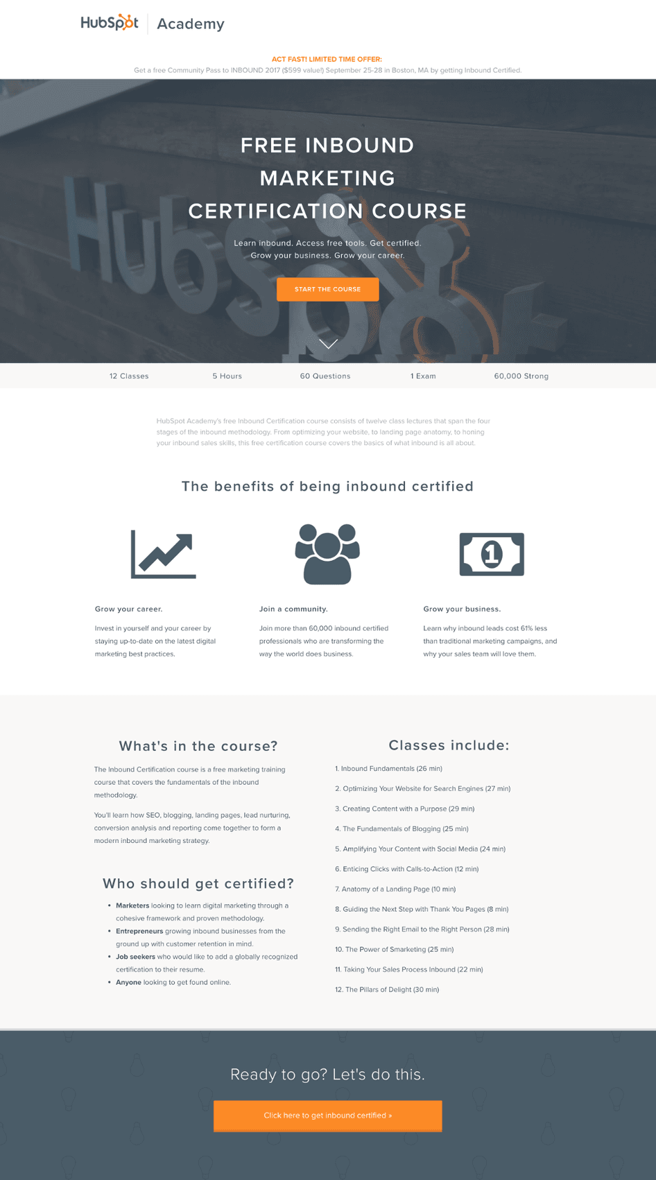
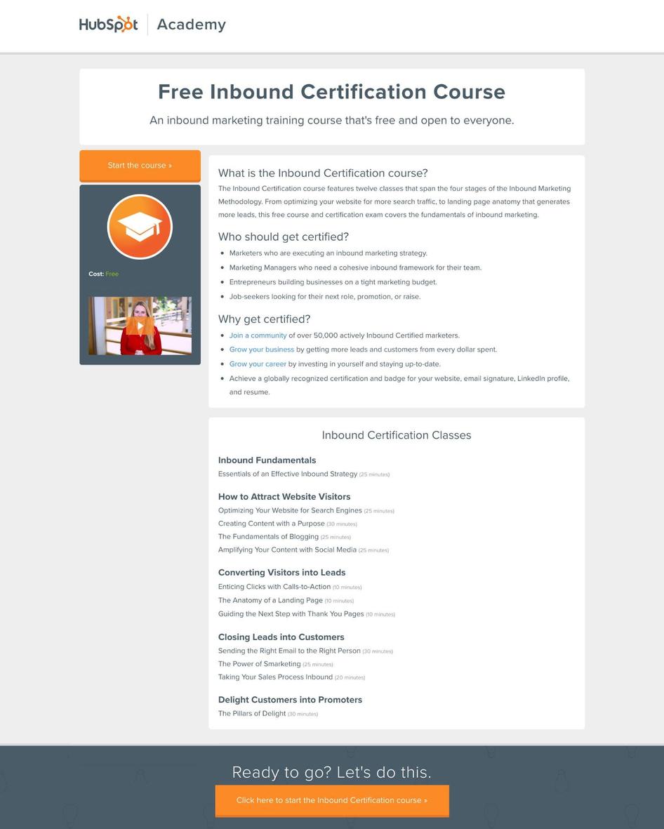
Eric: At the Academy, we use a 2-step signup process for our Certification Courses. When a visitor first arrives, they land on a ‘splash page’ whose goal is to quickly tell visitors what the course and certification exam is, who it is for, and what they’ll get out of the certification.
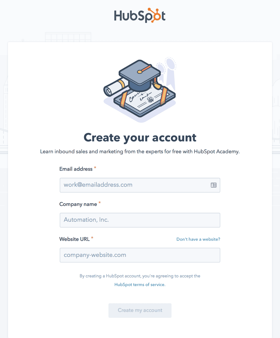
Eric: When visitors click through to register for the course, they are then presented with a registration form.
Nick: I can see the benefit of saving a longer registration form for a second step. What was your biggest challenge with this signup flow, and why did the pages need to change?
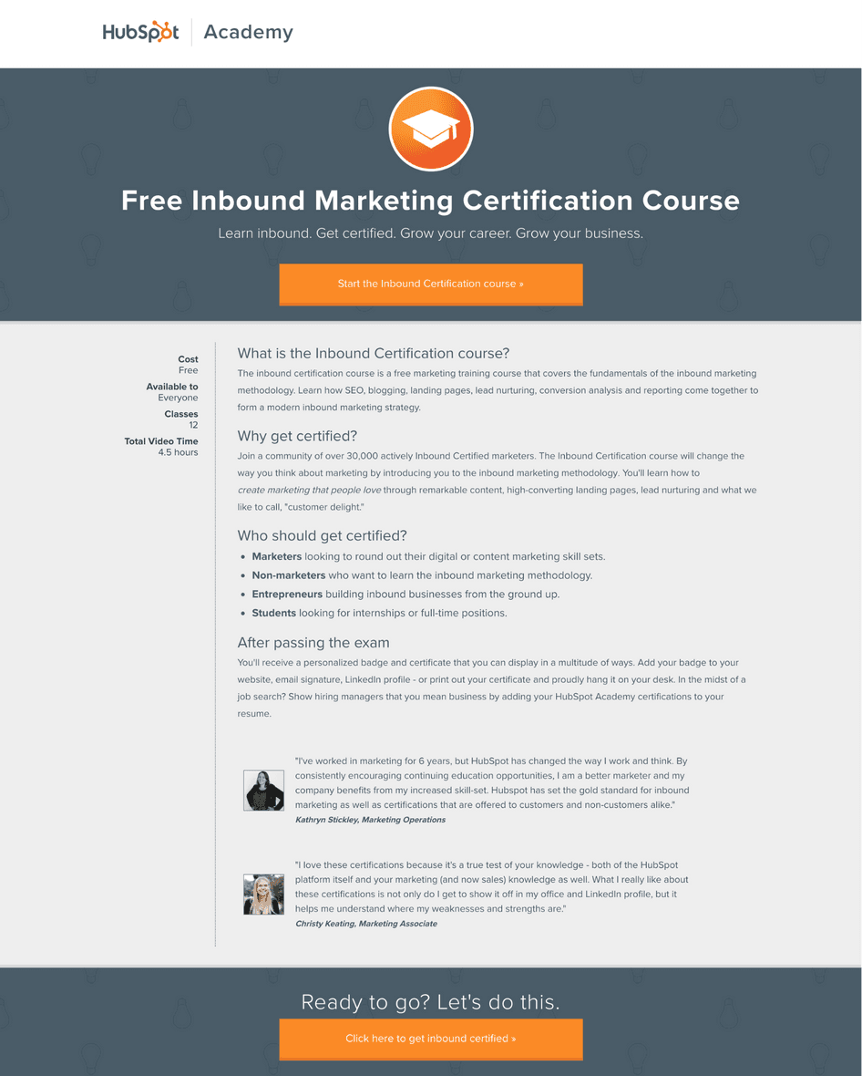
Eric: At the end of last year, our landing pages were doing an OK job. Overall, we were seeing a 9% visit-to-registration conversion rate, which wasn’t bad for a landing page. But since the last page design, a few big things had changed.
Nick: What had changed?
Eric: The Academy had begun offering courses in a growing number of new languages, which attracted newer visitor types with different kinds of goals. This was causing a lot of noise: the splash page was trying to address too much at once, and we had a hunch that the messaging was getting too convoluted.
Also, from a design standpoint, the pages were starting to look dated. The Academy delivers cutting-edge, always-being-updated education to its users, and the design needed to reflect that.
We needed to centralize on a modern page template that also worked really well in terms of clarity.
Nick: What was the first thing you did?
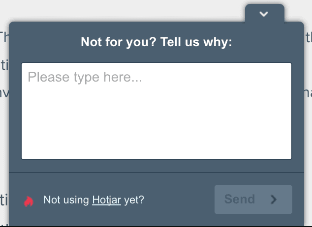
Eric: I dove pretty deep into the page performance and form analytics, hoping to find some patterns that would help with the redesign. One of our UX designers thought I was getting into too much detail, and gave me some advice: “Try to just put a Hotjar exit intent survey on that page and ask people: Why are you about to leave this page?.”
Nick: How did you respond to the advice?
Eric: I thought it made sense, it seemed really simple. I hadn’t used Hotjar Surveys in the past, but I thought it was worth a shot. I quickly set up a Hotjar on-site survey that same morning.
Nick: What type of responses did you get from the survey?
Eric: I was surprised to find that by the end of the first day, I was already getting some of the answers I’d been digging for. And they weren’t the type of answers I was expecting:
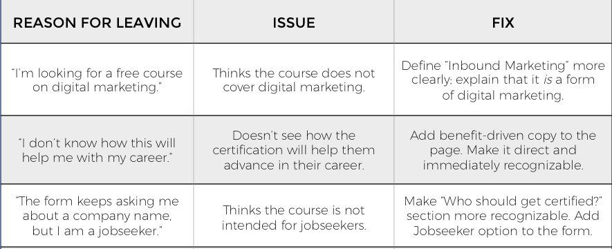
“Hi. I’m looking for a free course on digital marketing.”
“I don’t know how this will help me with my career?”
“I cannot make an account. The form keeps asking me about a company name while I’m a jobseeker. Please help.”
The survey revealed friction on the page that we would have never known existed. Based on the Hotjar survey responses, we started fixing the easiest issues first by simply updating content on the existing page:
That’s when we started to see an uptick in conversion rates on the page.
The changes made from the Hotjar survey gave us enough confidence to begin designing the new page template, which we then A/B tested to get to the final version.
Nick: That’s great to hear. How many versions did it take to arrive to the design you have today?
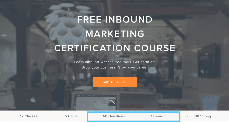
Eric: It took two versions to land on the winning design. Using answers from the Hotjar on-site survey, we saw a 10% uplift in conversions in the new English-page design of the Inbound Certification page, which we then extended to all other languages.
Nick: Those are some solid results. Can you talk about some key elements in the current splash page that derived from your findings?
Eric: Definitely. Many respondents didn’t understand there was a test at the end of the course to become certified. To fix this, we dedicated a section of the hero to set better expectations on certification details, and made sure to call out the exam required for certification.
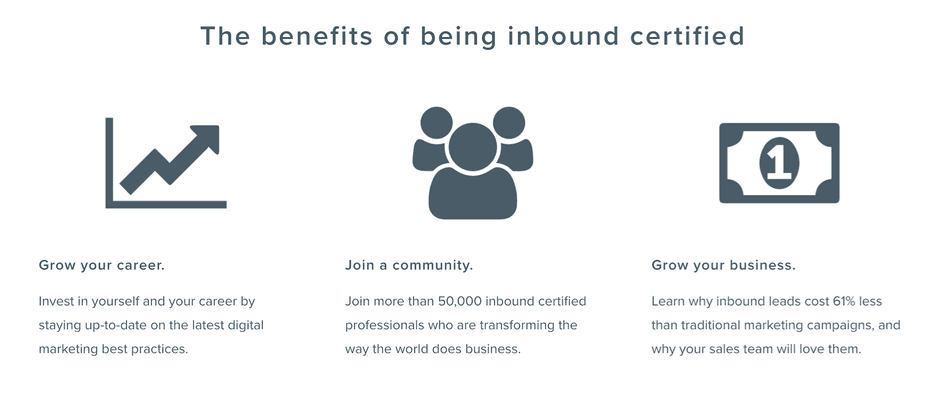
Other respondents weren’t sure how the certification would help them, so we created a ‘benefits of being certified’ section. We made it clean, simple to digest, and gave it a lot of real estate on the page.
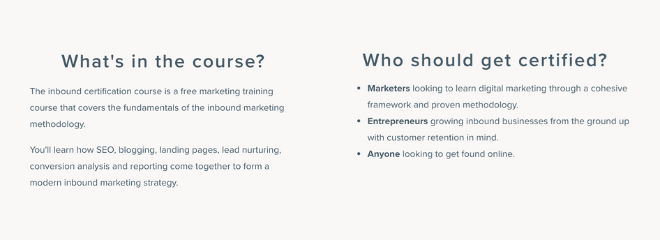
Since many survey responses expressed concern about whether users would be allowed to take the course, we also added a ‘who should get certified?’ section to the page. Now we say things like ‘looking to learn digital marketing’ and ‘looking to get found online’ to improve communication with visitors at different stages of awareness.
Nick: Based on your experience, do you have any advice for folks who are interested in trying on-site surveys to improve the performance of a landing page?
Eric: One of the toughest parts of this project for my team was removing our opinions from the design process. You may think a design is pretty slick, but when your data tells you otherwise, you’ve got to listen.
When you’re undergoing any redesign, guard against subjective input. And instead, rely on visitor insights you collect to drive the decisions you’re making.
Nick: What would you say was an added benefit of using Hotjar in this process? Eric: Using Hotjar was just a case of deciding which URL we wanted the survey to show up on. One hour after that UX designer recommended that we try it, the survey was already live and we had started getting answers. The speed was awesome. We have a lot of internal rules about who can modify code, where; had it been a two-day implementation where I had to go and ask some developer to do it, that would have probably never happened.
* Ready to set up an on-site survey? Here are a few simple instructions to get started, plus check out our Ultimate Guide to Website Feedback to understand your customers better and make user-driven decisions.
Get started with Hotjar
It only takes a few minutes to get started with Hotjar. Understand your users—start free, today.
No credit card required

No credit card required

56,549 users signed up last month

GDPR- & CCPA-ready
