Learn / Guides / Dashboards guide
How product teams can get the most out of Hotjar Dashboards
Hotjar’s Dashboards take your quantitative data analysis to the next level. Find out how product teams can benefit from these additional insights about their customers.

Product teams rely on quantitative and qualitative data to understand what users require from a product. You need access to the numbers and the stories behind them to make meaningful changes accordingly—and you need it fast.
As any product team knows, a clunky, unintuitive discovery process does not make fast possible. And yet, some are stuck with exactly that: switching between multiple analytics tools frequently, collating insights manually, and sharing half-baked ideas with the rest of the team.
When speedy decisions make the difference between losing or retaining users, you want a tool that lightens the load instead of adding to it. Ease your workflow and enhance collaboration with one final switch to Hotjar Dashboards.
Dashboards give you a view of all of your user behavior data in one place. With a few clicks on your personal product dashboard, you can deepen your insights, share with others what you’re seeing, and ensure team alignment on what to do next.
Take your product collaboration to the next level. Use Hotjar Dashboards to gain accurate findings, share your ideas with confidence, and get buy-in from all shareholders.
How to use Hotjar Dashboards as a product team
Dashboards lets your team keep a finger on the pulse of your product. It’s your one-stop shop for insights into what users do, how they feel, and how your product performs.
You can create as many dashboards as you need, and tailor them to your specific requirements so your team can surface the qualitative and quantitative insights that will help you prioritize your tasks and improve your product.
Here are a few situations when you want to use Dashboards as a Product team:
Keep an eye on page issues
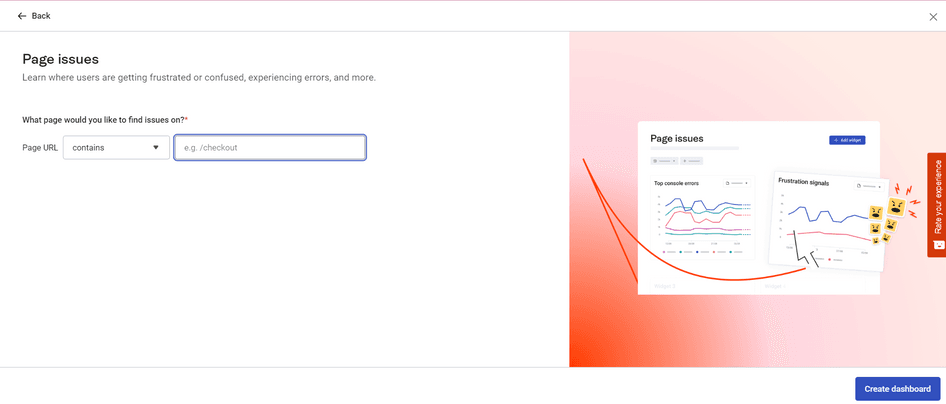
Your team might want to set up a dedicated dashboard for tracking issues in your product. To do so, start by selecting the “Page issue” template when creating a new dashboard. It will automatically populate your dashboard with widgets designed to help you monitor your product for bugs and other issues.
The "Page overview" widget lets you track some key metrics, including the drop-off rate and number of rage clicks that occurred on the URL you’re monitoring
With "Top clicked buttons & links", you can easily spot which CTAs are underperforming, then check heatmaps to analyze how users see them
"Top console errors" will surface the pages with JavaScript issues, so you or someone on your team can take a look at them. You can easily share recordings associated with those errors to make debugging easier.
The "Rage clicks & u-turns" widget shows you indications that users are frustrated. Watch recordings and analyze the relevant heatmaps to understand what’s happening as soon as you see those charts trending up.
"Page with issues" will indicate exactly which pages should get your attention, so you don’t have to manually look for those issues yourself
If you’ve placed a feedback widget on the pages you’re monitoring, the "Feedback" space in your dashboard will give you an idea of how your users feel about the page. If the score is going down, take a look at user comments or watch recordings to understand the source of their frustration.
Use case: monitoring issues in a checkout flow
Even while you’re working on the next iteration of your product, you still want to make sure everything works as intended before the next update.
As a product manager, let's say you create a dedicated dashboard to monitor issues in your checkout flow. You set up a dashboard with the "Page issue" template for URLs that include ‘/checkout/’.
First, you rearrange the widgets so you can access the information that matters the most to you. Now you’ll be able to spot the pages with issues, the rage clicks and u-turns, and the top console errors with a single glance.
Everything looks great for a couple of weeks, but then, you notice that one URL pops up in the "Pages with issues" widget. Just next to it, the "Rage click" widget shows a sudden spike. Time to investigate: you watch associated recordings from the rage click chart. It doesn’t take long for you to notice that several users seem to click frantically on the CTA button without resulting in any action. Strangely though, it doesn’t happen to all users.
A look back at your dashboard shows this CTA has indeed dropped in the list of ‘top clicked buttons’. The associated Trend graph confirms that clicks on this CTA have dropped by over 20%.
You follow your hunch and add a widget to your dashboard: "Technology". Time to validate your assumption.
After filtering data from the "Technology" widget by Operating system, you watch session recordings, and it doesn’t take long for you to discover that while all macOS users are going through the checkout flow as expected, those on Windows are unable to proceed further than the page with issues: it looks like the issue is specific to this OS.
With your hypothesis validated, you enable a developer on your team to solve the issue before your conversion rate drops further.
Monitor a new release
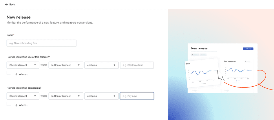
If your team is releasing a new feature, you could set up a dashboard to track adoption and the impact of the feature on your conversion rate. Create this dashboard with the “New release" template:
The "Use over time" widget lets you track how many users use a feature over time. If you want to see how they use your product, watch recordings of people interacting with your newly released feature.
The "Conversion rate" widget represents your conversion funnel and lets you identify where users drop off so you can prioritize fixes in the flow. Recordings of users who didn’t convert are only a single click away, so you can better understand the user behavior behind the numbers.
The "Feedback" widget is here to add a qualitative layer to your analysis and give you an indication of how your users feel about the new feature.
Use case: testing a new feature
After gathering feedback from your users, you learn that pricing is a major barrier to conversion because users aren’t sure they’ll get enough value out of your product.
You decide to test a new feature: you’ll give access to a demo version of your product so users can test it out before they buy. Your hypothesis is that the demo will increase conversions by 5%, and you aim for a 20% adoption rate of this feature (20% of users who visit the page will try it).
As soon as the feature is ready, you set up your dedicated dashboard: you define the use of this feature by the click of the ‘Try it now’ CTA button on your landing page, then define the events of your conversion funnel.
After checking your dashboard regularly, you're pleased to see the use of the new feature you pitched exceeds your target goal. But the conversion funnel doesn’t show much improvement. Strange, since user feedback is overwhelmingly positive…
Time to dig deeper: you watch recordings of users who visited the demo, and realize that exiting the demo sends them back to your site’s homepage instead of back to where they were in the checkout flow. You let your team know immediately and make the appropriate changes.
Soon after, your conversion rate starts climbing. Not to the level you expected just yet, but now you have a control center to discover new opportunities.
💡There are many more ways product teams can make the most of Hotjar Dashboards:
Determine whether issues are a one-time issue or a widespread event by navigating from the rage click widget to the Trends timeline
Compare non-converting and converting users by analyzing differences between devices and checking whether users who don’t convert tend to rage click more often than those who do convert
Gauge the success of a product redesign by monitoring user feedback, errors, and conversion rate
Measure user sentiment to know whether users react positively to product changes
Provide insights to your marketing team on which campaigns performed best, so they can replicate their success and discover new opportunities
Complement quantitative data with qualitative insights to weave a narrative into reports and get buy-in for the next feature
And so much more!
Product dashboards: why choose this collaborative hub
A unifying tool like Hotjar Dashboards brings collaborative processes together. Here are some reasons you should rely on Dashboards for your next brainstorming or launch:
Discover ideas that drive business growth
Find valuable user behavior data in one place. Then turn it into insights quickly and accurately to help your team brilliantly prioritize backlogs.

What makes Hotjar Dashboards unique for product teams?
Not all data sources are created equal. Some lack qualitative data and depend on integrations with other tools like Hotjar to uncover user insights. Others may offer both types of data, but there remains a gap between them, preventing deeper user analysis.
Hotjar Dashboards puts all important user metrics in one place, so you don't need to worry about integrations or wide gaps between quantitative and qualitative data.
Flexible
Your dashboards are customizable to your needs and those of your team. Sure, we’re saving you time by suggesting some templates based on common use cases for product teams, but even if you don’t start from scratch, you can customize your dashboards at will to surface the insights that matter to you: add and delete widgets, move them around, invite only specific people in your organization or your entire team—it’s up to you.
Integration-independent
The data found across the Hotjar suite is available to you in Dashboards, meaning you won't have to worry about integrations during setup. Access the following metrics (and more) in one place: total sessions, average session duration, average pages/session, bounce rate, top pages, average user sentiment (or average Feedback score), rage clicks & u-turns, new vs returning users, devices/browsers/operating systems, and top countries.
Scalable solution
Eliminate the need to switch between different tools when checking quantitative and qualitative data. Using multiple analytics sources slows down your team, creates data gaps, and prevents access to more accurate insights. With Hotjar, you can find the information that matters to your team and turn it into actionable insights fast.
Free and unlimited on all plans
Dashboards are available to product teams on all plans. Having a Hotjar account means you can immediately start viewing your product or website's aggregate user data—no additional coding or integration required. And there’s a dashboard for every occasion, from finding pesky bugs to monitoring product launches, so you can create as many dashboards as you need.
Analysis to insights, insights to action
When it comes to meeting user needs and improving their experience, product teams must bring quantitative and qualitative data together, turn it into meaningful insights, and make decisions that move the needle. Don’t let traditional analytics or a clunky process slow you down.
Hotjar Dashboards makes all of the above possible. The aggregate visualization enables you to spot problems and discover opportunities quickly. Because you can find everything you need for analysis in one place, you can maximize your team’s resources and get the entire product team on the same page—from product research and monitoring to improvement and scaling, collaboration has never been easier.
All these advantages translate to benefits for your users and growth for your business.
Say goodbye to switching between multiple tools or platforms. And welcome the all-in-one tool that makes insight-gathering fast, accurate, and simple.
Find insightful user behavior data in one place. Discover ideas that drive business growth.