Learn / Case Studies / Turum-burum
How Turum-burum used Hotjar to increase an ecommerce client’s conversion rate by 55%
UX and CRO agency Turum-burum used Hotjar Heatmaps, Recordings, and Surveys to improve online shoe retailer Intertop’s conversion rates, average revenue per user (ARPU), and bounce rates.


🏆 55% increase in conversions (and more)
Turum-burum’s partnership with Hotjar yielded the following results for its client, the Ukrainian online shoe retailer Intertop:
55% increase in conversions
11.5% increase in average revenue per user
13.4% decrease in checkout page bounce rate
🛠 Tools
✏️ Tactics
Hotjar Recordings: for playbacks of actions taken by individual users navigating a website or product
Filtering session recordings to find areas of friction and frustration on Intertop’s website
Hotjar Heatmaps: for an aggregate visualization of user behavior on key pages
Viewing heatmaps of Intertop’s product listing pages to see where users click, move, and scroll
Hotjar Surveys: for easy on-site and external surveys, enabling businesses to hear from customers directly
Setting up an exit-intent survey to understand why users abandon Intertop’s checkout page
Google Analytics: for collecting, analyzing, and reporting on website traffic data
Analyzing Google Analytics data to form experiment hypotheses backed by numbers
A/B testing tools: for testing ideas and validating hypotheses
Conducting regular experiments to roll out successful variations
Over the course of our year-long work with Intertop, Hotjar helped us identify hundreds of interface pain points, bottlenecks, and hidden sources of tremendous potential gains to improve user experience and drive business outcomes.
Problems identified
Almost half of all prospective customers abandoned Intertop’s checkout process
The site’s product filtering functionality was riddled with usability issues and technical bugs
Users didn’t scroll far enough down product pages, missing the primary call-to-action (CTA) button
Solutions implemented
1. Launching a full checkout page redesign
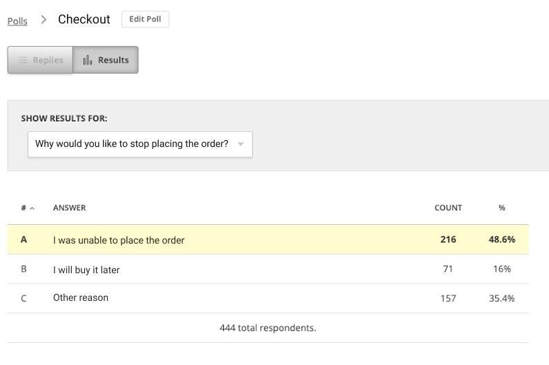
Turum-burum used Hotjar Surveys to conduct an exit-intent survey on Intertop’s checkout page. Survey results revealed that 48.6% of respondents couldn’t place their order—a long, cumbersome process hindered the user journey.
Get the same exit-intent survey template Turum-burum used to decrease abandoned checkouts.
Further investigation revealed that most users dropped off at the registration phase. So,
Turum-burum focused on reducing bottlenecks in the conversion funnel step from ‘checkout’ to ‘order placed.’
Using Hotjar’s heatmaps and session recordings to see how users interacted with different versions, the team A/B tested three changes:
A ‘Place order’ page redesign
Reduced checkout fields
An autofill function
Once the winning variations were implemented, these changes resulted in an 11.5% increase in ARPU and a 13.4% decrease in bounce rate.
2. Implementing clear product categories and improved filtering
With additional user feedback via Hotjar Surveys indicating issues with Intertop’s buyer experience, Turum-burum again turned to Heatmaps and Recordings for more context.
Data revealed that when users filtered Intertop’s shoe catalog for a specific size, the website also surfaced results for shoes one size higher and one lower—a poor ecommerce UX that either forced users to browse through a massive number of pages to find what they needed or prompted them to make a beeline for their previous page and u-turn away.
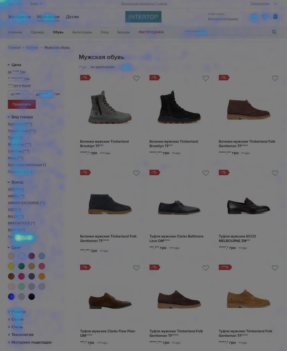
Analyzing Hotjar’s move maps, the Turum-burum team found that many users interacted with the ‘show all’ button because they lacked the necessary filters to find what they were looking for
As part of its conversion rate optimization (CRO) efforts, Turum-burum identified and prioritized clear product categories with active filtering functionality, an essential user behavior standard for online retailers.
The new product list display makes it significantly easier for users to filter their search and find exactly what they’re looking for. Coupled with the optimizations outlined in solution 3 below, this change resulted in significantly improved conversions—keep reading for the final results. 👀
3. Redesigning product listing pages for easy navigation
Through analyzing heatmaps, Turum-burum realized that Intertop’s main CTA button, ‘Buy now,’ was hidden below the average fold for most users, meaning several people missed it entirely. Users also frequently clicked on images to view more product details, but these elements were unclickable—a missed opportunity for Intertop to give prospects what they needed.
So, the team released a new product page with a clean, minimal design and simplified navigation.
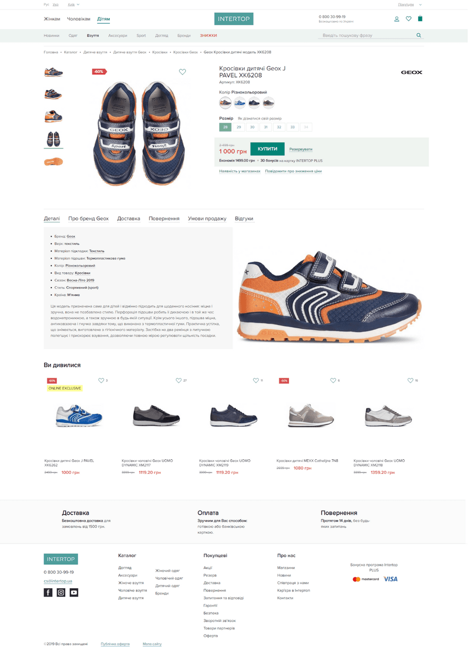
Along with the new product categories and filters introduced in solution 2 above, these changes yielded a 31% conversion rate increase from product page to cart and a 36.6% conversion rate increase from cart to checkout page.
Hotjar helps us map our client’s customer journey from a user’s perspective. We’re much more efficient in delivering value because of it.
Improve your ecommerce conversions with user-led insights
Turum-burum used Hotjar Heatmaps, Recordings, and Surveys to optimize its client’s website for significant results. Discover more incredible tools and features when you sign up for a free Hotjar account.
