Learn / Guides / Heatmaps guide
The complete guide to heatmaps
Heatmaps are a powerful way to understand what users do on your website pages—where they click, how far they scroll, and what they look at or ignore.
In this guide, you’ll find an introduction to the different types of heatmaps and how to create and analyze them. You’ll also get real case studies and practical examples, so you can see for yourself just how valuable and useful heat maps are when it comes to improving and growing your website.
(You’ll even get a complete overview of Hotjar’s free forever Heatmaps tool if you read until the end.😉)
What is a heatmap?
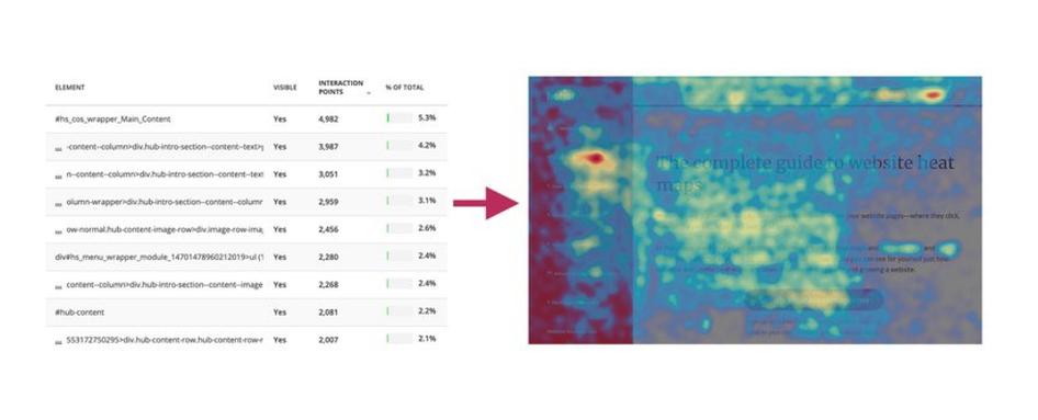
A heatmap (or heat map) is a graphical representation of data where values are depicted by color.
They are essential in detecting what does or doesn't work on a website or page, and which parts and elements of a page users engage with.
By experimenting with how certain buttons and elements are positioned on your website, heatmaps allow you to evaluate your product’s performance and increase user engagement and retention as you prioritize the jobs to be done that boost customer value.
Heatmaps make it easy to visualize complex data and understand it at a glance:
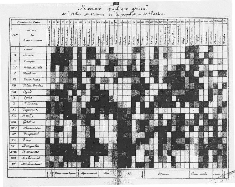
The practice we now call heatmaps is thought to have originated in the 19th century, where manual gray-scale shading was used to depict data patterns in matrices and tables.
The term heatmap was first trademarked in the early 1990s, when software designer Cormac Kinney created a tool to graphically display real-time financial market information.
Nowadays, heatmaps can still be created by hand, using Excel spreadsheets, or with digital experience insights tools like Hotjar.
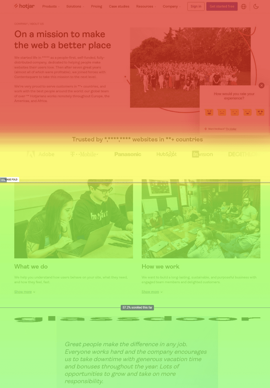
What is a website heatmap and how can you use it to improve your product?
Product and website heatmaps visualize the most popular (hot) and unpopular (cold) elements of your content using colors on a scale from red to blue.
But, who uses heatmaps and how do they work?
Heatmaps give product teams, marketers, digital and data analysts, user experience (UX) designers, social media specialists—and anyone who sells anything online—deep insights into people’s behavior on their site, helping them discover why users aren’t adopting their product, using call to action (CTA) buttons, or converting.
By aggregating user behavior, heatmaps facilitate data analysis—combining quantitative and qualitative data—and give a snapshot understanding of how your target audience interacts with an individual website or product page—what they click on, scroll through, or ignore—which helps you identify trends and optimize your product and site to increase user engagement , conversions (CRO) and sales.
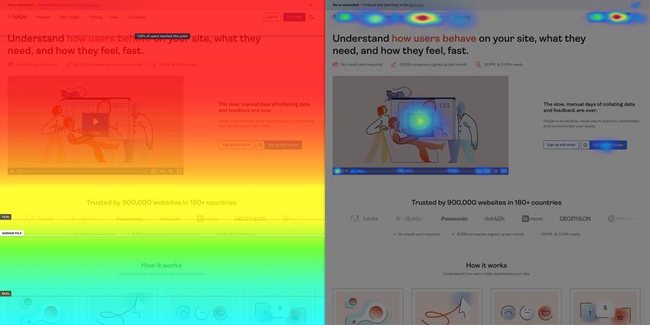
Heat maps also usually display the average fold, which is the portion of the page people see on their screen without scrolling as soon as they land on it.
The benefits of using heat maps on your website
Heatmaps help product managers and website owners understand how people interact with their website pages to find answers to critical business questions and goals such as ‘Why are my users not converting?’ or ‘How do I get more visitors to take action?’ Using heatmaps, you can determine if users are:
Reaching important content or failing to see it
Finding and using a page’s main links, buttons, opt-ins, and CTAs
Getting distracted by non-clickable elements
Experiencing issues across devices
As a visual tool, heat maps help you make informed, data-based decisions for A/B testing, updating, or (re)designing your website. They're also useful on a wider business scale: heat maps let you show team members and stakeholders what’s happening and get their buy-in more easily when changes are needed—it’s hard to argue with a heat map!

Hotjar Heatmaps continuously collect and let you filter data and create special heatmaps based on user attributes—like the user's role or title, the date they created their account, whether they're on a trial version of your product, and more—so you can quickly find targeted insights.
For example, product teams might use heatmaps to test how users are interacting with a new feature or prioritize bug fixes, whereas UX and UI designers will use heatmaps to measure the popularity or dislike of a page design, and implement changes that makes it easier for customers to navigate their website.
With Hotjar’s Highlights feature, you can ‘favorite’ and quickly share specific insights of a heatmap with other departments or individuals in your business, achieving successful cross-functional collaboration.
You can also create a ‘collection’ of heatmaps to highlight specific elements you want your business or team to prioritize.
For example, a digital marketer might create a heatmap collection to test a landing page and then decide to move a CTA button above the average fold, reducing churn and increasing sign-ups for their website or product.
Sign up for a free Hotjar account, add the tracking code to your site, and start using heatmaps today.
We used Hotjar’s insights to narrow down the possible causes of drop-off. It enabled us to focus on and test a few real solutions instead of chasing hypothetical solutions based on guesswork.
Sign up for a free Hotjar account, add the tracking code to your site, and start using heatmaps today.
What are the different types of heatmaps?
Heatmap is really an umbrella term for different heatmapping tools: scroll maps, click maps, and move maps. Knowing the difference is handy, as each type helps you investigate a slightly different aspect of your website and product performance.
Let's dive in!
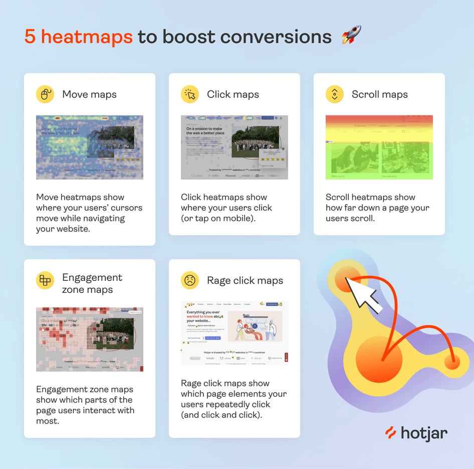
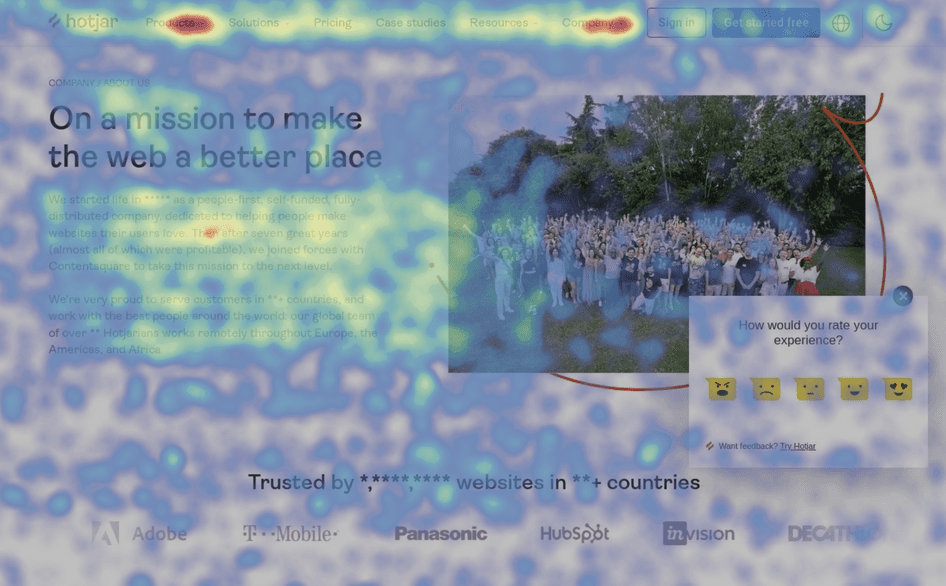
1. Scroll maps
Scroll maps show the exact percentage of people who scroll down to any point on the page: the redder the area, the more visitors see it.
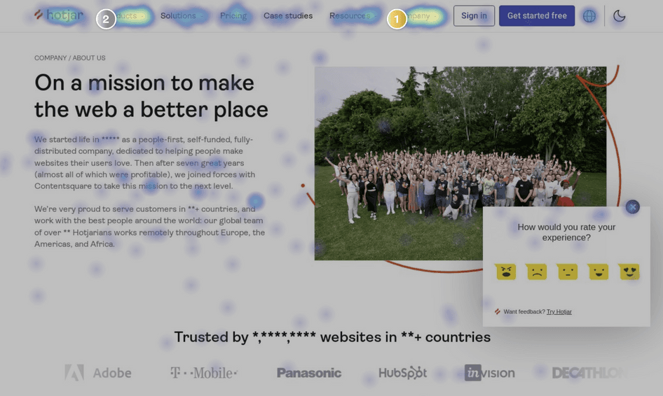
2. Click maps
Click maps show you an aggregate of where visitors click their mouse on desktop devices and tap their finger on mobile devices (in this case, they are known as touch heatmaps). The map is color-coded to show the elements that have been clicked and tapped the most (red, orange, yellow).
3. Move maps
Move maps track where desktop users move their mouse as they navigate the page. The hot spots in a move map represent where users have moved their cursor on a page, and research suggests a correlation between where people are looking and where their mouse is—meaning that a move map gives you an indication of where people might be looking as they go through your page.
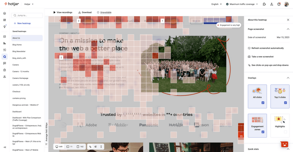
4. Engagement zones
Engagement zones combine interaction data sets from click, scroll, and move heatmaps into one simple view.
It’s a powerful data visualization tool that helps you analyze pages in seconds, so you can get a well-rounded view of user engagement with your product.
5. Rage click maps
Rage click maps let you pinpoint exactly where users get frustrated on the page. Spot and address those pain points to reduce rage clicks and friction in your key flows to improve UX and boost conversions.

6. Desktop, tablet, & mobile heatmaps

Desktop, tablet, and mobile heat maps help you compare the performance of your website on different devices. For example, content that is prominent on a desktop page might sit much further below the fold on a phone—and you need to see if interaction differs, and how.
Ready to create a heatmap and improve your website experience?
Heatmaps are easy to create and understand, and they let you discover actionable insights that help you improve the user journey and your product pages to increase retention and sign-ups on your website!
Set up your heatmap today
Sign up for a free Hotjar account, add the tracking code to your site, and start using heatmaps today.
