Learn / Product Forge / Article
8 CTA best practices to increase conversions (+ checklist and power words)
Struggling to increase website conversions? Learn how to increase clicks using CTA best practices and our downloadable checklist w/ power words that convert.


Website traffic is increasing, which means your search engine optimization (SEO) is finally paying off. But that's only the start of your visitor journey. Now, it's time to get more of your traffic to convert into leads—or better yet, customers.
This is where calls to action (CTAs) come into play. Effective CTAs can make all the difference in website conversions. If you're not using them yet or don't know how to make them more effective, you'll find this guide helpful.
Think about your CTA first
When you design a website or web page, you must guide visitors to take action. Whether your primary goal is to get more email sign-ups or sales calls, you need a CTA to make it happen.
Website visitors come for information, inspiration, and entertainment. Once they get what they came for, they'll leave without taking any further steps—unless you guide them onward. Adding CTAs to your web pages creates an intentional path for visitors to walk through.
CTAs can help in several ways:
Increasing button or link click-through rates (CTRs)
Building your email subscriber list
Boosting video views
Increasing ebook or guide downloads
Raising sales call inquiries
Growing sales of a product or service
But this only works if you know how to write, design, and place your calls to action. So let's look at the best practices for improving CTA conversion rates.
Learn why your visitors aren’t converting
Hotjar shows you what keeps your visitors from buying, so you can make website changes based on real insights, not assumptions, and watch your conversion rate grow.

8 best practices for higher conversions
There's no magic formula for creating effective CTAs. It requires ongoing testing to see what works for your specific audience. But you may find one or more of these best practices helpful in finding the right balance:
Make the CTA visible
If your CTA blends in with the rest of the content, visitors will miss it. Most people don't read an entire web page, so it's vital to make your call to action visible in placement, color, and font size.
Some make the mistake of burying the CTA in the middle of the content where it's harder to see. Instead, include CTAs at the beginning and end of the page where most people will see them.
Also add white space so there aren't large blocks of text hiding your call-to-action buttons and links.
Use eye-catching CTA button colors
The color of your CTA should stand out from the rest of the text on your site. Use bright, bold colors like red, yellow, green, blue, orange, and purple. These will grab attention and encourage visitors to click.
You can also use different fonts, sizes, and typographical emphasis (bold, underlines, italics). The choice depends on the typeface used throughout your site. You can select a different font for the CTA, or make it larger if it's the same font as your other text. But don't overdo this or it may look tacky. The font size and style should mesh well with the site so it doesn't look off-putting.
The goal is to make the call to action easy to spot. Also, test it on various devices and screen sizes to ensure accessibility.
Include only one CTA
Don't overload your visitors with too many options. If you have multiple CTAs on a single page, users may do more of one and not another—or worse, nothing at all. Offering too many options creates the risk of confusing your visitors into inaction, which will hurt conversions.
Instead, choose a single call to action so visitors know exactly what to do. If you have multiple goals, then create different blog posts and web pages geared towards each.
For example, you can have a series of blog posts that promote a new download, and each post directs to a unique landing page that targets the audience to take a different action, such as filling out a form for a segmented email campaign.
Keep the CTA short and sweet
A long-winded CTA may confuse and turn off visitors. Some may not even read the entire call to action. So your best bet is to keep it short and simple.
This may be problematic when you're trying to make your CTA specific and relevant to your audience. The goal is to keep the call to action to around two to five words—for example, 'Get your free ebook.'
The CTA should tell the visitor what will happen when they click the link or button, so be clear about the action they're taking.
Place the CTA in more than one section
Some visitors scroll faster and deeper than others, which means they may miss the first CTA if it’s near the top. By placing the same CTA in multiple areas of a page, you increase the odds of people seeing it.
Try adding one CTA button or link above the fold (the area you see on the website before scrolling down), one in the middle, and one near the end. How many you place will depend on the type of page and the length—the longer the text, the more CTA placements you can have.
For a short page or blog post, you can have one at the top and one at the bottom to cover both the skimmers and the more careful readers.
Include supporting text before the CTA
Some folks need more nudging to get them to click on something. By adding more context around the CTA, it'll give them a reason (and hopefully entice them) to click.
For instance, if your call to action is for email sign-ups, then write a line or two about the benefits of your newsletter before presenting the CTA. Focus on the pain points you solve or challenges you help them overcome.
Use social proof
To build trust, include social proof from other customers before presenting the call to action.
This can be screenshots from social media, a reviews plugin, or video testimonials. Make it viewable right on the page so it takes less action on the part of the user to convert.
Write compelling copy
Your CTA text should speak directly to your target customers. Address their specific pain points and concerns in the text before the CTA to make them want to click on it.
For instance, if you're selling a bookkeeping service to freelancers, speak about how much they're losing in unclaimed deductions and how much money your service helps others save per year. Then use a CTA that goes beyond saying, 'Buy now.' Be more specific, like, 'Stop losing hard-earned money,' or, 'Start saving on taxes now.'
A report from HubSpot shows that personalized CTAs convert 202% better than non-personalized CTAs. So use language that's specific to your audience and their needs (e.g., profession, challenges, goals).
Measure performance by testing
You implemented these CTA best practices—great! But your job isn't over yet. It's time to measure the impact.
How well are your CTAs performing? Could they be doing better? The best way to find out is to run A/B tests on your calls to action.
Choose an element to change, such as the color of the button, copy, or text before the CTA. Compare the change with the original to see which one works better. Do this with multiple versions to identify the changes with the best outcomes.
If you're not measuring your CTAs, you risk losing conversions. Do this too long, and you'll miss out on opportunities to grow leads and sales.
So make A/B experiments a regular part of your marketing strategy and consistently improve your CTA performance.
Four CTA examples from top brands
Sometimes, the best way to learn is to look at how successful brands are doing things. So let's look at four examples of top brands with effective CTAs:
1. Evernote: bold color and enticing language
When you land on Evernote's home page, you find a bold green CTA button with a power word: ‘free.’
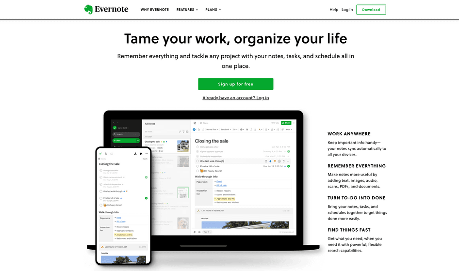
This works because it's eye-catching and plays on people's desire to get things at no cost.
2. BuzzSumo: compelling context before the CTA (and a freebie)
BuzzSumo has several use case pages. In this example, the CTA is for ‘competitor intelligence.’ What makes this CTA work is the context added above the button.
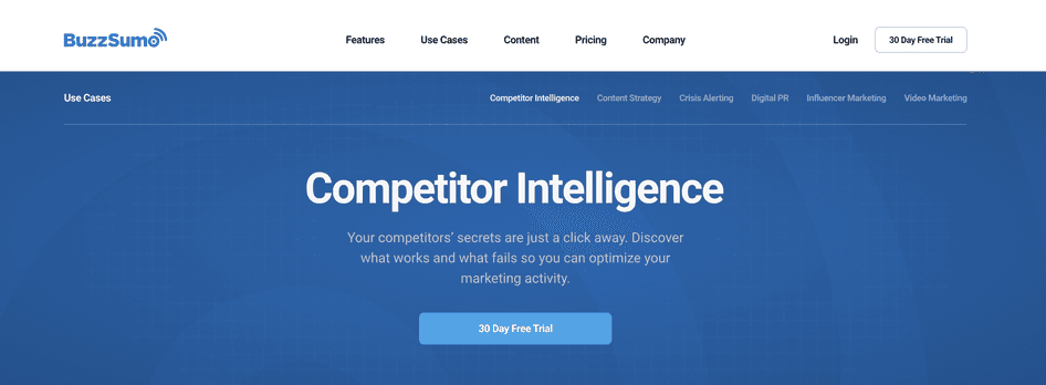
It touches on the benefits of the platform by highlighting how quick and easy it is (‘just a click away’) to perform competitor research. And it emphasizes a key benefit—how the tool will help them learn about their competitors' successes and shortcomings so they can better compete.
3. Buffer: eye-catching CTA graphic
If you're looking to grow newsletter subscribers, then sharing helpful information on your blog helps. Buffer does this regularly and promotes its newsletter in the middle of blog posts in an appealing way.
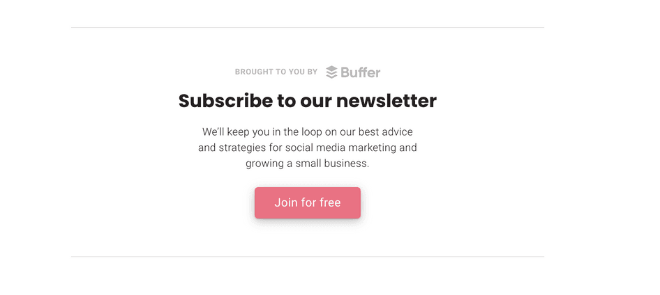
This graphic is large and uses contrasting colors and fonts, so it's easy to see as you're scrolling. The CTA copy speaks to a specific audience (small business owners and those using social media marketing). And makes a clear promise to deliver the best advice on social media marketing strategies and business growth.
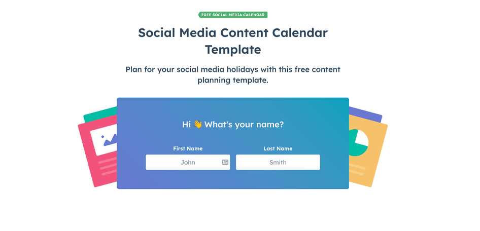
4. HubSpot: multiple CTAs with one offer
HubSpot is big on offering free resources to their audience. On their blog, you'll find hundreds of posts with free templates and checklists to download. In this example, we find a blog post on creating a social media calendar, and it comes with a free template.
At the top of the blog post, the CTA shows up in two different places. One has a bright orange button, and the other is formatted as text beneath the first paragraph.
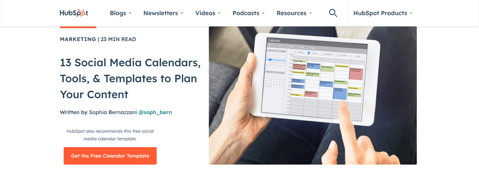
So if you missed the orange button, you'd see the large blue font with the arrow pointing to the word 'Free.'
Then as you scroll through, you'll find additional CTAs like this one:
At the end, there's yet another CTA to download the same social media content calendar template. But it has a unique graphic from the others, so it pops out.
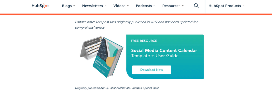
Notice how each CTA is unique—one is a clickable button, another is a clickable link, the third has a form with two fields, and the last has a simple 'Download Now' button text.
This strategy caters to different users and their willingness to convert. Those who don't want to fill out a form will more likely hit one of the buttons or links (even though this information is still required for the actual download).
How to monitor CTA performance with Hotjar
Now that you have a list of CTA best practices and inspiring examples, it's time to learn how to track your CTA performance. Hotjar offers tools to make this process simple. For instance, you can use Hotjar heatmaps to identify the areas of a page that get the most click-throughs.
The redder the area, the more attention it receives. The bluer the section, the less engagement it gets. Plus, you see the number and percentage of clicks a particular area receives.
Let's review how this works.
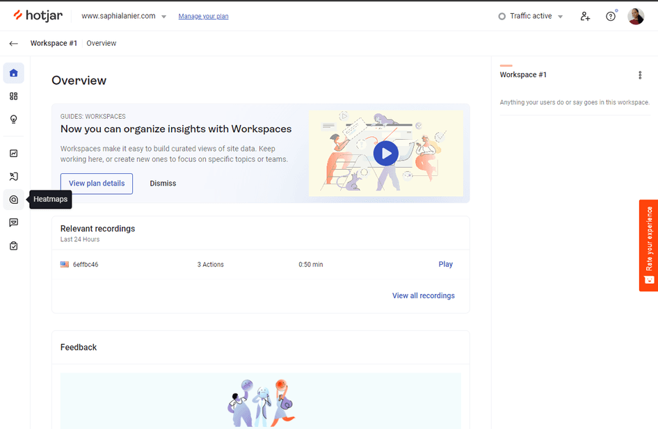
First, log into your Hotjar account (including our limited free account) and connect your website. Then click ‘Heatmaps’ in the sidebar on the left.
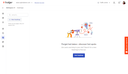
Next, you can either click ‘New heatmap’ on the left or the blue button in the middle.
If you click ‘New heatmap’ in the side menu, you'll see a pop-up window like this:
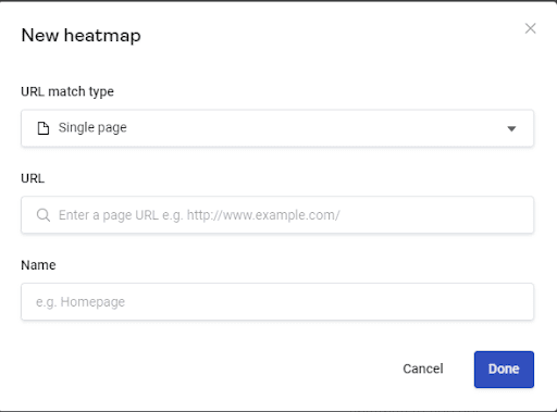
Type in the URL of the webpage you want to see and name it, then click ‘Done.’
If you clicked the blue ‘New heatmap’ button, then you’d see this page appear:
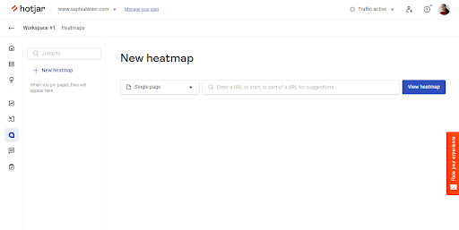
Type in the URL and click ‘View heatmap.’ Hotjar will process the URL, and then you'll see the following page:
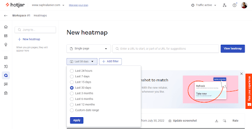
Select the drop-down to choose a time frame, or click ‘Add filter’ to focus on a specific path, attributes, or sessions:
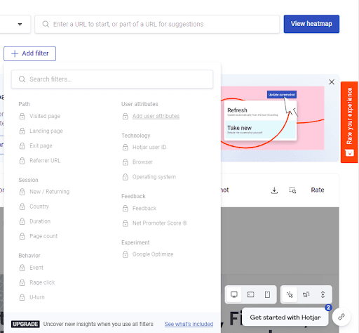
Once you're done adding the filters and time frame, scroll through the page to see where visitors click.
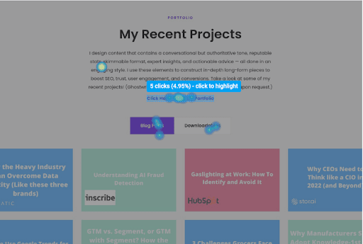
You can hover over the different heatmap spots to see how many clicks an area received. This information can help you tailor your future campaigns for maximum return.
Learn why your visitors aren’t converting
Hotjar shows you what keeps your visitors from buying, so you can make website changes based on real insights, not assumptions, and watch your conversion rate grow.
Best practices and power words for CTAs
Creating CTAs and monitoring their performance is easier when you have the right tools. So we put together a list of best practices and power words to use in your CTAs.
Checklist: CTA best practices
Increasing website conversion rates is possible when you focus on improving your calls to action (CTAs). Here's a look at the different areas you can tweak to test what works for your particular audience.
CTA copy
⬜ Clear and simple text: use simple words (no jargon) and short sentences that clarify what the visitor will receive for their action, for example 'Learn to increase email conversions'
⬜ Context clues: add one or two sentences before the CTA link or button to provide additional information about what they'll get when they convert (touch on the benefits and address objections)
⬜ Personalization: create CTAs that speak to specific groups of people by focusing on the pain points and desires of that audience, for example, 'Close deals 50% faster within 30 days' (for salespeople)
⬜ Social proof: add images, videos, or text from happy customers to show why your product or service is worth the purchase or download
⬜ Power words: include words that excite and inspire action, such as ‘free,’ or ‘limited-time offer’
CTA design
⬜ Font style: make the CTA text stand apart by changing the font, making it larger, or giving it a bold color (like blue, orange, yellow, or green)
⬜ Button style: use a button to make the CTA pop out
⬜ Graphic: turn the CTA into a graphic vs. just a button or link, so it stands out in the page or blog post: for example, create a square or rectangle graphic with text, designs, and a large CTA button
⬜ Images: add photos of people or the product to make the CTA easier to spot by skimmers
CTA placement
⬜ Before fold: put a CTA at the start of the page to ensure the visitor sees it without having to scroll down, and to let them know about your offer before they leave the page
⬜ Middle of content: include a CTA at the midway point, preferably near the most substantial section of the content
⬜ End of content: don't allow visitors to leave without seeing your CTA one last time. Include context before the CTA to drive home why it's important to download, buy, or schedule a call
⬜ Multiple placements: place your CTA in multiple spots throughout the page or blog post—the longer the text, the more CTA placements you should include
104 Power words to use in CTAs
Including powerful words in your CTAs evokes emotion in your visitors. Here's a look at some words to use based on the type of emotion you want to ignite:
Memorability
Undeniable
Impressive
Captivating
Unforgettable
Embarrassing
Genius
Novelty
New
Revolutionary
Miracle
Life-changing
Latest
Discover
Unexpected
Odd
Sensational
Remarkable
Extraordinary
Curiosity
Behind-the-scenes
Little-known
Bizarre
Stunning
Spoiler
Shocking
Unique
Unheard of
Bold
Riveting
Thrilling
Transform
Fascinating
Insider
Savvy
Cheap
Free
Affordable
Best
Save
Exclusive
Giveaway
% off
Bonus
Forever
Overnight
Sale
Unlimited
Budget
Speed
Fast
Quick
Short
Now
Today
Safety
Secure
Beware
Emergency
Hoax
Protect
Caution
Dangerous
Diagnosed
Safe
Scam
Signs
Warning
Red flags
Survive
Terrifying
Exclusivity
Breaking
Popular
Rare
Secret
Confession
Divulge
Priceless
Reveal
Sneak-peek
Trend
Unseen
Untapped
Worst
Special
Authority
Backed
Expert
Formula
Genuine
Honest
Guaranteed
All-Inclusive
Legit/legitimate
Proven
Complete
Guide
Professional
Studies
Masterclass
Ease
Easy
Simple
Painless
Step-by-step
Minimalist
Effortless
How-to
Guide
List
Clear
Comprehensive
Learn why your visitors aren’t converting
Hotjar shows you what keeps your visitors from buying, so you can make website changes based on real insights, not assumptions, and watch your conversion rate grow.