Learn / Blog / Article
5 UX mistakes that will make your visitors click the 'back' button
The very basis of UX Design is effective qualitative user research which is for the most part not achieved by reading - it's achieved by asking the right questions. When it comes to UX mistakes, more often than not it's the habits and processes we ourselves dictate that lead to a bad user experience. Let's explore some of the mistakes which might be easy to overlook but can have big negative consequences for your website.

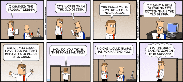
1 • Redesigning for the sake of redesigning
It's not a rarity that a company or a team decides they want to redesign a website or a section of it. This is by no means a bad thing. It becomes bad when you ignore everything about the current design and why it needs to change in the first place.
Redesigns are perfect projects to conduct UX research on since you already have a fully functional site or product. User testing tools, surveys and on-page surveys are amongst the many things you can do to learn what the pain points of users are when using the existing design.
What do users expect to see in this section of your website?
Do their goals and your goals align?
What elements are distracting the users from achieving their goal?
Should you add OR remove something to make it easier?
Is there any information which is misleading or incorrect?
Is a redesign even needed or is polishing the design and fixing a few issues enough?
Doing your homework upfront will give you the data you need to learn how the current design is being used. Apart from making it much simpler to tackle the re-design project, it also gives you the leverage you need when you have to persuade stakeholders and convince others why a change is needed.. or not.
2 • Wireframing / Mocking up too soon
UX projects usually start off as a set of stakeholder requirements and goals which the company aims to achieve. Unfortunately, these requirements usually come delivered in a document with a uniform font size and weight with no hierarchy whatsoever.
Here is where UX design comes into play - it allows you to segregate the different parts of the puzzle (project) and determine how they should be sorted in a way that actually makes sense and is most effective to the end user. So before any wireframing is done, content architecture is a must. You cannot know what is needed on a specific page until you know what message needs to be delivered. Content architecture helps you define what hierarchy your content should have by asking the right questions and doing user research.
What is the most important thing visitors must know about us?
What content is secondary and can be pushed to a different page?
Will we need any illustrations to visually explain the problem we solve?
What actions should we promote the most?
Do we need a signup form on the homepage, or should we hide that behind a button?
These are just a few of the questions you need to answer before you can wireframe anything. This is a very iterative process which you will most likely not get right the first time. It's the phase in which feedback is the most crucial since altering things now costs a fraction of what it would cost you later on in the design process.
3 • Not giving Forms the attention they deserve
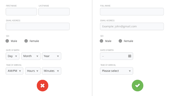
Forms are boring and if not done properly, they can be the biggest deterrent for your users. Has anyone ever approached you to say how awesome filling out a form was and that you should try it out? No. No one did, everyone hates them. They just stand there, observing everything you type, and if you make even one mistake, a red error message will jump up at you (hopefully), just like a high school teacher correcting your homework.
Only ask your users for information that is truly indispensable at that point in your relationship.
That said, a minimum of one form is for most sites unavoidable - so it's crucial you make it as approachable and easy to use as you possibly can. Only ask your users for information that is truly indispensable at that point in your relationship. For instance, don't be arrogant by asking for credit card details when users are signing up for a trial. Make the form super easy to scan and assist users in any way you can by using smart defaults and providing help where needed. When designing your form, you should aim to:
Only ask what’s indispensable
Know when to ask for the appropriate information
Include trust factors
Make it easy for your users to scan the form
Order the form logically
Use smart defaults
Break complex forms in a multi-step process
Carry out A/B split tests
Conform to code/browser standards
Earlier this month we published an article focused on form conversion and optimization. We would definitely recommend reading it: Form Design For Dummies: 10 Simple Tips On Designing A Form That Converts
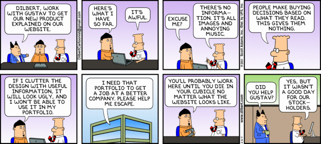
4 • Not directing your content towards your target audience

In some way or another you should know to whom your product is targeted for. Make sure you let your site visitors know that. There is currently a trend in website home pages, using huge bold titles such as 'A collaborative tool for designers - made by designers' or 'We build lawn mowers for people who are passionate about their lawns' - and this is for a good reason. People do not like to be generalised. They want to know that their trade or hobby is appreciated and that you are one of them. By being one of them, your users are inclined to think that you know what struggles and challenges they face and what tools they need to do whatever they do better.
When you specify immediately who your target audience is, people who fit that demographic will be more inclined to see what you have to offer, especially if you use their language. You wouldn't even want to attempt doing business with people who don't. A company which offers a monitoring solution for servers has no business in attending a UX conference with thousands of attendees - it's just not their target audience.
5 • Information overload and/or lack of focus
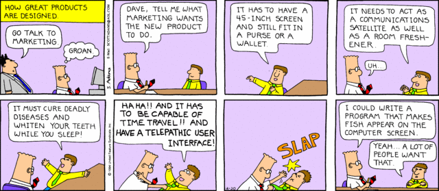
Stressed, tired and distracted. These are just a few states your users can be in at the exact moment they visit your website. Unless you have a site which people purposely visit to read or observe some sort of information that is important to them, you probably know that most visits are shorter than the time it takes to read a Dilbert comic strip.
With that in mind, it becomes extremely important that your homepage and landing pages focus on engaging visitors as quickly as possible by providing concise and effective messaging without too much detail.
One way of doing it is by keeping sentences as short as possible. Avoid very long sentences that you think might be doing a better job at explaining what you are trying to say but are actually making your visitors confused and are forcing them to re-read the whole thing. Yes, just like that sentence.
Remove anything that isn't providing value. Read the copy on your page out loud and ask yourself: Is this actually helping in any way? You'd be surprised to see how much you can easily remove without affecting the page.
Even after you've stripped down your page to just the bare minimum, users still won't even read half of what you want them to. One of the reasons is that your users are busy individuals, and by scanning the page they can decide whether your website is what they were looking for or not. That is why videos on home pages became so popular. They are concise and informative enough without requiring too much effort from the users part.
Always make sure the only information you are showing is the information your visitor needs. Hide all unnecessary information in other secondary pages and make sure you have clear calls-to-action so your users know what to do next.
Leave your feedback below and don't forget to subscribe to the blog.
Related articles

UX design and analysis
Design a homepage that delights your users in 9 easy steps (with tips and examples)
While product, UX, and marketing teams help shape a website or app’s homepage, a more powerful group holds the reins: the users. Their needs and preferences are key deciding factors in locking in an effective homepage design.

Shadz Loresco
UX design and analysis
The anatomy of a stellar website: the dos and don’ts of design
Over the past five years, buyers have largely shifted their shopping habits to be primarily online. For brands wishing to remain competitive in the digital marketplace, this means an accessible and attention-grabbing website has become more important than ever before.
Consumers agree: respondents to Hotjar’s Coming in Hot report told us that they have higher expectations for brands’ websites than they did five years ago.

Hotjar team

UX design and analysis
Coming in hot: the power of first impressions
Consumers have more than their fair share of vendors to choose from when shopping online. When attention is split between different brands and devices, ensuring your online presence stands out from the crowd hinges on first impressions.
But catering to the ever-changing habits and preferences of digital buyers is no small feat. That’s why Hotjar surveyed hundreds of US-based consumers—to reveal the insights you need to guarantee your website exceeds user expectations.
Hotjar team