Learn / Blog / Article
How to create landing page tests that increase conversions
If you’re running an online marketing campaign, you probably want the same thing everybody else does: better performance.
In my experience as Director of Content at Klientboost, I’ve found that one of the most useful tools in the campaign-performance-improvement toolbox is landing page split-tests, where you design two different versions of the same page and test them against one another to see which one performs best.
The KB team has created and tested over 1000 pages at a rate of 250-300 tests/quarter—in this article, I will share a few ideas about how you and your team can also identify new ideas to test on your landing pages.
In this article, I’ll cover what tests have worked for our clients and how we sourced the ideas to test on their landing pages. After all, knowing how to run a good split test doesn’t do you any good if you have no idea what you’re testing—and why.

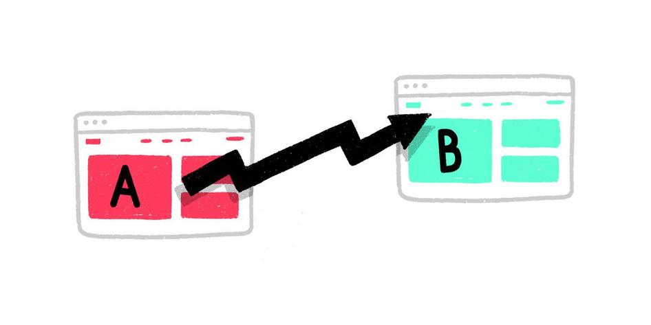
Table of contents
Example #1: Using feedback to inform landing page copy tests
Example #2: Identifying new pain points with landing page surveys
What are landing page tests?
In a nutshell, landing page tests (or split tests) are tests that you run on a landing page, where you ‘split’ inbound visitors between the original page and a variation to which you’ve applied specific changes. If more visitors convert on the changed version, you can implement it for all visitors and start the process over again.
How to form landing page test hypotheses
The best test ideas aren’t picked randomly from a hat. We Conversion Rate Optimization (CRO) practitioners use observable data as the foundation for our tests, focusing on wins that will move the needle quickly and effectively. If you’re in the business of split testing landing pages, you probably already know that:
Data-driven CRO and split tests usually start with a metric-based observation, which can include information like the average visitors’ time on your page, bounce rate, # of partial form completions, etc.
Advanced techniques and CRO tools go more in-depth by integrating on-site tracking: this is where you can use heatmaps, scroll depth information, and recorded visitor sessions as the basis for your hypotheses. You can use this data to refine your user experience, tweak button placements, adjust headline copy, and make plenty of other changes to improve your conversion rate.
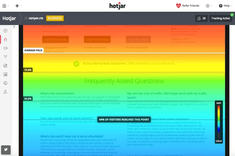
ALSO, HEATMAPS ARE PRETTIER TO LOOK AT THAN SPREADSHEETS
However—and this is key—in my experience, the best data isn’t always found in on-page numbers and statistics.
If you limit yourself to the data points I discussed above, all of the resulting test ‘ideas’ are still based on inferences you make from the data you collect. This means you have to make a logical leap from your raw numbers (“my bounce rate is too high”) to the reason for the problem (“my CTA button is too small,” or “my headline isn’t convincing”).
In other words, even though you’re using data, you’re still guessing (even if it’s an educated guess) what’s at the root of your conversion issues.
Our CRO team usually turns to customer feedback to see what else can be learned—and this is where we often end up seeing the most direct and actionable insights for us to implement on our pages.
Example #1: using feedback to inform landing page copy tests
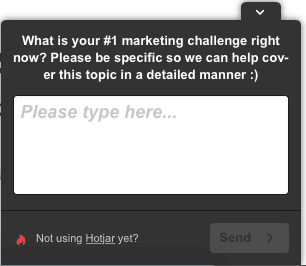
For starters, adding an on-page survey to your landing page can inform your on-page copy by identifying what information users find relevant. We use Hotjar (which we install on every landing page) to gather feedback from visitors about their on-site experience, so we can find gaps as well as new opportunities in the conversion process.
We find that when we’re stumped and have low conversion rates, it’s best to start asking visitors questions… about questions.
Step 1: collect visitor questions with on-page surveys
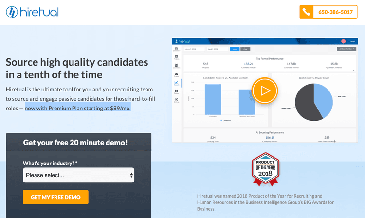
In this first example, we’ll take a look at one of our hiring consultant clients: Hiretual.
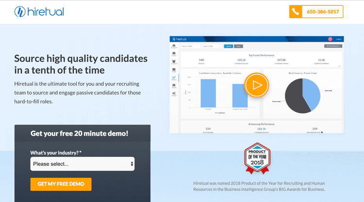
After creating some new streamlined and custom landing pages for them, we still weren’t seeing the increased conversion rates we expected. And adding additional value statements about Hiretual’s ability to help with hiring didn’t help either.
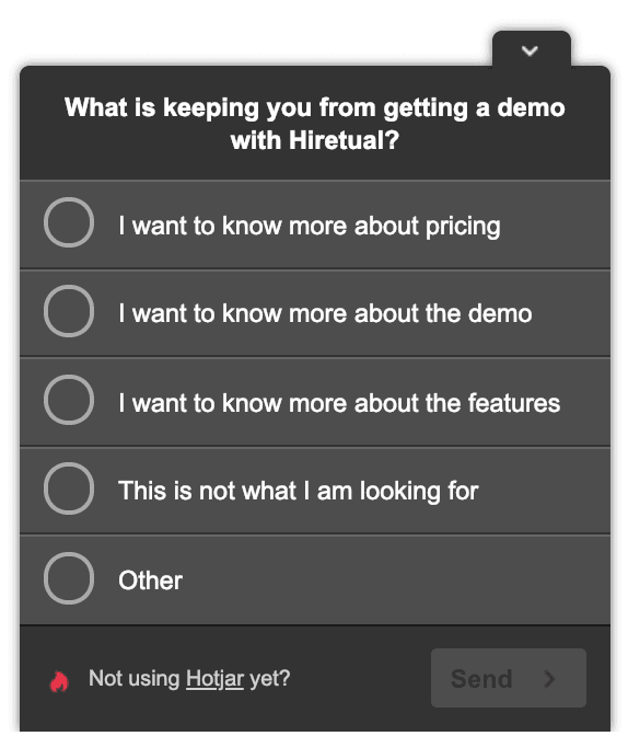
So, we added a survey to their landing page to ask users what was keeping them from downloading the free demo:
PRO TIP: MAKE YOUR SURVEYS AS EFFORTLESS AS POSSIBLE IN THIS EXAMPLE, USERS ONLY NEED TO CLICK TWICE TO COMPLETE THE FORM
After a few weeks, survey respondents provided these results:
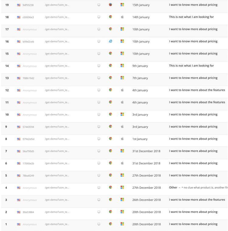
TO THE TWO USERS WHO CHOSE “THIS IS NOT WHAT I’M LOOKING FOR” BUT FILLED OUT THE SURVEY ANYWAY — THANKS. WE SEE YOU
These results might be less scientific than black-and-white metrics like conversion rate, but they provide more relevant insights. It’s the classic debate between ‘quantitative versus qualitative data’: you can use the information visitors provide to identify obstacles in your conversion path and test improvements.
Step 2: decide how to address customer feedback
In the example above, we discovered that the most common obstacle to downloading the free Hiretual demo was a lack of pricing info on the landing page.
When customers ask the same questions on a regular basis, you can create a space on your landing page to address these questions honestly, plainly, and prominently. This information often appears in the form of a Frequently Asked Questions (FAQ) section or page, which you can link in your landing page’s navigation or within the on-page copy.
Or, better yet, you can do what we did, and use your FAQs to inform your landing page copy. This way, the useful information that your most interested users are looking for will be readily available as early on in the landing page experience as possible.
Step 3: split-test landing page copy
Let’s get back to our initial example.
Now that we have a specific variable to change (“Adding pricing information to landing page copy”) and a metric to track (free demo downloads), we can form a hypothesis to test:
“If we add pricing information to the landing page copy, more visitors will download a free demo.”
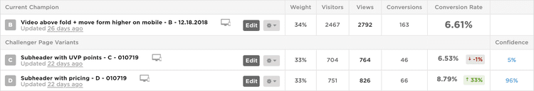
Now the action happens. We tested variations of the landing page with and without the pricing information to see if users responded more effectively to the change.
HIRETUAL’S ORIGINAL LANDING PAGE (NO PRICING INFORMATION)
HIRETUAL’S LANDING PAGE VARIANT (WITH PRICING INFORMATION HIGHLIGHTED)
It may seem like a small change, but prioritizing changes that move the needle quickly is how a successful CRO mastermind works.
GIVE YOUR TESTS A REASONABLE AMOUNT OF TIME TO RUN SO YOU CAN BE CONFIDENT IN YOUR RESULTS
In this case, the change brought a 33% increase in conversions — nice!
Example #2: identifying new pain points with landing page surveys
On-page surveys are also a great way to identify problems with your landing page or offer that you weren’t aware of.
While most users will tell you they didn’t convert because of a pricing issue (most conversion pain points relate back to price), you’ll still get valuable information that you can use to make adjustments and run tests.
Ask bouncing users why they are leaving your site
Let’s get real for a second.
The unfortunate fact is that the majority of the people who visit your landing page (or ours) aren’t going to convert. In fact, average conversion rates for Google Ad campaigns across all major industries fall below 10 percent.
So, if we can agree that nine out of ten people on every landing page will leave without converting, wouldn’t it be a good idea to ask them why?
As it turns out, you can ask. By asking for feedback in an exit popup, you can give visitors a platform to explain why they’re taking their business elsewhere. This opportunity to comment directly on your offer is another avenue for learning about your landing page visitors and what makes them commit:
In the example below, we used this poll on Briogeo’s landing page—a client of ours who sells high end, natural ingredient hair products—and asked visitors who were scrolling up to the “close tab” button what stopped them from making a purchase:
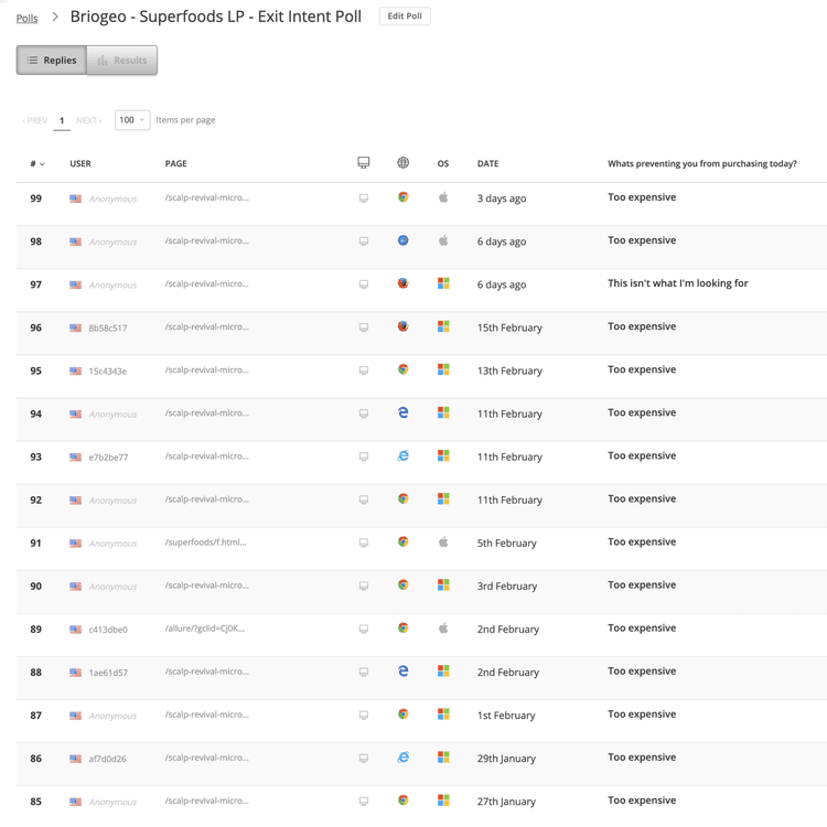
IN THIS CASE, IT MIGHT HAVE SOMETHING TO DO WITH THE PRICE
Exit survey data won’t always reveal a quick fix, but sometimes an adjustment to the way you present your offer can have a notable impact. And unlike numbers like bounce rate or time on page, an exii survey gives your audience the chance to tell you why they said no.
This, in turn, can even help show you changes you may have to consider in terms of your actual offer, as opposed to just landing page design/copy.
Adjusting offers to solve pain points
Once you have an understanding of your users’ pain points, you can test an offer adjustment to improve your conversion metrics.
To continue the example above, we added special sections at the top of Briogeo’s page and over the product image to call out a free shipping discount:
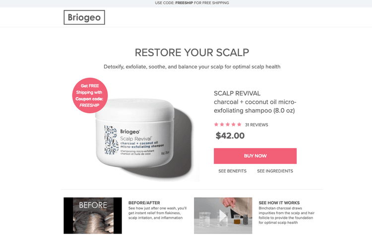
I’D NEVER HEARD OF ‘OPTIMAL SCALP HEALTH’ BEFORE, BUT NOW I CAN’T LIVE WITHOUT IT…
Free shipping is just one example. You can use the same techniques to offer referral discounts, limited-time or low-stock deals, and much more. But the key is always the same—make your updated offer obvious, especially during your test, to see if it’s effective.
Adjusting landing page and ad copy for CRO
Your survey questions should be tailored to help you find out what’s hurting your conversion chances the most. Once you know how your audience is prioritizing their needs—which can include price, convenience, time, etc.—you can address their concerns in your ad and landing page copy.
To wrap up our Briogeo example, we tested copy that highlighted discounts and free shipping on their landing page and in their ads to increase the click-through rate and traffic to the new offer.
Like all CRO tests, we waited until we had enough information to make a confident judgment.

GIVEN THAT THESE CHANGES CAN SIGNIFICANTLY IMPACT ROI, CONFIDENCE IS VERY IMPORTANT
This test saw a 48% increase in conversions… but the overall conversion rate is still around 5%, so we’ll keep looking for improvement opportunities. Not bad, though— especially if you look at it as the first iteration of an ongoing campaign to improve your… campaign.
The one-two combo of well-placed on-page surveys
On-page surveys on your landing pages offer two benefits that you shouldn’t ignore:
Your landing page tests will have a stronger foundation because your hypotheses are coming straight from the comments of your active user base.
The request for customer feedback might help your users stay engaged and feel appreciated.
Finally, one last tip: just because you’re excited about user feedback in your surveys doesn’t mean you can ignore other forms of customer feedback. You can learn from them all—and you should.
Data = inferential, customer feedback = tangible
If your hypothesis is based on tracking data, you’ll have to infer a “best guess” no matter how accurate and intuitive your landing page tracking data is. But if you crowdsource your hypotheses, you’re likelier to get insights that will lead to more impactful tests right away.
Keep in mind that it may take some time for you to find the real money-making questions to ask. You may only have to ask one question to get all the information you need directly from your users themselves...but only if it’s the right question.
In the end, just try not to take every comment or response too seriously…
OUCH...
Related articles

UX design and analysis
Design a homepage that delights your users in 9 easy steps (with tips and examples)
While product, UX, and marketing teams help shape a website or app’s homepage, a more powerful group holds the reins: the users. Their needs and preferences are key deciding factors in locking in an effective homepage design.

Shadz Loresco

UX design and analysis
The anatomy of a stellar website: the dos and don’ts of design
Over the past five years, buyers have largely shifted their shopping habits to be primarily online. For brands wishing to remain competitive in the digital marketplace, this means an accessible and attention-grabbing website has become more important than ever before.
Consumers agree: respondents to Hotjar’s Coming in Hot report told us that they have higher expectations for brands’ websites than they did five years ago.

Hotjar team

UX design and analysis
Coming in hot: the power of first impressions
Consumers have more than their fair share of vendors to choose from when shopping online. When attention is split between different brands and devices, ensuring your online presence stands out from the crowd hinges on first impressions.
But catering to the ever-changing habits and preferences of digital buyers is no small feat. That’s why Hotjar surveyed hundreds of US-based consumers—to reveal the insights you need to guarantee your website exceeds user expectations.
Hotjar team