Learn / Blog / Article
We analyzed the homepages of 20 awesome startups and here is what we learnt
Your startup's homepage or landing page may be the one most important page of your site. Think of it as an empty canvas which you, as a business owner or web designer, can use to engage your first-time visitors. Primarily, your homepage's job is to explain what your product or service is all about. But of course, it needs to do much more. It needs to provide your visitors with re-assurance that you are trustworthy, reliable and real. It needs to tell your visitor where to go next. It needs to provide enough information to keep your visitors from pressing the back button. And it needs to do all this in as little time as possible.
Unfortunately, there's no magic formula to building the perfect homepage. There are, however, a number of elements that most startups seem to use repeatedly on their homepages to convert first time visitors into customers. To help me get closer to understanding what makes a homepage work, I decided to analyse the homepages of the top startups. The aim of the research was to establish a set of ideas which can be tested on any homepage.


The first step: finding 20 SaaS startups
I wanted to analyse a combination of old and newer SaaS startups to determine what elements their homepages included and whether there was any pattern that could provide some insight into what makes the "perfect" homepage. So I started off by checking multiple "top startups" and "most successful startups" lists and built the following list:
ZenDesk
Basecamp
Boostable
Intercom
Optimizely
Contently
NextBigSound
CampaignMonitor
KISSmetrics
BrowserStack
Trello
NewRelic
MixPanel
Wistia
Recurly
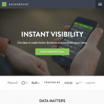
Geckoboard
Sqwiggle
Hootsuite
UserVoice
Pingdom
Next step: analysing each homepage
The next step was of course to look at each and every homepage and find out which elements each homepage used. This meant going through each of them and listing down the various sections in the page. Here are my findings:
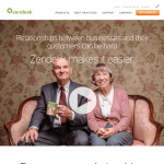
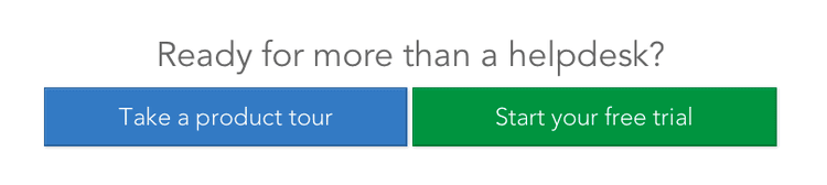
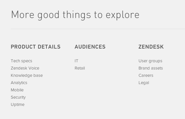
ZenDesk
Customer service software and support ticket software by Zendesk.
Homepage elements: Fixed Header, Slogan + CTA + Screenshot, Features List, Clients List, CTA and Footer
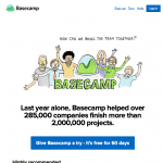
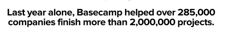
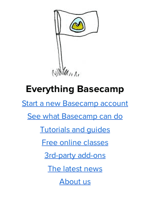
Basecamp
Basecamp is everyone's favorite project management app.
Homepage elements: Header, Slogan (using social proof) + CTA, Features / Social Proof, Screenshots, FAQ, even more Social Proof, Links to further information and Footer
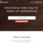
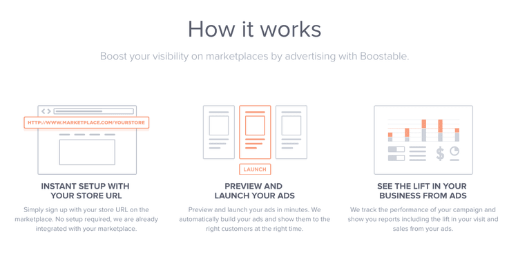
Boostable
Boost your visibility on marketplaces by advertising with Boostable.
Homepage elements: Slogan + Email Field + CTA, How It Works, Request Demo, Team and Investor Info, Career Info and Footer
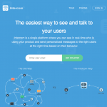
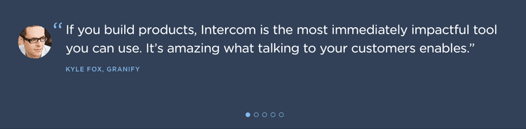
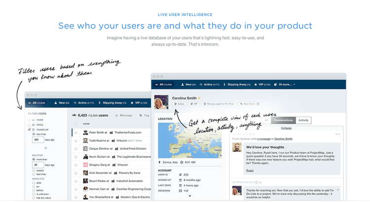
Intercom
User Intelligence and Customer Communication.
Homepage elements: Fixed Header, Slogan + Email Field + CTA, Feature Comparison, Clients List, Features + Screenshots, Testimonials and Footer
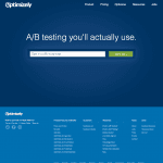
Optimizely
A/B testing software you'll actually use.
Homepage elements: Header, Slogan + Email Field + CTA and Footer
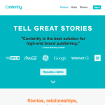
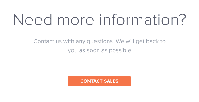
Contently
Contently empowers journalists and brands to engage audiences with compelling content.
Homepage elements: Header, Slogan + Client List + CTA, How It Works, Clients List, Social Proof and Footer
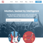
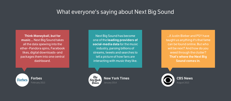
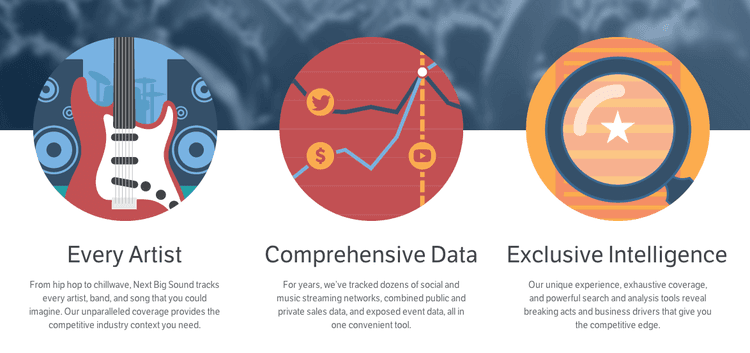
NextBigSound
Analytics and Insights for the Music Industry.
Homepage elements: Header, Slogan + Search, Top Features, Report, Case Studies, Testimonials and Footer
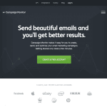
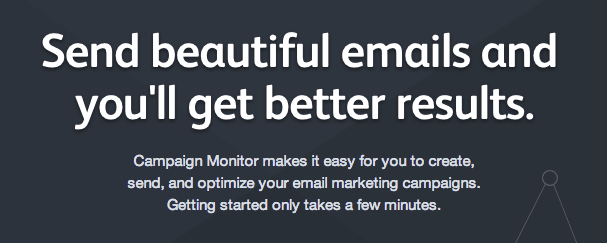
CampaignMonitor
Send beautiful email newsletters with Campaign Monitor.
Homepage elements: Fixed Header, Slogan + CTA, Clients List, Features and Footer
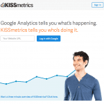
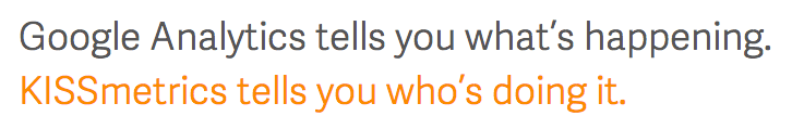
KISSmetrics
Customer Intelligence & Web Analytics.
Homepage elements: Slogan + Website Field + CTA and Footer
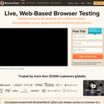
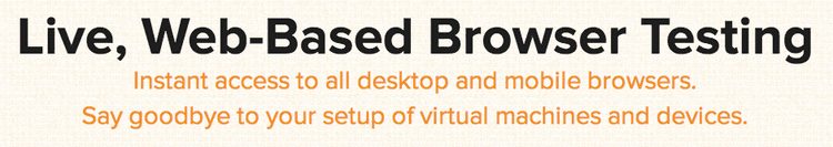
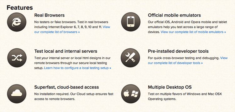
BrowserStack
Test your website for cross browser compatibility on real browsers.
Homepage elements: Header, Slogan + Video + Sign-up Form, Clients List, Testimonials, Features and Footer
UserVoice
Feedback & Online Help Desk Software.
Homepage elements: Fixed Header, Slogan + CTA, Features + Screenshots, Case Studies, Video, Client List and Footer

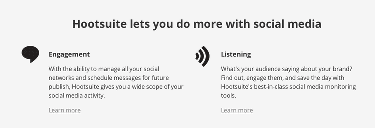
Hootsuite
Social Media Management Dashboard.
Homepage elements: Fixed Header, Slogan + CTA, Plans, Features, Target Market and Footer
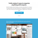
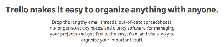
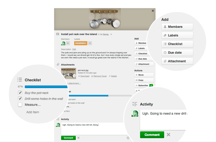
Trello
Trello keeps track of everything, from the big picture to the minute details.
Homepage elements: Slogan + CTA, Features + Screenshots, Clients List, CTA and Footer
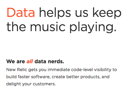
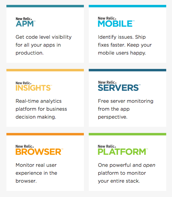
NewRelic
Application Performance Management & Monitoring.
Homepage elements: Header, Slogan + CTA, Clients List, Testimonials, Features + Video and Footer
MixPanel
The most advanced analytics platform ever for mobile and the web.
Homepage elements: Header, Slogan + CTA, Clients List, Case Studies, Testimonials and Footer
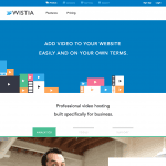
Wistia
Wistia provides professional video hosting.
Homepage elements: Header, Slogan, Features + Video, Testimonials and Footer
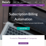
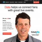
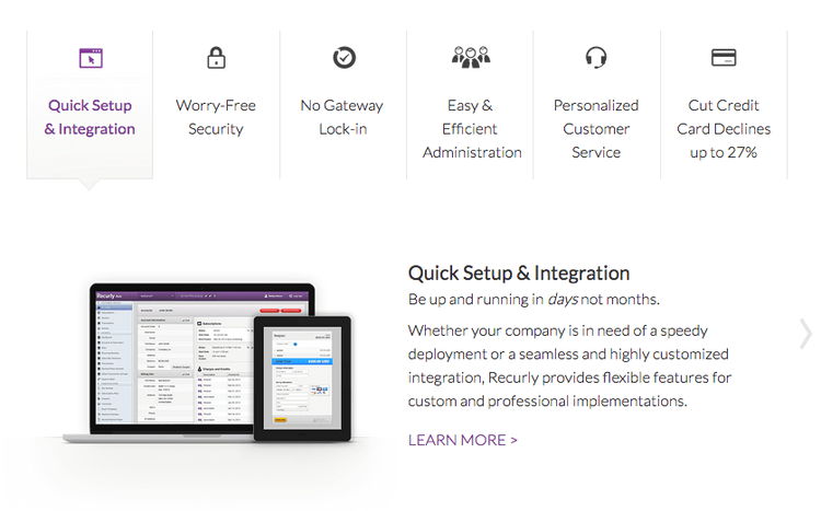
Recurly
Subscription Billing and Recurring Billing Experts.
Homepage elements: Header, Slogan + CTA, Clients List, Benefits + Testimonials, Features and Footer
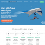
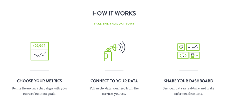
Geckoboard
Data Dashboards for Businesses.
Homepage elements: Header, Slogan + CTA + Background Video, Clients List, Benefits, How it Works, Testimonials and Footer
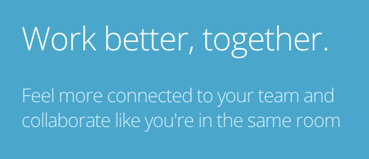
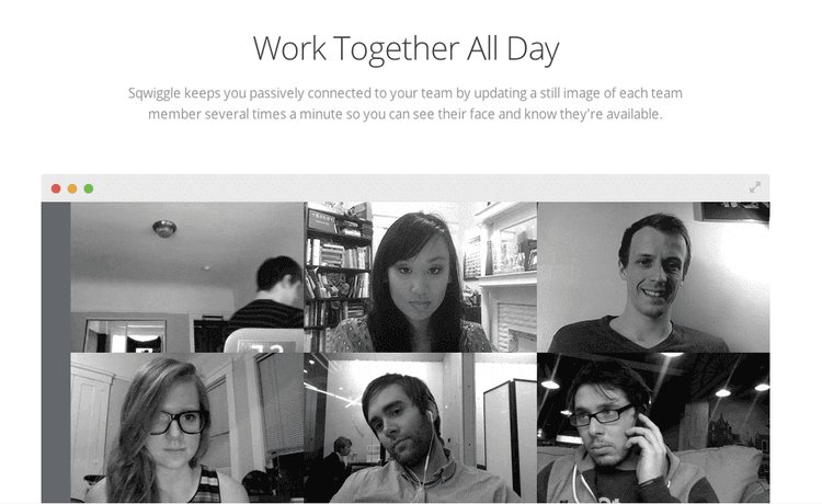
Sqwiggle
Online Collaboration Software for Remote and Virtual Teams.
Homepage elements: Header, Slogan + CTA + Screenshot, Problems, Testimonials, Benefits, Testimonials, Sign-up Form and Footer

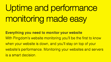
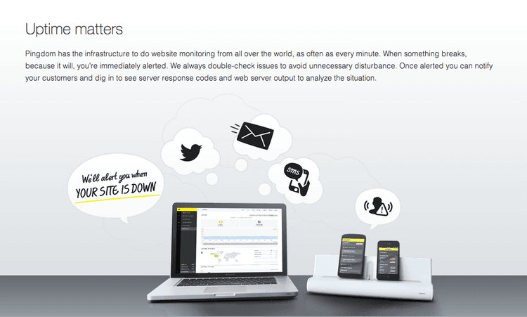
Pingdom
Uptime and performance monitoring made easy.
Homepage elements: Fixed Header, Slogan + CTA + Screenshot, Clients List, Testimonials, Benefits, Social Proof, Features, Plans and Pricing, Featured List and Footer
Next Step: analysing each element used
With all the data collected and compiled, I decided to examine how often particular elements were used. Here are some interesting stats about the 20 startups which were analysed:
100% include a slogan
75% include a description beneath their slogan
95% include a CTA above the fold
20% include a CTA with one field (email or website) just before it
50% include the word "Free" in their CTA
10% include a full sign-up form
5% include information about pricing
20% list the benefits of using their product
65% list the features of their product
Multimedia
20% include a video
35% include screenshots
Headers and footers
85% include a header
30% include a fixed header which sticks to the top of the screen as you scroll down
100% include a footer
Social proof
80% include a form of social proof (Clients List, Testimonial or Case Study)
60% include a clients list
50% include testimonials
15% include case studies
So what do the numbers tell us?
It is important to understand that since I did not have the actual conversion rates of each homepage, it was not possible to use this data to determine which elements worked better than others (statistically). However, since the goal of this analysis was to build a list of ideas worth testing, the data collected was more than enough to work with.
If you're thinking of updating your homepage, then this is part you will be most interested in. Below is a comprehensive list of ideas you can test out.
1. Your slogan: your chance to stand out
Your homepage needs a slogan. Think of it as a way to tell your visitors what your site is all about in under 5 seconds. It needs to be short and powerful. It needs to highlight the benefit of your service in one simple line.
All startups analysed included a slogan - 75% of them also included a description just beneath the slogan. Try to keep the phrases as short as possible and read them out loud repeatedly. Imagine you have 5 seconds to explain your product or service to a friend... what would you say?
Testing ideas:
Test new homepage slogans
Add or change the description beneath the slogan.
Here are a few examples from the startups analysed:


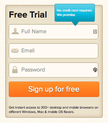
2. Your CTA: engage your visitors above the fold
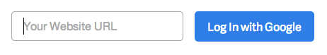
Almost all startups (95%) included a CTA (call-to-action) above the fold. The text in your CTA can have a massive effect on the amount of visitors clicking it so it is definitely worth testing. Half of the startups analysed use the word "Free" in their CTAs, even though they all have paid plans available.
The research also revealed that a number of startups (20%) use an email or website field just before the CTA. This is generally used to make your visitor feel like they've already invested some effort and made a commitment into signing-up once they get to the actual sign-up page.
Testing ideas:
Test new phrases in the CTA - try the word "Free".
Make your CTA clearer by testing new colours and formats.
Add one text field just before your CTA to make your visitors build commitment.
If your sign-up form is short, test adding it to your homepage.
Here are a few examples from the startups analysed:


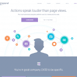
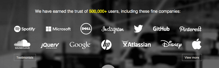
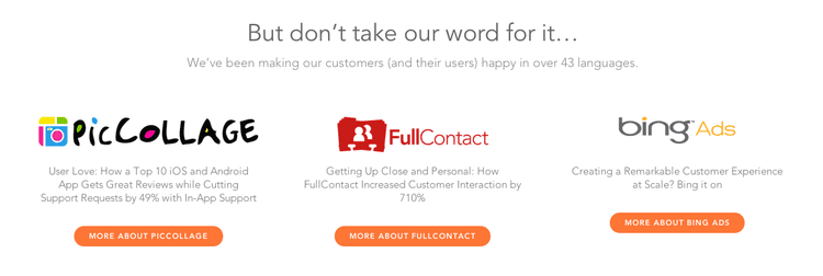
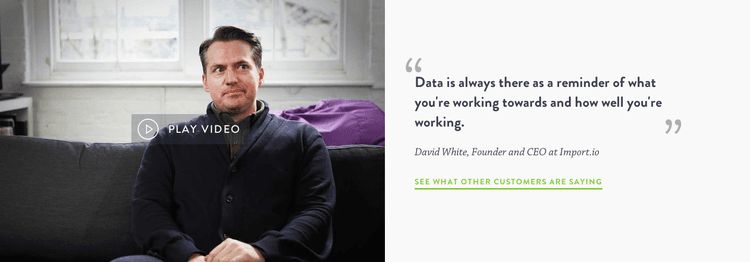
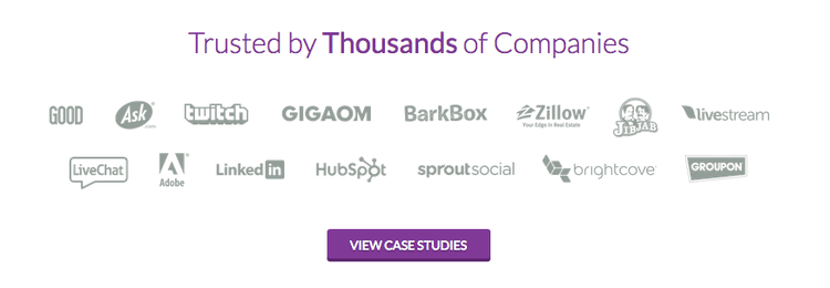
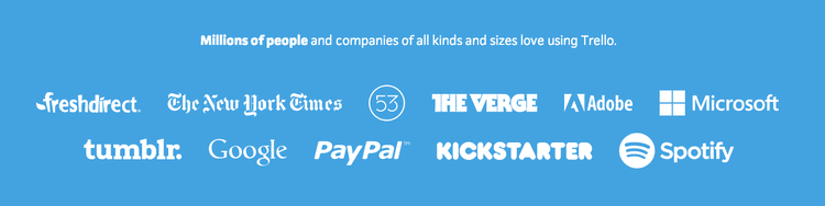
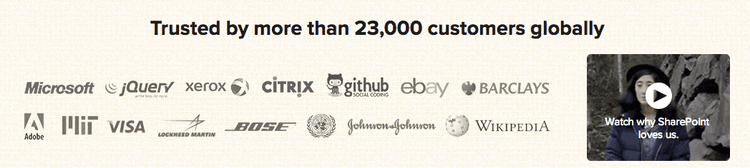
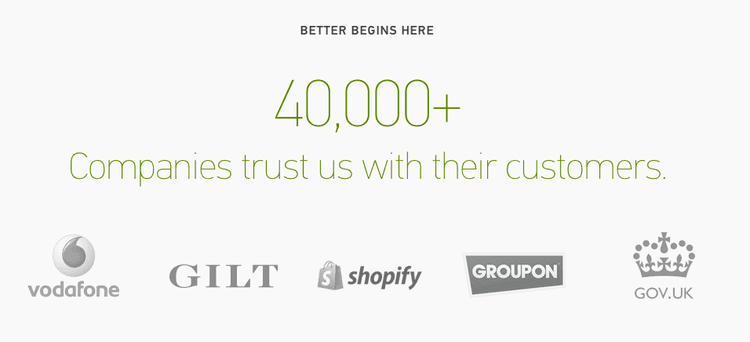
3. Social proof: build trust and engagement
It was not surprising to find out that some form of social proof was used in the majority (80%) of homepages. Social Proof works because visitors need to feel re-assured that your service/product is real and that others are using it.
Three primary forms of social proof were used:
Client lists or numbers (saying how many clients use your service) (60%)
Testimonials (50%)
Case Studies (15%)
Even if your startup is brand new, it is not too hard to get a testimonial from a friend who's used your product. And as time passes, you can replace your less popular clients, testimonials and case studies with more impressive listings.
Testing ideas:
Add a clients list - even having a few relatively unknown companies can help.
Use a service like Userstats to quickly add social proof to your site.
Ask your customers for testimonials.
If you know a customer is really happy with your service/product, try to build a case study around them.
Here are a few examples from the startups analysed:


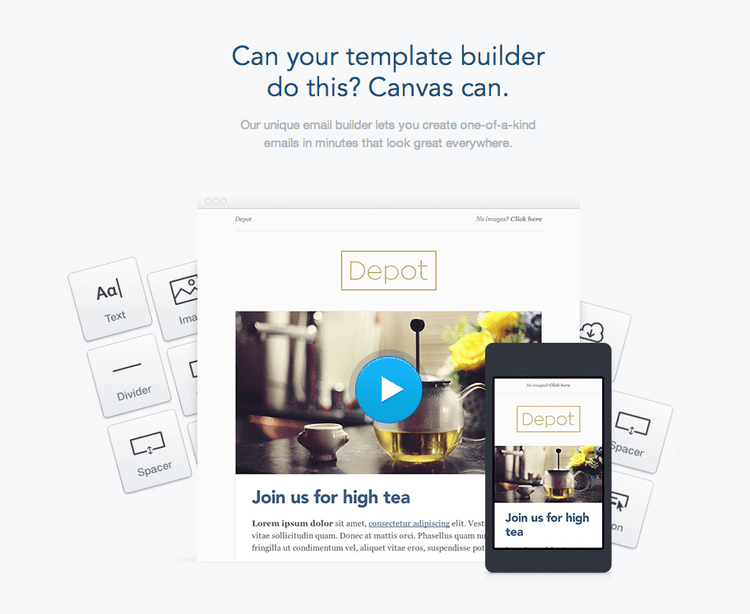
4. Features: explaining how your product works
Whilst 60% of the startups listed their features, 20% of them had sections specifically dedicated to mentioning the benefits of using their product. Unless your product is already so popular that the majority of visitors already know exactly how it works, you will need to have a section on your homepage that explains what your product does.
There are many different ways of explaining your product - you could use screenshots or videos. Alternatively, you could just have a simple text list which explains how each section of your product works. One of the startups analysed listed a testimonial under each feature - this can be a very powerful way of describing the benefits of the features through the words of your customers.
Testing ideas:
Add screenshots to visually explain what your product does.
If you have the budget, create a short video outlining the benefits of your product.
Try get testimonials for each feature to explain the benefits in your customers' words.
Make your features more benefit-oriented. Just answer: How is this feature helping our customers?
Here are a few examples from the startups analysed:

5. More info: for visitors who need more information
You will definitely find that a number of visitors aren't satisfied with the information on your homepage alone. These users will want to find out as much as possible about your product before even thinking about using it. Because of this, you will need to make sure your visitors can easily go to other parts of your site from your homepage.
A few of the startups analysed do this by including a secondary CTA which links to a product tour, adding an FAQ or by including useful links in their footer. Make sure your visitors have somewhere to go next if they do not want to sign-up just yet.
Testing ideas:
Add a second CTA which links to your product tour.
Add an FAQ area to your homepage answering a few of the biggest concerns.
Include links to either your blog or your knowledge base in your footer.
Here are a few examples from the startups analysed:


The final homepage testing ideas list
Thanks to the analysis, I was able to build a list of 17 ideas which could be tested on any homepage. It is important to keep in mind that what works for one site will not necessarily work for yours. Proper split (or multivariate) testing is needed to actually confirm whether a specific element has any effect on your conversions. And remember: Sometimes removing extra elements from your homepage can be exactly what it needs. Here is the final list:
Test new homepage slogans.
Add or change the description beneath the slogan.
Test new phrases in the CTA – try the word “Free”.
Make your CTA clearer by testing new colours and formats.
Add one text field just before your CTA to make your visitors build commitment.
If your sign-up form is short, test adding it to your homepage.
Add a clients list – even having a few relatively unknown companies can help.
Use a service like Userstats.com to quickly add social proof to your site.
Ask your customers for testimonials.
If you know a customer is really happy with your service/product, try to build a case study around them.
Add screenshots to visually explain what your product does.
If you have the budget, create a short video outlining the benefits of your product.
Try get testimonials for each feature to explain the benefits in your customers' words.
Make your features more benefit-oriented. Just answer: How is this feature helping our customers?
Add a second CTA which links to your product tour.
Add an FAQ area to your homepage answering a few of the biggest concerns.
Include links to either your blog or your knowledge base in your footer.
The list above should give you a few ideas on what to test next in your quest to get even more customers to sign-up for your product or service. Before doing so, however, I recommend analysing your own homepage using:
Heatmaps: to find the most important parts of your page.
User Testing and Session Recordings to see if visitors are getting stuck.
Surveys: to find out what your visitors think of your page.
Form analysis: to determine whether your forms need improving.
Your visitors can provide you with the only feedback you will ever need - so make sure you're ready to listen.
If you're interested in a tool that includes Heatmaps, Visitor playback, Proactive Chat, Feedback & Exit polls, Online surveys, Recruit User Testers and Funnel / Form analysis in one simple to use and incredibly affordable app, I would recommend signing-up for Hotjar - www.hotjar.com).
Do you have any experiences with homepage testing? Do you agree or disagree with any of the ideas above? I'd love to hear about it - just comment below.
Related articles

CRO
7 stats that prove user-centric websites win for mid-market companies in 2024 (with tips on how to improve UX)
Is your website user experience holding you back? Don’t rely on guesswork and gut feeling alone: use data to elevate your UX and enhance your bottom line.

Shadz Loresco
CRO
7 stats that prove user-centric websites win in 2024 (with tips on how to improve UX)
Is your website user experience holding you back? Don’t rely on guesswork and gut feeling alone: use data to elevate your UX and enhance your bottom line.
Shadz Loresco

CRO
How to improve your online reputation to acquire more users and customers
A good online reputation inspires your users to share positive reviews that make your business more trustworthy in the eyes of potential customers, and, in turn, increases sales.
But it takes more than a good product to build and maintain an effective online presence. You have to actively listen to customers to understand how they feel and make changes to improve the user experience (UX).

Hotjar team