Learn / Case Studies / Every.org
How Every.org increased donations to charities by 29.5%
Every.org is a donation platform on a mission to make it easy for people to donate and for nonprofits to collect their donations. Dave Sharp, Every.org’s Senior Product Designer, noticed donors were getting stuck when trying to make donations. As a result, they gave up.
Here’s how Dave spotted the issue, fixed it, and increased donations by 29.5%.


Everything looked great on the surface
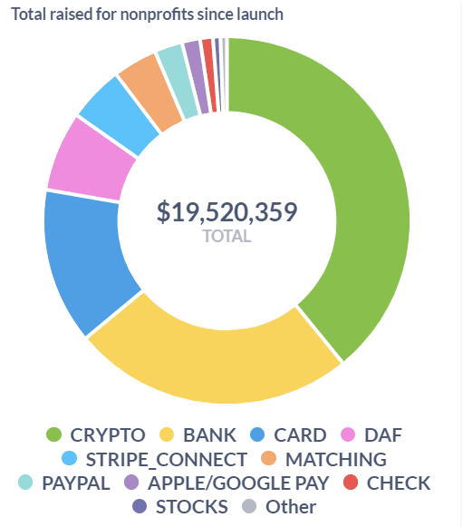
Every.org was founded as a central hub where people can donate to any 501(c)(3) nonprofit through a range of means like cash, crypto, and stocks. Since Every.org’s launch in March 2020, they’ve raised an impressive $19M for charities worldwide.
On the surface, Every.org’s numbers look great. But numbers don’t always paint the whole picture, and they can’t always tell you where users are getting frustrated or why they’re leaving without converting. Dave knows this, which is why he turns to Hotjar to fill in any gaps in his knowledge.
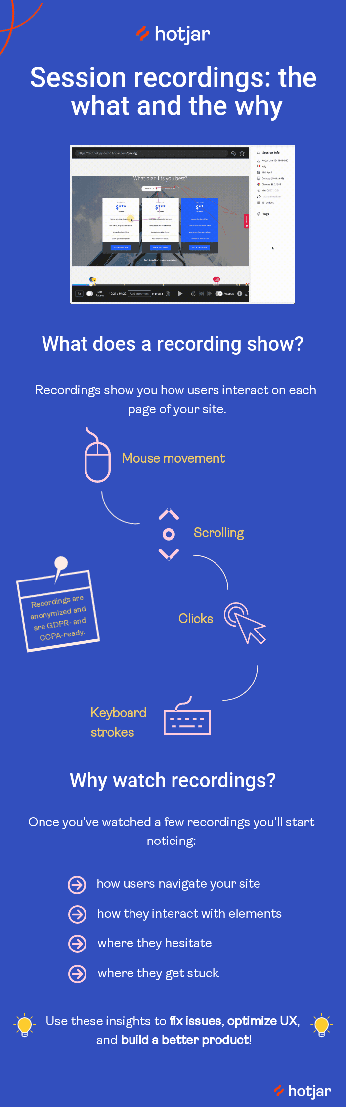
Dave tells us he loves watching Hotjar’s Recordings, especially in combination with the user interviews he conducts, because recordings tend to give unbiased data:
“There's always that performative element during user interviews where the user is eager to please the person asking questions. But recordings save a lot of time and give me better data—from seeing them on the site, clicking through, trying to do something, getting confused, and all of that.”
Even though Every.org amasses millions of dollars in donations, Dave still looks for ways to fine-tune the user experience. Every week, he sits down to watch potential donors fill out the donation form to ensure no friction or bugs prevent people from giving to the most meaningful causes.
Dave finds relevant recordings—and saves time—by filtering recordings by their URL and sorting them by relevance.
Recordings were “painful” to watch but revealed key insights
While watching recordings one day, Dave noticed how frustrated users became when trying to make a donation.
“It was painful for me to watch. I could see people getting confused, getting frustrated, and rage clicking.”
Dave’s instinct told him a form redesign could reduce rage clicks, but he knew he couldn’t rely on gut instinct alone—he needed to build his hypothesis on real user behavior. He dug further into the recordings to try and spot what was making users angry.
Hypothesizing a new donation flow
As Dave reviewed recordings with rage clicks, he saw the problem clear as day.
Regulatory laws require users to add a card before they can proceed with their donation. As a result, Every.org’s donation form had conflicting CTAs. Users who hadn’t added a card were rage clicking on the Donate button, and were confused why their clicking wasn’t doing anything.
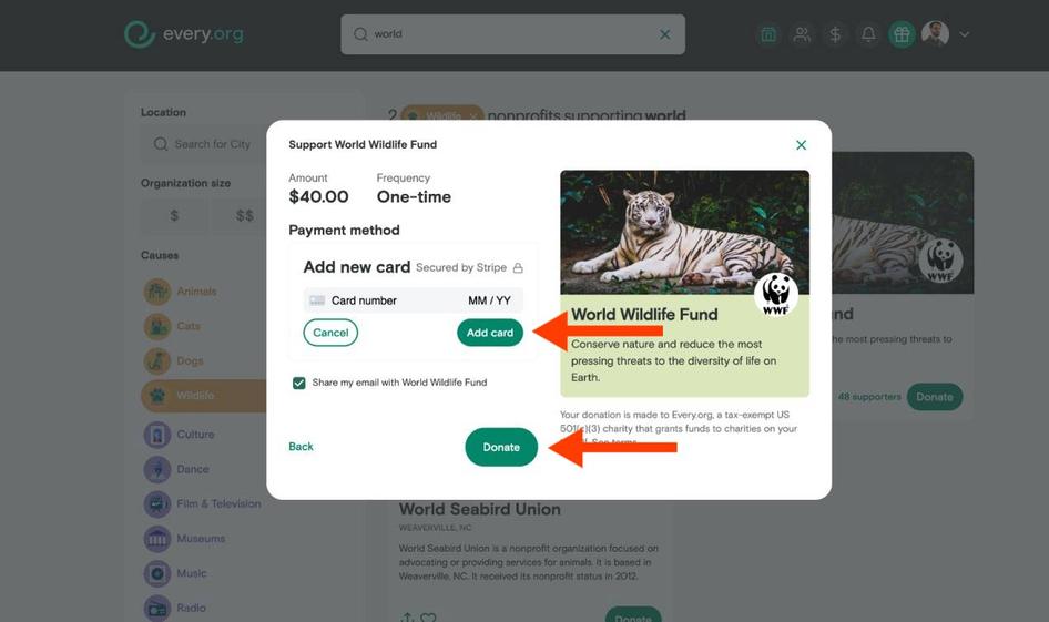
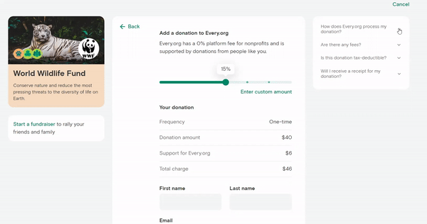
In Every.org’s original form, users were shown two buttons on the same page: Add card and Donate.
Dave hypothesized that these extra—but necessary—buttons confused users, who were used to making purchases with one swift click, like they do when online shopping.
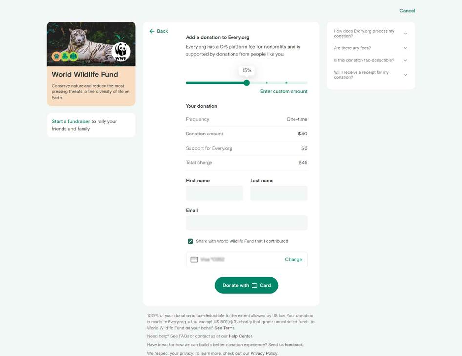
Seeing the rage clicks inspired Dave to propose a more user-friendly donation flow. Here’s how the new flow worked:
First, users go to a page to add their credit card.
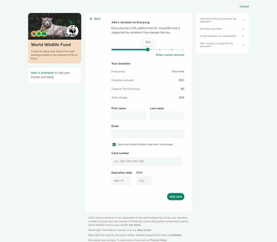
After adding a card, they go to a new page which allows them to make their donation.
Adding extra pages into the donation flow might seem counterintuitive. After all, traditional advice states to limit the number of steps in a checkout flow. But in this case, Dave knew from reviewing the recordings that adding extra steps would actually make users happier.
Giving additional context to users
Because Every.org is an intermediary between donors and charities, Dave suspected users may have been hesitant to donate through their platform.
He hypothesized that adding questions and answers to the donation flow might put potential donors at ease. Questions like:
What is Every.org?
Do you charge fees?
How do you process my donation?
“My thinking with the FAQs was if we can provide users with some of that information about who we are and what we’re doing, it'll build trust and familiarity and comfort, so they're more likely to make the donation.”
To keep the questions from cluttering up the sidebar—and overwhelming users—Dave and his team turned the FAQs into an accordion that revealed detailed answers to popular questions.
A 29.5% increase in conversions
The A/B test between the two donation flows came at the perfect time. Every.org had just partnered with actor Kristen Bell. The partnership sent a considerable amount of traffic to test the new and old flows.
During the A/B test, Dave made use of Hotjar’s integration with Slack and set up an alert to notify him and his team of any new Recordings of users going through the new donation flow.
“The Slack integration was really helpful in bug spotting and bashing. We got together as a company in the days before the launch and did as much as we could, but users will always do something that you couldn't think of.”
It’s also impossible to fix something if you don’t know it’s broken. And as Dave notes, oftentimes users won’t notify you about bugs on your site—they’ll just leave:
“Occasionally, I would watch people go through the donation flow, and something really goofy would come up—something wouldn't load, a button would break, or something like that. Recordings were helpful to spot that because those users didn't contact us—they just didn't complete the donation.”
But lucky for Dave, he has Hotjar Recordings and he never has to wonder what his team is missing.
Recordings of the flow showed that users were no longer rage clicking and were interacting with the FAQs before making their donations. Both changes were a success, and the final result was a 29.5% increase in donations with the new flow. To put that into perspective, in 2021, Every.org helped nonprofits raise over $16mm in their first two years of operating. This one design improvement (and accompanying 29.5% increase in conversion) means the next $16mm becomes $20.7mm!
As for what Dave loves about Hotjar? He says:
“Using Hotjar is like opening a window and being able to peer into the actual use of the site. It’s the real use, not the users while you're on a Zoom call watching them through screenshots. Having that window has been fantastic.”
Want to discover areas users are getting stuck on your site? Give Hotjar a try today, for free!
Every.org increased donations by 29.5%
Every.org used Hotjar to uncover areas of their site where users were getting stuck—areas that they wouldn’t have known without Recordings.
Ready to spot areas of frustration on your site? Sign up for a free Hotjar Observe plan and try Recordings today!
