Learn / Guides / Product design guide
5 brilliant product design examples (with results)
Amazing product design centers on amazing problem-solving.
The best product designers can rapidly identify customer and product issues and scope out solutions that meet user needs and business objectives.

This article gives you five examples of brilliant product design. Keep reading to learn how your team can successfully solve problems through user-focused design thinking—and get results for your customers and business.
Spot and solve product design issues with Hotjar
Learn how user-centered product experience insights can help you design with confidence

5 examples of product designs that worked
Here are five examples of user-centric product design that create customer delight.
1. Audiense: creating a smooth customer journey
Audiense is a marketing technology (MarTech) startup that deploys big data and AI to help companies understand their target audience better.
The challenge:
The Audiense product team noticed low conversions and high rates of product abandonment. They sought to understand why users weren’t converting, optimize their sales funnel, and improve usability and accessibility to get users engaged with the value of their product.
How they solved it:
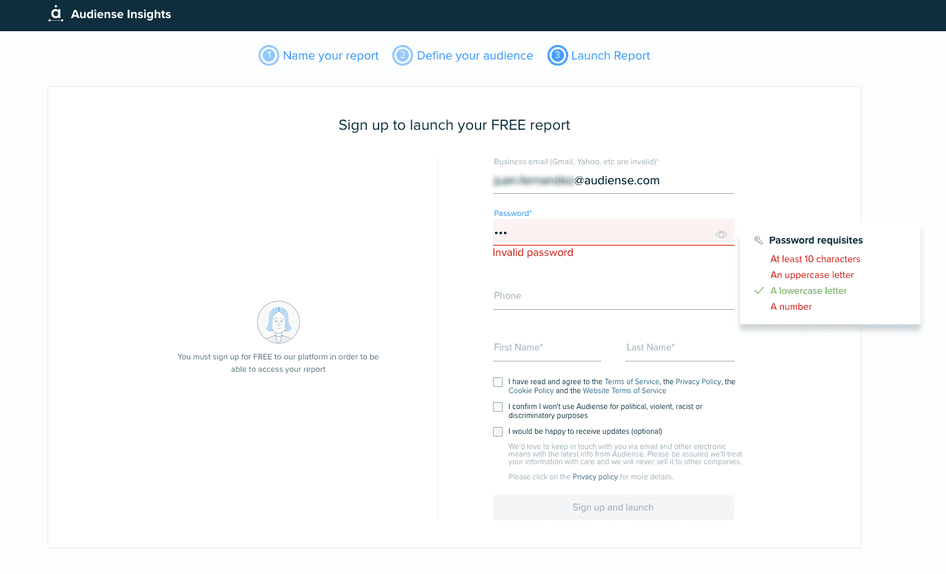
The Audiense team prioritized the most urgent conversion issue: dropoffs on their sign-up page that led to a decline in conversions.
Using Hotjar Session Recordings, they tracked individual user experiences on the site and quickly saw that the sign-up form had password validator feature bugs, which they fixed, leading sign-up rates to soar back up.
“Every small improvement increases conversions around 10%-20%, which is really significant”, says Juan Fernandez, head of product at Audiense.
2. Razorpay: improving usability
Razorpay offers a suite of end-to-end payment solutions, including payment links, subscriptions, and payment pages to companies based in India.
The challenge:
Razorpay wanted to redesign their user dashboard to boost usability, design clarity, and user engagement. But they didn’t want to disrupt the overall user experience (UX) as they trialed updates.
How they solved it:
The Razorpay team decided to take an agile approach to their problem: they soft-launched their new dashboard to a small audience segment so they could incorporate user feedback and iterate without radically changing the product experience for all users at once.
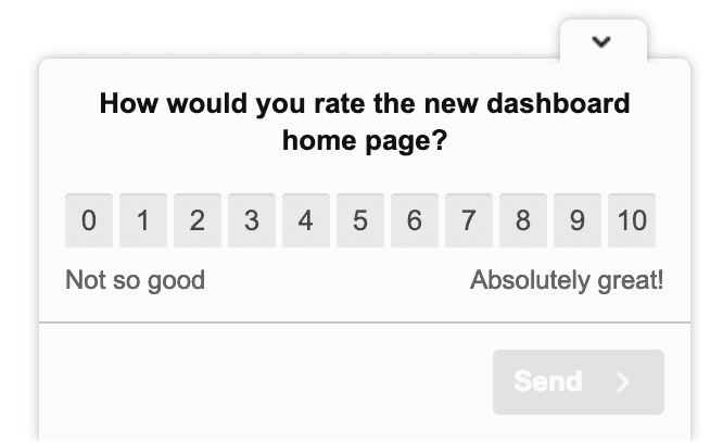
First, they rolled out the dashboard to 10% of users and gathered a rich mix of quantitative and qualitative feedback from them. They deployed Hotjar Surveys and Feedback widgets to get users to rate their experience, but also asked open-ended questions to get voice-of-the-customer (VoC) insights.
Initially, ratings were disappointing—but the Razorpay product team saw this as an opportunity to improve and create the excellent PX their customers needed.
They used the numbers as a starting point and dug deeper to really empathize with users and improve their experience in subsequent iterations. Their user-centered product design process improved the average user rating from 6.2 to 8.7.
3. Bannersnack: increasing user engagement
Bannersnack is a digital banner maker that helps users design attractive, customized banners and visuals for social media. They have now expanded their services and rebranded as Creatopy, a full-scale visual communications solution.
The challenge:
Bannersnack's product designers realized that their long-term customers weren’t using their new ’Timeline’ feature, missing out on key aspects of their product.
Like many product design teams, they felt they didn’t fully understand what users were thinking and feeling as they used their tool. They wanted deeper insights into how users were behaving and why they were behaving that way to make data-informed improvements to PX and feature usage.
Despite all the tools we used to measure traffic, such as Google Analytics, we didn’t really know what our users were doing on our website or how they were using our online tool. Our goal was to start optimizing based on data, not assumptions—but we felt like we didn’t have enough information to make our process shorter and more efficient.
How they solved it:
The first step was pinning down which users weren’t enticed to use the Timeline feature and examining their experience step by step. Through heatmaps and recordings, it became clear that users weren’t drawn to clicking on the Timeline feature, because the option was closed by default and the button wasn’t as visible as they’d thought.
Solving the issue required only simple tweaks to the product design. Adjusting the user interface (UI) to reposition the Timeline button and make it more prominent offered a 12% increase in overall usage.
By making decisions based on user data, the Bannersnack team avoided guesswork or unnecessary full-scale redesigns. They circled in on the issue—and solved it.
4. HeyOrca: designing for delight
HeyOrca is a collaborative social media tool that helps teams plan and schedule social media posts and get approval from colleagues and clients before publishing.
The challenge:
The HeyOrca team wanted to find a better way to measure and visualize user satisfaction to improve their PX/UX and boost customer loyalty and retention rates.
How they solved it:
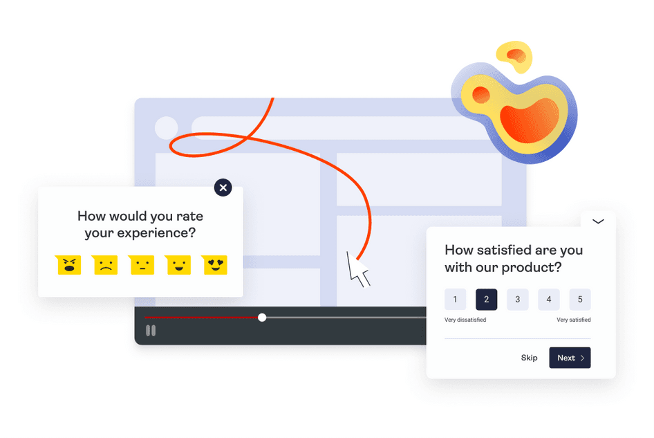
HeyOrca’s researchers and designers used surveys and session recordings to rapidly collect and manage user feedback.
With every improvement, iteration, or UI change, they sent out quick, targeted surveys to understand how users were responding to their product updates “in the wild” and adjusted their design based on the results.
As a fast-growing company, they needed a scalable solution and Hotjar’s tool stack helped them gather, visualize, and communicate feedback all in one place. They deployed Net Promoter Score® (NPS) surveys that asked users how likely they were to recommend products or features to their network, which provided clarity on customer loyalty and satisfaction. By transforming user feedback into product design action items, they reached a 65% ‘Promoter’ classification and an NPS score of 54.
5. Hotjar: guiding design with user feedback
Hotjar(👋) is a product experience insights tool that helps you understand your users by providing you with a visual story of how they engage with your website, product, or service, giving you the quantitative and qualitative data your business needs to generate customer delight.
The challenge:
Hotjar’s product designers wanted to be certain they were putting user feedback to work in informing product design decisions. They needed a clear review process to ensure user feedback didn’t get lost and make sure they picked up on all customer complaints and opportunities for product improvement.
We don’t just throw stuff at people: we want to be in a conversation with them. So we put a design or a feature out there and that’s our conversation starter, but then we need to hear back to close the feedback loop. And then, based on what comes back, we need to speak again. And then another thing comes back, and we keep going.
How they solved it:
Hotjar’s product design team decided to run a monthly feedback investigation where they could dive deep into positive and negative user feedback to make sure nothing was missed. They methodically analyzed ‘hate’ feedback, then ‘neutral’ feedback, and finally ‘happy/love’ feedback collected using Feedback widgets and NPS score surveys.
The next step was a review meeting where they committed to turning insight into action. By using customer conversations to inform design choices, they were better able to prioritize the product design backlog.
For example, user feedback patterns showed the code tracking ‘copy-to-clipboard’ wasn’t working for a while, largely impacting the user experience. Regular feedback reviews helped the Hotjar team spot the issue and prioritize the fix.
Tackling product challenges through brilliant design
Solving user problems is at the heart of excellent product design.
The key is to focus on customer needs. By using product experience insights tools like Hotjar, companies can move beyond assumptions and incomplete analytics to really understand their users—and learn how to engage, retain, and delight them.
Spot and solve product design issues with Hotjar
Learn how user-centered product experience insights can help you design with confidence