Learn / Product Forge / Article
Is your content reporting missing this vital element? (and how to fix it)
Relying solely on quantitative analytic tools can lead to content reporting gaps. Here’s how to gain insight into how your marketing lands with your audience.


Content marketing strategy, check. Blog content, check. Results? Not quite there.
When you have a solid content strategy and production schedule but still struggle to engage readers and drive desired results, a lack of proper content reporting is often the missing piece.
Successful content marketing is data-driven—you need to monitor crucial metrics to determine how well a piece of content performs and what can be done to improve the results. That’s what content reporting involves. But basic analytics tools alone won’t cut it anymore.
In this post we’ll uncover some key factors for improving your content reporting strategy:
Why traditional content reporting tools like Google Analytics are insufficient for understanding content performance
Which content insights are worth exploring
How Hotjar can help
Why content reporting is broken
In the past, marketers published content with little insight into its performance. But nowadays, the stakes are higher. Content marketers often need to justify their budgets to stakeholders.
Content reporting is one way to prove your return on investment (ROI)—a top challenge for marketers. Still, according to a 2021 Semrush survey, only 66% of brands claimed to be measuring their content performance. Most of these were using quantitative data such as organic traffic, search rankings, and leads as their key performance indicators (KPIs).
Although beneficial, analyzing content solely from this perspective does not provide well-rounded reporting.
The need for qualitative data
Search traffic, search engine rankings, bounce rate, leads generated, page views, and average time on page are all valid KPIs. These metrics show how many prospects are finding your website, engaging, and converting to leads.
However, a sole focus on quantitative data (numbers, numbers, numbers) leaves gaps in the content reporting process. These metrics reveal whether readers are staying on your site—but they say nothing about why. This leaves marketers scrambling when positive quantitative indicators drop, effectively attempting to salvage a rising bounce rate or plummeting traffic with guesswork.
In contrast, qualitative content reporting considers the reasons behind content performance issues. These include how user-friendly your site is, what readers gain from browsing it, and what obstacles hinder them from committing to your service.
Focusing on qualitative data is a more customer-friendly strategy than using purely quantitative reporting. Quantitative metrics prioritize the company’s business goals and targets, but customer-driven content reporting drills down into the motivations behind customer actions. It is geared toward serving customers.
How to take your content insights to the next level
If you want to understand the reason behind the numbers and take your content marketing reporting to the next level, you need to integrate qualitative and quantitative insights. This means combining classic tools like Google Analytics with other tools that provide qualitative insights into your content performance.
Here are three practical ways to dig deeper:
1. Use heatmaps
A heatmap is a visual representation of user activity on your website, with areas of high activity depicted as red zones and low-activity areas shown in blue.
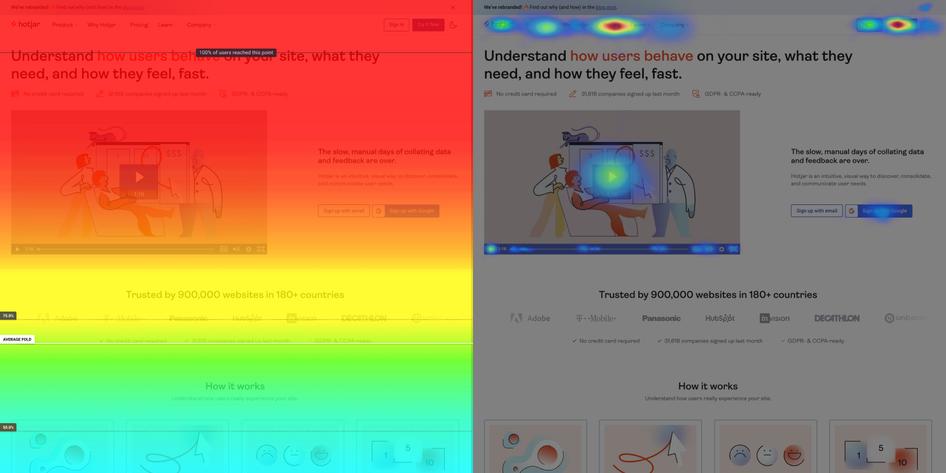
Heatmaps show you which site elements users interact with the most, how they navigate your website, and which elements fail to grab their attention. They also give you valuable information about:
How far readers are scrolling through your content before they exit
Which navigation elements first catch users’ attention
How well users navigate on desktop vs. mobile
Whether readers are clicking on CTA links and buttons
Whether readers are clicking on non-clickable elements
Although heatmaps can be insightful, they’re less impactful when used as a standalone tool. To get the most out of your heatmaps, combine them with other features like feedback and surveys. These insights can help you pinpoint why your bounce rate is high or why your click-through rate (CTR) or conversion rate is low. Using this information, your marketing team can craft strategies to reach your business goals while keeping a customer-first mentality.
Tip: want to boost your conversion rate? There are three types of heatmaps that can help you the most; and knowing the difference is handy, as each type helps you investigate a slightly different aspect of your website and product performance.
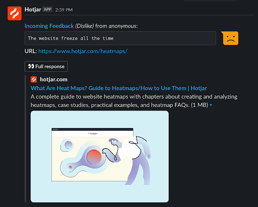
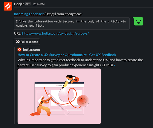
2. Ask for feedback
The most straightforward way to get customer feedback is to ask for it.
Send engaged prospects survey links by email to learn what they think about your product, campaign, website, or blog content. You can also use surveys for data collection directly on websites and blog posts.
Besides asking for written feedback, offering simpler survey methods like rating scales that may make it easier for users to leave feedback. You may also combine a rating scale with a request for more information after users have selected their rating.
And for bonus points, you can make all these replies appear automatically on a Slack channel like ours, #feedback-guides, to quickly take action on issues or get some pats on your back.
3. Try A/B testing
Like surveys, A/B testing is highly effective for learning customer preferences and knowing which kind of messaging most appeals to your audience. A/B testing or split testing refers to showing two variations of content to an audience to decide the most effective version.
You can A/B test everything from email newsletter headlines to social media captions. But for content marketers, landing pages are especially good places to perform A/B testing. Whether they are product pages or connected to pay-per-click (PPC) ads, landing pages can be a powerful way to reach prospects.
Experiment with your page’s headlines, call-to-action (CTA) text and buttons, the amount of information, and even visuals on the page to see which options resonate the most with your audience. Then make your A/B test even more powerful by using heatmaps to observe how visitors interact with each version.
What kind of content insights can you get via Hotjar?
Hotjar is designed to help users bridge the Why Gap and understand the motivations behind website user behaviors.
Here are four content insights you can unlock using Hotjar:
1. Direct user feedback
Hotjar’s Ask features, Feedback, and Surveys allow you to get user feedback with little effort.
Choose between using survey templates or building your own from scratch. You can also decide which pages to host your surveys and feedback forms on based on page performance.
With well-crafted survey questions, you can find out what visitors like and dislike about your site, how useful your blog content is to your audience, and what’s stopping people from completing purchases on your ecommerce store. The information you gain from direct user feedback helps improve your attribution process and shows you which kinds of content to keep investing in.
2. User engagement
A move map can reveal a lot about how engaged and active users are on your site. Viewing these heatmaps on recordings will show you which website elements attract and hold visitors’ attention and which ones they totally miss.

For example, readers may be drawn to your sidebar content and completely ignore footer elements. With the insights from your heatmap, you can decide to move high-value information to the sidebar and remove it from your site’s footer.
3. Friction sources
Is your navigation bar hard to find? Are pop-ups obtrusive for mobile visitors? Is your above-the-fold copy persuasive enough? Or do you need to move your social proof block higher? It’s all about user experience (UX).
Poor website UX can be a major source of frustration for prospects, putting them off your website and product in seconds.
One crucial part of reducing friction is site optimization for mobile. Reports from Statista indicate that mobile device searches account for over 60% of organic search traffic. This means your website should be just as easy (if not easier) to use on a mobile device as it is on a desktop.
Hotjar Heatmaps and Recordings can help you detect navigation patterns and recognize obstacles for mobile users, such as how much difficulty your visitors have with closing pop-ups.
4. CTA efficacy
Whether you’re A/B testing landing pages or wondering why your blog conversion rates are so low, Hotjar’s heatmaps can help you evaluate the efficacy of your CTAs.
Watching Heatmaps will give you some vital insights:
Whether users are even making it to the end of your content (and thus your CTA)
If site visitors are noticing your CTA
If website users are seeing your CTAs but not feeling compelled to click them
With this information, you’ll know whether you need to improve the quality of your content (or change your content type or angle altogether), make your CTA buttons bolder and more noticeable, or experiment with different copy to make your CTA more persuasive.
The bottom line is that you’ll have a better shot at getting to the root of the problem. Tip: struggling to increase website conversions? Learn how to increase clicks with these CTA best practices.
How to add Hotjar content insights to your monthly reporting
Mine your survey and feedback data for useful information and add it to your reporting by recording it in the most accessible way for your team. You can record user feedback in Trello, Notion, Google Sheets, or any preferred data collection tool. Integrate Hotjar with these tools using Zapier and set up new responses to automatically save as soon as they’re recorded.
Depending on your team’s needs, you can organize the responses into categories, like feedback to implement, feedback to consider, and feedback to discard. Add links to the feedback in your content reporting dashboard, so your entire team can access the information as needed.
Based on the responses you receive, you may need to make website changes, plan new posts, or invest in one form of marketing over another.
Unlock deeper content reporting with Hotjar
Qualitative data may not be as easy to represent on dashboards as numbers and percentages, but it doesn’t make it any less important. Effective content marketing is only possible by integrating qualitative and quantitative content reporting metrics.
Instead of just narrowing down your data analytic reports to the numbers on the charts, include data about how customers feel about your content. Get user feedback, discover friction points on the customer journey, and optimize your site accordingly.
Hotjar’s features are built to help you unearth the reasons behind user behavior. If you don’t know where to begin, Hotjar’s Heatmaps are one of the best places to start. With it, you can observe visitors on your site, see which copy and elements work for them, and learn how to create a more impactful user experience.
Step into your users' shoes 🔥
See where your site visitors click, find out what they get stuck on, and then make the changes that matter the most. Answer burning questions like, ‘Why is my website not converting?’, ‘How can I improve my UX?’ And, ‘Why are visitors leaving without buying?’
