Learn / Guides / Web design guide
13 web design best practices to improve UX in 2024
Every team’s nightmare is finishing up a lengthy web design process only to discover their website offers a poor user experience (UX).

To avoid having to go back to the drawing board, apply tried-and-tested web design best practices from the start.
We’ve put together a list of 13 web design guidelines to help you improve UX, reduce bounce rates, and boost your brand reputation and revenue by delighting customers every time they interact with your website.
Improve user satisfaction on your site with Hotjar
Hotjar’s product experience insights tell you exactly what users love (and hate) about your site, helping you make the necessary changes to your website's design.

13 web design best practices to implement
Web design best practices start with putting the customer first and making their experience as easy and intuitive as possible.
Our list covers 13 key areas of web design, with actionable tips you need to apply before, during, and after the design phase for continuous improvement.
1. User-centric design
“Good web design is about more than just aesthetics,” says Kristopher Tabaie, a web developer at Lesar UK. “It involves a user-friendly layout, clear navigation, and a clean interface that clearly communicates the content. This makes your website accessible (internally and externally to search engines) by creating an easy-to-navigate experience.”
So, how can you make your design customer-centric?
Start from the end goals of your website. Get clear on who it’s for—whether that be potential clients, investors, or employees. Ask yourself: what are my users trying to accomplish? Are they looking to find product information, compare prices, or apply for a job? How familiar are they with your products, services, or brand?
For ecommerce businesses, for example, the primary goal is usually making sales, while a secondary goal might be to increase newsletter signups. That means your design should focus on making the browsing and buying experience clear and compelling for your customer.
Use a 4 pillar framework to identify:
1. What customers want to find out
2. Where they want to go
3. What they want to do
4. What they want to buy
Create buyer personas based on real user demographics and job roles. Do research to understand your users’ problems and how your website solves them.
Get cross-functional teams—UX and design teams, SEO specialists, content writers, CSM, and sales—together so they can offer different perspectives on your customers and their needs
Create a panel of test users for continual feedback: it’s much easier to identify user pain points when you understand who they are and how they behave
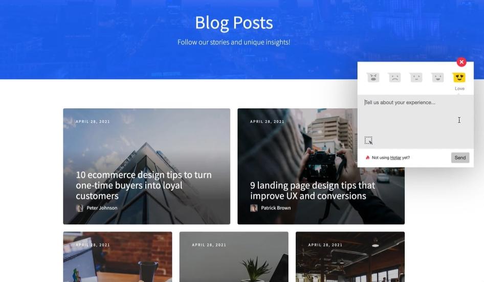
Pro tip: Use Hotjar’s Observe tools like Session Recordings for a granular view of user behavior on your site. Then, use Surveys to ask your users questions and understand the why behind their actions.
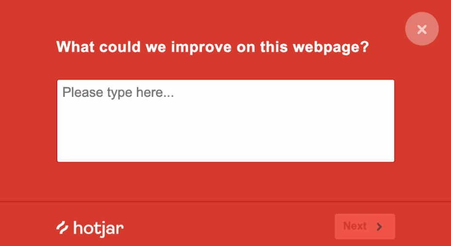
Hotjar's Surveys allow you to ask questions about the user experience on your site to help you learn what's working and what's frustrating customers
2. Design conventions
It’s tempting to make your site stand out with a fully original design, but if you don’t stick to certain design conventions it can confuse users and cause them to bounce.
During the design phase, create customer delight and help users feel ‘at home’ with these best practices:
Have a clear ‘hero’ area with a headline that effectively describes the problems your business solves. Users decide to stay or bounce in seconds, so getting your message across fast can boost time-on-page and conversions.
Place main navigation menus at the top or left corner of your webpage where users expect to find them
Use buttons that change color when users hover over them, so they get feedback that clicking will result in an action
Use recognizable icons like a shopping cart on an e-commerce site
Place the logo at the top left or center of your website, and have it link back to the homepage to help users always return there
Use standardized layouts for pages common to all websites such as 'help' pages
Place a large phone number at the top and bottom of the page, and make it clickable so it’s easily visible and usable on a mobile device
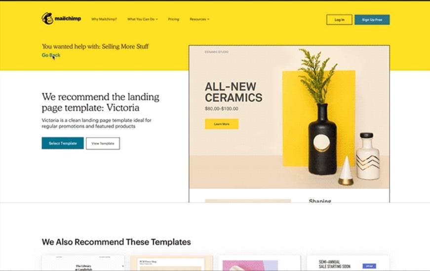
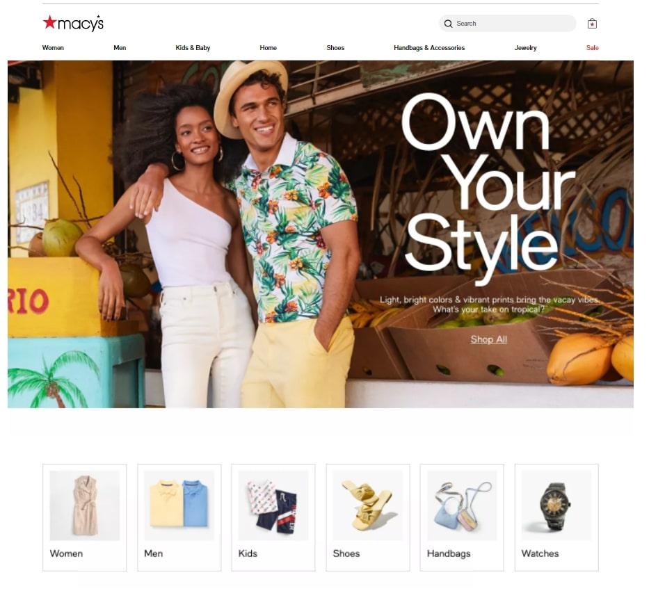
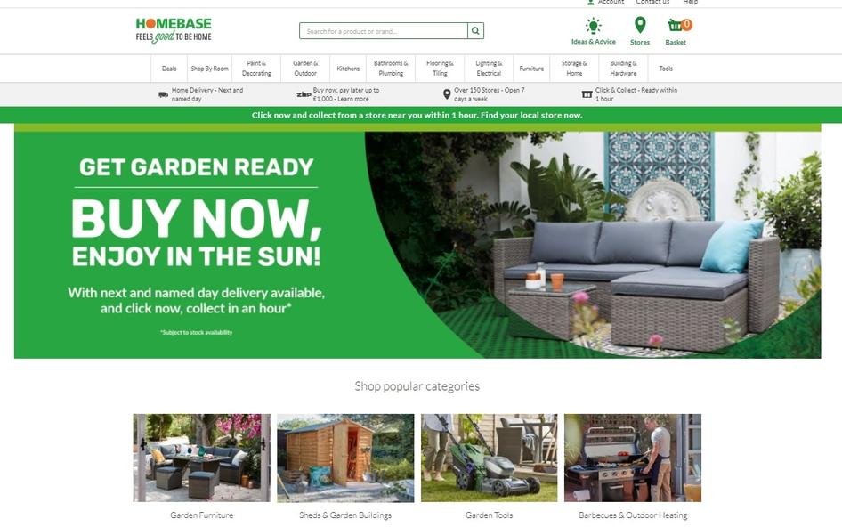
Use conventional page layouts for your industry. For example, if you’re an ecommerce company, users will expect your site to look similar to the ones they've navigated before.
3. Navigability
Users won’t convert unless they can quickly and easily find the information they need to make a decision, so your site needs to be well organized.
"Make sure the navigation menu is easy to find on desktop and mobile, not overly detailed, and clean. A clear, concise navigation menu helps users quickly locate their area of interest and follow it. And it helps the designer create a design that guides users along a desired journey."
Use these seven best practices for great navigability:
Use menu categories, and simple, descriptive menu names that are relevant to your website
Use menu conventions like About, Services, Contact, etc., so users know what to expect
Include a search bar so users can find what they’re looking for anywhere on your site
Include a navigation footer so they don’t need to scroll up to the top of the page
Use ‘breadcrumbs’ to track user journeys, so they easily retrace their steps
Include links in copy, with descriptive anchor text
Make pricing clearly visible, so customers don’t have to contact you to ask
Pro tip: during beta testing, use Hotjar’s Session Recordings (playbacks of users scrolling and clicking through your site) and Heatmaps to see exactly how users navigate your site and understand which page elements they engage with most.
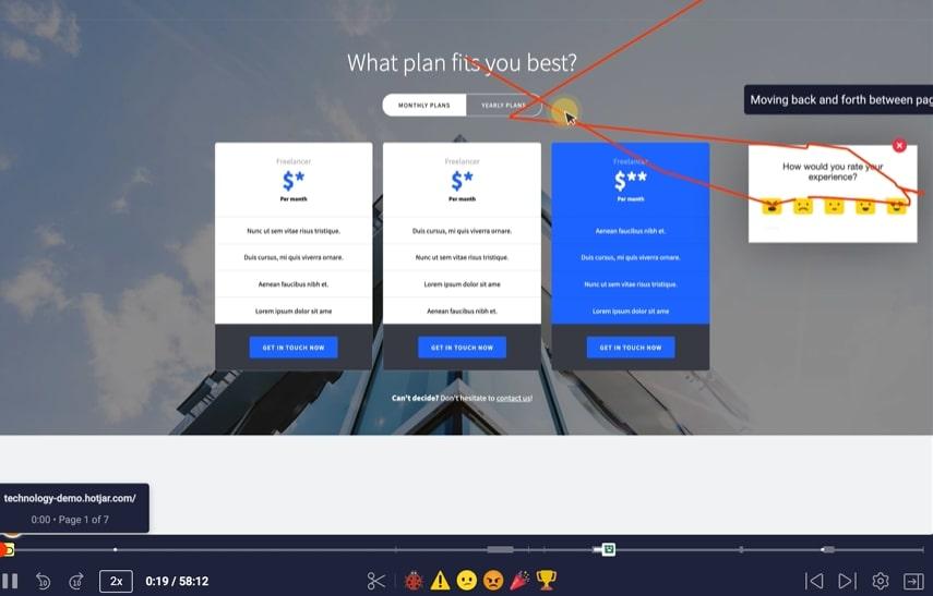
Hotjar Session Recordings let you spot bugs and problems that frustrate users and cause them to bounce
4. Information hierarchy
On-page hierarchy involves arranging website elements so visitors naturally gravitate to the most important information first. This helps guide users take action in a way that feels natural and enjoyable.
Use the right position, color, and size to draw attention to important elements first.
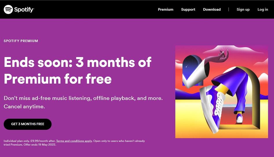
The webpage for Spotify’s Premium offer is a great example of brilliant visual hierarchy: the headline grabs your attention before your eye naturally moves to the benefits and CTA.
5. Readability
An easy-to-read website makes for a pleasant user experience and creates loyal and satisfied customers.
Find the right balance between content, style, and functionality. Avoid clutter, let the content breathe a little, and use images or videos as support for your content.
Here’s how to make your content easy to read:
Use consistent fonts during the wireframing stage to create a sense of cohesion across your site
Choose a clear font like Open Sans (not cursive) in at least 12-point
Stick to just two or three font sizes in total
Use different font styles to separate content from menu items and navigation buttons
Use different fonts for different content types, and be consistent
Chunk text into short paragraphs to make it easier to read and scan—large blocks of text are visually unappealing on a screen
Start each paragraph with new information, so users can quickly see whether they need to read it
Use bullet points to make text scannable
Contrast text color with backgrounds, and avoid combinations like red and black, which are hard to read
Leave plenty of space between copy, main headings, and margins to create a balanced, uncluttered effect
6. Branding
Using consistent branding throughout your site helps customers recognize your business and establishes trust.
Make sure your branding is industry-appropriate—for example, users looking for an accountant will probably bounce from a site with bright colors and Comic Sans font.
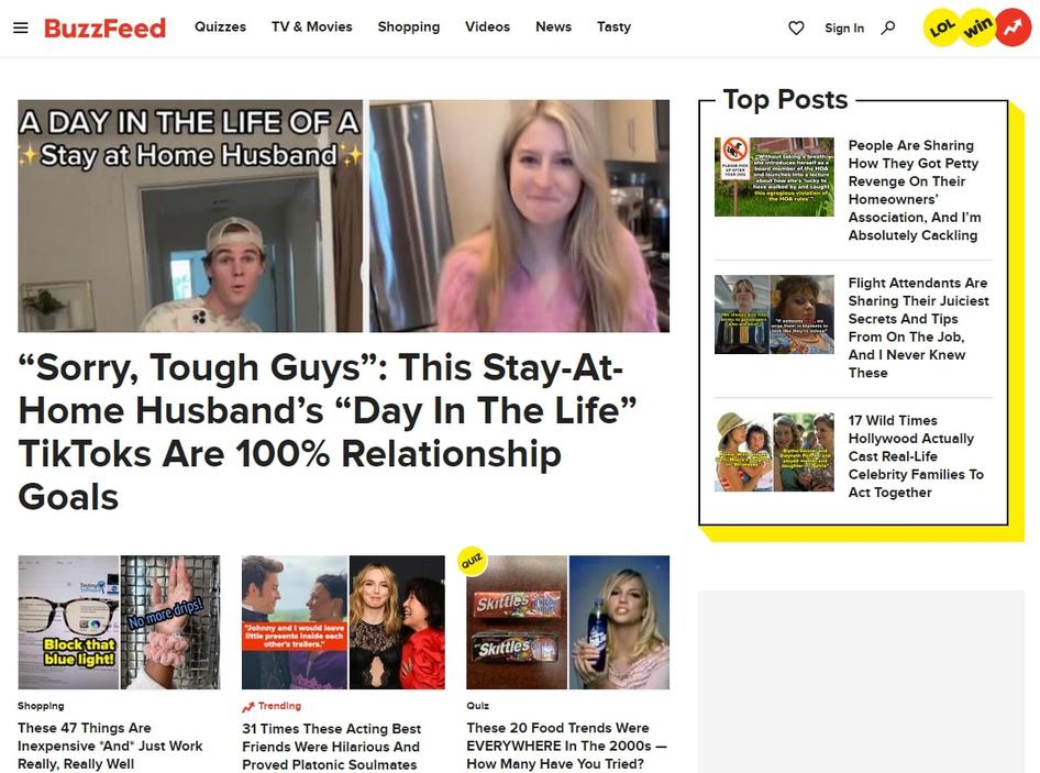
Stick to three colors, and keep a consistent look and feel across all your pages. Choose colors that evoke the right emotions in customers. See how Buzzfeed’s yellow and red grab users' attention and gets them excited about the content.
7. Visuals
Strong visual elements get users’ attention and break up text to make your site scannable. Plus, they help customers imagine themselves using your products in their everyday lives.
So what are the best practices for website visuals?
Choose images at the wireframe stage of your web design process. If possible, avoid generic pictures and use high-quality photos of your products, employees, or premises to create a more authentic impression and build trust.
Make sure images are responsive—so they look good across different devices—and compressed to avoid slowing down your site, with alt text for SEO and accessibility
Animations are great for instructions, but keep large files to a minimum to avoid hurting load speed
If your business is seasonal, be sure to rotate images as your offering changes so users always see the most up-to-date products
8. CTAs
Your site’s ultimate goal is to persuade users to take an action, whether that’s downloading a lead magnet, signing up for your newsletter, or buying a product. Strategically placed calls to action (CTAs) help convert users into paying customers.
Follow these best practices for standout CTAs:
Make CTAs clearly visible: don’t bury them in text, and use white space around them to help the eye zoom in
Route incoming leads in the right direction by including a relevant CTA on each page. Don’t make users navigate back to your home page to convert.
Include CTAs on internal pages like your 'About' page, as well as product pages
Use consistent CTAs for the same actions to avoid confusing and frustrating users

Pro tip: use Hotjar Heatmaps and Session Recordings to identify when CTAs aren’t getting clicks. This allows you to make quick fixes, like moving the position or using a different font, without necessarily needing to redesign the whole page.

Heatmaps show you an intuitive aggregated view of which parts of your site are attracting attention and which aren’t to help you make changes that improve UX
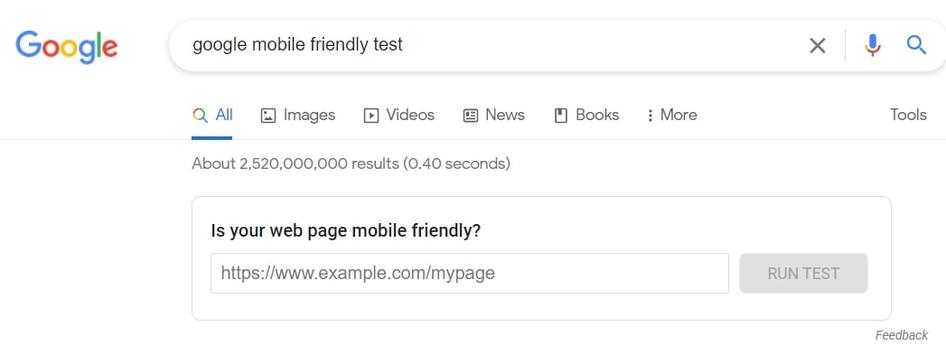
9. Responsive across devices
Over 50% of website traffic comes from mobile devices, so your site must perform well on smartphones and tablets as well as desktops and laptops. If it’s hard to navigate, or elements aren’t correctly displayed on a small screen, users will get frustrated and bounce.
During the final stage of design, once the layout is approved, apply these best practices for responsive websites:
Keep menus simple, and include a search bar so you can limit menu items
Make CTAs clearly visible, with buttons large enough to be tapped with a thumb, which is less precise than a cursor
Use a simple design to prioritize load speed
Avoid large blocks of text, and use a font that can easily be read on a small screen
Test on different browsers
Mobile responsiveness also helps with SEO. “There’s the added issue of Google's mobile-first attitude,” says Shane McEvoy of Flycast Media, “meaning non-mobile ready websites are unlikely to rank well and, therefore, sacrifice valuable traffic.”
10. Accessibility
Everyone, regardless of device, special needs, or location, should be able to use your site.
Ask yourself: is your website design compatible with assistive technologies? How can you make the site easily navigable for all users? What tools will you use to develop the site, and do they have any inbuilt accessibility issues?
Then, apply these accessibility best practices:
Early in the design phase, think about color contrast
Remember never to use color alone for instructions to avoid confusing color-blind users
Use resources from the Design and Develop Overview | Web Accessibility Initiative (WAI) | W3C and Accessibility Insights to make your design accessible
Get user feedback and run research to improve design iterations
Note: while Hotjar doesn't claim to be an expert on accessible design, we’re constantly striving to make our own site more accessible to diverse users.
"Accessibility doesn’t only benefit users—it also helps website owners, who get more traffic, more views, as well as higher adoption and engagement as more people are able to access their websites and applications."
11. SEO
Few people click beyond the first page of search engine results, so you need to make sure your website ranks high to ensure your users can find it and start browsing. And that means thinking about what makes a good website for users as well as ticking optimization boxes for search engines like Google, Bing, and Yandex.
Use these best practices for search engine optimization (SEO):
Create useful, shareable, keyword-optimized content
Include internal links to other pages on your site
Use headings and subheadings, and include a site map to make it easy for web crawlers (and users) to understand
Get backlinks from other reputable sites
Use alt text for images
12. Security
Whether users are making payments through your site or just browsing, good security establishes user trust and boosts your brand reputation.
Use these best practices to maintain high security levels:
Use a secure web host with server-side firewalls, encryption, antivirus and anti-malware software, on-site security systems, SSL certificate, and CDN availability
Prevent unauthorized access by limiting login attempts with plugins like Login LockDown
Mandate secure passwords with letters, numbers, and special symbols, and use two-factor authentication
13. Test, test, test
Test as early as possible to validate your design ideas, and continue to run user tests right up to launch. Once you’ve launched, test on an ongoing basis—especially after adding new features or updates—to spot bugs that disrupt UX and increase customer churn.
"Once people are actually using your website, it’s important to measure everything and get concise data to drive business development, and design & technical development of the website."
When your site is live, run regular A/B testing to test different features—like publishing two identical landing pages with different CTAs to see which performs best.
Use Hotjar Surveys and Feedback widgets to get in-context feedback ‘in the wild’ as users interact with your site, so you can validate your assumptions and improve the design.
Continuous customer-centered design
Web design trends come and go, but strong, user-centric design is eternal. Implementing web design best practices helps you create a fantastic UX, so users can easily achieve their goals on your site.
Put users front and center at all stages of planning, design, and beyond—and they’ll reward you with loyalty and increased revenue. Understanding how users really interact with your site will put you on the right track toward success.
Improve user satisfaction on your site with Hotjar
Hotjar’s product experience insights tell you exactly what users love (and hate) about your site, helping you make necessary changes to your website's design.