Learn / Guides / Web design guide
6 modern web design trends to inspire you in 2024
Web design is dynamic. As soon as you think you’ve figured out what great design looks like, a hot new trend pops up—and makes even the best teams question themselves. Should we rethink our current design? Does it work with our brand identity? Will our customers like it?

Using design trends can help you draw on the latest techniques to meet user needs—but you also need to ask questions and weigh which trends will most benefit your particular users and brand. This article will guide you through the most important design trends of 2024—and show you how to decide which are best for your site.
Discover design trends that align with your brand and users
Use Hotjar tools to get user feedback on web design trends and improve UX.

6 innovative web design trends to inspire you in 2024
Make customer delight the driving force behind your design trend decisions. Speak to your customers before and after you make any big design decisions to ensure those website changes solve their problems and create an optimal user experience (UX).
As you make your way through our list, ask yourself which trends will provide the most value to your users and meet their specific needs.
1. Emphasizing negative space
Using a healthy amount of white, blank, or negative space around your design elements has long been a popular minimalist design trend. But it’s becoming even more important in 2024, with more and more users seeking a streamlined, app-like web experience.
Integrating plenty of negative space into your site design can help:
Guide customers’ focus: when you surround website elements with white space, it’s clear to users where you're trying to draw their attention
Make your site more responsive: the demand for simple, streamlined user interfaces (UIs) is growing—largely due to users needing websites to work as well on mobiles and tablets as they do on desktops. If your site interface embraces white space rather than cramming in too many elements, it’ll be more responsive and easier to optimize for different screen sizes.
Create a better navigation experience: negative space makes it much easier for users to interact with your site and process the information you present, increasing usability and delivering great UX.
The negative space trend is easy for any business to integrate on their site. In fact, adding just a little more white space to your finished design is one of the top web design best practices you can implement. For SaaS and ecommerce brands that need to present a great deal of information in an easy, intuitive way, it’s vital to include a healthy amount of white space.
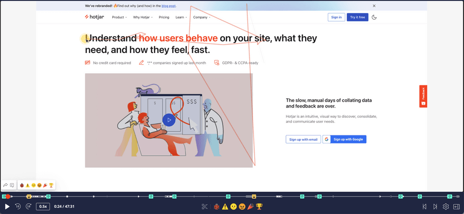
Pro tip: use Hotjar's Observe products to understand how white space affects your users’ browsing experience. Use Heatmaps to see whether site elements attract more attention when surrounded by white space—then go deeper with Session Recordings to watch entire playbacks of customer sessions and see where they click, scroll, and move.
2. Streamlined hero sections
Hero sections are the oversized banners right below the top menu on your homepage. Since they’re the first thing customers see on your site, they need to make an impact.
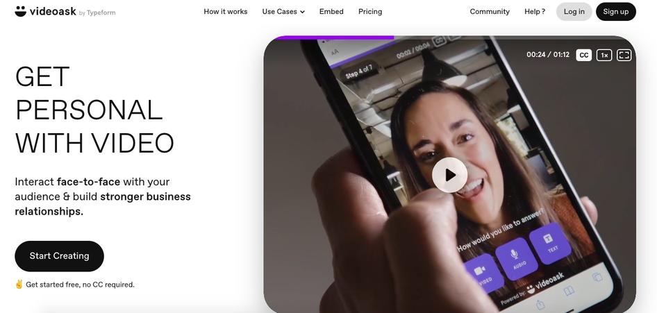
Many brands try to give their users as much information on the homepage as they can—as a result, there’s often too much going on in their hero sections. But teams have realized that bombarding people with different images, videos, headings, and buttons right off the bat can be a major UX design mistake.
In 2024, streamlined hero sections that include only the most important information are in style as a way of reducing friction in the customer journey and making your site easier to navigate.
"While hero sections with media can be attention-grabbing, they can also be overwhelming and cause users to leave the website before they've even had a chance to explore it. By reducing the amount of media in hero sections, designers can create a more balanced and less overwhelming design that still captures users' attention."
It can be tricky for ecommerce brands and creative agencies to simplify their hero sections because their businesses rely so heavily on visuals—but this trend is perfectly suited to SaaS websites looking to put the focus on their main product for conversion rate optimization.
Try these best practices to create an effective, straightforward hero section:
A strong, eye-catching heading that makes your unique selling proposition (USP) and product positioning clear
A streamlined paragraph of copy providing more context about your product
Calls-to-action (CTAs) that prompt users to convert
One key image or video
Pro tip: Hotjar's Observe tools—like Heatmaps and Session Recordings—can help you streamline your hero section and show you which website elements get the most attention from users, so you can prioritize what’s most important and move or delete the rest. After you make your changes, use tools like Feedback widgets to ask users how they feel about your adjustments.
Watch Hotjar Session Recordings to find out which parts of your hero section grab users' attention and which they overlook to help you make website changes.
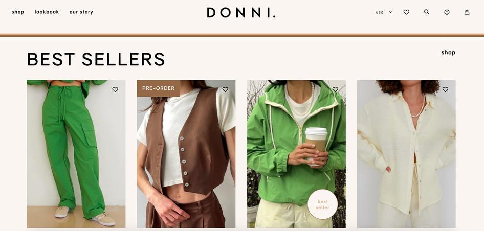
3. Bold and loud typography
Oversized typography transforms simple, written content into a captivating visual element. It’s a trendy way to communicate key information while giving your website a unique, visually compelling feel.
Depending on the kind of statement you want to make, you can go all-in on the extra-large text trend or use it more subtly.
Instead of relying on images, consider using a stylized slogan to communicate the most impactful task your product or service accomplishes for users. Be sure to keep your color contrast high and your background simple so your message stands out and doesn’t clutter your UI.
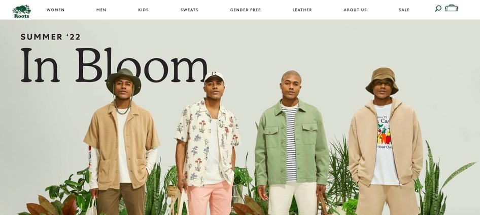
To try out a softer version of the oversized type trend, check out ecommerce retailer Roots’ homepage for inspiration. They’ve supersized the name of their collection but used a simple font so the text doesn’t overwhelm the page, and product images are still highlighted.
4. Nostalgic design
Sometimes great web design isn’t about looking forward—but looking back. Retro-style websites made a comeback in 2024 to create emotional connections with users by appealing to past memories and aesthetics.
Here are some nostalgic design elements you can use to take users back to their 'golden days':
Simple shapes
Unique linework
Two-toned color schemes
Vintage-style typography
Old-school textures
Cartoon-style illustrations
To let your retro design really shine, keep other design elements—like the navigation menu, search bar, and cart icons—simple, clear, and intuitive.
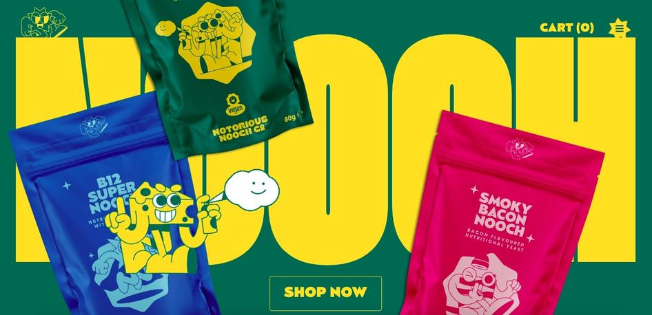
Nostalgic design works best if it aligns with either your overall brand identity, or a specific product. Take Notorious Nooch, an online shop that sells flavored artificial yeast: while their product is a niche in the market, they use familiar flavors and packaging to make customers think of the kinds of snacks they might have enjoyed as a kid. Their retro typography, color scheme, and quirky characters make their site feel nostalgic and add delight to the browsing experience.
5. Collage-style graphics
Collages are an aesthetic and practical way to incorporate many different images into one graphic or interface while making sites unique and memorable.
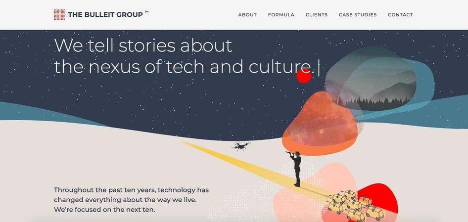
Tech PR & media agency the Bulleit Group, for example, features a collage-style image in their hero section. They’ve chosen overlapping playful yet futuristic images which support their mission to 'tell stories about the nexus of tech and culture.' The variety of colors, textures, styles, and shapes they’ve included adds a layer of dynamism and sophistication to their interface.
To follow their example, choose visuals that align with your brand and tell users who you are for hero-section collages.
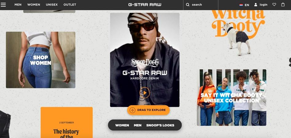
G-Star Raw uses a totally different kind of collage graphic on their site that takes up the full background of their homepage. With several calls-to-action (CTAs) incorporated within the collage, their approach is more product-centric and less artistic, but it still feels fresh and different. In particular, the texture they’ve included in the background adds a unique touch, giving the feel of images on poster board.
For ecommerce and retail sites, with several images to feature, a collage-style homepage is a great way to make a strong visual impression on users while keeping your site fresh and uncluttered.
6. Horizontal scrolling
While vertical scrolling is the norm for desktop browsing, more and more websites are integrating horizontal scrolling in 2024.
Horizontal scrolling gives users:
A unique, memorable experience interacting with your website
The ability to seamlessly scroll through a large gallery of images
An intuitive experience on devices, like smartphones, with swiping functionalities
“One of the main reasons why this trend will be taking off is that there's something very familiar about horizontal scrolling. When you think back to the first websites you ever browsed, they were probably all horizontal. Then as we got used to scrolling vertically on our computer screens, it became the norm. But as more and more people start browsing on their phones and tablets, we're seeing a resurgence of this familiar way of navigating websites.”
Horizontal scrolling is a great web design trend for companies looking to share lots of visual content with users—it gives you more space on your webpage and avoids a cluttered UI. Horizontal scrolling is also effective if you have large, interactive elements like maps you want to put on display.
But be cautious: horizontal scrolling can also cause usability issues if it isn’t implemented correctly. It’s a good idea to try horizontal scrolling on just one webpage first, and use Hotjar tools like Session Recordings to analyze exactly how your customers are clicking, scrolling, and moving, so you can see whether users are successfully interacting with your interface or getting confused. Then, you can make improvements before rolling it out across the whole site.
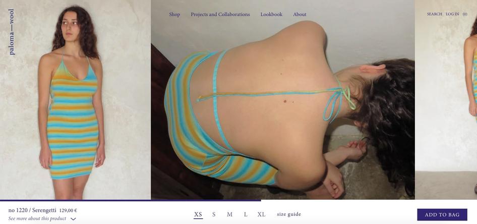
For inspiration, take a look at clothing brand Paloma Wool. They use horizontal scrolling on their product pages to include several different photos of their pieces. To make the scrolling experience more intuitive, they’ve put a horizontal bar at the bottom of their pages to guide users in their journey.
Freshen up your web design by trying a new trend in 2024
To effectively navigate web design trends, you’ll need to make sure the concepts you choose align with your brand and please your users—and make sure you don’t jump on board with short-lived fads.
To successfully implement the web design trends we’ve outlined in this article, keep your customers at the center of your decision-making process. Consider whether your new design ideas will improve your user's experience, and test and collect feedback before and after making any significant changes.
Discover design trends that align with your brand and users
Use Hotjar tools to get user feedback on web design trends and improve UX.