Learn / Guides / Ecommerce guide
7 intuitive shopping cart design ideas for your ecommerce business
How you design your shopping cart can make or break a conversion. On the journey from a product page to checkout, the customer experience should always be your priority. The easier it is to navigate your shopping cart’s interface, the better the experience will be.

A simple and well-designed shopping cart makes it easy for visitors to view product details, choose add-ons, and select their payment options for checkout, leading to bigger website revenue and better conversion rates.
This chapter gives you seven innovative shopping cart design ideas to drive conversions. Think of these examples as starting points, then change and adapt them based on your ecommerce store’s needs.
Increase sales with better cart page designs
Use Hotjar to dive into the user experience and make small changes to your shopping cart for a big impact.

Why does shopping cart design matter?
Checkout is probably the most critical moment in the ecommerce customer journey. And it's your responsibility to design a shopping cart that works great—for you and your customer.
Sure, you could just rely on the shopping cart design provided by your CMS or ecommerce platform. You know, the basic template, which is also used by countless other online stores, has no custom elements, and doesn’t cater to your specific customer base. 🤷
Or, you could design a shopping cart experience that’s actually based on your customers' needs, desires, and expectations. 💁 (We'll show you how—keep reading!)
A well-designed shopping cart creates happier customers and increases conversions, making it easy, efficient, and enjoyable for people to buy products or services from your online store.
Good shopping cart design is an essential part of a customer-centric conversion rate optimization (CRO) strategy, and can help you improve the user experience and boost your sales, long term. It’s also your best shot at a lower cart abandonment rate.
As of early 2023, nearly 70% of online shoppers abandon their shopping carts. Ouch. That means roughly 7 out of every 10 shoppers won’t complete their transaction—and that’s a lot of lost ecommerce revenue. Customers abandon their shopping carts for many reasons. Based on the data collected from Baymard Institute's research:
48% felt the extra costs were too high (tax, shipping, etc.)
24% left because the website urged visitors to create an account
17% felt the checkout procedure was too long or complicated
16% felt costs weren't transparent enough
13% had experiences with the website crashing
9% felt there weren't diverse payment options
The good news is that optimizing your shopping cart design takes care of many of these issues—the same study noted that improving checkout design can increase conversion rates by 35%.
Pro tip: understand why customers abandon their carts to increase your conversion rate.
If you have a high cart abandonment rate, it’s up to you and your team to optimize the shopping cart experience by identifying—and then removing—issues and blockers that cause customers to abandon your store.
Before you design or change your existing shopping cart, take the time to understand why customers abandon their carts. This puts you in a better position to make changes that truly matter (with the data to validate them).
Use surveys to gather customer insights and ask questions specifically targeted toward the shopping cart experience to get the best results
Analyze recordings to see how your customers work their way through each step of your checkout process
Include a feedback widget in your shopping cart that lets customers give you their opinions of your checkout process while they experience it
Once you understand your customers’ frustrations, you can take action to resolve their pain points and create a shopping cart experience that meets and exceeds user expectations.
An example of a Hotjar Recording
7 design ideas for a high-converting shopping cart
Here are seven shopping cart design ideas and examples to help you apply best practices—while adding your own creative flair—for a smooth, memorable shopping cart experience.
1. Use the shopping cart icon to your advantage
Those familiar, teeny-tiny shopping cart or bag icons used by so many online stores aren’t just there for decorative purposes—they’re functional and integral elements of the ecommerce shopping experience.
Optimizing your shopping cart icon is the definition of focusing on the ‘little things’ that have a big impact. Here are three ways to do it:
2. Highlight what’s important to your customers
A good shopping cart design shows customers what they want to see—whether that’s a detailed (but not crowded) order summary, relevant images, alternative financing, transparent pricing, or shipping and delivery info.
By focusing on what’s truly important to your customers, you address their needs and wants and increase your chances of a successful conversion.
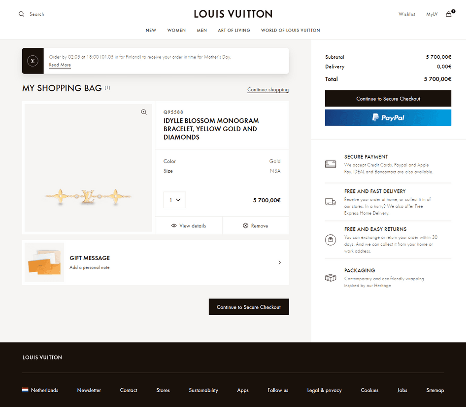
Louis Vuitton’s website provides their luxury clientele with a clean, engaging, and visually appealing shopping experience. As one of the world's most valuable luxury brands, the brand’s user interface or UI design nails the image gallery on their shopping cart page, allowing users to zoom in and see the intricate details of what they’re about to purchase.
LV also displays additional information on the left side panel below the price summary. These clickable sections show detailed info through pop-ups. The cart page also offers helpful information like "shop by [date] to get delivery in time for Mother’s Day," with a gifting prompt to nudge users to check out.
Pro tip: place a Hotjar Feedback widget on your checkout page to improve your customers’ shopping cart user experience.
A feedback widget lets your customers highlight the parts of your shopping cart UX that they love—and the parts they don’t—so you can identify any pain points or website bugs early on and make design changes that impact your bottom line.
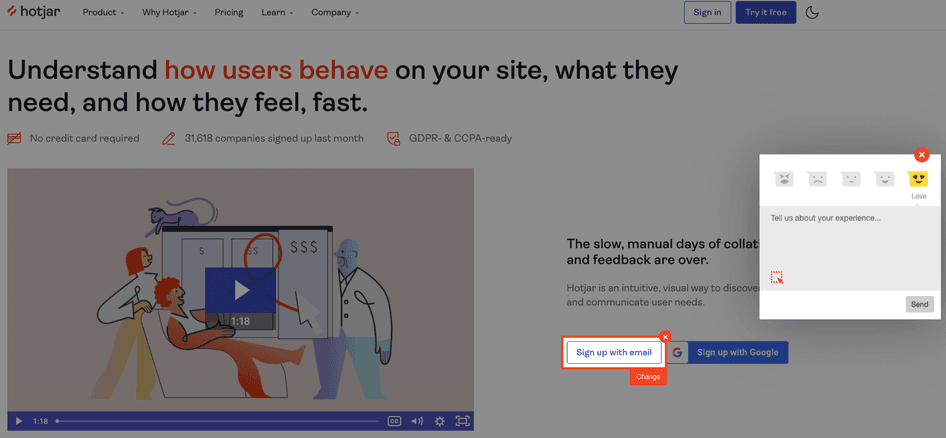
Hotjar's Feedback widget lets customers give you their opinions of your checkout process while they experience it
3. Design faster payment options
Nine percent of customers feel like ecommerce stores don’t include enough payment methods—they can’t find the payment option they want to use, or even their second- and third-favorite option. Coupled with the 17% of customers who feel the checkout process is too long or complicated, this strengthens the case for a fast and effective payment process that includes a variety of options.
Before you design, check if your chosen ecommerce platform offers a familiar and safe payment gateway, like PayPal or mobile wallets, and look for safety certificates like SSL. Make sure you offer your customers different payment options—like credit cards, Apple Pay, Google Pay, cryptocurrencies, and electronic checks—so they don’t run off and buy from a competitor.
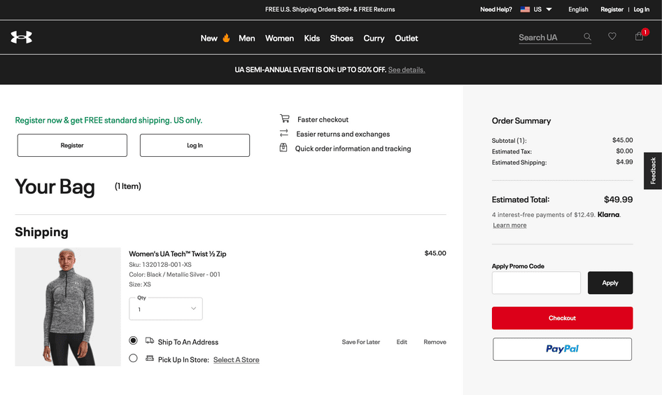
Sportswear retailer UnderArmour offers 4 interest-free payments via Klarna on its cart page to enable faster checkout. This type of ‘Buy Now, Pay Later’ (BNPL) option is used by 45% of customers and can be an effective way to increase shopping cart conversions.
Pro tip: lean on user interviews to understand your customers’ buying preferences and habits.
Your customers’ preferences can vary drastically between regions and industries, so understanding the market you serve is essential. Run user interviews or location-specific surveys to find out the right payment methods for your customers.
Customer interviews give ecommerce businesses qualitative insights that add context to traditional analytics or quantitative PX insights.
Use Hotjar Engage to tap into a pool of 175,000+ verified participants for user interviews. Narrow them down by location, age, gender, education, industry, and mobile device to learn what drives their shopping habits and cart abandonments.

Hotjar lets you interview customers of different ages and backgrounds, so you can find out what’s missing in their ecommerce experience
4. Add layers of authenticity to help customers check out with confidence
Want to win over more customers? Make it easier for them to trust you with these ecommerce web design tips that increase confidence and security.
For ecommerce websites, added layers of authenticity come in the form of elements that are incorporated in the shopping cart design. These layers help create a positive user experience that leads to sales, inspires repeat purchases, and encourages customers to recommend your brand to others:
5. Be clear about shipping and delivery options
Displaying shipping, taxes, and fees at an early stage is part of an effective ecommerce CRO strategy to optimize your checkout process and make it more user-friendly.
To design a simple shopping cart layout that gets all the important points across, take a hint from high-street staple Crate & Barrel. The retailer offers multiple shipping and delivery options on their cart page. However, the details are not crowded in one place. Instead, they’re divided across the shopping cart to keep the customer’s attention.
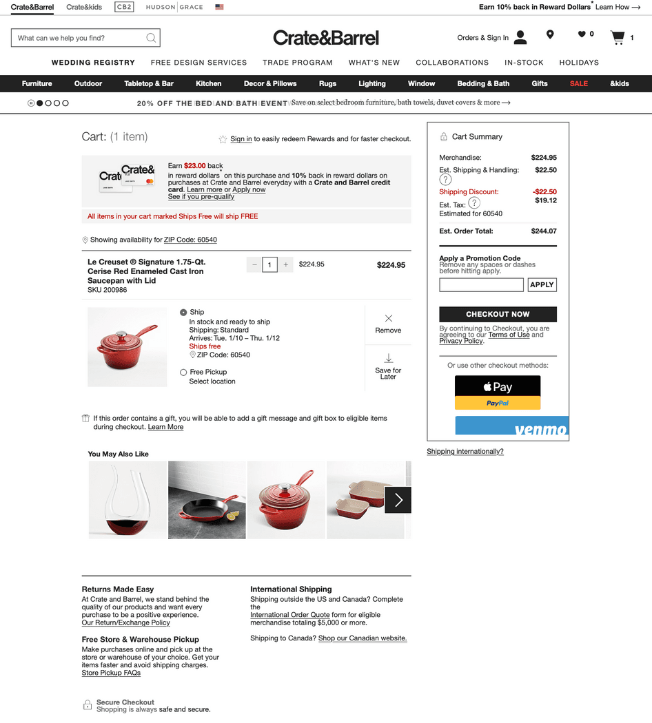
Once they add items to their carts, Crate & Barrel customers will know if their cart is eligible for free shipping by checking the tag in the cart that says ‘Ships free’ beside the product. All the highlighted text, like standard shipping, arrival, ships free, and ships directly from the vendor, display more information once clicked.
Crate & Barrel also displays costs upfront, calculating sales tax according to zip code. This tells customers exactly how much they'll pay, so they're not surprised at checkout.
The cart page also provides visitors with information on returns policies, international shipping, and different pickup options, without pushing customers to sub-pages and risking them losing interest.
Pro tip: use qualitative data from reviews and responses from customer service questions to explore how your customers feel about your current return process. If you need more insight, add a survey to your returns page with a straightforward question like, “How do you feel about our current returns process?”
6. Include product recommendations
Since they’re already in a purchasing mindset, the shopping cart is a great opportunity to convince customers to add more items to their cart without requiring them to leave the page.
Making personalized product recommendations increases your Average Order Value (AOV) by nudging more sales with quick add-ons and subtle upsells. By featuring related items, you can also cross-sell products with an added utility value by supplementing or complementing the product in the cart.
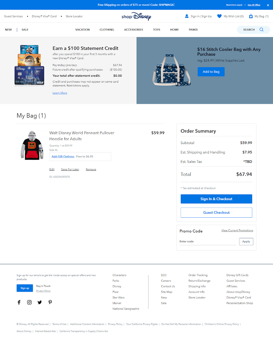
The Disney shopping cart is a great example of displaying product recommendations on the cart page without looking like you’re trying too hard.
The cart page features products that show information about their loyalty program and cross-selling a limited edition product. A clear call to action (CTA) lets customers add the product to their cart right there, without opening another tab.
7. Be at the customer’s service
It should come as no surprise: customer expectations are higher than ever. As consumers, we want quick, personal support 24/7.
In a world where shoppers have hundreds of choices, ecommerce businesses need to deliver what customers want or risk losing out to the competition. And that includes shopping cart design.
Including customer support details in your ecommerce web design can stop customers from abandoning their carts because of unanswered questions and hesitations. This type of proactive support makes visitors feel ‘seen’ and provides reassurance for a better customer experience.
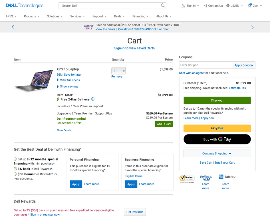
Technology provider Dell’s cart page has a business-like approach that reflects the brand’s personality and offers multiple ways to communicate with someone on their team. Customers can click the banner on top of the cart to call or chat with a Dell representative, or they can use the customer service plug-in by clicking the link above the Subtotal section.
Pro tip: ask customers what convinces them to buy.
How better to learn what ‘hooks’ customers than by asking the customers themselves?
Use a Net Promoter Score® (NPS) survey to identify your most excited and engaged customers. After you ask customers to rank how likely they are to recommend your product and brand on a scale of 1–10, follow up that question with, “What was the main reason for your score?” Responses from customers tell you what they value about your product or brand—which you can highlight more on your sales pages.
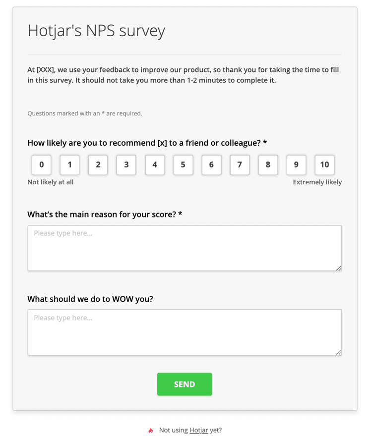
Tracking your NPS® benchmarks over time can show whether the changes you implement in your business are working
Next steps in crafting an amazing shopping cart design
Whether you implement all of these shopping cart design ideas or just a few, what’s most important is that you always put your customers’ needs first when optimizing your online shopping experience.
There’s no 'one way' to make your ecommerce site better, and there's no magical formula to increase conversions overnight. But we know of something that can set you on the right path: getting to know your users.
Having a deep understanding of the people who use your site helps you design user-centric shopping cart pages for them. Along with data-driven CRO strategies, you'll know exactly what you need to do on your website to enhance your ecommerce website’s checkout experience.
Increase sales with better cart page designs
Use Hotjar to dive into the user experience and make small changes to your shopping cart for a big impact.