Learn / Guides / Web design guide
6 common mistakes businesses make when designing their website
Creating a site users love interacting with isn’t easy. The road to a frictionless website is full of errors, iterations, and testing.

While making mistakes is part of any design process, we’re here to help you sidestep some of the biggest errors website owners and business teams make. This article dives into the six most common website design mistakes and how to avoid them.
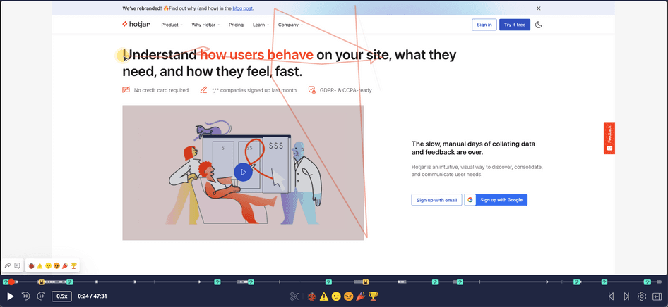
Give your users a smooth website experience
Use Hotjar's tools to detect web design mistakes and come up with effective solutions for your users.

6 top web design mistakes to avoid
Anticipate and avoid the following six design mistakes for a website that delights customers and makes a great first impression, boosting sales, conversions, and findability through search engines.
1. Unclear communication & navigation
Complicated website layouts and poor communication will make users click away without really understanding what your site and product are all about and produce a negative customer experience.
Avoid confusing and frustrating your users as they navigate by designing your website around customer needs. Avoid making assumptions—like thinking users already understand your solution and know what to do on your site—by incorporating customer feedback into your website design at every stage of the process.
For great communication, make sure that when visitors arrive on your homepage, they instantly know who you are and what you do. Clearly show how your products and services can help your users.
For stellar navigation, keep the 'three-click rule' in mind: users who can't find what they're looking for after three clicks are likely to bounce. People visit websites for a reason: they need to be able to get what they came for in as little time as possible.
Pro tip: proactively monitor how customers interact with your website for top-notch communication and messaging. Hotjar's Observe tools like Session Recordings make it easy to dig deep into how users are experiencing your site, letting you see how people are moving around your web pages and where they’re getting confused.
Watch Hotjar Session Recordings to gain valuable product experience insights
2. Weak calls-to-action (CTAs)
Many websites have weak calls-to-action (CTAs) that don’t do a good job of guiding customers to carry out specific actions or tasks.
When you don’t help your customers along in their website journey with clear, easily understandable CTAs, they won’t do what you need them to. That means lower conversions, opt-ins, and sales.
"A bold large button above the fold is tried and true to make your CTA effective. But good, emotional copy that makes you believe in the message and service is the key to whatever you're selling. People don't want to simply be sold to anymore, they want to align to a brand."
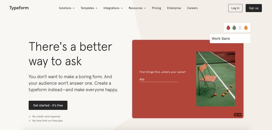
For clear, strong CTAs, take inspiration from Typeform’s site.
When a new lead lands on their homepage, Typeform wants them to sign up for a free trial. The best practices they use to guide users toward that free trial are:
A clear CTA button positioned above the fold
Addressing common user concerns: there's no time limit on their free plan and users don't need a credit card to sign up
Integrating their unique selling proposition (USP) into their homepage: Typeform is a much more enjoyable and interesting survey platform than their competitors because of their relatable brand identity and stand-out graphic design.
Communicating the problem they’re solving: Typeform can help with creating effective and engaging surveys
Pro tip: Hotjar's Observe tools can help you maximize the power of your CTAs and work on conversion rate optimization. For example, Heatmaps tell you exactly where your users are clicking the most and how far they scroll down your web pages so you can make sure to place key CTAs in high-visibility areas.
3. Too many website elements
Design teams often get overly enthusiastic about all the different content they want to include on their site and forget to prioritize clarity. The result? A cluttered user interface (UI) with too many elements, which leads to confused and overwhelmed customers.
A good website lets users navigate intuitively and clearly, without unnecessary clutter. To create a clear and simple browsing experience for your users, avoid too many different fonts and colors, and make sure you don’t have an overload of images, buttons, and media elements competing for attention.
"It’s great to have a fancy page and show off your design talents but when our audience comes to our page, we want them to intuitively know what they are supposed to do. What action do we want them to take with the information on the page? The design should answer that without taking all of our audience’s time."
Here are two of the most effective techniques to streamline your web design:
Incorporate negative space: minimalist sites with plenty of white space are more than just a web design trend. Adding more negative space between elements makes interfaces look cleaner and draws customer attention to your most important content.
Prioritize the most important elements: use product experience (PX) insights tools like Hotjar to zero in on which elements customers focus on the most. Once you know which to prioritize, move or get rid of what isn’t serving your users.
IMDB’s homepage is an example of web design that may confuse users. Their fonts and colors are streamlined, but they have too many different videos and clickable icons front and center. Their menu is also hidden and their search bar is small—all elements that users are likely to click on but are hard to find.
With more negative space and streamlined media elements, the homepage would give users a clearer, more enjoyable experience.

4. Untrustworthy design elements
With more websites on the internet than ever and increasing fears around cybercrime, it’s important to build brand credibility through your website's design.
When users arrive on your website, they need to feel reassured that you are who you say you are and that your business is trustworthy. It’s especially important for newer businesses that aren’t widely used or well-known in their industry to establish credibility.
If users don’t trust your website, they’ll be reluctant to interact and are likely to navigate away. That means fewer leads, higher bounce rates, less traffic, poor SEO rankings, and lower conversion rates.
To create a trustworthy website, avoid the following red flags:
Missing or incomplete contact information: make sure your site has a comprehensive contact information page that includes a physical address and a phone number
Excessive graphics and pop-ups: there’s nothing wrong with pop-ups, but use them sparingly. When users are bombarded with tons of pop-ups and graphics as soon as they land on a site, it can come off as spammy and arouse suspicion.
No SSL certificate: SSL certificates safeguard data and communications, verify site ownership, help prevent cybercrime, and play a critical role in making customers feel safe while interacting with your site
No ‘About Us’ page: customers want to know the story behind your brand and get a glimpse of the real people working behind the scenes. If you don’t have an ‘About Us’ page, users may question your transparency.
Performance issues: for your site to be trustworthy, it has to be consistent and work well. Problems like slow loading times, glitches and bugs, and broken elements all make your brand seem less credible.
5. Not optimizing across different devices
Users view websites on mobile devices almost as much as they do on desktops—meaning your web design needs to work brilliantly on screens of all sizes.
If you don’t prioritize design that’s responsive to both mobile and desktop interfaces, you’ll lose out on traffic, conversions, and sales on one device or the other.
So why does non-responsive design happen? Some designers plan out their site’s desktop design first, then throw together their mobile interface as an afterthought. Others make an effort with their mobile design, but don’t observe user behavior or test it out sufficiently to make sure users can interact with it intuitively and seamlessly.
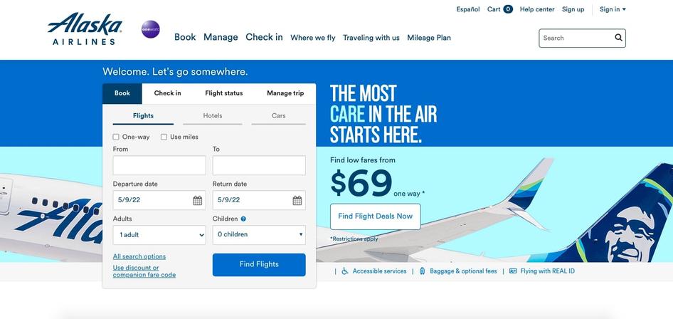
Take the design of Alaska Airlines’ mobile site, for example. Some elements are mobile-friendly: frequently-used pages like check-in, flight booking, and trips & reservations are highlighted, and they’ve enlarged their navigation menu to make it easier to read on a smaller screen.
But Alaska Airlines’ mobile interface (below) doesn’t provide the same quality user experience as their desktop interface.
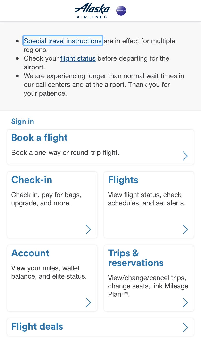
Now, compare their mobile interface with their desktop interface. Alaska Airlines’ desktop site is more dynamic, provides more information, and is generally easier to navigate.
To avoid this mistake, prioritize designing for both desktop and mobile devices from the get-go. Test your finished product out with real customers before you launch, optimize it where necessary, and be open to user feedback once your site is live. By designing for users of different devices, you’ll keep your site user-centered, responsive, and high-performing.
6. Poor accessibility
If your website isn’t accessible and inclusive, you’ll be seriously limiting the group of people who engage with your site. For example, those living with disabilities make up the world’s largest minority at approximately one billion people worldwide.
Without accessible design, you’ll miss out on connecting with a significant user group, potentially lose traffic and conversions, and miss opportunities to create a better UX for all users.
"If we consider a feature like Live Captions, which was created for people who are deaf, it also benefits other people without disabilities as they may use the feature in the case of bad internet connection or loud spaces like airports to take their calls."
To avoid this mistake, here are some tips to make accessibility and inclusivity a part of your design process from the beginning:
Remember to include alt text
Choose large, easy-to-read fonts (minimum of 18px font for paragraph text)
Opt for high-color contrasts
Select imagery and media that showcase diversity
Determine whether your design would be compatible with assistive technologies
Integrate continuous feedback into your site design
Use tools like Accessibility Insights
Test with user groups that include people with disabilities
Though we can't claim to be experts on accessibility at Hotjar and we have work to do to make our own site more inclusive, we’re actively improving. We believe all businesses should prioritize inclusive and accessible design.
Sidestep design mistakes to create a fantastic website
It’s inevitable that you’ll make some mistakes when designing your website. Work with a growth mindset: use your mistakes to learn, grow, and inform future design decisions.
By understanding the most common design blunders, you'll anticipate potential errors and sidestep them in time to produce a site that delights your users.
Give your users a frictionless web experience
Use Hotjar's tools to detect web design mistakes and come up with effective solutions for your users.