Learn / Guides / Web app design process
6 excellent web app design examples for inspiration
Striking the right balance between great aesthetics and strong functionality is tricky when creating web applications. Web apps need to be responsive and highly functional so that users can achieve their goals—but, at the same time, they also need to look good.

This article will walk you through six examples of successful web app design to inspire you and help you create user delight with your own product!
Discover how users experience your web app with Hotjar
Hotjar pinpoints what works and what doesn’t in your design—so you can iterate, optimize, and roll out your web app successfully.

Get inspired with these 6 fantastic web app design examples
Make sure your users have a frictionless experience interacting with features and content on your web application by understanding how these six companies created brilliant web app designs.
1. Vimcar
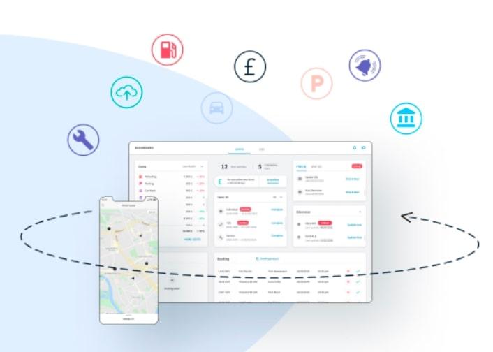
Vimcar is Germany’s top fleet management platform, and they’ve now expanded into both Austria and the United Kingdom, giving fleet managers, owners, and business leaders a 360 view of what’s going on at all times, letting them keep track of drivers, vehicles, and costs.
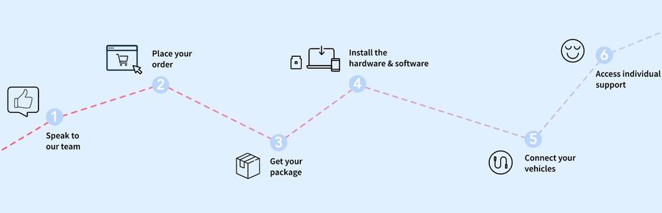
Vimcar anticipates potential questions on its homepage and takes the first steps to guide users through their customer journey. They have a great section on how their software benefits businesses, as well as a handy graphic that shows how the Vimcar setup process works.
Vimcar’s design is based on satisfying user needs. They pinpointed their target audience’s concerns and understood their pain points by using Hotjar's Observe tools like Session Recordings and Heatmaps to identify blockers and where users were getting lost on their site.
Pro tip: make sure potential leads feel informed and empowered after navigating through your homepage. Identify questions your ideal customer persona has with Hotjar's onsite or offsite Surveys and answer these within your web app design.
2. Vinted
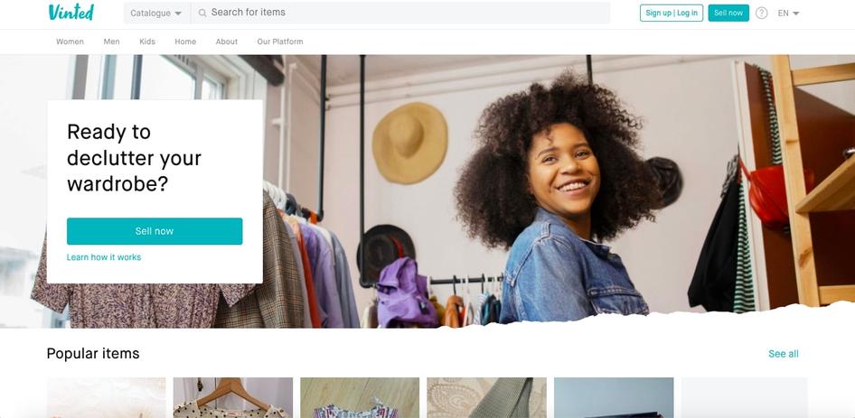
Vinted is an online marketplace where you can buy and sell secondhand and vintage clothing and accessories.
Their web app design does a great job of accounting for both of these user objectives without things getting confusing. They’ve got a great CTA above-the-fold that prompts visitors to either start selling or learn more about how their platform works.
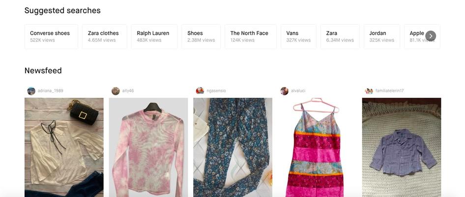
When you scroll down, Vinted shows a selection of currently-for-sale items to engage customers who want to shop, grouping pieces by item popularity, brand, and seller for a more intuitive browsing experience.
Pro tip: if you’re creating a web app where users have multiple possible objectives, keep their different motivations in mind throughout your design. Whether your users have to decide between buying and selling—or something else altogether—be sure they can easily figure out how to accomplish their jobs to be done.
Use Heatmaps to uncover where users are clicking and play around with placement, image links, and button size to see what yields the best results—then go deeper by adding a Survey or Feedback widget to key pages.
3. Reed
Reed.co.uk is one of the largest online career marketplaces in the UK, connecting people with professional opportunities and offering courses and career advice for both recruiters and job seekers.
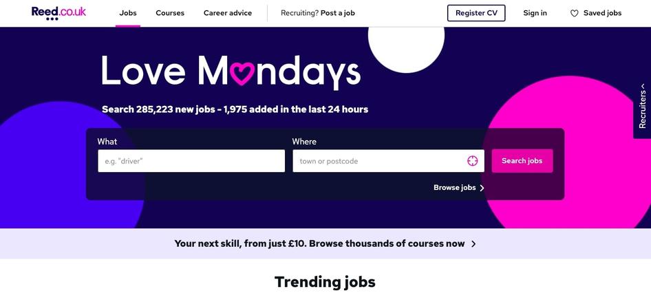
Reed.co.uk’s homepage sets users up for an intuitive browsing experience, allowing them to search for jobs according to industry, location, and whether they’re trending or not.
The Reed.co.uk search results page that pops up next also has a great, clear design that gives job seekers comprehensive information on available positions. They can filter their results by most recent or most relevant, save or hide listings, sign up for alerts, filter search distance, and apply for jobs in just a few clicks.
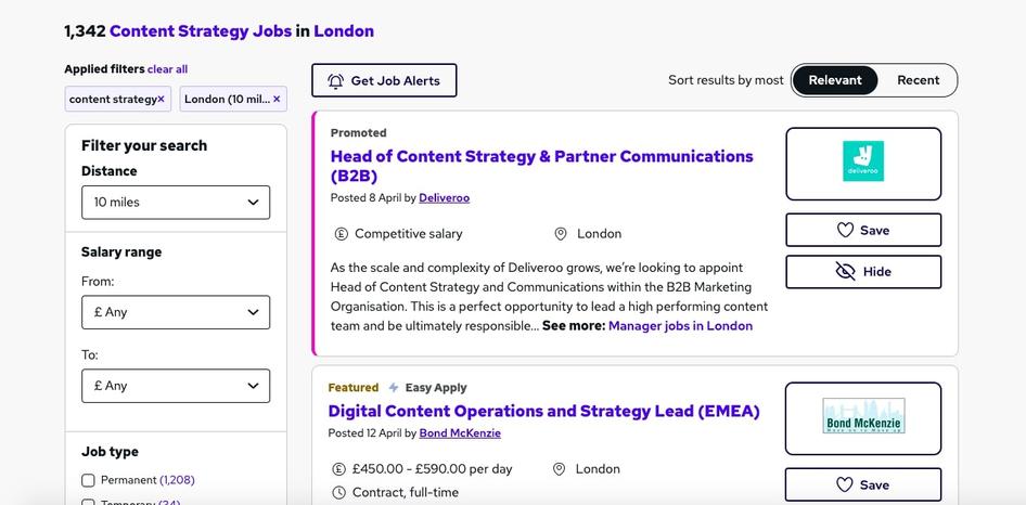
Pro tip: one of the most important web app design best practices is clarity. If you’ve got a web app like a marketplace, streaming service, or ecommerce store that’s got a lot of interactive content, make sure you prioritize navigation and filter functions in your design so users can easily move through tasks.
4. Zencastr
Zencastr is an online podcasting software that allows creators to record and edit their podcasts within the platform itself. It features a free plan, studio-quality sound, HD video recording, automatic post-production, and secured cloud backup.
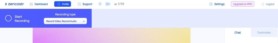
Zencastr’s web app design is fantastic because of its user accessibility and intuitive navigation. It’s clear where users have to click to start recording, choose a recording type, chat with other participants, and ask for support. It also plainly shows users how to navigate back to the initial dashboard in case they get lost.
Great web apps are designed to feel intuitive for their users. It’s best to assume your users have minimal expertise, especially with technical functions like video recording or audio editing. Make it easy for users to get started with minimal onboarding, and use design elements like buttons and information panels to guide them through their customer journey.
Pro tip: to make sure your app stays usable and relevant over time, conduct qualitative and quantitative user research regularly with product experience insights tools like Hotjar. Watch Recordings to see hows users interact with your product in action and continually optimize your web app to deliver the best possible results.
Hotjar Session Recordings help you go deeper into how users experience your product
5. The Plum Guide
The Plum Guide is a luxury vacation rental platform that curates the best of the best listings. Their search engine lets customers browse and book award-winning homes all around the world, also allowing hosts to promote and rent out their properties.
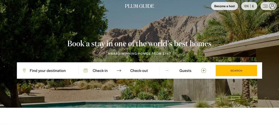
The Plum Guide reflects its high-quality standards with a seamless, highly interactive web app design by:
Including a positive testimonial about their app
Showcasing recognizable publications where they’ve been featured like Conde Nast Traveler, The New York Times, and Forbes
Mentioning that their listed holiday homes are ‘award-winning’ and the ‘world’s best'
Explaining their rigorous vetting process
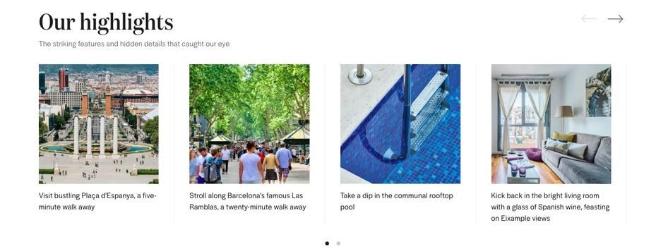
The Plum Guide further establishes user trust with their dynamic listings. As well as describing usual rental information like rules and check-in times, users can browse interactive sections about property highlights and nearby can’t-miss experiences.
Pro tip: build credibility with fast loading times, great usability, professional branding, testimonials, partner pages, and more, always making sure the elements you include are in line with your branding. Hotjar's Heatmaps help you see the most popular credibility-building elements so you can optimize their placement.
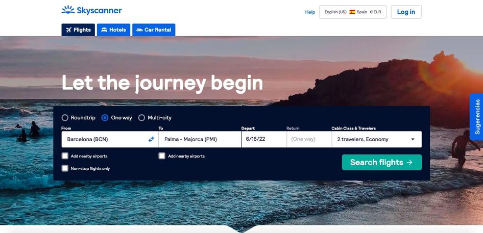
6. Skyscanner
Skyscanner is an online travel agency where people can search for and book flights, reserve hotel stays, and find car rentals. The platform is known for helping travelers find great deals, and its user-friendly interface makes it easy to do so.
Skyscanner’s web app design is simple for users to toggle back and forth between currency and languages; their top menu is clear and easy to navigate; and Skyscanner’s main search bar is front and center.
The app’s interface also looks great on mobile—it’s been optimized for the smaller screen by removing the background image, adding white space, and moving the top menu. These changes make it easier for users to interact with the interface so they can access the features they want.
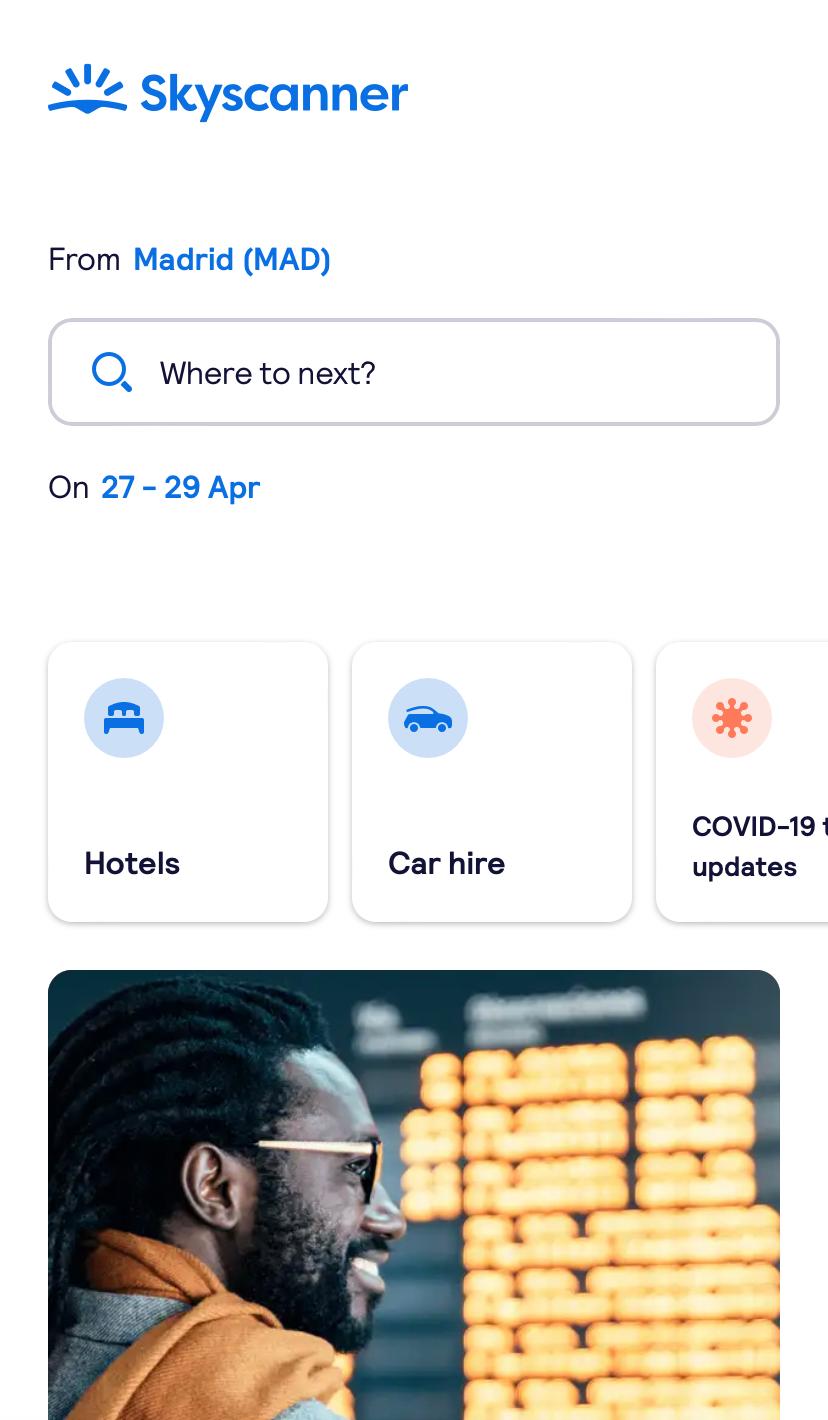
Pro tip: design your web app to look great and work well on devices of all sizes. In 2020, mobile devices drove 61% of visits to American websites. Your web app needs to function just as well on mobile as it does on desktop or you’ll be missing out on a serious number of customers and conversions.
What makes a strong web app design?
There’s no one way to create a strong web application because user needs vary and are sometimes unpredictable, but implementing the following principles will help you shape the process.
Your app should be easy for first-time users to navigate: most web apps that have steep learning curves or require too much teaching simply aren’t designed well. Many new users won’t have the patience to learn how to use them and move on to something else. Make your web app intuitive and accessible, and conduct user testing to validate your ideas.
Your overarching visual design has to be strong: keep the principles of visual consistency, functional consistency, and external consistency in mind and make sure all the different elements work together to create an ideal customer experience.
Make sure your web app is highly responsive: users interact with web apps on different screens like mobile devices, tablets, laptops, and desktop computers. Optimize across multiple devices to create a seamless navigation and interaction experience for your users, and monitor core vitals to ensure your application is responding quickly and smoothly.
Guide users through the navigation experience: new users will need help scrolling and clicking their way through your web app, and you can provide that with great design. A clear top menu, cleverly placed buttons, and usability testing with product experience insights tools like Hotjar will help users quickly get acquainted with your web app.
Be creative, but don’t go overboard: excellent web app designs strike the perfect balance between novelty and simplicity. Provide users with a product they haven’t seen before but feels familiar and manageable at the same time.
‘Creativity’ in app design needs to be applied in clever and subtle ways. Too many colored and moving parts on your screens, and users could get distracted and confused. Keep it simple, work on removing rather than adding, and ask yourself, ‘Is this information/content really useful at this point in this journey?’
Create an effective web app design for your business
While you can draw inspiration and get ideas from the successful examples of web application designs given above, you need to tailor your product to your unique business and user goals.
Understanding your users’ wants, needs, and pain points and creating new iterations until you get your desired results are at the core of creating an effective web app design for your business.
Discover how users experience your web app with Hotjar
Hotjar pinpoints what works and what doesn’t in your design—so you can iterate, optimize, and roll out your web app successfully.