Learn / Guides / Web design guide
11 web design challenges and how to solve them
Strong website design is the path to a great user experience (UX) and improved time-on-page, conversions, and search engine rankings.
But if you don’t address key web design challenges at the right stage in the process, you could end up pouring time and money into a website that doesn’t convert and has to be redesigned.

We've reached out to website experts to understand what the 11 most common web design challenges are, and in this article, we'll help you anticipate and overcome them with several different solutions to create customer delight.
Ready? Let’s dive in.
Design a website that converts users into customers
Hotjar’s tools help teams overcome web design challenges by showing you exactly what users love (and hate) about your site.

11 common website design challenges—and ways to tackle them
Providing a high-quality UX is all about balancing strategic design choices and practical functionality. We’ll talk you through some common challenges that arise in website design—and guide you through the best ways to solve them.
1. Designing for your users
To convert website users into paying customers, you need to know who they are and what they want. But it’s hard to put yourself in their shoes without solid data to validate your assumptions.
"One key challenge is really understanding who the target users are, what their goals are, and in what context your website will be viewed—on mobile, tablet, desktop, laptop, or outside/inside? In a noisy environment? By one person or in collaboration with many users?"
To design an effective site, start by asking who it’s for. Do research to understand what your users want to learn, do, or buy on your site.
For example, customer use cases vary between ecommerce and software-as-a-service (SaaS) websites. Ecommerce users need to navigate through thousands of products—so they’ll want good search capabilities, filtering, comparison tools, and clear information about processes like shipping.
By contrast, SaaS website users are looking to understand a specific product and how it might benefit them, so they’ll need your site to provide in-depth information that establishes trust and includes things like customer testimonials, case studies, or additional information about your team.
Unless you dig deep into who your users are and what they want to know or achieve with your site—their jobs to be done—you’re just second-guessing, which can lead to your site missing the mark when it comes to attracting visitors and converting them into customers.
Here’s how you can solve this planning phase challenge.
Solutions
Conduct qualitative and quantitative research with a focus group that matches your user personas. Collaborative activities might include sketching out designs, which saves time before you start using web design software.
Create buyer personas based on real demographic data in collaboration with cross-functional teams like UX designers, sales, customer success, SEO specialists, and copywriters to get a range of different perspectives on your customers.
Pro tip: validate your website prototype with focus groups and test users as early as possible in the design process. Hotjar's Observe tools—like Surveys—give you granular user feedback that helps you understand how visitors interact with specific elements on your site.
2. Getting the right technical know-how
Building the right team for web design can be a challenge. If you’re starting out with web design, you’ll need to find people with varied skill sets, choose the right tech stack, and decide whether to build from the ground up or use existing frameworks or templates.
For smaller or less experienced teams and web owners, this can all be a bit overwhelming.
Solutions
Think about the skills you’ll need for programming, databases, servers, and web-building tools. Do you have individuals who possess these skills on your team or do you need to source out? If you're going to source out, is it more efficient and cost-effective to hire individual engineers or work with an agency? Either way, get recommendations from others who’ve walked your path.
Use industry forums to connect with web designers or individuals who have built similar projects to see what tech, skills, or templates they needed.
If you’re in a larger company, engage in cross-functional collaboration with other departments to access the skills and knowledge you need for faster, more efficient design.
3. Balancing aesthetics with functionality
An attractive, attention-grabbing design can keep users engaged with your site. But if you prioritize flashy visuals over customer needs, your users will get frustrated trying to understand or navigate your site and are likely to bounce.
It can be tricky to design an attractive site that corresponds with your brand and values, while avoiding showy design choices that negatively affect website readability and usability, like cursive fonts, hand-drawn letters, or excessive symbols.
"The level of marketing noise hounding consumers is fierce. Companies are trying to outdo each other with loud, gimmicky designs, which only leads to miserable outcomes—like defensive, dissatisfied users."
Solutions
Choose visuals that demonstrate your expertise, and present them as a coherent storyline. Think about what users need to understand your website’s story, and keep it as simple as possible.
Prioritize usability by choosing the right page style for your field: ecommerce customers will expect to see products displayed in a grid and grouped by categories like other online sites. Following design conventions like this means users can intuitively find what they need.
Use easy-to-read fonts and have enough white space between paragraphs, text, and images to let the design ‘breathe’
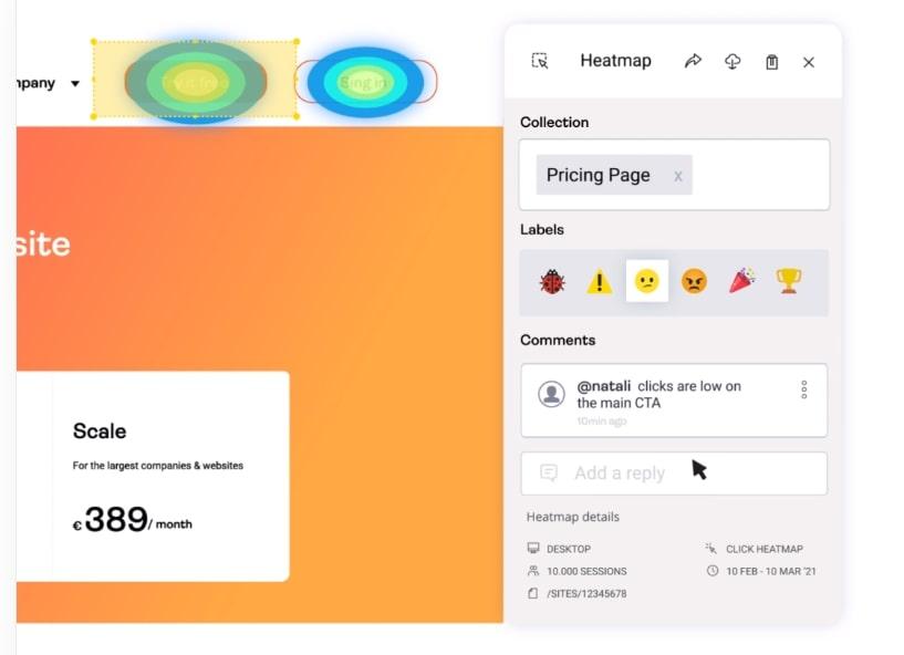
Pro tip: use Hotjar's Observe tools to spot functionality issues on your site. Heatmaps show you whether users are actually clicking on buttons, CTAs, and contact forms. If they’re not, overly busy design could be to blame: watch Recordings to see whether users are navigating clearly or getting confused.
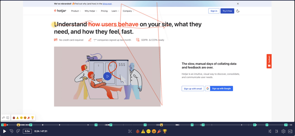
Watch Hotjar Session Recordings to find out if your users are clicking where they're supposed to on your website.
4. Making your site easy to navigate
“If people can't figure out how to get around a website, they’ll leave as soon as they arrive,” says Harry Hughes, CEO and co-founder of Onsiter. “Users are a diverse group of individuals and your website should be simple to navigate for all people. They should be able to quickly locate the information they require, and secondary navigation should be arranged to help people find their way through the website.”
The challenge here is that navigation requires an established structure and order, but varied user needs don’t always follow a logical flow. Companies with large product catalogs or customizable services may find navigation design especially challenging, as overlapping information across the site can overload and confuse users.
Users need to know how to start their journey based on a one-word navigation menu item—so it’s important that you design navigation so they intuitively know where to go.
Solutions
Use simple, descriptive menu names, and categories that are relevant to your brand and products. Follow web design best practices and conventions like using 'About, Services, and Contact' labels so users know what to expect.
Include a search bar, navigation footer, logical internal links, and ‘breadcrumbs’ so users can easily retrace their steps
If you have sales staff, ask them how customers talk about your products so you can make sure your web design speaks to them in their own language
Pro tip: use Hotjar Session Recordings to understand how users navigate your site, where they naturally gravitate to, which pages or elements they avoid, and what causes them to ‘rage click’ when they get blocked in their navigation journey.
5. Balancing functionality and aesthetics with speed
“The balance of speed vs. functionality/content is a challenge that occurs every step of the way, from design to development," says Nick Leffler, the founder of Loclweb, which helps businesses build customized websites.
Attractive images, videos, and animations draw users in and keep them on your page. But too many media elements can decrease your loading speed—which frustrates users and lowers your search engine rankings.
It’s challenging, but essential, to strike a balance—especially for ecommerce sites with a diverse range of products: users may abandon a slow site before browsing all relevant products or completing an order.
"Shoppers expect a high level of functionality, while a site might include third-party services for on-site search, live chat, display advertising, shipping calculations, payment processing, heatmaps, analytics, social media remarketing, hosted web fonts, accessibility, and more. Each piece of functionality increases load time, which can affect usability."
Solutions
Keep your site's design as simple as possible, and only include essential elements. Videos can slow down your website, for example—so only use key videos that help you increase conversion rates.
Make sure your basic information architecture and hierarchy is logical and intuitive before designing the UI
Choose the right third-party tools and incorporate them properly and early on in design. Benchmark other sites using similar systems, and talk to site owners to see what they recommend.
Use fast hosting, good plugins—and a cache tool if you're using WordPress
Use conditional loading so that only essential elements appear on mobile versions of your site. This way, the most important elements load first, rather than overwhelming mobile users with pictures, text, video, etc.
Limit the amount of content on each page
Use clean code to make it easy for web crawlers to quickly understand your site
Compress large files

6. Ensuring accessibility
Elements like complex typefaces, colors, and multimedia elements can make your site hard to understand for users with visual or other impairments.
Websites designed for accessibility help you target a wide range of users—and accessible sites are easier to crawl and index. This boosts your search engine rankings, which increases the probability of even more people finding your website or product.
Solutions
Include a diverse range of users in your focus group
Use accessibility resources from the Design and Develop Overview | Web Accessibility Initiative (WAI) | W3C and Accessibility Insights
Carefully consider potential accessibility issues for each element and tool you want to include
Add ‘alt-text', image descriptions, and transcripts for visually impaired users
Have a clear layout, with headings and labels to organize information
Avoid flashing media elements, which could cause some users to have a negative physical reaction
Use high contrast, accessible color schemes and fonts, and optimal line spacing and font size
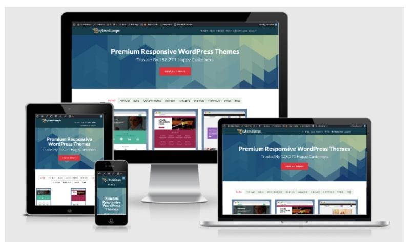
7. Making sure your website works well on all devices
One of the biggest challenges of responsive web design is making sure your site looks good and loads quickly on all browsers and devices.
Users expect a website to work well and look professional on any device. But if images and text are misplaced or distorted on mobile, it can harm your brand's credibillity. And if you don’t plan for responsive design early on, you could end up with expensive retrofits later.
Solutions
Plan your design responsively. Develop wireframes and mockups for multiple devices and three to four key breakpoints (screen widths) before implementation.
Make navigation menus intuitive and self-explanatory on any size screen. They should scale in proportion to screen size, but not look different as this can confuse customers browsing on different devices.
Decide which top-of-page elements are important to display on smaller devices and which can be hidden to avoid overwhelming users. Don’t make your customer scroll down to get to important information.
Use tools like Lighthouse to conduct responsiveness tests on different devices and browsers
Compartmentalize your design in blocks, so you can easily collapse the site into mobile view
Check if the media types you’re using are compatible with all browsers
If you’re a smaller business or solopreneurs without technical expertise, get input from specialists to determine the right platform and responsive theme for you
8. Creating a website that converts
There’s no point in having a beautiful design it if it doesn’t convert—and retain—users.
Many websites fail when it comes to conversion rate optimization because:
Teams didn’t consider user needs at the design stage
The copy is all about the company, rather than what users want to know
CTAs aren’t clear or well placed
Thinking about what makes users convert requires deeply understanding your users, which can be a challenge.
Solutions
Get to know your audience to understand what they want from your site. Then, create relevant, user-centered content that builds trust and keeps them browsing.
Balance text and images, and keep your text short
Use high quality, relevant graphics—especially for the header image—that match your content and brand colors, so users have a coherent experience, helping you build trust with your brand. Well-placed graphics can also replace or break up text, which makes your site more scannable and easy to read.
Use professional photos with real people, rather than generic stock images, as these are more convincing and build credibility. If budget is an issue, try free sites like Unsplash.
Create targeted landing pages to capture high-intent traffic
Pay attention to on- and off-page SEO (keyword density, word count, time-on-page), and use well-written code. Use Google Lighthouse to check metrics like responsiveness, SEO, accessibility, and performance, and get suggestions for improvements.
Integrate social media and other tools to drive traffic to your site
Include prominent, well-placed CTAs across your site
Pro tip: Use Hotjar Heatmaps to check whether users are actually clicking on your CTAs. If not, you can make quick fixes, like repositioning them or tweaking their design to stand out more against the background, without needing to redesign the whole page.

Heatmaps show you an intuitive aggregated view of which parts of your site are attracting attention and which aren’t to help you make changes that improve UX
9. Scalable design
Designing a site that’s flexible enough to grow with your business and audience is a major challenge. You might start out as a blog and end up as an ecommerce site, but unless that’s your plan from the outset, how do you design a site that can cope?
Getting more users as you grow affects performance and speed. Processing more user transitions makes your site work harder, and it’s also more difficult to update data and display information in real-time. For ecommerce sites with constantly changing inventory, this is a huge challenge.
Solutions
Consider your long term goals when planning your site. Do you plan to add more revenue streams in the future? What elements will you need on your site to make that work?
Ensure your servers can handle several simultaneous requests to reduce performance issues.
Distribute site traffic across different servers to spread the load at peak times
10. Keeping data secure
Watertight website security is a must to comply with data protection legislation and earn your users’ trust. This becomes even more important if you’re collecting credit card information, contact details, and sensitive or personal user data. But even non-transactional sites can be hacked and used to send malware to users.
The prevalence of hacking, phishing, bugs, and viruses mean you need to rise to the challenge of keeping your site up to date with the latest security measures.
Solutions
Use a secure web host with server-side firewalls, encryption, antivirus, anti-malware software, on-site security systems, SSL certificate, and CDN availability
Use two-factor authentication to safeguard user accounts, and plugins to limit log-in attempts
Mandate strong passwords with numbers and symbols
Regularly update your operating system and patch the framework
Make it easy for users to find your website’s privacy policy, which builds trust
11. Managing stakeholder expectations
Whether you’re a design agency, an internal team in a large organization, or a small business owner, you’ll need input from various stakeholders as you design your site.
But you know what they say about too many cooks in the kitchen…
When several different people are involved, communicating why you want to do things a certain way can be extremely challenging. Other teams may not understand the purpose of your website or want to add features or functionality that they think might negatively impact UX.
If you don’t align business goals with your website's vision and get stakeholder buy-in, you risk your design being diluted or changed. In the worst cases, you could face delays, increased costs, disagreements, or even project cancellations.
Solutions
Set a clear plan from the outset and stick to it. If you’re a designer working with external clients, include clauses in your contract to provide for changes of direction. Explain to clients or bosses how new additions or changes will affect your website performance, project timelines, and budget.
Create specific, quantifiable business objectives, like growing sales by X percent or obtaining Y new clients. List the features you’ll need to achieve each goal. Which can you implement now, and which will have to wait?
Keep the design and project specifications as simple as possible, while making sure they'll help you achieve your goals
Pro tip: use Hotjar Highlights to sort and curate website and user insights and share them with stakeholders as you demonstrate how each design decision will impact your users so you can get buy-in and keep different teams aligned around customer needs.
Highlights let you save and share the most convincing product experience insights with the rest of your team.
…and launch!
Web design challenges will occur at every stage of the process—from conception to launch and beyond.
As Holly Burleson, senior UI developer at Copart, says, “For every piece of functionality added, there’s a tradeoff for site speed. For every paragraph dedicated to SEO, an experience tradeoff. For every flashy 'buy now' button, a branding tradeoff, and so on.”
The key challenge for website owners is to find a happy medium by prioritizing customer delight above all else. Put users front and center when designing your site and you’ll be on the road to success.
Design a website that converts users into customers
Hotjar’s tools help teams overcome web design challenges by showing you exactly what users love (and hate) about your site.