Learn / Blog / Article
How to improve UX to ramp up your website conversions
When you want to improve your conversions, the secret is simple: focus on the user experience. You’ll hit your goals when you solve real problems for users and deliver a helpful, enjoyable, and friction-free website experience.


But what do your unique audiences need from your website—and what does a great user experience look like for them? Let’s explore the art and science of UX design, and how it helps you answer these difficult questions.
Conversion optimization, without the guesswork
With tools like Recordings, Heatmaps, and Surveys, Hotjar helps you get the data you need to optimize your site based on user insights.

What businesses get wrong about conversion rate optimization (CRO)
Every online business wants more conversions and the profit that comes with them. But only focusing on the end result of ‘increased conversions’, and not the reasons why these numbers fluctuate, puts you at risk of making the wrong moves. If you cut all your prices in half, your conversions would probably go through the roof—but it wouldn’t help your business grow.
So here at Hotjar, we don’t recommend focusing on CRO ‘hacks’ or viewing conversions as an arbitrary number to increase at all costs. Instead, think of conversions as the result of creating the easiest possible journey for users to get what they desire and need.
The link between UX and CRO 🔗
The activities you would do to improve conversions actually relate to improving the user experience.
As Scott Johnsen, Head of Design at Alto, says, “UX is a process of deeply understanding the user's needs and objectives, identifying where their greatest problems exist, and working generatively to ideate ways to solve these problems.”
In the context of websites, that translates to
Understanding user needs, pains, and buying journeys
Crafting products and services to solve unmet needs and desires
Creating a buying journey that’s frictionless and intuitive, and gives users confidence when making decisions
The 7 attributes of good UX design
According to designer and information architect Peter Morville, good UX means creating website content that is
👍 Useful: your website should solve problems and help users achieve their goals, from finding information to buying the right products.
🛠 Usable: visitors should be able to use your website intuitively, with minimal friction from page design or site errors.
🔎 Findable: visitors should easily be able to locate your website and navigate your content.
✅ Credible: your website must convey that your product, service, or expertise is trustworthy.
⭐️ Accessible: your site should work on different browsers and devices, and must be accessible to all users.
❤️ Desirable: your site must convey an image, identity, and brand that evoke a positive emotional response from users.
💰 Valuable: your website must deliver value to users, helping them make money, feel good, or advance toward an important goal
Every website will need a different balance—for example, for a high-end fashion website, it’s more important to be desirable than useful. But keep these seven factors in mind when assessing your own UX.
5 ways to improve your UX and boost conversions
Here are some of the main ways you can put the above UX principles into practice when improving your website.
1. Build trust
Your website (probably) asks users to spend money with you: that requires trust. And depending on your business, there may be ‘hidden’ costs of using your service, such as the effort required to set up your solution.
With this in mind, you need to tick the ‘credible’ box and show users they can trust you to deliver what you promise.
Use trust signals on your website
Trust signals are visual elements on your site that demonstrate authority, professionalism, or an association with other trustworthy providers. They also show you’re a genuine company with a healthy customer base.
They can include
Reviews and testimonials
Customer logos
Payment partner logos (like the Visa and Mastercard logos)
Security information and logos
Return and refund policies
Pictures of your team and premises
Social media links
Companies often pay a lot of attention to trust signals on the homepage and neglect them for the rest of the user journey. They need to be present on every page—what if a user doesn’t land on your homepage? They will miss these reassuring signals that are so important.
Empathize with their problems and desires
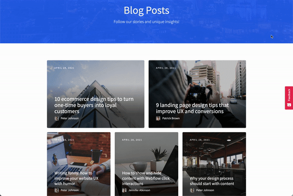
Your users want to know you’re an expert in their space, and your website should demonstrate that you understand their world. Notice how the Lighter Side of Real Estate website discusses problems that only an industry insider would know about.
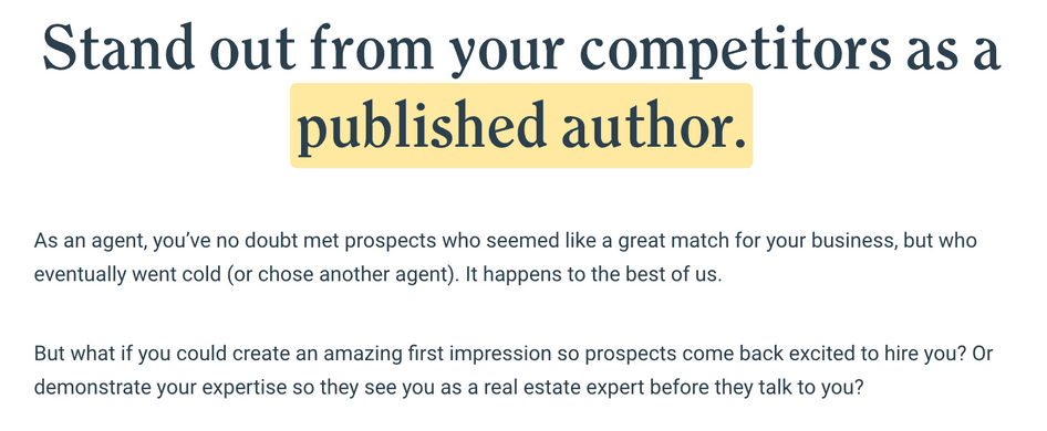
The Lighter Side of Real Estate website shows a keen understanding of its audience
However, empathizing with users isn’t something you can fake. To increase your credibility, research your users’ problems and perspectives with focus groups, user interviews, and usability tests.
Once you understand your users’ worlds more, you can
Adapt your website copywriting, so it reflects their problems, perspectives, and language
Optimize your product or service and guarantees to solve user pain points
Create informational content demonstrating your expertise in areas where visitors need help
👉 Check out our guide to UX research to learn more.
🔥 If you’re using Hotjar
Use Hotjar Engage to host user interviews and usability tests directly inside Hotjar. Engage gives you an automated transcription of every conversation, plus the ability to create video highlights to share with colleagues.
Engage also lets you recruit interviewees from our pool of 200,000+ participants. But if you already have participants in mind, you can invite them directly to Engage with a single link.
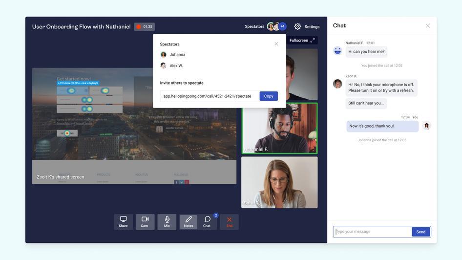
Engage lets you host user interviews with ‘invisible’ spectators from your team
Remove issues that reduce credibility
Just as a well-designed website can improve credibility, sloppy website design or copywriting will work against you. Inspect your website carefully, and be sure to
Remove spelling and grammar errors and typos
Fix copywriting mistakes (such as jargon that doesn’t match your audience’s sophistication level)
Ensure your blog and social media channels have been updated recently with high-quality content
Check internal and external links are working properly
Rectify website bugs and display issues (we’ll talk more about this later)
2. Create engaging and intuitive visual hierarchies
When optimizing your website, it can be tempting to invest in impressive, creative website design to ‘wow’ users. While there’s a time and a place for originality in marketing, familiar designs are usually what users find most intuitive (and therefore more usable).
This is particularly true in SaaS or ecommerce, where customers will be used to the ‘standard’ feel of websites.
But even if you opt for a typical website design, it’s important to continually assess how usable and findable your content is for visitors. For example:
Are your pages the right length?
Is it easy for users to find important call-to-action (CTA) buttons?
Can users easily navigate to key pages from your home page or sub-menus?
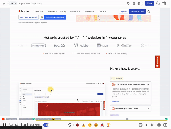
Use heatmaps to assess how users experience individual pages
The Hotjar Heatmaps tool reveals how users behave on an individual page by showing where they scroll, click (or tap), and move their mouses to. There are multiple ways to use heatmaps to improve UX.
Scroll heatmaps show how far down a page most of your users scroll, so you can assess your page hierarchy’s effectiveness. They look like this:
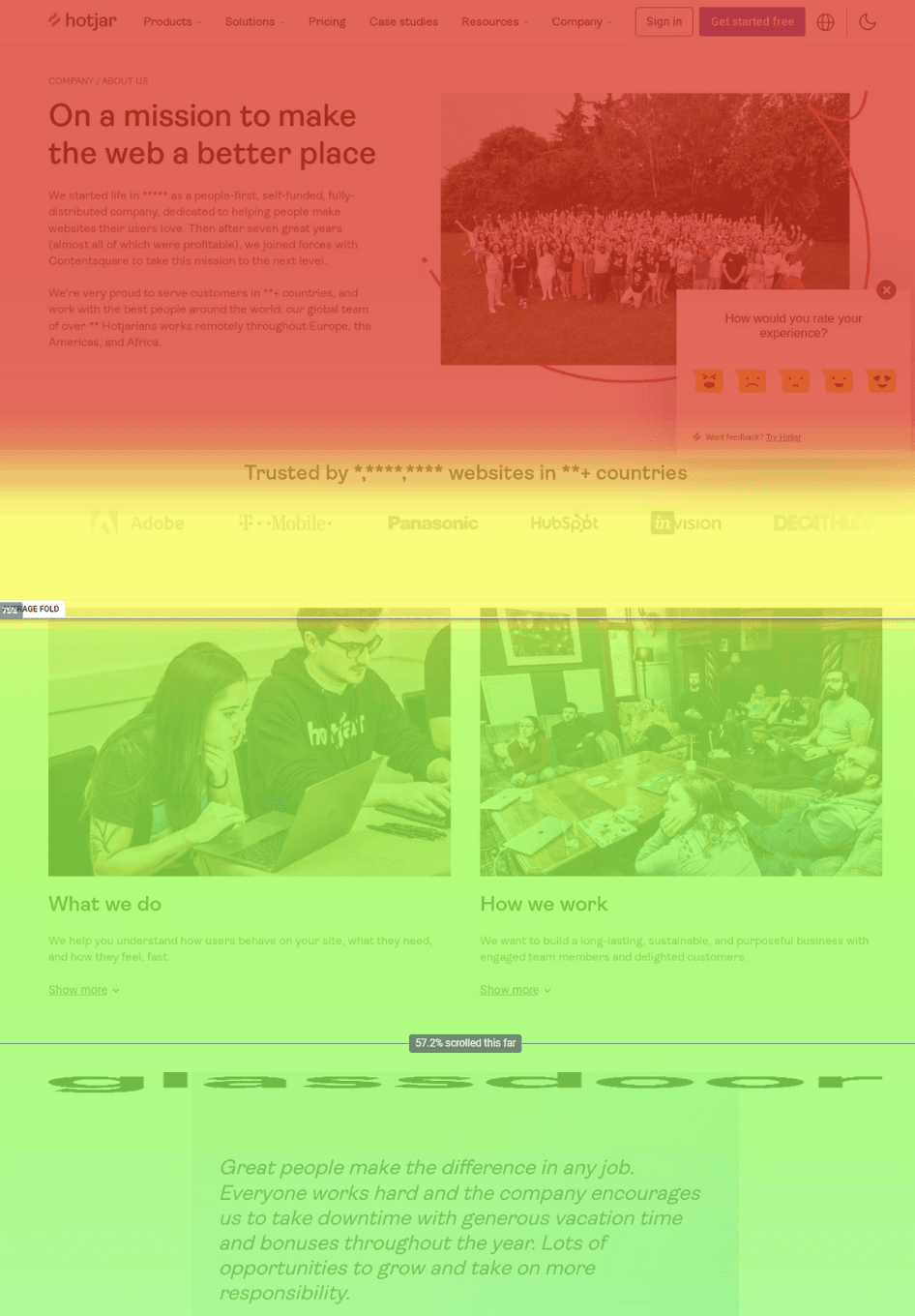
Analyze scroll maps to check whether users see important content like ‘buy now’ buttons
But there’s lots more you can learn from heatmaps. For example, Hotjar’s Engagement Zones maps combine data from all three types of heatmap: clicks (or taps on mobile), scrolls, and mouse movement.
By reviewing engagement zones, you can see which areas of the page get the most total engagement. This is ideal for understanding what grabs users’ attention—and whether anything is distracting them from important page elements.
Get feedback on what users love and hate about your design
When you want to know whether your design works for users, why not ask them? Hotjar Feedback is a widget users can click on to share their comments about your site. (See that red button on the right of your screen now? That’s the feedback widget!)
The feedback widget invites users to give your page a quick rating on a five-point scale. It can also allow users to highlight specific design elements and write comments about them.
Of course, users can’t tell you what to change about your UX—that’s for you to work out. But their feedback can be supremely helpful in finding broken or poorly functioning on-page elements to optimize for a better UX.
3. Help users achieve their goals
Users browsing your site have numerous goals throughout their journey, which we could break down into two categories.
Macro goal: this is the overall problem they are trying to solve, like ‘get a new qualification to help further my career’.
Micro goals: these are the smaller goals they are trying to achieve on individual journeys—like ‘find out how this programming course compares to others by similar providers’.
By understanding users' overall goals and micro goals at each step of their journey, you can tailor your site's UX to their needs.
Understand your users’ jobs-to-be-done
Jobs-to-be done (JTBD) is a research framework to better understand your users’ macro goals. Unlike traditional marketing, which focuses on personas and shared characteristics, jobs-to-be-done researches why people want a product, and what specific outcomes they need from it.
While jobs-to-be-done is mainly used in product development, it can help you refine your website UX too. Conduct user interviews while following the jobs-to-be-done framework to learn what users’ most important goals are—then build your product, navigation, and site copy around them.
Map out your customer journeys
Create a customer journey map that details the actions your users take before, during, and after their time on your website. Use it to define your users’ goals at each stage of the journey.
If you’ve already conducted jobs-to-be-done interviews, you should have some idea of how your customers find and use products. However, you may need to do additional research to understand the paths that users take and the goals they have along the way.
🔥 If you’re using Hotjar
Launch pop-up surveys for more insights on what your users want to do on each page. Choose from our ready-made survey templates—or get Hotjar AI to write your questions, summarize the responses, and give you a list of actionable next steps. 🤖
Audit each page for usability
Now that you’ve mapped out your customer journey, take a look at how each part of your website supports users in reaching their goals.
Could additional information help them make decisions?
Is there any (potentially distracting) content that doesn’t support the users’ goals?
Could you restructure content to help users reach their goals faster—for example, by moving or enlarging key CTA buttons?
Optimize your website navigation
Site menus and navigation bars are often neglected, but they play a huge role in helping your users achieve their goals. Follow these tips to improve them:
Use the Next Page Path report in Google Analytics (now GA4) to learn which pages visitors most commonly navigate to from your home and category pages
Check click maps to see which items in your menu get the most and least clicks
Re-order your menu bars and sub-menus to help users find priority pages
Ensure your primary menu bar has fewer than eight links
Use simple, goal-focused menu labels (no creative copy here)
👉 For more tips, read our full guide on how to optimize your site’s menu layout
4. Find and reduce friction
Friction is anything that prevents or slows down your users from finding what they need on your website. It can come in many forms, such as
Broken links
Poorly displaying page elements
Slow-loading pages
Confusing copy or page layout
A lack of guidance
By removing friction on your site, you give users a far easier journey toward their goals—which means better UX and more conversions.
Identity problem pages
Start by finding the parts of your site that show the biggest signs of friction. This could include
Pages visitors frequently visit just before contacting customer support
Pages where visitors often submit negative feedback
Pages where you recently saw a drop in conversions
Pages with an unusually high exit rate
Naturally, you’d expect users to leave after visiting something like a ‘Contact us’ page. But if your product pages, checkout pages, or other conversion-focused pages have an unusually high exit rate, take a closer look to address friction.
🔥 If you’re using Hotjar
Funnels is a Hotjar tool that visualizes key pages in your conversion path, showing you how many users leave at each stage. Use it to identify the worst-performing parts of your funnels—then look at heatmaps and recordings to learn why users drop off.
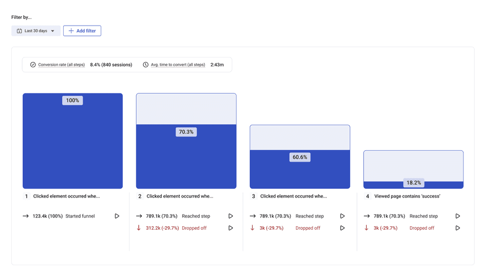
When viewing funnels, click the ‘play’ icon to view Hotjar recordings and heatmaps for each specific page
Check where users rage click
‘Rage clicks’ refer to instances of users repeatedly clicking in the same place over a short time period. This usually indicates that something isn’t working—like a faulty form, or a non-clickable element that looks a little too clickable.
Some UX analytics tools (like Hotjar) detect track rage clicks so you can home in on parts of your page that cause frustration. From your Hotjar dashboard, generate a rage click map to see which page elements get the most aggravated clicking.
Identify sources of friction
Next, you’ll want to analyze individual pages and page elements where problems occur. There are two easy ways to do this:
Visit the page yourself and look for page elements that aren’t functioning
View recordings from the page to replay individual user journeys
Hotjar’s session recordings show you exactly what each user saw in real time, helping you discover issues that only occur on certain devices or browsers.
💡 Pro tip: find the most relevant recordings faster by checking the frustration score. Hotjar computes the score by looking at a number of ‘friction signals’—like users rage clicking or leaving negative feedback.
You can also filter your recordings to see journeys of users exiting from a specific page.
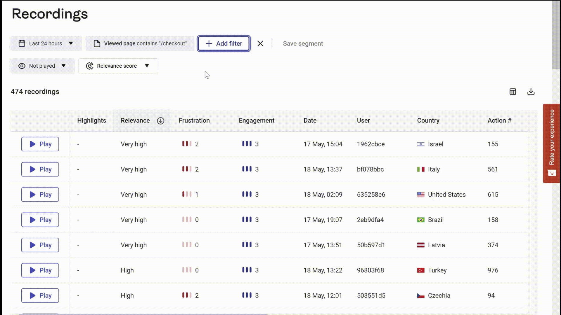
Filter your recordings to see sessions of frustrated users
Find out if the same friction occurs elsewhere
Sometimes, the issues and errors you find are one-off incidents. Other times, they’re a repeated problem that affects several users.
See which category each issue falls into by looking for patterns. For example, if a user couldn’t add a product to their shopping cart, check if the same problem occurs on other product pages.
🔎 Find patterns faster
Hotjar’s multi-product platform makes it easy to access additional data related to any specific issue you find.
For example, if your rage click heatmap reveals frustrated clicks or taps on a product page, ‘zoom out’ of this issue and see the bigger picture by using Trends to check whether rage clicks on that page have increased over time.
Get issues fixed quickly
Solving bugs and issues can often fix conversion drops overnight, so talk to your design and development teams as soon as you identify a problem. Be sure to forward any information that might be helpful, such as related recordings or customer support tickets.
💭 Did you know? Hotjar’s Jira integration lets you log issues with your development team directly from your Recordings dashboard. When you identify a console error, send a clip of it to Jira with just a few clicks.
5. Make your website accessible for all users
One of the seven principles of UX is that content must be accessible across all devices and browsers. And while most companies test their website designs on mobile, there are often bugs and issues your testers won’t spot initially.
Additionally, mobile and tablet browsing is fundamentally different from desktop browsing. Creating a fantastic user experience on mobile is often an ongoing process that requires improvement based on user feedback.
Ensure your website is responsive
Google has a free tool you can use to check your page performance on mobile. Pop your URL into the Mobile-Friendly Test for a quick assessment of your site and a preview of how it looks on mobile.
Update page elements that don’t work well on mobile
Even if your page is responsive on mobile, be wary of small UX elements that are often overlooked on mobile websites. Some examples:
Non-optimized pop-ups can be hard to close or interact with
Auto-playing media can be intrusive while using excessive data
Long drop-down menus may not display well on mobile
Look for opportunities to create a better UX on mobile
Conversions aren’t the only indicator of how well your site works on mobile. Gather data to learn more about how users experience your mobile site:
Recordings show you how your website appears on different devices. From your Recordings dashboard, simply add filters for the devices and browsers you’re interested in to bring up relevant data.
Heatmaps reveal how mobile users interact with important page elements, like call-to-action buttons, menus, forms, and information resources. Scroll heatmaps can also identify whether mobile users are viewing important content.
Usability testing on mobile devices can help you determine if the page is intuitive and easily navigable for your audience.
👉 Read our full guide to solving mobile usability issues
Hotjar and Time4Sleep: rousing new conversions on a mobile store
Time4Sleep is an ecommerce retailer that sells quality beds and mattresses at discount prices. Looking to improve its mobile conversions, it hired conversion rate optimization agency Epiphany to conduct research.
Reviewing a range of analytics and UX data, Epiphany uncovered several valuable insights:
Web analytics revealed users bouncing back and forth between category and product pages before leaving
Survey results showed visitors having difficulties identifying which frames and mattresses were right for them
Heatmaps revealed visitors were not clicking on Time4Sleep’s bed-buying guides, which were harder to see on mobile
Epiphany hypothesized that users were being held back because they couldn’t see the buying guides and had too many unanswered questions.
To solve this, Epiphany tested two new page variants with improved navigation elements and prominent links to the buying guides.
The result? A 63% increase in mobile conversions, and a 19% overall increase in conversions—the kind of improvements we all want to wake up to!
Effective UX design starts with getting to know your users
UX and conversion rate optimization go hand-in-hand for good reason: they’re both about putting the user at the center of what you do. Whatever your business provides for your customers, good UX will help you meet their needs better while providing a faster and more satisfying journey for them.
But you can’t do any of these things without getting to know your user (and their perspectives) better. So when you want to improve conversions, equip your team with tools that provide a complete, 360-degree view of your users. With the right data, you can eliminate guesswork and create the experiences you just know your users need.
Deep user insights from a single platform
Hotjar combines advanced analytics with voice-of-the-customer tools to give you a complete picture of your users and their needs.
FAQs about improving UX to increase conversions
Related articles

CRO
7 stats that prove user-centric websites win for mid-market companies in 2024 (with tips on how to improve UX)
Is your website user experience holding you back? Don’t rely on guesswork and gut feeling alone: use data to elevate your UX and enhance your bottom line.

Shadz Loresco
CRO
7 stats that prove user-centric websites win in 2024 (with tips on how to improve UX)
Is your website user experience holding you back? Don’t rely on guesswork and gut feeling alone: use data to elevate your UX and enhance your bottom line.
Shadz Loresco

CRO
How to improve your online reputation to acquire more users and customers
A good online reputation inspires your users to share positive reviews that make your business more trustworthy in the eyes of potential customers, and, in turn, increases sales.
But it takes more than a good product to build and maintain an effective online presence. You have to actively listen to customers to understand how they feel and make changes to improve the user experience (UX).

Hotjar team