Learn / Blog / Article
How can I optimize the menu layout on my website?
Creating an intuitive, easily navigable website makes a huge difference to your user experience—and your sales. But while most website owners understand the value of optimizing their site structure and page design, many overlook a key factor: the menu.


Your menu layout contributes to one of your users’ most fundamental goals: finding the products or services they need. By optimizing your menu layout, you make it easier for visitors to move forward in their journeys.
Your menu also impacts your ranking—search engines analyze the links on your web pages and use them as a factor in determining how user-friendly your site is. Plus, well-structured linking in your menu helps search engine bots crawl your site effectively.
So many stellar benefits! But how do you optimize your menu layout for the best results? Let’s find out.
Get the insights you need to optimize user journeys
With tools like Heatmaps, Recordings, and Surveys, Hotjar gives you a close-up view of what users do on your website.

How to optimize your menu layout in 6 steps
Website menus might seem simple, but they’re often built with sophisticated UX design principles and optimized via user research and testing.
Follow these steps to ensure your menu meets modern web design standards and helps users achieve their goals.
1. Start gathering useful data
Optimizing your menu can positively affect your website’s selling power, but if you get it wrong, it could have the opposite result. That’s why it makes sense to base your optimization efforts on data (especially if your website’s already live).
Start gathering data with the following tools and methods so you can run a full analysis in future steps:
Usability testing
Even if your site’s not yet live, you can gain invaluable user feedback by conducting usability tests. This involves asking participants to complete tasks on your website—like navigating to a specific page—and observing their journeys.
Usability tests reveal how easily users find and use your menus, and where they get stuck. You can also follow up each test with an interview to get feedback on how the user experienced your menu.
🔥 If you’re using Hotjar
Hotjar Engage helps you host, record, and analyze user interviews. Recruit test participants from our pool of 175,000+ people (or invite your own users to the platform), then use Engage to transcribe interviews and share notes with your team.
Heatmaps
Heatmaps show you handy visualizations of where users click, scroll, and move their mouses to—or, on mobile devices, where they scroll, tap, and pinch.
If your site is already live, set up heatmaps to start gathering data. You’ll see which parts of your menu get the most interaction and which links users click most.
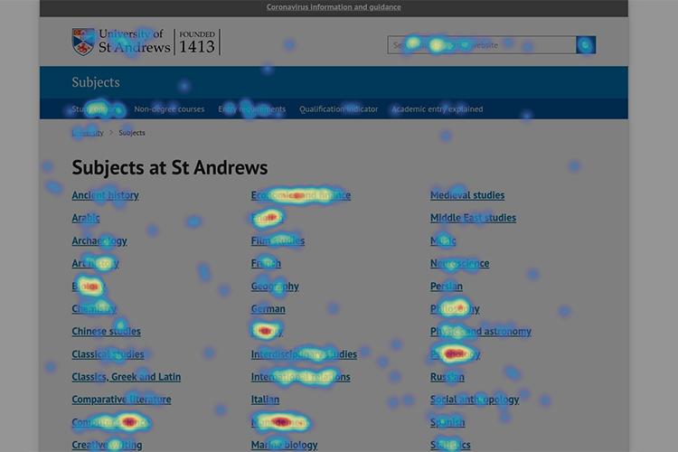
The University of St. Andrews uses Hotjar to see which navigation elements get clicked on most by its users
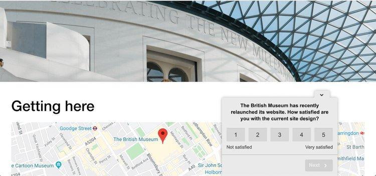
Surveys
Surveys let you ask site visitors quick questions, so you can get feedback from the people who matter most. Simply asking users, “What do you think about our menu bar?” or “What would you change about our menu layout?” reveals plenty.
You could even ask visitors to rate your menu on a scale of one to five, then use a follow-up question to ask them why they rated it that way.
Set surveys up to appear on pages other than your homepage, so you ask people who have navigated through your site for feedback.
Recordings
Recordings let you watch a video-style replay of an individual user’s journey through your site. You see everything they did—including where they clicked, when they hesitated, and how they moved from page to page.
When optimizing menus, watch what users do before and after clicking menu links. If users frequently get lost or backtrack, there could be a problem with your menu.
When you start watching Hotjar recordings you’ll think, “Surely this user will complete the action!” But once you’ve seen 20 people make the same mistake, you know the problem is with your site, not the users.
2. Determine which pages on your site are most important to users
First and foremost, your menu must help users find the pages that are most important to them. Your menu structure should therefore prioritize the most popular links, both in visibility and sequence.
To learn which pages are most important, check your website data from a traditional analytics platform such as Google Analytics. Use the following process:
In the menu, navigate to Behavior > Site Content > All Pages.
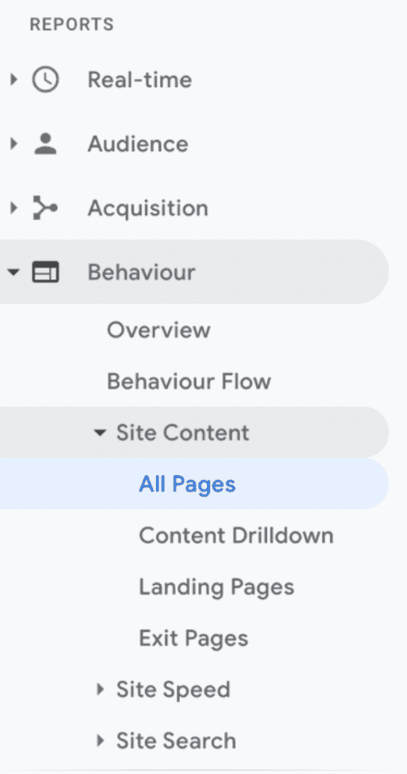
On the next screen, click ‘Navigation Summary’.
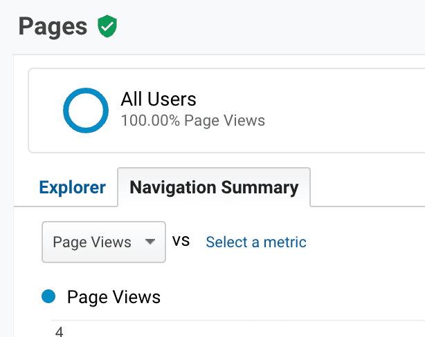
Adjust the date range to your preference and look at the readout under ‘Next Page Path’. This will show the most popular pages users navigate to after your homepage.
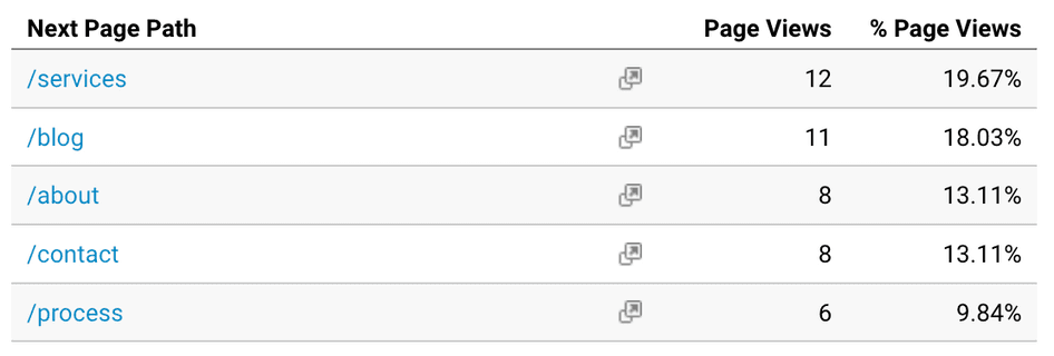
This report gives you a quick overview of which pages are most important to visitors.
👆However, a quick caveat: this report will be greatly influenced by links that are currently on your homepage. If a page isn’t linked there, obviously, users won’t navigate to it.
For this reason, you might also want to look at the same report for pages other than your homepage—for example, sub-category pages that link to other pages.
Website menus, just like everything else in digital, should be optimized based on performance data.
If you create a Path Exploration in GA4 to see where people go from your homepage, you'll know the click-through rate of every link.
If important links are getting skipped, try a new label. Or make them more visually prominent. Or remove other lower-value items nearby.
3. Analyze your data
Here’s the part where you do a bit of detective work and extract insights from the data you’ve gathered so far.
Review your Google Analytics data
Were there any surprises in your Next Page Path data? Are people frequently visiting pages that aren’t given prominence in your menu? Take note of the bounce rate from your homepage, too, as this can help you identify problems with navigation.
Cross-reference this data with your heatmaps
While Next Page Path reports are helpful, they don’t differentiate between users clicking on your menu bar and other links on your homepage. Check your heatmaps to see which menu links got the most and least clicks.
💡 Pro tip: learn more about your menus with Hotjar Heatmaps.
Most heatmap tools give you the choice of looking at move, scroll, or click heatmaps. Hotjar Heatmaps combine all three in engagement zones, helping you get a well-rounded view of engagement with your menu.
If your website uses expanding or drop-down menus, some heatmap tools won’t display the menu properly when you review data. But with Hotjar’s Heatmap retaker, you can instantly create new snapshots that accurately show your page and menu design.
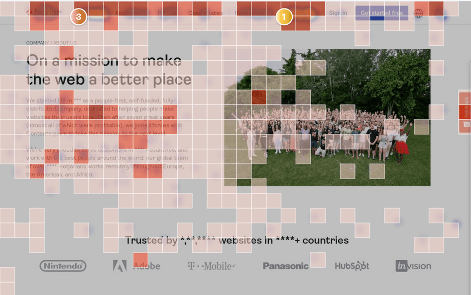
Engagement zones help you discover new insights, like areas of your page that may not get clicks but retain people’s attention
Look for patterns in your recordings and usability tests
Observe how users interact with your menu: do they find the pages they’re looking for quickly? Do they get stuck, hesitate, or return to the menu after navigating to a page? Note down any trends in behavior.
Get more insights from your survey and interview data
By now, you should have found some patterns in how users interact with your menu. Dive into your survey and interview data to learn why users act the way they do. As before, note any trends in their responses.
4. Identify any problems with your current menu layout
Signs of a problematic menu include:
A high bounce rate (50%+) from your homepage, suggesting visitors can’t find what they need
Popular pages not being present in your menu (or being present, but rarely clicked)
Menus with multiple layers of sub-categories not receiving clicks in deeper layers
Menus getting fewer clicks on mobile
Users struggling to find what they need in usability tests
Users reporting directly that your menu gave them a less-than-stellar experience
To investigate these issues further, evaluate the following aspects of your menu:
Order and quantity of links
Some UX designers believe your most important, popular links should appear either first or last, with less-important links in the middle. This is because of the primacy and recency effect: the human brain retains information in these positions better.
If users struggle to navigate your menu, it might be that you simply have too many distracting sub-categories. Check your heatmaps to see which categories and links users click—and consider removing ones they ignore.
Menu structure
As a general rule (well, two):
Your primary menu—usually the horizontal menu bar—should have fewer than eight links.
If you need to direct users to more pages than this, add drop-down menus and secondary menus with sub-categories.
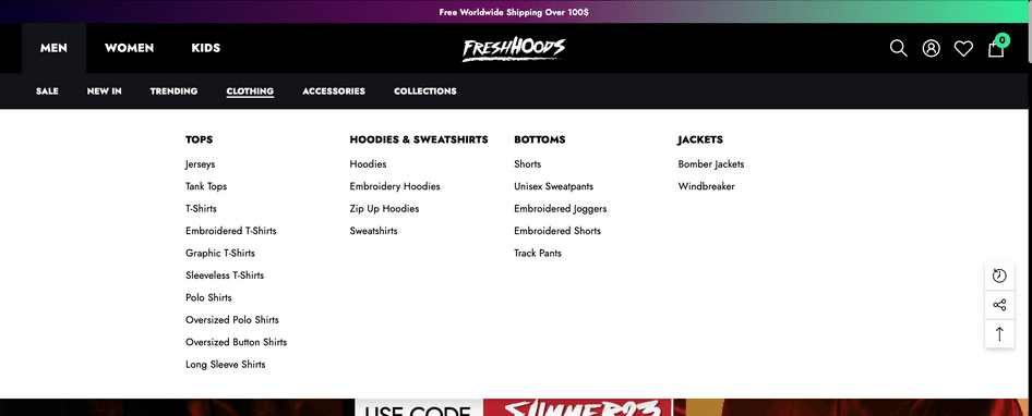
On Freshhoods.com, hovering over a main menu item triggers a drop-down menu with multiple sub-categories
The more sub-categories and links in your menu, the more careful you need to be with its structure. Ensure your categories unfold in a way that is intuitive to users, or you risk confusing them.
One of the best ways you can evaluate whether users understand your menu layout is with tree testing.
🌲 What is tree testing?
Tree testing is a usability testing method that helps to evaluate your site’s architecture and menu layout.
Participants are shown a basic version of the website’s menu (i.e. just words with no graphics)
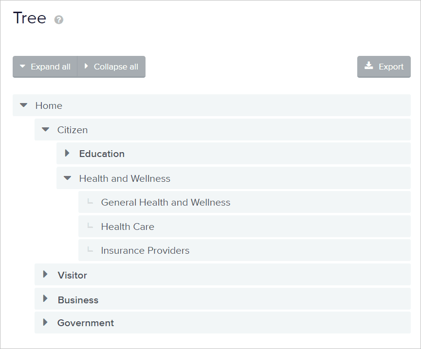
Participants are instructed to find a specific page on a website, or asked where they would look to solve a specific problem (like finding support or logging out of their account)
Researchers observe where participants navigate to, noting if they struggle, backtrack, or get lost
Carrying out tree tests with a handful of participants gives you a sense of whether your menu layout is intuitive to users or not. And luckily, there are numerous usability testing tools to help you carry out tree tests.
Menu copy
The phrasing of your links is also important here—if the text doesn’t match what users are looking for, they won’t click it. Now is not the time to be unclear or overly creative: ensure your link titles are simple and goal-focused.
As an added benefit, search engines will recognize descriptive link names in your menu. People don’t search for ‘shop’ or ‘products’, but they do search for ‘women’s shoes’, for example.
Visibility
Ensure your menu doesn’t use color schemes that distract or confuse the user—for instance, translucent menus can be difficult to read.
Mobile optimization
Not optimizing your site (and menu) for mobile is one of the worst mistakes when designing a website. Long horizontal menus only display well on desktop computers, so ensure you use a different menu format for your mobile site.
Positioning
Users are less likely to find your menu if it’s hidden or positioned unconventionally. If mobile users need to click something to bring up the menu, ensure it’s a clear ‘menu’ button or hamburger button.
5. Redesign your menu
If you identified any layout issues in the previous steps, now’s the time to solve them with a little web design and UX design magic.
This will typically involve restructuring your layout in line with user goals, highlighting the most popular pages, and removing sub-categories that users don’t click on.
Here are a few best practices to consider when redesigning your menu:
Try to minimize the number of clicks needed to get to key pages. Some UX designers believe that aiming for three or four clicks is ideal.
Keep link wording clear and relevant to your visitors’ most important goals
Make your navigation and menu layout consistent across every part of your website
Help users see where they are by using a menu that highlights links as the user’s mouse hovers over them
Make sure that, if you have a company logo in your menu bar, the logo links back to your homepage
Consider whether icons could make your menu easier to scan
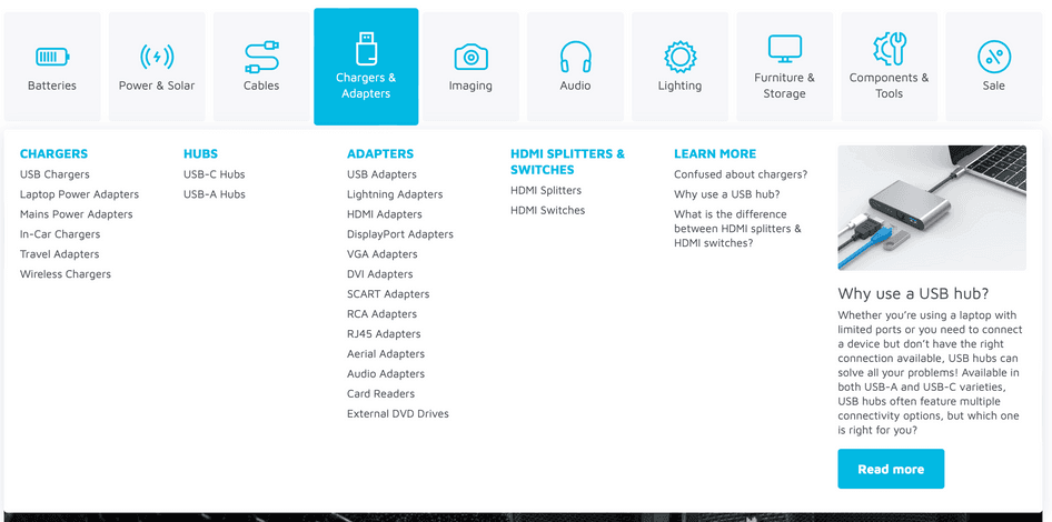
This menu from Maplin incorporates icons designed to grab visitors’ attention
Remind users where they are by using breadcrumb navigation links on each page. Breadcrumb navigation shows the category pages that users have navigated through to reach the current page, which is particularly helpful on complex websites.
6. Test out your new menu design
Menu redesigns don’t always hit a home run the first time, so consider doing additional evaluation and testing after you publish.
Keep gathering and reviewing data. Heatmaps will reveal whether your new layout attracts clicks, and if there are any menu items that users ignore. Recordings will help you see if any users are struggling to navigate your new menu layout.
A/B test your new menu layout. A/B testing helps you determine whether your new menu attracts more clicks than the previous one. The more clicks it receives, the more helpful it is to users.
🔥 If you’re using Hotjar
Use our Omniconvert integration or Optimizely integration to get faster, deeper insights into A/B testing results. Instantly bring up Heatmaps, Recordings, Feedback, and Survey data for any page variant to understand user behavior on it.
What are the most common types of menus?
➡️ Horizontal menus
A horizontal menu is a simple bar crossing the top of your page. They’re best used when you have a relatively simple site structure, but many sites combine them with drop-down menus as their website grows.

⬇️ Drop-down menus
Drop-down menus appear as a single title that expands when the user’s mouse hovers or clicks over them. They’re suitable for more complex sites as they allow you to ‘hide’ menu items so the page stays uncluttered.
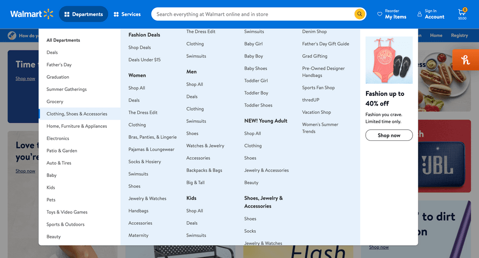
📰 Mega menus
Mega menus expand to show many sub-categories and pages in a single menu. This is ideal for companies like Walmart, which have an enormous range of departments.
Large sites can even use drop-down menus with multiple layers of sub-categories to help users find the pages they need. A great example is this multi-layered menu from Etsy:
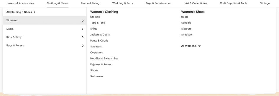
When a user clicks ‘Clothing & Shoes’ on Etsy’s horizontal menu, they’re presented with a drop-down menu. The user then chooses between four more sub-categories to browse the final layer of sub-categories on the right-hand side.
Notice how the menu also incorporates ‘All Clothing’ and ‘All Women’s’ buttons for people browsing without a specific item in mind. Smart!
🍔 Hamburger menus
Hamburger menus are drop-down menus that expand when the user clicks on the burger-like icon (or something you’d see outside a McDonald’s drive-thru).
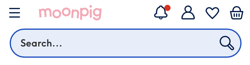
Moonpig keeps its mobile experience uncluttered by using a hamburger menu supported by a search bar
They’re ideal for mobile sites that lack the space for an always-visible menu. However, some UX professionals consider them less practical for desktop sites.
🫲 Left-hand vertical menus
Left-hand vertical menus run vertically down the side of the website, instead of horizontally across the top. However, because people typically read websites in an F-shape pattern, they’re arguably not as effective as horizontal menus
While vertical menus don’t support this F-shape, they allow the website to fit more items into its top layer of categories. And because many popular software apps now use left-hand vertical menus, users are increasingly familiar with the vertical style.
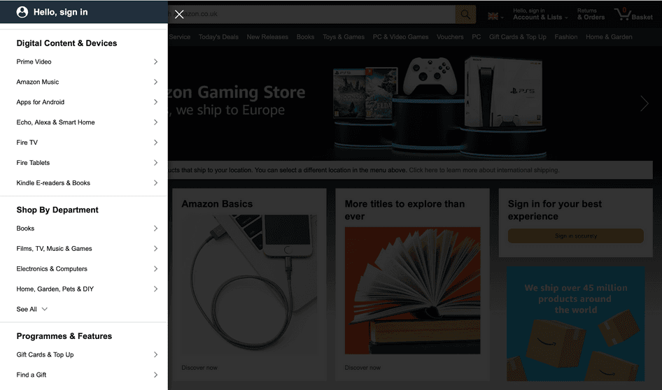
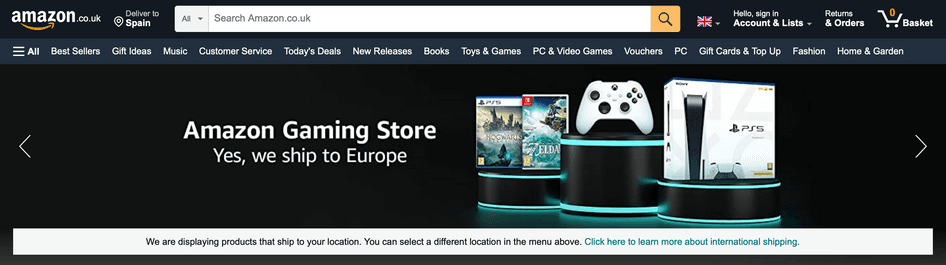
Some websites (like Amazon) combine hamburger menus with regular horizontal menus. This gives users one-click access to strategically chosen pages, along with the option to browse the full list of categories.
5 website menu mistakes to avoid
If every website menu were perfect, we wouldn't have written this article. Here are the most common mistakes to avoid when designing (or redesigning) your menu:
Creating an overly-complex menu with too many sub-category layers: vistors should get where they want to go as quickly as possible
Trying too hard to be creative (either in menu design, link wording, or both): there's a time and a place for creativity, but a website menu is neither
Making the menu hidden or difficult to find when a visitor lands on your site: visitors should be able to explore your website intuitively
Neglecting to structure your menu around the most common user goals: your menu should effortlessly nudge users in the right direction
Not optimizing menus for mobile devices: with so many website visits coming from mobile, an unoptimized menu would lead to wasted traffic and fewer conversions
To optimize your menu layout, start with the right user insights
Menus are surprisingly complex beasts, requiring a strategic and well-researched approach to design, ordering, and structure. But when you get them right, they help users take that all-important first step on your website, potentially boosting sales and conversions.
However, you can’t optimize a menu without first understanding what users need. Be sure to equip your team with tools that give you accurate data on user behavior, needs, and perspectives. By basing your menu layout around user goals, you deliver the great experience your visitors deserve.
Optimize your site like a pro
Hotjar tools let you uncover hidden insights about your users, so you can optimize their experiences and boost your conversions.
FAQs about optimizing your menu layout
Related articles

Solving common problems
How to evaluate the impact and reach of website bugs
Those pesky bugs. Even with the most meticulous checks possible, one or two usually make it through to production.
It’s vital to evaluate website bugs as they come up, so you know how urgently you need to fix them. Without taking a moment to assess impact, you’ll be shooting in the dark.
You might invest your precious resources in unnecessary work, or worse—underestimate the problem and cause frustrated users to take their business elsewhere.

Hotjar team

Solving common problems
Create an effective landing page using these free tools (video tutorial)
Your website is still one of your most important business tools, yet only 15% of websites average over 100,000 unique monthly visitors. In order to create successful websites that convert, consumers have access to an array of tools and features that promise to simplify their lives.
However, the overwhelming abundance of options can sometimes lead to more complications. Business owners often find themselves wondering, "How can I easily create a landing page that converts without design resources, IT support, or expensive optimization experts?"

Marc Hans

Solving common problems
10 ways Hotjar helps you understand your users better
Your sales are down; the well's running dry. What do you do to encourage people to buy from you: add a new product or service or multiply an existing product's features?
Increasing choices and features may be a business's automatic response to boost interest and, later on, conversion and sales. But more is needed to justify using company resources to create a solution that may or may not resonate with customers.
To achieve real, needle-moving change, you need to dig deeper and understand users better—what motivates or frustrates them and what hinders or helps them satisfy their 'jobs to be done'.
Hotjar team