Learn / Guides / UI design guide
6 UI design principles to delight your users every time
Your product's or website's user interface (UI) has a deceptively simple job: to delight users without getting in their way as they navigate your product to reach their goals. Following some foundational UI design principles ensures your user interface serves that purpose.

Think of UI design rules like a roadmap. Hear us out:
Imagine you’re going on a long car drive to get to your destination. If you choose to wing it without using directions and maps, your journey might take twice as long, frustrate you because you keep getting lost, and lead you onto some dodgy roads you would rather have skipped.
But when you use a map, you can follow a road that’s safe, tried and tested, and enjoyable to drive. You can also get to your destination more efficiently, and choose the path you’ll take to get there.
The map plays a key role in what your trip will feel like—aka your experience—and in the world of UI design, there are principles to guide your actions, the same way a map does, which will impact how a user experiences your product.
Keep reading to learn about six essential UI design principles, with some examples of the products that follow them, and how you can do the same.
Create a UI design that delights your customers
Every touchpoint is a chance to make your users more efficient and successful within your product. Hotjar helps you prioritize the right UI improvements.

Here are the six UI design rules to rely on when making product decisions:
Clarity: make the next step obvious and easy to complete
Flexibility: make your product malleable to different experience levels and use cases
Efficiency: remove unnecessary steps for completing a task
Invisibility: make your product so easy to use that the user doesn’t notice specific design elements
Instant feedback: give users confidence about completing a step or a task
User control: let users customize their in-app experience
1. Clarity
A 'clear' user interface means the next step isn’t just obvious—it’s also easy for the user to complete.
From a usability perspective, this means there’s a purpose to each element on the page. The next step is always intuitive and predictable, giving users the confidence to proceed.
But there’s another element to clarity: a user’s knowledge, or lack thereof, about the task they’re attempting to complete.
For example, let's say a user wants to build an email campaign using an email marketing tool. They might get stuck when they reach the step of writing a subject line—not because the product isn’t intuitive and easy to use, but because they don’t know how to write a good subject line.
In this case, 'UI clarity' would look like prompts or fill-in-the-blank subject line templates the user can use to get unstuck.
Who does it well
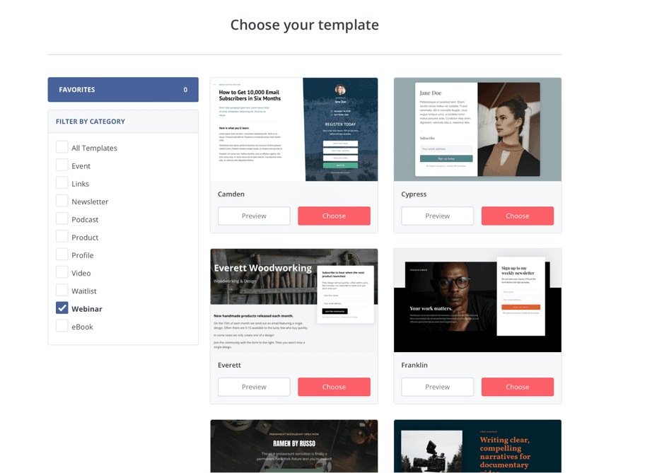
ConvertKit is a marketing platform for creators that offers features like landing pages and email signup forms to attract new subscribers. The company achieves clarity in their UI in two distinct ways:
1. Templates
ConvertKit's library of free landing page templates makes it easy to start using the product. There are more than 50 templates in it that anyone can view—not just customers—which is an excellent selling point.
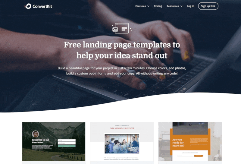
But for customers, choosing from 50+ options might be overwhelming. That’s why ConvertKit lets you filter landing page templates based on their intended use cases—like webinars, podcasts, ebooks, and links pages—and reduces 50+ options down to a few targeted ones.
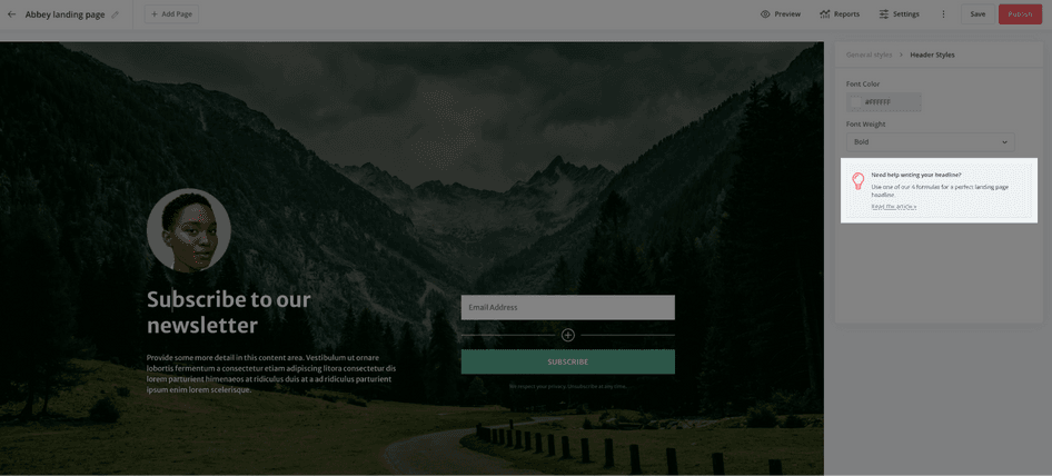
2. Tooltips
Another way ConvertKit embodies UI clarity is the tooltip that appears after a user clicks on the landing page headline in the editor. Once they click the suggested tooltip link, they’re taken to a specific chapter of ConvertKit’s landing page guide, with tips, prompts, and real-life examples of headlines to inspire them.
2. Flexibility
Flexible UI design is about making your product malleable to users of all experience levels and with different use cases.
For example, an experienced user will move through your product quicker than a newbie. They’ll use keyboard shortcuts, advanced features, and hacks to do what they wanted to do when they logged in. They’ll also be used to specific workflows based on the device they’re using.
On the other hand, a brand new user often takes their time. They’ll move through the steps at a slower pace to make sure they’re not missing something or making a mistake.
A flexible user interface caters to both of these users without cluttering the screen or trying to do too much all at once.
Who does it well
Todoist is a powerful yet easy-to-use task management tool. Even if you’ve never used project management software or a to-do app, Todoist makes it easy to get started thanks to its simple, intuitive interface and a getting started guide that’s part of its user onboarding.
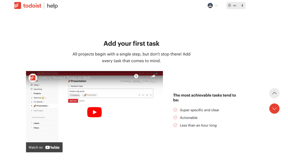
Even if you never created a task in your life, you’ll find Todoist easy to use.
But Todoist also has power users—people who take advantage of customizations, shortcuts, and advanced features that aren’t obvious (or even necessary) for the average user to see success within the app.
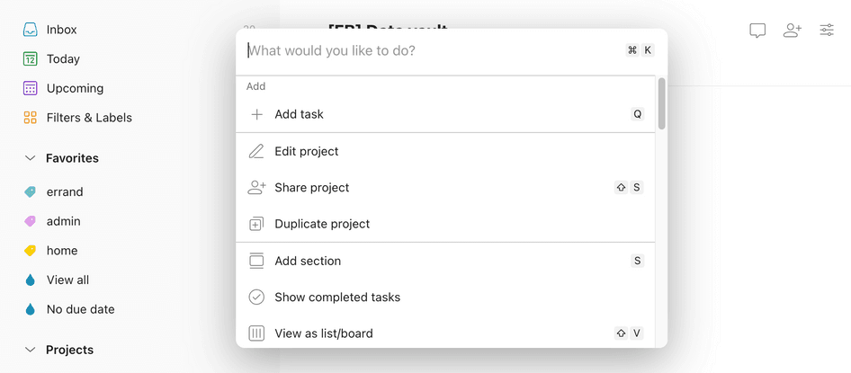
Advanced users can use voice commands with Siri, Google, Alexa, or their smart watch to create tasks and set due dates. They can customize their swipe gestures when using Todoist on their phone. On desktop, they can move through Todoist by only using their keyboard thanks to the ⌘ + K or Ctrl + K keyboard shortcuts.
As a user goes from a complete newbie to a Todoist pro, the tool adapts to their needs so they can keep hitting their goals.
3. Efficiency
An efficient user interface reduces the number of steps the user has to take to complete a task (aka their job-to-be-done, or JTBD). Efficiency is about predicting what the user needs at every step and preventing unnecessary clicks, taps, and time they’d otherwise spend trying to accomplish their task.
For example, an invoicing tool could auto-fill invoice numbers based on recently issued invoices (if the standard practice is to increase the invoice number by one every time, of course).
The user would otherwise have to jump between a few screens to find the previous invoice number, and then type in the new one. If a product does this without effort required from the customer, it creates a moment of positive surprise and customer delight—and saves precious minutes in the user’s day.
Who does it well
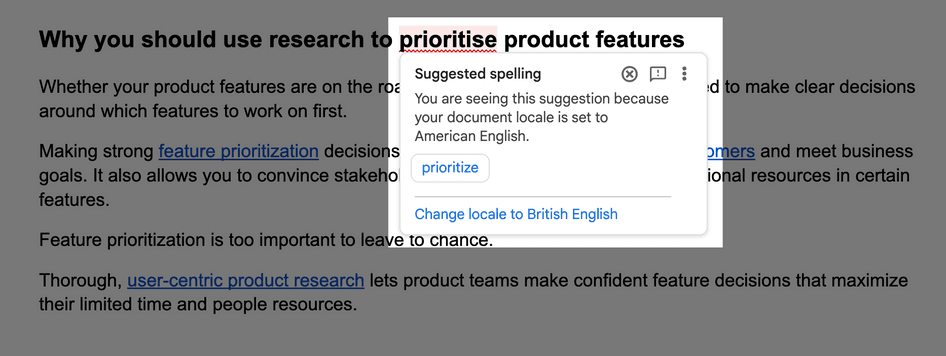
A fantastic example of this comes from Google Docs, which lets you set the language of your document, including subtle differences like American English versus British English. If you spell a word in a way that doesn’t match the language you defined for your document, you’ll see a prompt to either fix it or change the specified language.
Hidden within the three dots menu of this prompt is also the option to always fix this version of the word, meaning that each appearance of ‘prioritise’ would be treated as a misspelling and automatically changed.
What stands out here is that all three options are either one or two clicks away, which replaces the manual effort to fix dozens of potential spelling errors.
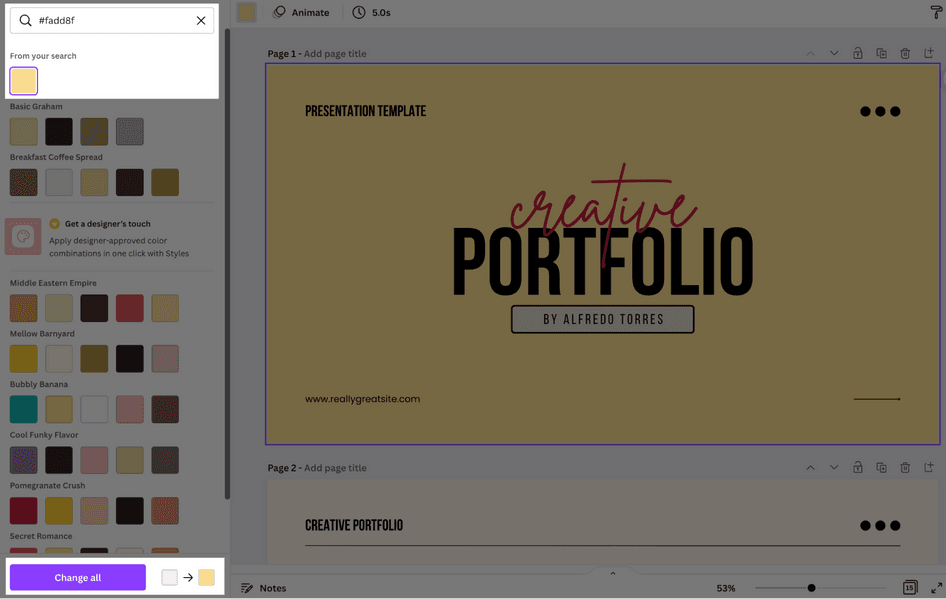
Then there’s Canva, an online graphic design tool that offers a one-click option to change all instances of a color in multiple slides. This happens if you change a color that appears in the document multiple times, like the background, text color, or footer bar.
Thanks to this feature, you can use any one of Canva’s thousands of templates and adjust it to your brand colors in no more than a few seconds.
4. Invisibility
Invisible design is an experience so smooth, a product so easy to use, that you don’t even notice it.
The function of UI design is not the design itself—it’s about how it influences the experience your users have with your product. Invisibility in a user interface means the user will progress through a step, or a set of multiple steps, without thinking, paying attention to it, or having to make a decision.
The most beautifully designed app could still have a terrible user experience, or be confusing to read, or inaccessible, or inconsiderate of users with neurodiversity.
As a content designer, I also have to call out preference for any UI trend that puts language clarity above visual flair.
Placing a shopping cart icon at the top right corner of an ecommerce website is among the most common examples of invisible UI design. That icon doesn’t need to draw attention or be wrapped in fancy design elements—users always know that the top right corner is where they’ll find it when they need it.
In his guide on invisible design, Intercom’s VP of Product Design Emmet Connolly wrote: "Don’t make me notice what I’m doing. Just make it simple."
Who does it well
AirPods, Apple’s wireless earphones, are a prime example of invisible design.
After you connect AirPods to an Apple device, they automatically connect to that device once you put the earphones in your ears. If there was sound coming out of your phone while you were doing that, it instantly starts playing over AirPods instead.
There are actually several UI design principles hidden in this example, but one stands out as particularly invisible—a prompt that pops up on iPhone as you open the AirPods case.
It shows the remaining battery life of each earphone and the case. Instead of searching through settings, you get this information at the same time you start using your earphones. It aligns with Apple’s promise of AirPods being practical, comfortable, and smooth.
AirPods don’t stand in the way of whatever you’re doing when using them—a true specimen of invisible design.

5. Instant feedback
Users should never wonder if an action they took in your product has gone through. Instant feedback is what gives users the confidence and comfort that they’ve done exactly what they were supposed to.
For example, when a user clicks the ‘Send invoice’ button, the response they see should verify that the invoice was indeed sent.
Other instances in this category are actions like:
Sending a message
Pairing a music player app with a Bluetooth speaker
Scheduling an email broadcast
Connecting a device to a charging cable
Instant feedback provides visual cues like prompts, pop-up notifications, brief sounds, confirmation messages, and battery charging lights. Instead of checking whether their task was completed, users can use instant feedback to move on, rather than worry about whether they’ve made a mistake or ran into an error.
Who does it well
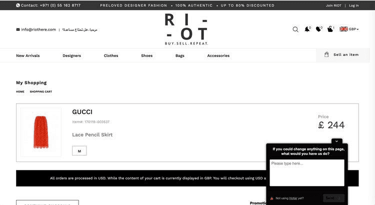
Wise, an online money transfer company, prioritizes confidence in sending and receiving money (almost) anywhere in the world and in dozens of currencies. It focuses on transparent conversion rates and fees.
When you send money with Wise, you get a confirmation screen that shows you the expected timeline of your transfer, which is table stakes for a tool of that type.
It also generates a shareable link—and this is where the magic happens. You can send that link to the person you’ve sent the money to, which lets them see exactly when the transfer started and the expected completion time. This creates transparency and trust for both sides, and removes the ‘Where is my money?’ fear that is expected in actions like this one.
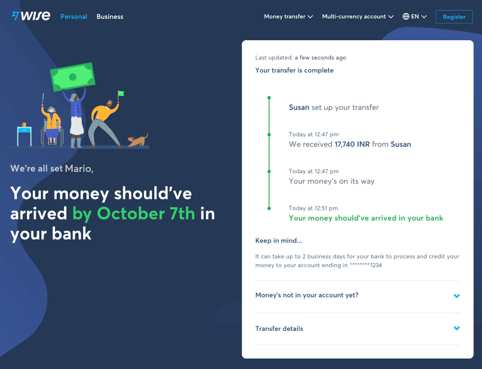
Money transfer confirmation screen in Wise (source)
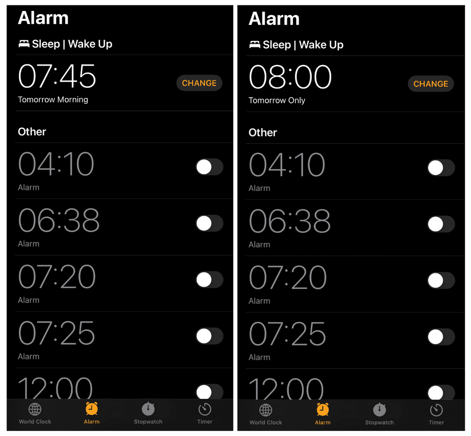
Another example comes from Apple, this time in the way iPhones handle the process of setting an alarm.
On iPhone, you can set default sleep schedules that repeat on certain days of the week, or even every day of the week. This defines your wake up alarm without extra effort by you.
There’s also an option to change that alarm for the night ahead, and when you do so, the label under that specific alarm changes from ‘Tomorrow Morning’—the label when the default sleep schedule is active—to ‘Tomorrow Only'.
This setting is then also displayed on the iPhone's lock screen after Sleep Mode kicks in, as well as on the Apple Watch—again giving confidence that the alarm was set correctly.
6. User control
Users want to feel in control of their experience. It minimizes any insecurities, anxiety, and confusion—and empowers them to make the most of your product based on their own needs and preferences.
Giving users control over their experience can look like:
Letting users choose their own path versus forcing them into a flow that might not suit them
Making it easy to correct an error or return to a previous step
Giving users the option to tailor their experience, like custom dashboards or shortcuts
Without the user control principle, users may feel trapped while using your product—even if they can’t quite put a finger on why that is.
It might be that they hesitate to click ‘Next’ in fear of not being able to go back and make a change. Or they could feel that the most important features of your product are too many clicks away from the main interface, so they struggle to use it regularly.
If you know your product is valuable to users, but they feel a lot of resistance when extracting that value, lack of user control might be the culprit standing in their way.
Who does it well
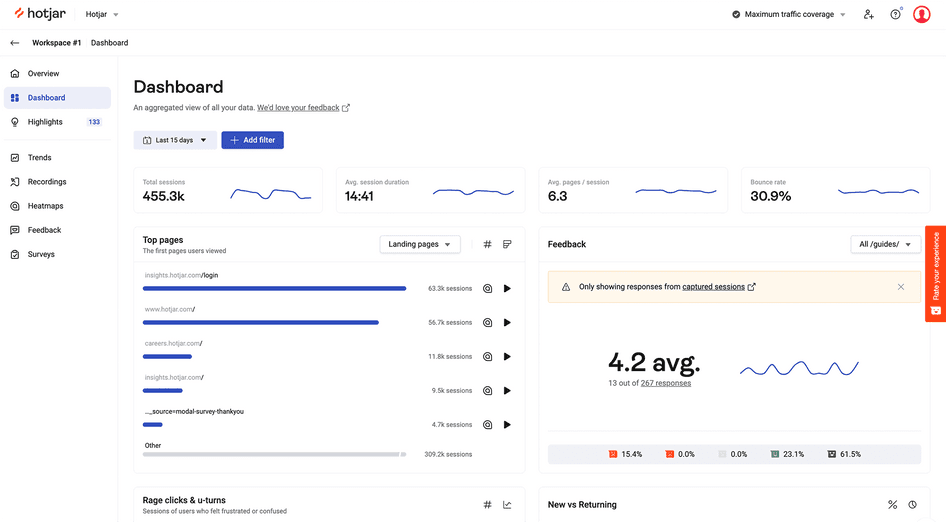
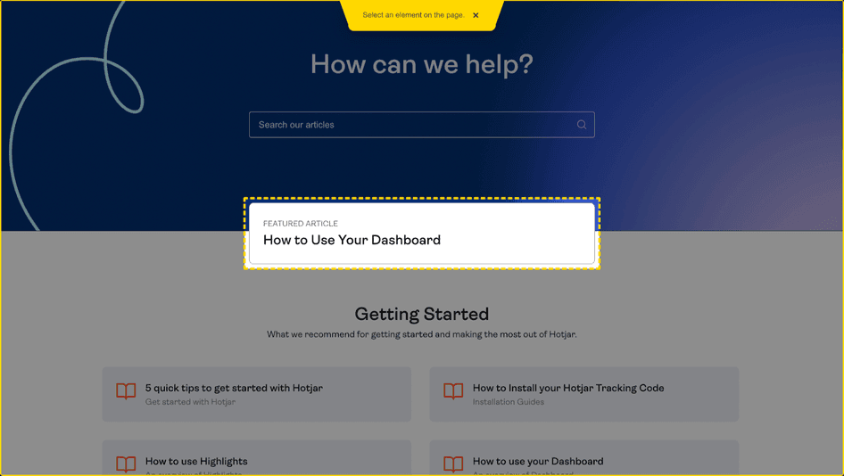
Hotjar (that’s us! 👋) provides product experience insights to digital product teams. These insights can include hundreds or even thousands of user interactions in a given period, which means there’s a risk of overwhelming our customers with too much data.
That’s why we empower our users to build custom Dashboards with widgets. Hotjar Dashboards highlight the most relevant, impactful, actionable data points that teams can access instantly and relay to key stakeholders and decision-makers.
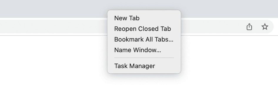
Another example is the Chrome browser and its ‘Reopen closed tab’ function. Accidentally losing a tab is frustrating, and by right-clicking the bar at the top, you can reopen the last tab you’ve closed.
You can also use a keyboard shortcut: ⌘ + Shift + T (on Mac) or Ctrl + Shift + T (on PC) while in Chrome to make this even faster.
How to use Hotjar to implement these UI design principles
Measuring the presence of UI design principles can be a challenge—especially the subtle ones like clarity and invisibility.
Here are some questions that can help you gauge where you stand:
How quickly and easily are your users progressing through a specific task?
Is there a common issue in your user interface that gets users stuck?
Does your user interface inherently allow users to customize their experience, like with a custom dashboard, shortcuts, and advanced features?
Do users receive instant feedback as they move through your product, or do they have to manually check their progress or success as they complete a task?
Is there an action your users repeatedly do that you could shorten and make more accessible?
If you don’t already rely on product experience insights, these questions might be hard to answer. PX insights are data that helps product management teams understand exactly how customers experience a product. You can collect PX insights with tools like session recordings, heatmaps, and surveys to quickly find points of frustration, delight, confusion, and efficiency.
Here’s how you can use Hotjar’s Observe and Ask products to improve your product experience with UI design principles.
Observe tools: Heatmaps and Recordings
Hotjar’s Observe tools let you see what your users see and visualize their behavior.
Where are they clicking? What makes them linger longer than necessary on a page? What’s confusing or frustrating them? What’s standing in their way of completing the task they came for?
Heatmaps and session recordings hold answers to these questions. As you dig into them, you’ll uncover the best opportunities to implement one or more of these design principles.
Here are some things to look for:
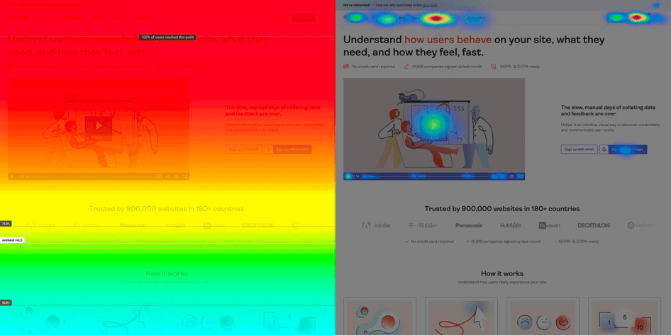
Scroll maps: is important information staying out of the user's view and confusing them?
Click maps: are there unclickable elements many users click on, expecting instant feedback from it?
U-turns: are users hitting the ‘back’ button quickly after landing on a page, signaling confusion?
Rage clicks: are there signs of unclear instructions that make users repeatedly click on an element?
Heatmaps and recordings reveal the exact touchpoints that users find unclear, which can be the starting point for your next product iteration. Pro tip: session recordings are particularly valuable for finding UI design problems, as they show the user's exact, moment-to-moment behavior on important pages.
Ask tools: Surveys and Feedback
Hotjar’s Ask tools uncover the explicit feedback, thoughts, and feelings customers have about a specific part of their journey, or their experience as a whole. Put simply: the Observe tools show you what happens. The Ask tools help you understand why it happens by asking your users for more context.
You can deploy surveys on specific pages or set up specific triggers like link clicks, time on page, or URL parameters.
Use Surveys to ask direct questions like:
We’re sorry to see you go! What’s your reason for leaving? (an exit-intent survey)
What’s stopping you from moving to the next step? (a poll about longer time on page)
How easy is it to use our [product/website]? (a usability survey)
How easy was it to solve your problem with our product today? (a customer effort score survey)
The answers might reveal a lack of clarity, the need for more flexibility and user control, or a problem of having to go through too many steps to complete a task. It’s the ideal place to start embedding UI design principles that make your product experience smooth, efficient, and delightful.
You can also use the Feedback tool to learn what your users think about the page they’re on. They start by rating their experience on a scale, followed by an option to leave written, open-ended feedback. During this second step, they can select a specific UI element like a button, image, or paragraph for more targeted feedback.
Create a UI design that delights your customers
Every touchpoint is a chance to make your users more efficient and successful within your product. Hotjar helps you prioritize the right UI improvements.