Learn / Guides / UI design guide
5 effective UI design examples and why users love them
Getting user interface (UI) design right is a crucial business objective leading to happier users, more purchases, and accelerated growth for your company. But simply copying what the usual suspects—like Apple, Dropbox, or Spotify—are doing will never be your most effective option: your customers, and their needs, are unique to your business.

In this guide, we walk you through five effective UI examples from companies that used qualitative and quantitative data to inform their design decisions. Aside from sparking ideas for UI trends to follow, we hope you get inspired by these companies’ smart processes for creating and evolving their interfaces in response to real user needs—because a process is something you can definitely copy!
Good UI design starts with people, not pixels
Hotjar’s tools help you design your UI around user behavior. Discover how your users interact with your website so you can give them exactly what they need.

What makes UI design ‘good’?
Design trends come and go, but there’s only one consistent way to know if your UI designs are ‘good’ or not: do they work for real users—your users?
A design could look flawless on paper, but if your users can’t figure out something simple, like where to click next, their experience is effectively ruined. Struggling to buy from your website or use your product may push them toward a competitor. Similarly, a design could look plain, outdated, or downright bizarre (see below!), but if it works for its intended audience, it’s good UI design.
The ‘secret’ of web design/good UX is to be human. And truthful and honest, and not force it and stop manipulating people.
5 UI design examples that users love
These five examples show you different approaches to UI design from teams that have grown by measuring the impact of their designs on users, alongside tips to help you achieve the same success.
1. Hotjar
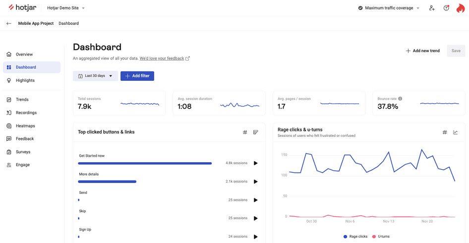
We’re starting with a UI design example we know inside-out: Hotjar (hello! 👋). If you don’t already know us, we’re a product experience insights platform with Heatmaps, Recordings, Surveys, Feedback, and user research tools.
Christian Schorm, Hotjar’s Director of Brand, worked with brand agency How&How and the team to completely redesign our website and product interface. Before designing anything, we asked people (using Surveys) what they thought of Hotjar as a brand and what they needed from the product.
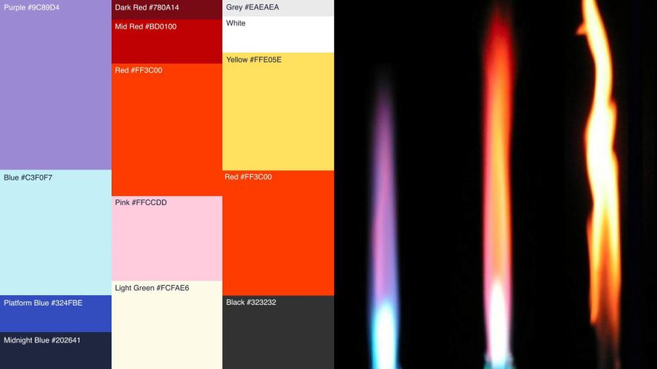
In response, the redesign focused on restyling our product to maintain consistency with the rebranded website, adding more negative space and using the same typography and CTA buttons. The updated website now evokes the product with ‘trace lines’ resembling mouse movement lines on session recordings and a heatmap flame-inspired color palette.
Other features came directly from user feedback, like the sitewide dark UI mode (click the sun or moon icon on the top-right to toggle!).
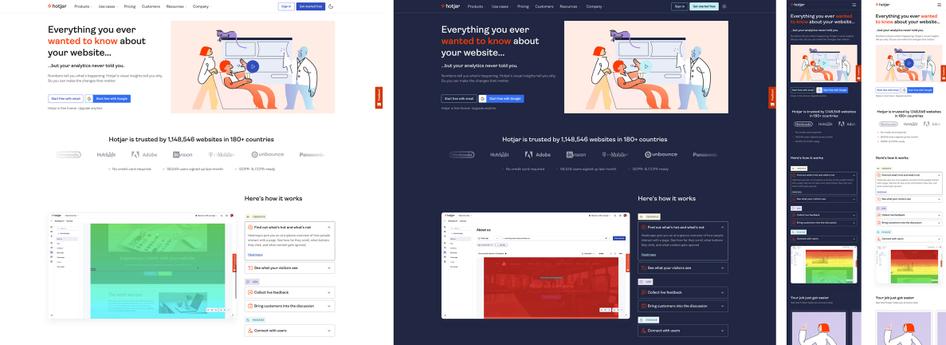
Before rolling out the new interface, we collected feedback again, this time from around 300 non-users (to avoid bias), who confirmed that our designs were working as we wanted them to.
We now have a comprehensive product design system and UI component library so that everyone on the Hotjar team can maintain consistency when updating the product and website in the future.
UI design tip 1: before undertaking a major rebrand of your product or website, survey your users (we recommend Surveys for this) to understand how they view and interact with your brand. Also survey non-users after the redesign, before rolling it out, to learn how potential customers might respond to the redesign (you can do this with Hotjar Engage).
2. ClickMechanic
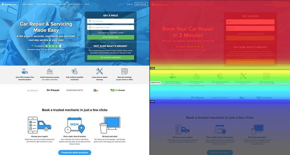
ClickMechanic is an online auto repair marketplace that gets over 300,000 monthly visitors in the UK.
When the ClickMechanic team decided to optimize their landing pages’ UI, they used Hotjar Heatmaps to view existing site usage. Scroll map data showed that 75% of visitors never scrolled beyond the hero image, so they focused all their interface redesign efforts above the fold.
According to Simon Tinsley, ClickMechanic’s Growth Manager, carrying out an above-the-fold-only redesign reduced costs in terms of design and engineering overhead and delivered a 15% increase in conversion rate.
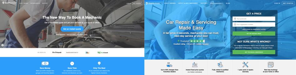
As the before-and-after comparison above shows, the team managed to reduce the number of clicks needed for users to get a quote by integrating a two-field quote form into the hero section. They also added social proof by highlighting their excellent Trustpilot rating under the main heading.
💡Pro tip: download Hotjar Heatmaps as JPEG files and import them into your favorite UI design tool so you can wireframe redesigns alongside user click and scroll data.
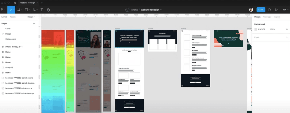
Product Designer Sara Brunettini redesigning a UI in Figma using Hotjar Heatmaps
UI design tip 2: to save time and money when redesigning an interface, focus your resources on the parts that get the most attention and clicks—use heatmaps to visualize the most popular areas of your website so your UI design improvements will have the biggest impact and ROI.
3. TechSmith
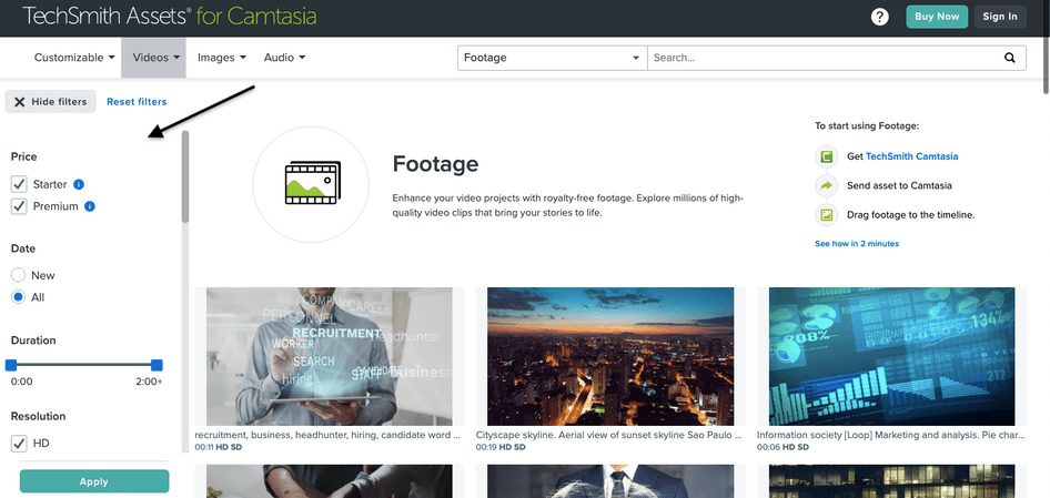
TechSmith is a software company best known for screen capture apps Camtasia and Snagit.
When redesigning the company’s asset library, a searchable asset library for Camtasia customers, UX Designer Conan Heiselt used a click map to visualize where users were clicking. He found that most visitors were rage-clicking unlinked product icons instead of the CTA buttons. So, based on this insight, the team made the entire element clickable, reducing frustration for users interacting with the interface.
For more UI design ideas, Conan set up an on-site survey trigger when visitors scrolled beyond a certain point to ask: “What’s your biggest frustration with this page?” and grouped similar responses into categories. Answers revealed that many users wanted filters to make finding relevant content from the library’s 20 million assets easier.
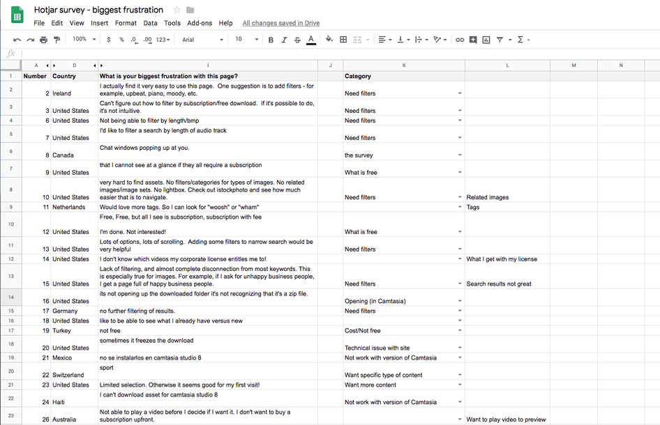
Suggestions from TechSmith’s users collected using Hotjar Surveys
The team then added a hideable filter panel that is open by default. TechSmith can make sure the element is helping users by continuing to monitor heatmaps and session recordings.
UI design tip 3: crowdsource UI improvements from your own users and visitors to your website by asking a single open-ended question: “What can we do to improve this page?” (you can do it with Hotjar Surveys). The responses will reveal if users are confused by existing UI design elements or need a new feature to make things simpler.
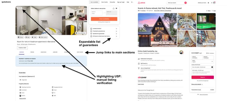
4. Spotahome
Spotahome is a mid- to long-term rental booking platform operating across Europe that gets over 1.5 million monthly visitors to its website.
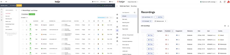
The Spotahome team uses a combination of website insights tools like heatmaps and session recordings alongside A/B testing to iteratively design their UI.
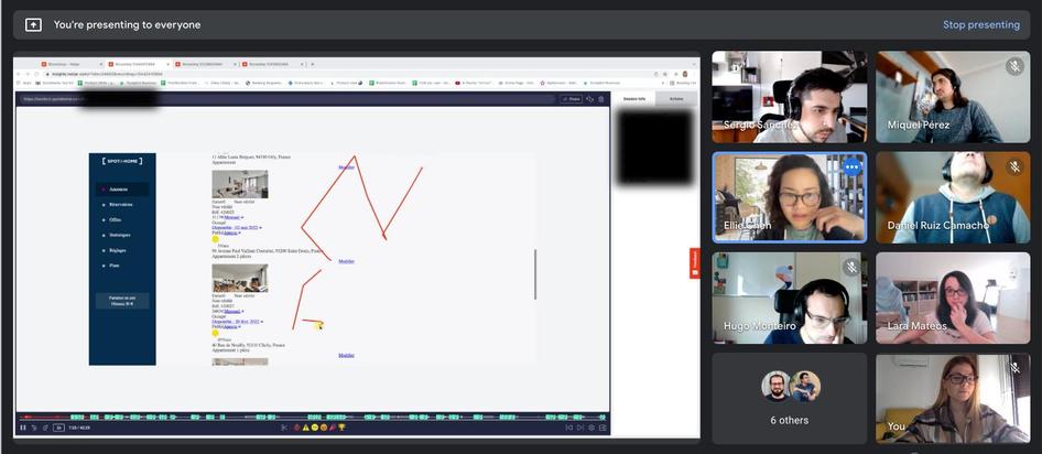
Sara Parcero-Leites, Spotahome’s Customer Knowledge Manager, reviews Hotjar Heatmaps and Recordings and creates Highlights from any that clearly show users getting stuck on confusing design elements or clicking on the wrong CTAs. Then, the product and engineering teams review insights together (it’s called a Hotjar Watch Party—have you heard of it?) and decide what needs to be improved.
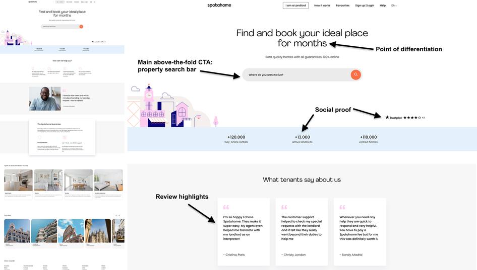
Instead of copying best practices or large competitors like Airbnb, Spotahome’s testing-based approach to UI design has resulted in unique elements that solve user pain points. For example, Spotahome’s listing pages have jump links to let users skip to relevant sections down the page.
UI design tip 4: instead of trying to design the perfect UI all in one go, regularly review session recordings of user actions (we recommend Hotjar Recordings for this) and A/B test improvements.
5. A Place for Mom
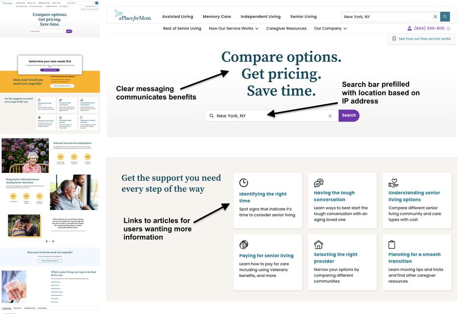
A Place for Mom, founded in 2000, is a senior care referral service that attracts over 1 million monthly visitors to its website.
Brett Polonsky, Director of UX/UI, led the human-centered site redesign with one main goal: “making sure we got the messaging correct, so when people come to a page, they understand who we are, what we do, why they should care, and what they should do next”. Brett and his team designed A Place for Mom’s UI by testing prototypes on users in their target demographic spread across the US and Canada with PingPong (now Hotjar Engage—come take a look!).
By running remote user interviews, the team was able to make impactful changes. As a result, the above-the-fold content on A Place for Mom’s homepage gives visitors an immediate understanding of what the company does and the main benefits of the service. There are also two clear ways to take action: call the number in the top-right of the menu bar or search for listings (using the prefilled search bar). For visitors needing more information, there are links to articles on the main body of the page.
UI design tip 5: if you’re designing a new interface or heavily redesigning an existing one, test it with your target audience or your own users first (try Hotjar Engage for this). Feedback will allow you to refine messaging and remove confusing elements before going live with your changes.
How to get more UI design ideas
Hopefully, the five UI design examples above gave you some ideas and ways to approach your next design challenge. If you need more inspiration, search for other designers’ work for free on Dribbble or Behance, but don’t just copy what you see: scrolling through pixel-perfect designs won’t tell you if they function for their intended audience.
Very often, Recordings show me things I would never think about. I use them for inspiration on how to improve a website’s interface.
We believe the best way to get UI design ideas is to watch how real users interact with your website or product interface via Heatmaps and Recordings and collect feedback with Surveys. And if you’re designing something brand new, test your prototypes on real people from your target audience to see if everything works before launching it live.
🚀 Become an example of excellent UI design
Let real users guide your design decisions, and make them love your business even more.