Learn / Guides / UI design guide
6 common UI problems + mistakes (and how to solve them)
UI design is all about making sure your users have a good experience with your product—creating interfaces that are intuitive, easy to use, and aesthetically pleasing. But the road to a frictionless customer experience is full of challenges, iterations, and testing.

Designing a product users love interacting with isn’t easy. This article dives into common UI design problems, along with how to avoid or correct each one. Each of the six challenges listed below can detract from the quality of your product—and your user experience.
Nail your UI design with product experience insights
Use Hotjar to prioritize the right improvements and build a product your users love.

6 UI design problems and how to solve them
As designers create more products for users, they have to consider new design challenges—like accessibility, localization, and globalization. While making mistakes is part of any design process, we’re here to help you sidestep some of the most common problems you might face when designing your product or site's user interface (UI).
Being able to anticipate and avoid these six UI design problems will lead to building a product or website that:
Delights customers and makes a great first impression
Boosts conversion and retention rates
Increases revenue and raises brand awareness
1. Not optimizing across different devices
Some designers plan their product’s desktop design first, then throw together their mobile interface as an afterthought. That becomes a UI problem for a mobile user, as they struggle to view the content in its entirety or use the product as intended.
Others make more effort with their mobile design, but don’t observe user behavior or test it sufficiently to ensure that users can interact with it in a way that is intuitive and seamless.
The challenge is clear: when customers can’t enjoy the best features of your product on their small screens, they leave.
An unresponsive design prevents you from providing the best UI possible. It adds effort instead of reducing it, forcing your customers to rethink their purchasing decision and turn to another solution.
If you don’t prioritize design that’s responsive to both mobile and desktop interfaces, you’ll lose out on traffic, conversions, and sales on one device or the other.
How to manage it: customers use products on mobile devices almost as much as they do on desktops—meaning your UI design needs to work brilliantly on screens of all sizes. To address this problem:
Pro tip: see how users interact with your UI design to prioritize the right improvements.
Some bugs must be seen to be believed. Use Hotjar to see the users’ experience live, understand the problem, and prioritize a fix.
Watching and analyzing Session Recordings helps you:
Investigate how new features are performing on desktop, tablet, and mobile
Identify issues and pain points that make people leave
See what users do and how they feel across the entire user journey
Identify where they struggle, get stuck or confused, and leave
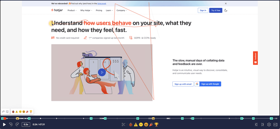
A Hotjar Session Recording in action
2. Cluttered navigation
Navigation is one of the most important features of any tech product: it can make or break the user experience (UX).
Some design teams get overly enthusiastic about all the content they want to include, and forget to prioritize clarity. Others let too many people in the organization have a say on what goes in the navigation, leading to a bloated navigation menu.
The result? A cluttered UI with too many interface elements, which leads to confused and overwhelmed customers.
The challenge here is two-fold: keeping stakeholders happy while also creating a great UI for your users.
How to manage it: a good product lets users navigate intuitively and clearly, without unnecessary and distracting elements. Try this to clear the clutter:
Your navigation should be crystal clear, and it should always meet user expectations. Place the menu where they expect to find it, which is either horizontally across the top or on the left as a vertical sidebar. And keep the number of menu items under five or six.
Then, focus on securing buy-in from stakeholders for your simplified UI design:
Build a compelling case for your ideas with real user insights and feedback from Hotjar
Create a shared Slack channel where your whole team can see vital recordings or negative feedback
Send a weekly round-up email with Hotjar's key recordings to align senior stakeholders
For most projects, you’re going to have a lot of stakeholders to convince. Showing real user data from Hotjar really helps get their attention.
3. Failing to address your users’ needs
UI design is constantly evolving. Just when you think you’ve mastered user interface design, a new trend emerges that forces you to reevaluate your previous strategies. Or even worse, stakeholders start dismissing your ideas and squeezing in their own.
Only designing in response to UI design trends and biased stakeholder opinions results in poor UI design. Design trends come and go, and stakeholder opinions can be influenced by subjectivity and gut feelings.
At best, trends and opinions lead to satisfactory outcomes for some people, but the impact—addressing your users’ real needs—is almost certain to be underwhelming.
However, with the right mindset and UI design tools to meet these challenges, creating interfaces that put the user first becomes much easier.
How to manage it: reevaluate your user experience and performance metrics to determine whether the idea is a right fit for your product.
Assessing each trend and stakeholder opinion is part of your job as a designer, but that doesn’t mean you need to adopt them all—especially when it becomes detrimental to your users and their needs.
Instead, your focus should be on refining your UI design ideas based on emerging user needs. And the best way to do that is through continuous discovery.
Continuous discovery—continually gathering information on user needs to refine your product ideas—can lead to happier customers, sharper priority lists, and a better product-market fit. Here’s how you can implement it to your advantage:
4. Not testing the design enough
As an industry, UI/UX designers have less time to create each product. This means they have to come up with more efficient strategies to complete their work. These strategies can include using lightweight product design tools; creating libraries of reusable designs, frameworks, and wireframes; and using animations for a better user experience.
Some UI/UX strategies might also include rushing through testing to launch the product as soon as possible and start generating revenue—which can quickly become a short-sighted strategy.
Without proper testing, users may encounter bugs, poor navigation, broken links, or missing images and videos while engaging with your product. Ideally, these issues should be flagged and fixed by your development team through testing, rather than after the product, website, or feature is live.
The testing stage brings fresh eyes to the site after it’s been worked on by the same professionals for so long. It can also save money down the line: fixing an issue in development is 10x more expensive than fixing it in the design stage—and it’s 100x more expensive to fix it after release.
The sooner you catch UI issues, the less problematic and costly they’re likely to be.
How to manage it: we know that testing is crucial for good design—but it has to be an extensive process to be effective. Your testing should cover:
Investing time and resources into thorough testing across these areas increases the quality of your user experience. The work you put in at this stage will pay off when you boost your conversion and retention rates.
Remember, UI design optimization should continue for as long as the website, product, or service is up and running. Implement a process that involves continuous discovery and testing to recognize issues before they disrupt the user experience.
Pro tip: use testing to determine how the product fits the people it’s built for.
Usability testing is about getting real people to interact with a website, app, or other product you've built, and observing their behavior and reactions to it.
As users explore a product and interact with it in various ways, their unfamiliarity with the product will help reveal potential user experience problems—from complex menus and confusing CTAs to features that won’t load properly.
By implementing usability testing methods and experiments, you gain valuable insight into how your product or website will fare when it goes live. You can even use tools like Session Recordings and Feedback widgets to identify design and technical issues that developers missed (or didn’t think to look for) based on feedback from real users.
Session recordings are a fantastic way to spot major problems with a product’s intended functionality
5. Designing for yourself
As beginners, some designers tend to over-indulge themselves and forget who they’re designing for in the first place: the customer.
Designers who put style over substance risk delivering a design that doesn’t address user wants, needs, and expectations.
A beautiful UI design with a useless user experience will not stand the test of time and will not achieve its goals. It can mean the difference between a successful product and one that fails to make an impact—or worse still, leaves a memorably bad impression on the user.
It’s great to have a fancy page and show off your design talents, but when our audience comes to our page, we want them to intuitively know what they are supposed to do. What action do we want them to take with the information on the page? The design should answer that without taking all of our audience’s time.
How to manage it: develop user personas to target the exact needs of who you’re designing for. Then, listen to user feedback to understand their habits, behaviors, frustrations, needs, and wants—so you can design with empathy.
The end goal for UI designers is to produce an intuitive, aesthetic, and efficient user interface—one that generates trust, which leads to more conversions.
To design an effective UI for a product or service, it's important to know who you are designing for.
User personas are a great tool for developing an accurate picture of your customers. They help uncover the different ways people search for, buy, and use products, so you can focus your efforts on improving the experience for real people and use cases.
A good user persona answers questions about your ideal customers, like:
Who are they?
What are their goals?
What are the barriers preventing them from achieving their goals?
Since they’re the people you design for—the users you want to buy your products and invest in your services—their feedback should always be welcome. There are many ways to gather high-quality user feedback. You can:
6. Measuring the presence of UI design principles
Designers can have a hard time identifying the presence of the more subtle UI design principles—like clarity and invisibility.
UI design principles guide your actions, which will then impact how a user experiences your product.
In UI design, clarity means the next step isn’t just obvious—it’s also easy for the user to complete. The interface is always intuitive and predictable, giving users confidence to proceed. Examples include prompts or fill-in-the-blank subject line templates that help users easily figure out what they need to do next to achieve their goal.
This principle goes hand in hand with invisibility: an experience so smooth, so easy to use, that you don’t even notice it—like placing a shopping cart icon at the top right corner of an ecommerce website.
How to manage it: assess the effectiveness of UI design principles by answering a series of questions and using PX insights to understand exactly how customers engage with your product. Here are some questions that can help you gauge where you stand:
Together, the answers to these questions might reveal a lack of clarity, the need for more flexibility, or a UI problem of having to go through too many steps to complete a task. It’s the ideal place to start embedding UI design principles that make your product experience smooth, efficient, and delightful.
Pro tip: product experience insights tools like Hotjar can help you answer the above questions more easily and quickly find points of frustration, delight, confusion, and efficiency:
Heatmaps and Session Recordings show you what happens, answering questions like: where are they clicking? What makes them linger longer than necessary on a page? What’s confusing or frustrating them? What’s standing in their way of completing the task they came for?
Surveys and Feedback tools help you understand why it happens by asking your users for more context: what’s stopping them from moving to the next step? How easy is it to use your product? How easy was it to solve their problem with your product?
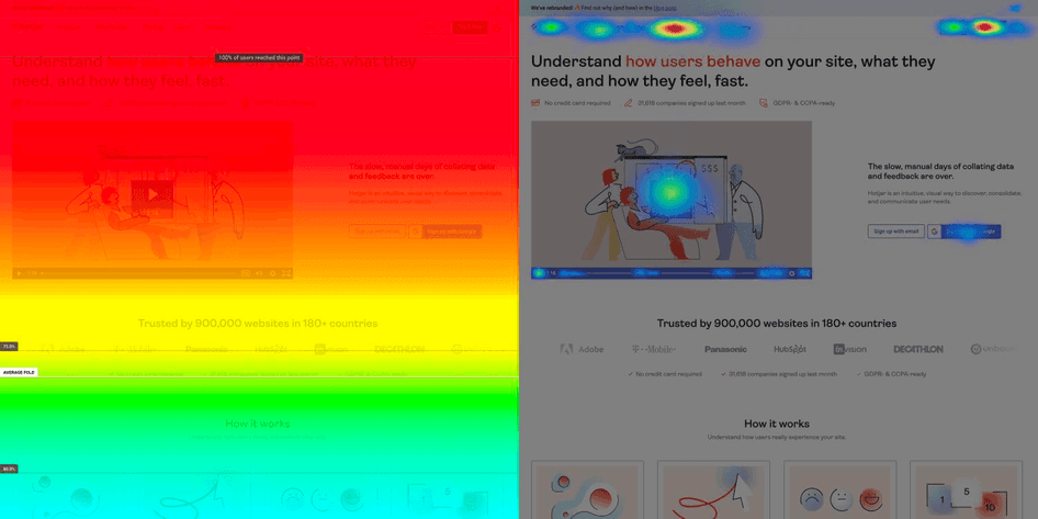
An example of Hotjar scroll and move heatmaps
Next steps to solving UI problems and challenges
UI design problems can lead to users not getting the full potential of products, which defeats the purpose of the development in the first place.
By understanding the most common UI design challenges, you can anticipate potential errors and sidestep them in time to build a website, product, or service that delights your users.
Nail your UI design with product experience insights
Use Hotjar to prioritize the right improvements and build a product your users love.