Learn / Guides / Web app design process
10 types of web app design patterns for your business in 2023
Crafting the perfect web app experience that's both responsive and interactive for users with high expectations can be a challenge. Web app design patterns are a great solution, providing tried-and-tested dynamic interface components that help you elevate the user experience (UX).

We’ve put together a list of the ten most effective web app design patterns out there, and we'll show you how to pick the right one to meet your user needs and achieve business goals.
Understand how users experience your web app
Use Hotjar’s Observe and Ask tools for user-centered insights that will drive better design decisions.

What are web app design patterns?
Web app design patterns, or user interface (UI) design patterns, are reusable design structures that help developers and designers streamline your web app so that users can effortlessly perform tasks.
Web app design patterns help you build smooth applications by making sure every page has the same layout and functionality, no matter what device visitors use or how big their screen is. Design patterns allow users to interact dynamically with your web app, solve problems, or structure their schedules.
10 web app design patterns you can use to delight users
Our guide talks you through the most effective web app design patterns and gives you all the information you need to find the best one to achieve your business and user goals.
1. Grids
A grid web app design pattern solves users’ needs for organized, easily-scannable content.
Organizing key content snippets in a grid makes it easy for users to view and navigate content-heavy web apps. Grids also offer more options for dynamic viewing and scrolling than a simple list structure.
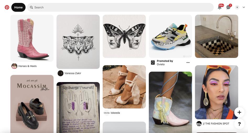
To use grid design patterns effectively, make sure the grid looks the same across different devices. You should also be conscious of grid spacing and its implications on the user experience (UX).
For example:
More space means slower navigation, but more of your content gets viewed by users
Less space means faster navigation, but you risk your users bypassing some of your content
Pro tip: if you plan to display a large amount of content that might confuse users, the grid pattern is ideal for your business. Grids are great for teams looking to visually organize the UI so that users can get straight to what they came to achieve on your web app.
2. Cards
The card web app design pattern lets users interact with content and access controls without encountering cluttered screens.
This pattern presents information and options in small ‘cards’ that can be manipulated by the user. For example, cards can help you hide control buttons and actions until a user hovers over the item they’re associated with.
Pro tip: if you’re aiming to have segmented ‘modules’ of easily-viewable and findable data in your web app, the card pattern is a good option for you. Cards work best for data modules that can be manipulated and viewed individually, such as Tumblr or Twitter posts. Card web app design patterns let users intuitively find and browse a variety of content while catering to social feeds and responsive design trends.
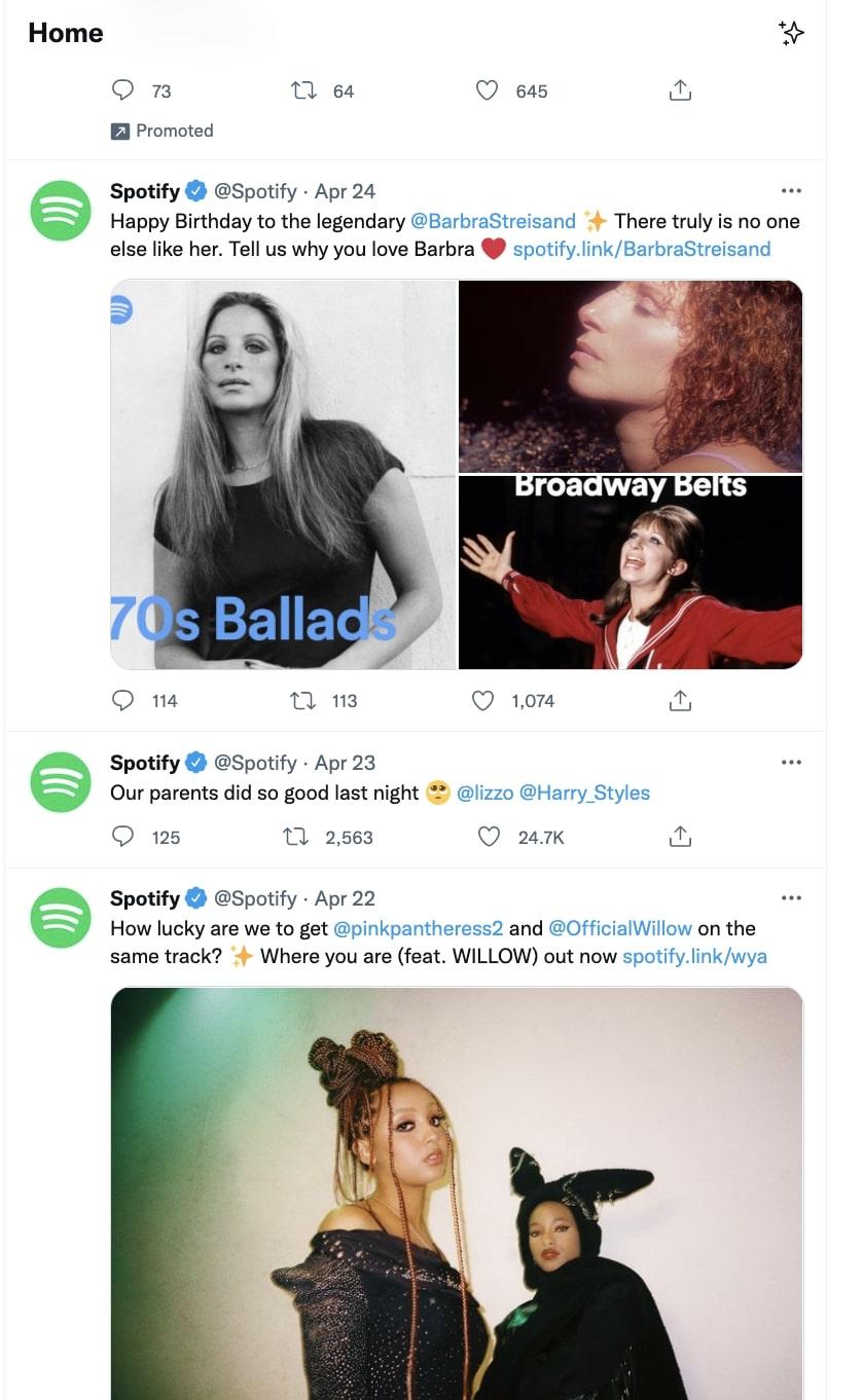
3. Empty state design
Empty state web app design patterns give users a good first impression by making sure they’re not confronted with confusing blank states or form fields where there’s no user data yet, guiding them through the flow of your web app.
Great empty state design helps users get started with examples or instructions that give them a sense of what fields or sections will look like once they’re filled with content.
Spotify uses empty state design patterns to remind users to start building up their music library by displaying an empty ‘Saved Songs’ section. The states’ emptiness reminds users what to do next, like inputting their favorite songs. Tumblr also uses empty states to inspire users to fill their dashboard with content they like.
Pro tip: empty state design patterns are best for web apps that let users personalize their profiles or dashboards. They give users an idea of what the empty area is supposed to look like once they take a certain action and compel users to engage with your web app.
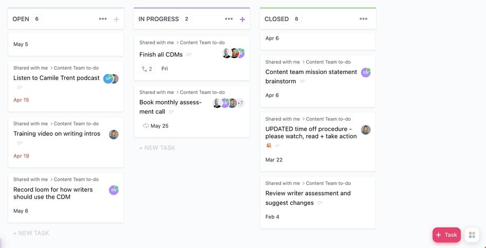
4. Content + data manipulation
This design pattern solves the user's desire to directly and intuitively interact with your web app. Design patterns that center on content and data manipulation let users edit content directly without having to transition between editing or deleting modes.
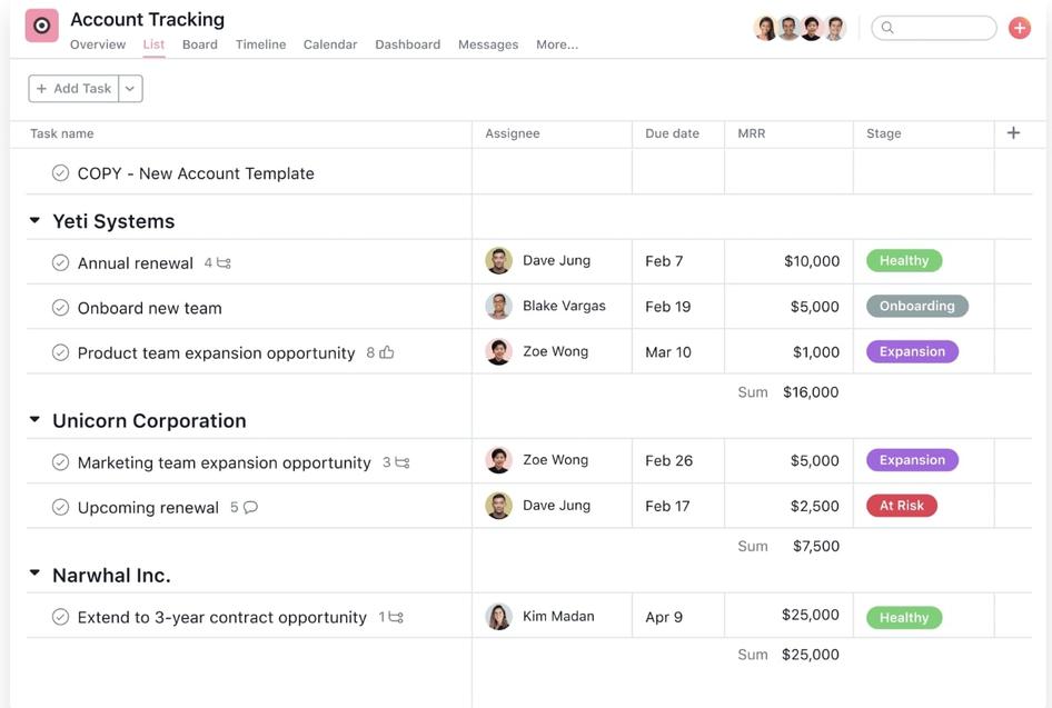
Letting users work with data directly on the screen can make your web app more intuitive and engaging by removing the extra layer of interaction given by buttons or context menus.
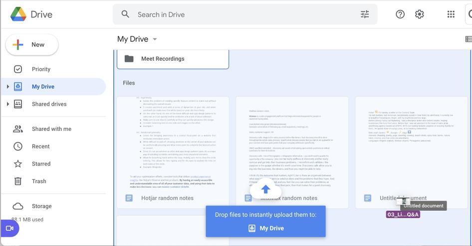
Google Drive also uses this design pattern to indicate how objects can be dropped into a folder without switching between multiple windows, which removes obstacles and lets users seamlessly interact with different options.
Pro tip: if you want to help users avoid frustration when performing tasks and offer them a seamless transition when rearranging items or initiating file uploads, manipulation of content and data is key. This web app design pattern ensures a smooth and intuitive user experience for dynamic, task-based web apps.
5. Split-screen
Split-screens solve the problem of providing two or more primary screen focuses. With split-screen design patterns, you showcase two contrasting ideas, giving them equal visual footing on your web app.
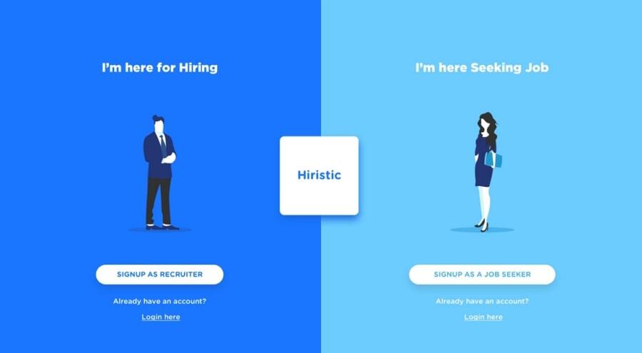
Split-screen patterns let you create a more responsive web application for your users—they can be presented differently on computer or mobile screens and easily adapted to various formats.
Paying attention to which options users pick also gives you important insights into their behavior, which you can use to curate the rest of their web app experience.
Split-screen patterns are best for web apps that cater to distinct functionalities or target personas, helping you guide different user groups on a personalized journey that ensures customer delight at every touchpoint.
Pro tip: use Hotjar Heatmaps to see where users are clicking in your split-screen design pattern, helping you identify the most popular and unpopular elements of your design so you can understand and improve the user experience.
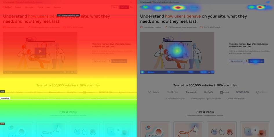
#Hotjar Heatmaps tools
Source: Hotjar
6. Single-page
Single-page patterns let users complete multiple tasks and actions all on one page without them having to waste time navigating between several different pages.
While single-page web app design patterns mimic some of the components found within a multi-page site, they allow for a continuous scrolling experience, ensuring users' jobs to be done aren’t interrupted by loading pages.
Single-page patterns are ideal for web apps that offer customers multiple elements as they make sure users don’t have to wait for separate pages to load between actions. This makes browsing faster and more responsive, elevating the product experience by empowering users to seamlessly transition from task to task.
Pro tip: if you use single-page patterns, use ‘sticky navigation’ to reduce user confusion. ‘Sticky’ navigation elements like menu bars stay visible and ‘stuck’ in the same position, so users have a fixed reference point as they navigate your web app.
7. Direct messaging
Direct messaging design patterns let users send private messages from within your web app alongside their other interactions.
Use this design pattern to enable user communication and interaction with your web app, so your customers don’t go somewhere else to complete the same action. Direct messaging can be combined with other web app design patterns to cater to multiple user needs in-app.

8. Horizontal symmetry
The horizontal symmetry pattern solves challenges in visual organization using symmetrical images like columns so that users can intuitively interact with your web app, promoting higher engagement, increased UX, and better brand recognition.
If your web app’s intent is to guide users through a logical, straightforward progression, horizontal symmetry can be a helpful pattern to let users map out what they need to do to achieve their goals.
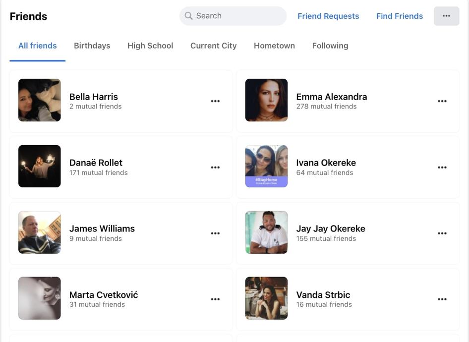
9. Group friends + content
This web app design pattern empowers users to curate large chunks of content according to their personal preferences with easy lists. For example, group friends and content lets users sort and organize their friends and followers inside web applications like Facebook.
Design patterns that let users group friends and content are a great solution for web apps that have several different user profiles and user-generated content, ensuring a smooth, social experience.
10. Draggable objects
Drag and drop design patterns help users sort and organize items in ways that make sense to them. This pattern lets users pick up and rearrange content, or simply drag it to perform an action.
This is a highly interactive design pattern, so make sure your UI provides visual feedback in the form of animations or color changes to clearly indicate to users that something is happening and a change has been made.
Use draggable objects if your web app features a lot of elements to inspire users to interactively move building blocks as part of their workflow. This helps boost user engagement as your customers can immediately make changes and understand their progress across different tasks.
Why use web app design patterns?
As these examples show, web app design patterns offer solutions to common, recurrent user problems, helping businesses improve their web application's UX and UI.
Web app design patterns enhance the user experience by:
Letting users dynamically engage with your web app and helping them perform tasks
Ensuring users can access and navigate your web app with comfort and consistency
Helping you anticipate how users will interact with your web app
Drawing on the tried-and-tested knowledge and experience of the design community to improve the quality of your web application
The right web app design pattern is about using fundamental UX/UI design principles and creating an engaging experience. People don’t always remember the information presented, but they do remember what they feel. Web app design patterns ensure the interface is user-friendly—helping to improve your customer retention, boost engagement, build customer loyalty, and increase conversion rate.
How to choose the right web app design pattern for your business
Choosing the right web app design pattern ultimately makes it easier for people to use your product, resulting in positive user experiences and loyal customers. Start by understanding customer experience and user needs. The right web app design pattern for you is the one that lets users interact with your web app to achieve their goals.
Take time to consider each of the design patterns above and decide which make the most sense for your business based on what you want to help users achieve and the type of user you’re looking to attract. If you have the budget, time, and flexibility, you can try out different patterns or combinations, experimenting to see which most help your users along their journey.
Tools like Hotjar Recordings help you better understand your users’ experience on your web app, arming you with real user insights on how to provide a more intuitive, dynamic experience and create customer delight.
Once you’ve seen how users are behaving, use Hotjar Ask tools like Surveys and Feedback widgets to listen to your users and get in-depth information on how they experience and engage with your web app. This will help you decide which design pattern to use and gauge whether you’ve selected the right one.
Take a look at our list of web app design examples for further inspiration on great web app design.
Understand how users experience your web app
Use Hotjar’s Observe and Ask tools for user-centered insights that will drive better design decisions