Learn / Guides / Website problems guide
6 mobile usability issues that could cost you conversions (and how to fix them)
As an online business owner, you know how important it is to have a website that looks great and functions well on all devices.
But do you know which common mobile website issues are turning customers away? And how can you ensure your website provides users with a great experience no matter what device they're using?

This guide examines six of the most common mobile usability issues, explains why they matter, and gives you tips on how to identify and fix them, including the tools you need to do this.
Let’s dive in!
1. Unresponsive design
Unresponsive design refers to a website that doesn’t adjust or adapt to different screen sizes and devices. This issue will quickly stop mobile website users in their tracks. It makes your website difficult for users to navigate and take a desired action—like purchasing a product—on mobile devices, which have smaller screens and different aspect ratios compared to desktops.
For example, if a website is designed only for desktop screens, it may appear distorted or require users to zoom in and out to read text, which can be frustrating and time-consuming.
Unresponsive design leads to a poor user experience (UX) and decreased conversions on your site—even if your offer is exactly what the visitor is looking for. If your mobile site is hard to browse, visitors will likely leave and find an alternative website that’s easier and more enjoyable to use.
How to identify and fix unresponsive design:
Mobile-Friendly Test: Google has a free tool that lets you know if your site is mobile-friendly. Type your URL into the Mobile-Friendly Test page, and in a couple of minutes you’ll have your results, including screenshots of how the tested page appears on mobile.
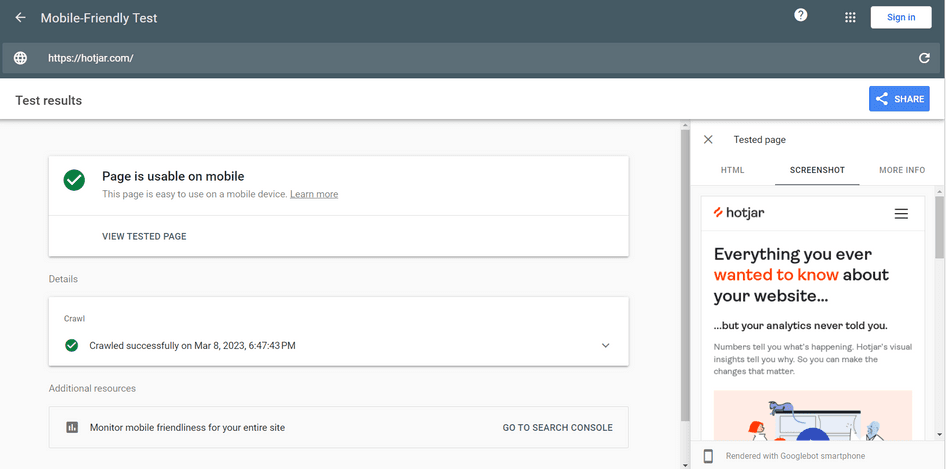
Image optimization: reduce the size of image files, so you can adjust visuals to fit into smaller spaces without becoming distorted or hard to see. You can optimize images online with sites like Squoosh, in Photoshop, or with WordPress plugins like WP Smush Pro.
Eliminate design clutter: use heatmaps to spot unnecessary elements in your website design (like complex animations or images and videos that are purely decorative). With fewer elements on the page, users will easily find what they’re looking for without getting confused or frustrated.

Hotjar Heatmaps show where users click, scroll, and engage with your mobile site, so you can easily identify less important elements and remove them from your web design
2. Non-mobile-friendly pop-ups
Pop-ups are windows that appear on top of a website's content, usually asking the user to perform an action, like signing up for a newsletter or giving feedback. Pop-ups may be useful on desktop browsers, but they can be a major issue on mobile devices.
More often than not, non-mobile-friendly pop-ups cover the entire screen, making it difficult for users to
Navigate away from the window
Interact with the content underneath
Close or ‘X’ out of, due to the icon’s small size
This kind of experience frustrates your users, leading to lower engagement and increased bounce rates.
How to identify and fix non-mobile-friendly pop-ups:
Monitor rage clicks: rage clicks are when users repeatedly click on an element of a site, and are a great way to identify user frustration. Analyze the number of rage clicks on your mobile pop-up with recordings, so you can get a sense of whether it’s annoying them or not.

Add parameters: add rules to your pop-up for when it appears. For instance, only after a certain amount of time or when the user has visited a specific number of pages. That way, it only displays when users have shown a clear interest in your site, making it less likely to turn them away.
Resize the pop-up: if you don’t want to get rid of the pop-up completely, try resizing it, and keep monitoring user behavior to ensure it’s not still causing problems for website visitors. Hotjar Trends is perfect for tracking user behavior metrics over time, so you can get a clear picture of how resizing the pop-up impacts your mobile visitors over a certain period.
Use Hotjar Trends to track and spot patterns in user behavior over time
3. Auto-playing media
Video or audio that starts playing automatically when the user opens or scrolls through a webpage can be a mobile usability problem, because it:
Disrupts the customer experience : that video in your hero section may look amazing on a desktop device, but some mobile users find it intrusive and annoying as it interrupts their ability to interact with your site.
Uses too much data: auto-playing media consumes a lot of data, which not only slows down your site’s load times, but may also affect the mobile device’s performance and force the user to download data they don’t want to, leading to a high phone bill nobody wants.
Drains users’ battery power : for auto-playing media that’s particularly long, users may decide to abandon the page so it doesn’t drain their battery.
How to identify and fix problems with auto-playing media:
Use heatmaps: see where users click on your site to understand if they're interested in your videos or just scrolling past them
Replace auto-playing videos: use a simple color block or a static, high-quality image in place of the video on mobile devices
💡 Pro tip: embed a survey link in an email to get your users' opinions about your mobile site's auto-playing media, and avoid the pop-up issues we mentioned earlier in this post.
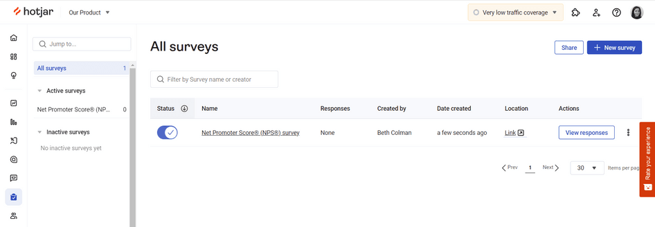
Here’s how to send a survey via email to your users with Hotjar:
Select ‘Link’ as your survey type, and format the rest of the survey (questions, appearance, and where you’ll get your responses) according to your preferences
Once it’s complete, navigate to ‘All surveys’ and find the correct survey in the list
Under ‘Location’, you’ll see a link. Click the link to open the survey in a new window, and copy the URL.
You can now paste the URL into an email and directly share the survey with your users
Uncover your mobile website issues with Hotjar
Understand where your users are getting lost or frustrated, so you can create amazing mobile experiences that drive sales on repeat.

4. Difficulties with touch input
Small touch targets (like buttons or links) are a major mobile usability issue, as they make it difficult for users to accurately tap where they want to.
For example, if the distance between two elements on the screen is too small or the touch target is incorrectly calibrated, users may accidentally tap on a different element. This isn’t only frustrating but can lead the user to an entirely different page than the one they wanted to visit.
In turn, this severely impacts conversion rates—users may abandon a purchase or decide not to complete a form if the touch inputs aren’t working correctly.
How to identify and fix difficulties with touch input:
Add touch feedback: mobile sites with great UX design use cues like color changes or vibrations to let the user know they’ve completed an action on the page
Meet recommended touch target sizes: ensure that touch targets are at least 44 pixels for buttons and links
Increase padding around touch targets: set your padding to at least 8 pixels for each side of the element to improve usability
💡Pro tip: use rage clicks as a filter in Hotjar Session Recordings to pinpoint the moment a user repeatedly clicks on touch targets on your site, so you can identify which changes to make to improve the user experience.
For example, say you have an ecommerce site selling shoes, and you notice you get a large number of rage clicks on product pages on mobile. Recordings let you see exactly where customers are getting stuck, whether it’s hitting the ‘+’ symbol to increase the quantity of an item, tapping the dropdown menu to select a size, or even clicking the button to add the item to their basket.
What a rage click looks like on a Hotjar Recording
5. Unclear navigation
When user interface (UI) design elements, like your layout, are unclear or confusing, customers may quickly become frustrated and abandon your website altogether—bad news for your bounce rates and conversions.
This causes a major problem because mobile users tend to be on the go, and they have less time and patience to navigate through a site.
For example, say you have an online bookstore and list your books by genre in your menu. This may look good on a desktop device where you have the space to display it properly, but it can quickly become annoying for mobile users who have to scroll down a long list to find the genre they’re looking for.
How to identify and fix unclear mobile navigation:
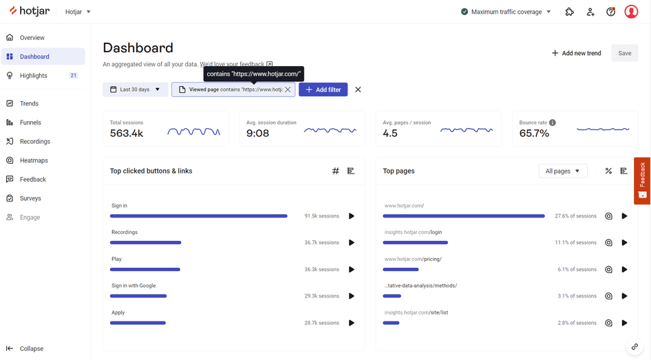
Check your web analytics: take a look at Google Analytics data or the Hotjar Dashboard for your homepage on mobile. If your bounce rate is particularly high (anything above 75%), this could indicate users are struggling to find their way around your site.
Simplify your menu: instead of a long drop-down menu with subcategories, consider using a few main categories that link to pages with more specific subcategories. For example, a clothing retailer might have main categories for ‘Men,’ ‘Women,’ and ‘Kids,’ with subcategories for ‘Tops,’ ‘Bottoms,’ and ‘Accessories.’
Optimize the user flow through testing: create different prototypes for your new design and test them with users before updating your site to avoid wasting precious time and resources on a navigation bar that won’t necessarily improve UX.
💡Pro tip: use software like Optimizely to launch A/B tests and different versions of your navigation, and create Hotjar Recordings of each variant to see the impact they have on your users.
6. Hard-to-read font
Font size, style, and color can cause issues on any device, but are particularly important for mobile devices due to their small screen size.
Here's why:
If your website’s font size is too small, users may have to strain their eyes to read the content or zoom in, which is frustrating and time-consuming
Text with poor contrast (where it doesn’t stand out enough against the page’s background color) makes it much harder for people with visual impairments or disabilities to access the content
Hard-to-read font also impacts your search engine optimization (SEO), as Google and other search engines prioritize mobile-friendly websites that have strong readability
How to identify and fix hard-to-read font:
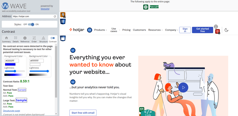
Use accessibility testing tools: check for compliance with accessibility standards using software like Wave to identify issues like poor contrast or problematic font size
Use recommended font sizes: UX pros recommend using at least 16px for body text, while headings and subheadings should always be larger and more prominent
Conduct user interviews: while accessibility tests and guidelines will put you on the right track, there’s no better way to understand mobile usability than to ask your users directly. Use Hotjar Interviews to get website feedback specifically for mobile devices, and ask users if your website’s content is easy to digest on their cell phones.

Put user needs first to create an amazing site experience on any device
It may feel like a daunting task, but prioritizing user needs and creating seamless experiences on any device is something every online business should strive for.
Use the tools and techniques we’ve outlined in this article to easily identify and fix any issues that might be hindering your mobile site's UX. In return, you’ll get higher website traffic, lower bounce rates, and more paying customers for your business.
Create amazing mobile experiences with Hotjar
Use Hotjar’s customer insights to catch mobile issues early and stop lost sales in their tracks.