Learn / Guides / UX design
How to leverage user insights to perfect your mobile UX design
Imagine if your vehicle could make right turns but not left. Only having part of the driving experience would get pretty frustrating, right? That’s what it’s like for your customers if your desktop site is wonderful, but your mobile UX design falls flat.

Since your mobile UX design is part of the customer experience, it can’t take a backseat.
Whether consciously or not, mobile website visitors judge everything they interact with. A hard-to-navigate site with annoying pop-ups drives people away, while an intuitive and engaging page draws customers in and builds brand affinity.
This guide covers
TL;DR
Creating a website that’s easy and enjoyable to use on a mobile device is a critical part of the customer experience, which impacts engagement, loyalty, and conversions.
Improve your mobile UX design by
Identifying what drives mobile visits, from referral sources to user goals
Removing barriers to engagement and conversion, like broken buttons or confusing navigation
Researching hooks that close a sale based on your customer personas
Comparing how mobile vs. desktop users use your website to tailor the experience
Prioritizing accessible design so every visitor can seamlessly use your mobile website
Measuring website analytics and iterating your UX designs
6 ways to improve UX design for mobile devices
Mobile user experience (UX) design is the process of building a website that’s easy and enjoyable to use on a mobile device. It’s an important subsection of UX design because 57% of the time people spend browsing the internet is on a mobile device.
While the same basic UX design principles apply to mobile and desktop sites, visitors may interact differently when browsing desktop and mobile.
Because the way your customers use your mobile and desktop sites varies, you need to test and fine-tune them separately—but it’s worth it. Here’s why:
Now that you know why mobile UX design matters, let’s dive into techniques to optimize it.
1. Identify what drives mobile visits
Drivers are why and how visitors make it to your site. The path people take to get to your site and what they want to do can vary between desktop and mobile, so you need to design your mobile site to put relevant information front and center.
Here are a few ways to identify what drives mobile visitors:
Find your most popular landing pages for mobile visits and prioritize UX improvements there
Watch recordings—real-time playbacks of visitor interactions—to learn how users move through your site and what content or pages they look at
Test a ‘start here’ page or prominent buttons for page categories and review what’s most popular with mobile visitors
💡 Pro tip: use mobile UX-friendly surveys to learn more about your customers.
Surveys let you hear directly from customers to find ways to improve your UX design, but if you aren't careful, your on-page mobile survey can sabotage the experience you want to improve.
Here are a few ways to use surveys without ignoring mobile UX design principles:
Use embedded surveys that exist on your mobile page instead of a pop-up that covers your user’s entire screen
Send a survey to customers via email that asks about their experience with your mobile website
If you do use a pop-up survey, test the design across devices to make sure the ‘X’ button is noticeable and easy to use
2. Remove barriers to engagement and conversion
A barrier is anything that causes mobile visitors to leave, like a button that doesn’t work or missing information. These screeching halt moments affect the current visitor session and leave a lasting impression that keeps potential customers from returning.
Bugs, faulty design, and frustration are bound to happen sometimes, so your best bet is to be on the lookout for barriers that need attention. Here’s how:
Filter recordings for rage clicks and u-turns that signal frustration or confusion through repeated clicks or quickly going back to a previous page
Use an on-page feedback widget to find pages visitors are unhappy with
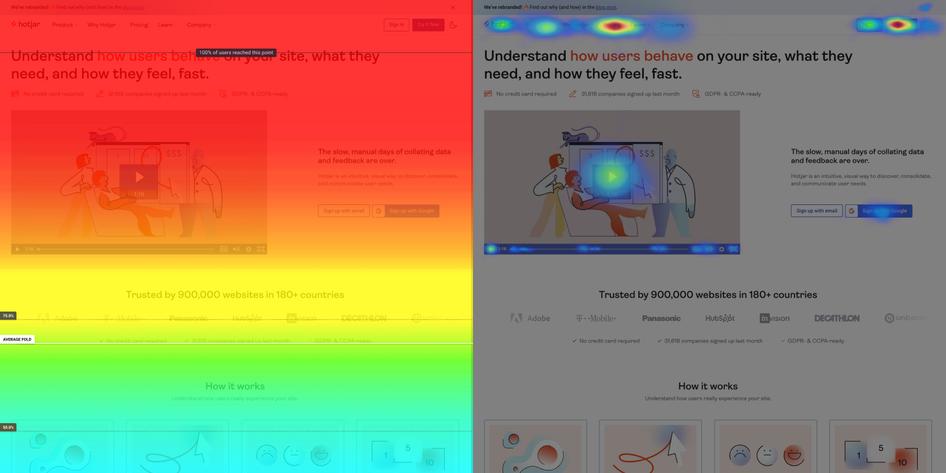
Review heatmaps that visualize where most visitors scroll, click, and move to find critical elements they ignore or unnecessary designs you can delete
🏃 In a hurry? Try these quick fixes to common mobile UX problems.
The tips above help you find barriers specific to your audience and mobile site, but there are other common mobile website issues to resolve that improve your UX.
Use Google’s mobile-friendly test to find unresponsive design elements
Optimize image files with Smoosh
Create touch targets that are at least 44 pixels for buttons and links, and set your button and link padding to at least 8 pixels for each side
Add parameters to pop-ups, like a minimum number of pages visited, to ensure you only show them to interested visitors
Replace auto-playing content with a static image to avoid draining mobile device batteries and consuming too much data
3. Research hooks that close the sale
Hooks are the elements that persuade users to take action or make a purchase, so you need to learn what resonates with mobile users to improve your design and increase conversions.
Here are a few ways to find hooks:
Identify customers who purchased on mobile and email them a link to a post-purchase survey to learn what they liked about the experience and what almost kept them from buying
Conduct A/B tests to find UX design variants that increase sales, and then review recordings from those sessions to understand why the design worked
Interview customers about their goals, challenges, and preferences and then use their terminology in your designs

💡 Pro tip: learn about your customers to discover your winning UX design for mobile.
Understanding customer psychographics—which outline who your customers are beyond classic demographics like age—helps you create mobile UX designs they love interacting with.
For example, the branding and layout of a mobile website for an outdoor gear company would be very different than one for a luxury apartment building in the city because the goals and priorities of each customer group vary.
Here are a few examples of how customer details influence UX design:
Personality: extroverts might prefer group shots, while introverts could want images of solo time
Interests: people interested in pop culture may connect with a CPG company that uses movie references in their design
Beliefs: a collection of logos from organizations a company donates to might hook a socially conscious audience
Values: budget buyers might gravitate toward products images with stickers of the percent savings for bulk orders or subscriptions
4. Compare user flow expectations vs. reality
Even the most customer-centric UX decisions are still somewhat of a guess—you need to see how users interact in reality and compare it to your expectation.
User experience tools give you a real-time look into mobile website interactions:
Filter funnels to view mobile and tablet sessions to visualize where users drop off, then compare them to desktop visits
Review recordings for mobile and tablet visits to learn how visitors navigate your website on mobile vs. desktop
Use heatmaps to uncover what navigation elements mobile visitors interact with and use this to prioritize your design roadmap
How re:member optimized their mobile website
Re:member, one of Scandinavia’s leading credit market companies, used Hotjar’s UX and behavior analytics tools to increase conversions by 43%. Here’s the five-step process they used to spot and fix a mobile UX issue you can emulate.
Watch recordings: re:member realized mobile website users hovered over the ‘benefits’ section on their application page and often scrolled up and down the sign-up form without filling it out
Review click maps: visitors tried to click on the benefits section and expected bullet points to be an expandable area
Compare user behavior between traffic sources: the re:member team took the analysis a step further and compared mobile UX interactions across traffic sources
Create a hypothesis: they realized that users (especially those from affiliate links) wanted more information about the application’s benefits before they could make a decision
Test a solution: the team moved the ‘benefits’ section to the top of the mobile page and created an expandable section on the desktop version
Re:member discovered that additional card details encouraged visitors to fill out an application
5. Prioritize accessible design
You want everyone to enjoy your website, so you need to consider your UX design accessibility. Permanent visual, mental, or physical impairments and even temporary injuries like a broken hand all impact how customers use your website.
Here are a few accessibility tips to incorporate into your design:
Put labels in code for dynamic content to work with screen readers
Review heatmaps to see which navigation headers visitors frequently use and which you can delete to simplify your design
Use WAVE to check font accessibility
Check the color contrast of your site
Don’t rely on colors to convey a message, like green for ‘good’ and red for ‘bad’—add symbols or text, too
💡Pro tip: talk to customers about their mobile experience.
Talk to customers, especially those with disabilities that impact how they use your website, to gain a new perspective on your UX accessibility.
Email your customers a short survey to recruit participants for accessibility testing, then use an interview to hear about their experiences with your mobile site.
Customize your recruitment survey questions to find participants from a particular segment
6. Measure and iterate
After you implement the previous strategies, you need to measure their performance. Mobile website metrics signal potential issues and high-performing pages, which means they’ll help you find pages to iterate and designs to duplicate.
Here’s what to measure to monitor your mobile UX design:
Checkout and cart abandonment rate: find what mobile UX moments make customers leave a sale
Conversion rate: compare conversion rates between devices and over time to find UX issues
Net Promoter Score® (NPS): understand how likely mobile customers are to recommend you to their friends
Customer satisfaction (CSAT): gauge overall customer satisfaction to benchmark sentiment toward your UX design
💡 Pro tip: get a high-level view of UX metrics with Hotjar Trends.
Reviewing detailed user analytics, like a single recording of a mobile visit, helps you iron out details of your mobile UX design—but you also need to review performance from a high level.
Hotjar Trends lets you visualize user behavior patterns to stay aware of the overall customer experience. For example, you can check if u-turns on your mobile site trend up to find pages with outdated information or broken design elements.
5 amazing mobile UX design examples to learn from
The best mobile UX design is specific to your company and audience—which takes some time to perfect. Still, looking at inspiring examples of great UX design for mobile offers a starting point and a way to learn without a lengthy trial-and-error process.
1. Duolingo’s integrated research
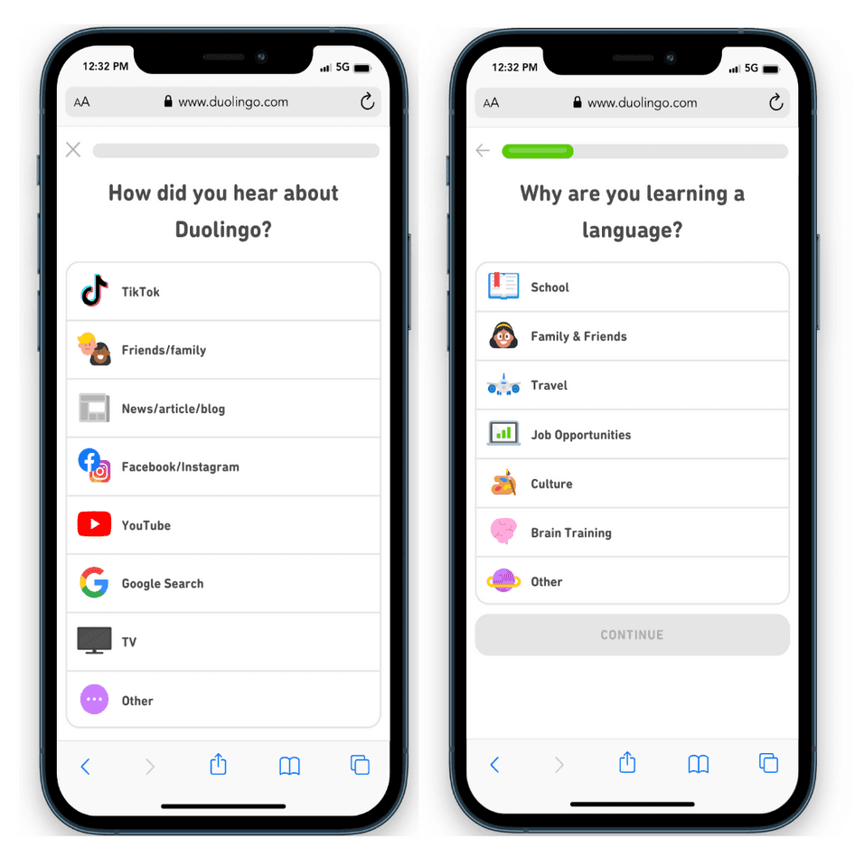
Duolingo’s mobile site asks new users how they heard about the program and why they want to learn
Why it works:
Duolingo’s site identifies drivers by asking how mobile visitors heard about the company
All of the answer options appear on the page without scrolling
There are recognizable icons for options next to the text
There’s only one question per page to avoid overwhelming visitors
2. Hotel Tonight’s on-the-go priorities
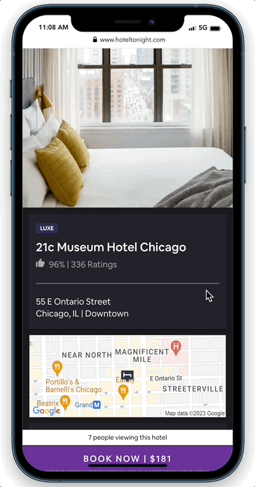
Hotel Tonight puts quick reference hotel details at the top of the mobile page, like guest rating and location
Why it works:
Hotel Tonight’s mobile website places the hotel map at the top of the page—instead of further down like on the desktop version—which is perfect for on-the-go customers
Visitors can establish a quicker opinion thanks to the ‘Why We Like It’ copy high on the page
The ‘Book now’ button with nightly price is always visible so visitors don’t have to scroll up or down to find it
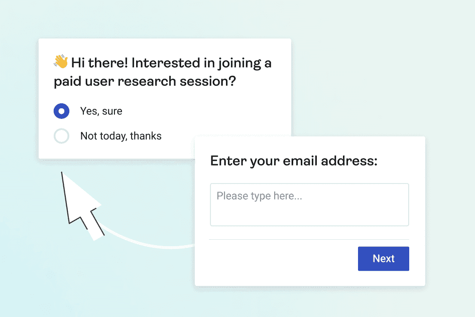
3. Hotjar’s unobtrusive feedback
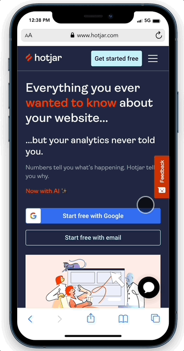
Hotjar’s feedback widget doesn’t automatically pop-up or cover the entire mobile website page
Why it works:
Hotjar’s feedback widget only opens when a visitor clicks on it—no intrusive pop-ups
The ‘X’ button on the first pop-up is visible, and the pop-up doesn’t block the screen
The text box lets visitors add more comments
4. InVision’s content hierarchy
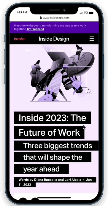
InVision’s blog lets the content take up as much space as possible on the mobile site by eliminating any distracting sidebars
Why it works:
InVision’s website focus is just on the content—it eliminates distractions and the font is as large as possible
There’s a subtle progress bar at the top of the page to let readers know how far into the content they are
There’s white space between paragraphs and between lines for readability
5. Spotahome’s delightful details
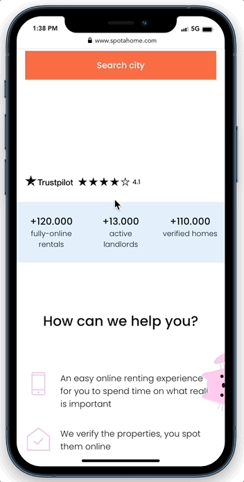
Spotahome uses a subtle illustration at the side of the mobile website that opens a quiz for new users to find housing
Why it works:
The cat on the side of Spotahome’s mobile site creates delight. At first, you don’t notice it, but it’s too cute not to investigate.
The short quiz feels like an adventure unfolding while being a lead driver for the company
The progress bar lets visitors know how far they are in the process
Great mobile UX design begins with empathy
User behavior and interactions transform your website from a collection of code into an experience—so it’s critical to include customers in your mobile UX design efforts. Learning from customers helps you make relevant design decisions with less guesswork to create an enjoyable mobile site for visitors.
You might not always know what to ask and when, but leading with empathy and learning along the way will carry you to your goals.
Test your mobile UX design with Hotjar
Hotjar’s tools let you see exactly how mobile visitors interact with your site so you can test and iterate your design.
