Learn / Guides / Dashboards guide
How to turn insights into action with Hotjar Dashboards
Get to grips with the metrics on your Dashboards, a Hotjar feature that gives you a bird’s-eye view of what is happening on your site and why, so you know exactly what to prioritize.

Dashboards display information on a single-view, easy-to-digest visual interface, making valuable data such as user metrics available to teams, departments, and entire organizations in one place.
All this time-saving, choice-defining capability is present on Hotjar Dashboards, designed for digital product teams, marketers, and UX designers wanting quick access to the metrics they care about. Use this feature to share important findings with teammates, enhance collaboration, enrich decision-making, and reach growth goals.
Let’s dive into this feature, step by step.
Accurate insights for fast-paced teams
Access all the user metrics that matter on one platform. Through Hotjar’s Dashboards, teams can share insights, deepen their analysis, and make decisions that drive business growth.

How to view your Dashboards
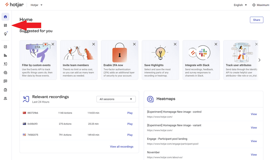
Signing in to Hotjar takes you to the Overview page, which contains all the relevant Hotjar tools and insights, from session recordings and heatmaps to feedback and surveys. It also links to Dashboards and specific tool dashboards on the left side.
In this guide, we'll go straight to the Dashboards page. Remember that this feature is free for all Hotjar plan users, so you can access it anytime.
What your dashboard will look like
The way your dashboard looks is up to you. Remember, you can create as many dashboards as you like in Dashboards. Each of them is flexible: you can customize them to your needs.
That being said, when creating a new dashboard, you can choose between several templates:
Page issues
New release
Marketing campaign
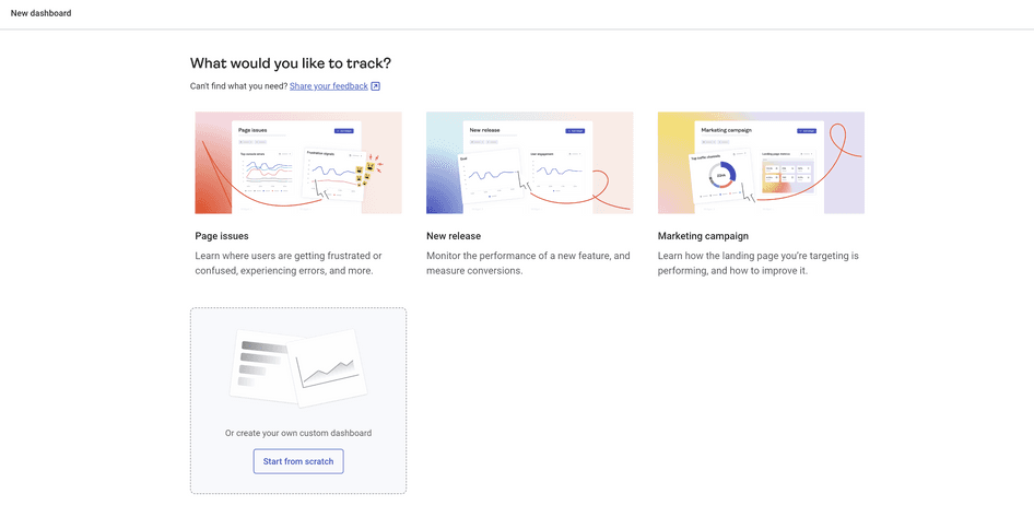
Your dashboard will be automatically populated with widgets relevant to the default use case you’ve selected.
For instance, a “Marketing campaign” dashboard will display your top traffic channels as well as traffic to the landing page of your choice. On the other hand, a “Page issues” dashboard will let you monitor top console errors and keep an eye on rage clicks and u-turns.
But again, each dashboard, even the templated ones, is entirely customizable: add the widgets you need and remove those you don’t.
What can you see on your dashboards
Depending on the dashboard template you use, the default widgets you’ll see won’t be the same. Dashboards comprises a snapshot of trends across multiple session-based metrics and a series of widgets displaying your user experience data.
Learn more about each dashboard widget and element, so you can start sharing product metrics with your team and improve user experience fast.
1. Key session data overview
Speaking of fast, this aggregate view provides key session data in one place. There's no need for you to switch to Google Analytics or initiate an external integration. This one is available by default on every type of dashboard.

It displays data on four key metrics:
Total sessions
Google defines a session as a sequence of user interactions with your product or website taking place within a particular time frame. This means it includes everything a user does during each visit, such as viewing a product, adding items to their cart, and completing the checkout process.
💡Dashboards takes it up a notch by allowing you to uncover the story behind the numbers. For example, you can record how users interact with your website, seeing exactly where they drop out. And by reviewing and analyzing session recordings, you can optimize exit pages for better conversion.
Average session duration
This measures the average length of sessions on your website. Counting starts from the moment a user lands on your site and continues until they leave or become inactive for up to 30 minutes, after which the session duration will reset zero.
Average session duration can show you how long it takes users to get through a sales funnel. However, it does not count exit pages, so you can't optimize those to improve conversions. You need the qualitative tools on Dashboards (like surveys) to understand why users leave without making a purchase.
Average pages per session
This metric refers to the average number of pages a user visits in a given session. It can help you gauge how sticky your site is. For example, an average pages/session of 2 means users view a couple of pages on average before they exit your site.
To increase the number of pages visitors see, you can ask them open-ended questions, such as the type of content they find engaging, through the Hotjar Feedback tool.
Bounce rate
Your site's bounce rate is the percentage of sessions resulting in a bounce. Also called a single-page session, a bounce occurs when a user enters your site, fails to interact with it in a meaningful way, and then leaves.
If you have a high-bounce page, session recordings can give you a sense of what's causing users to bounce without converting and help you plan to reduce bounce rate.
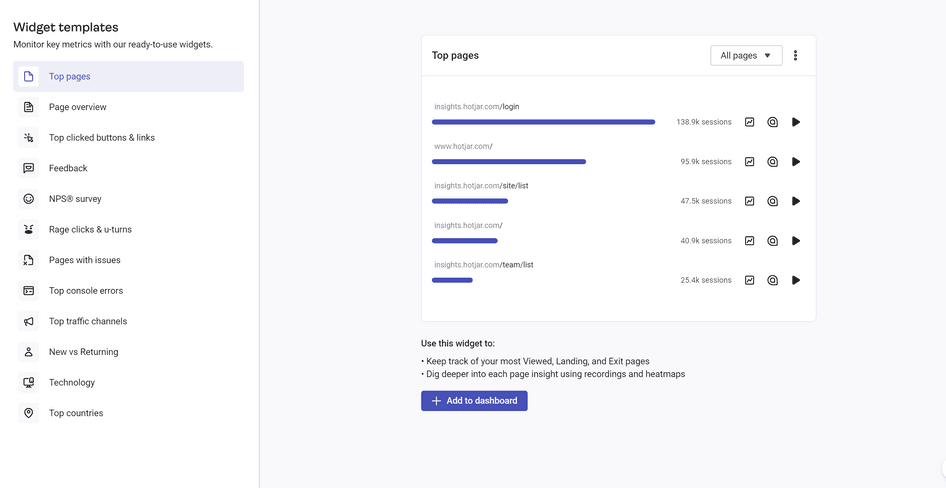
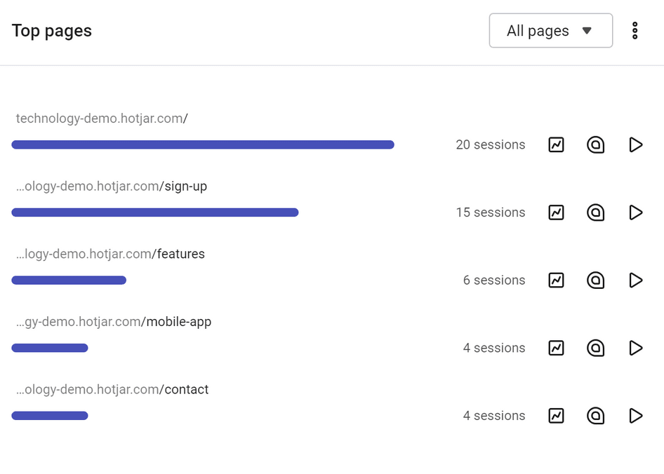
2. Top pages
Find out where users are spending most of their time through this widget. You can also zoom in on exit pages and quickly see where users are leaving and why.
To analyze further, click through specific heatmaps and recordings beside each page. Lastly, use the filter to customize your view based only on the landing pages or exit pages.
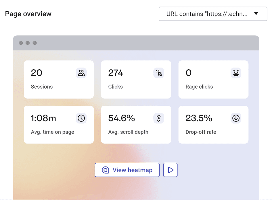
3. Page overview
This widget lets you keep an eye on key quantitative metrics in one place and dig deeper into qualitative insights by sending you to relevant heatmaps and session recordings with a single click.
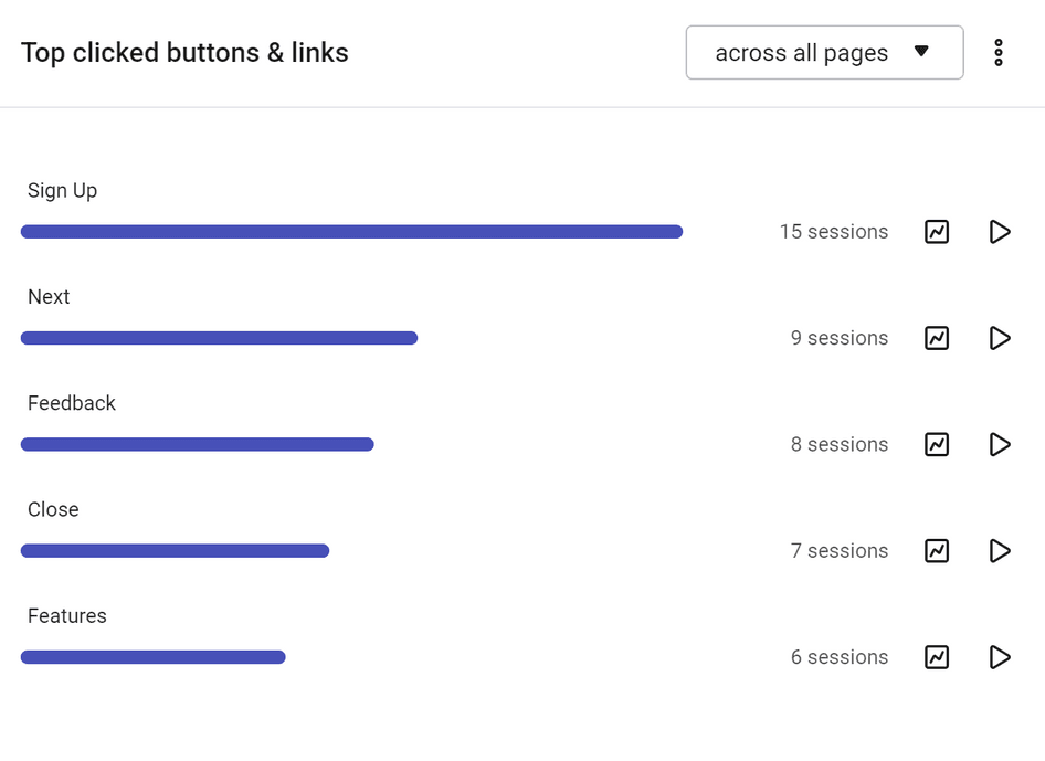
4. Top clicked buttons & links
Track and compare the calls to action (CTAs) your users engage with the most, either across all the pages encompassed within your dashboard, or on a specific page.
From this widget, you can dive deeper into the performance of a particular CTA (button or link) by viewing its Trends data or viewing recordings of users who either clicked on it or didn’t, so you can understand why and improve CTR.
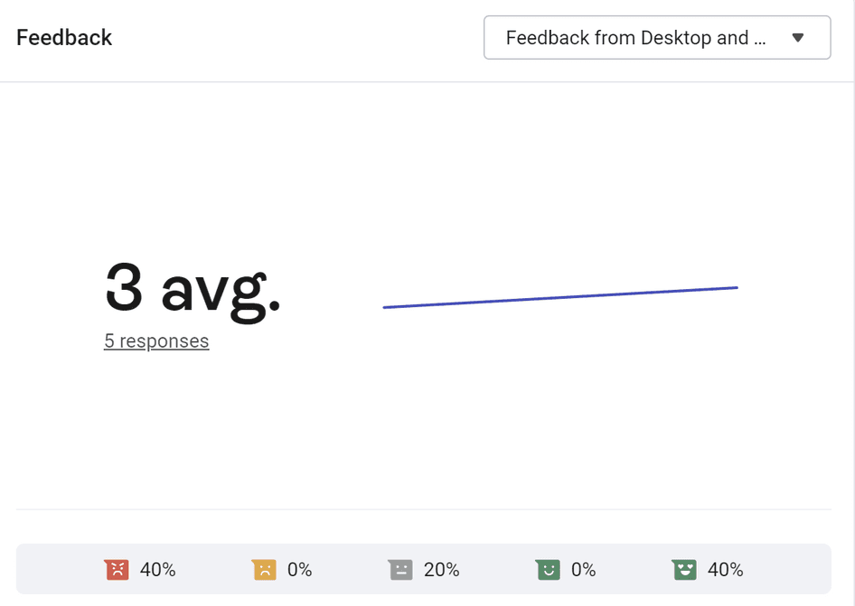
5. Feedback
This data comes directly from Hotjar's Feedback tool. The Feedback widget shows you how users feel about your site over time. Here, you can look at the average score, the number of responses, and the percentage contribution of how users responded.
It's a great way to see at a glance how users are feeling as you make changes to your site and whether the improvements you implement make a difference to user sentiment.
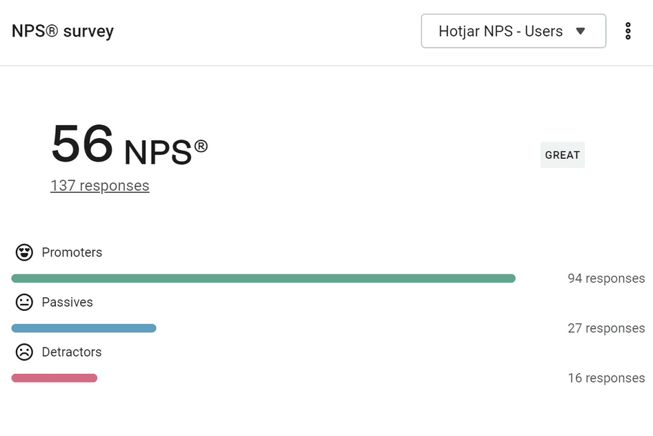
6. NPS survey
The NPS survey widget lets you keep an eye on your NPS score, to give you an idea of how customer satisfaction and loyalty are trending and whether improvements to your site are making a difference.
The breakdown of the score is also available at a glance, so you always know how many promoters and detractors you have.
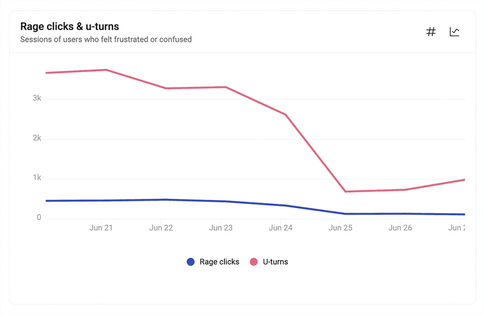
7. Rage click & u-turn trends
Here's an important widget for checking where users are feeling frustrated. The insights originate from recordings, and you can jump back to relevant session replays with a single click by hovering over the chart.
By looking at where frustration is building up, you can spot problems before they become worse. Plus, by zooming out to Trends from the chart, you can tell if an event is one-time or a part of a broader pattern that's emerging and needs to be nipped in the bud.
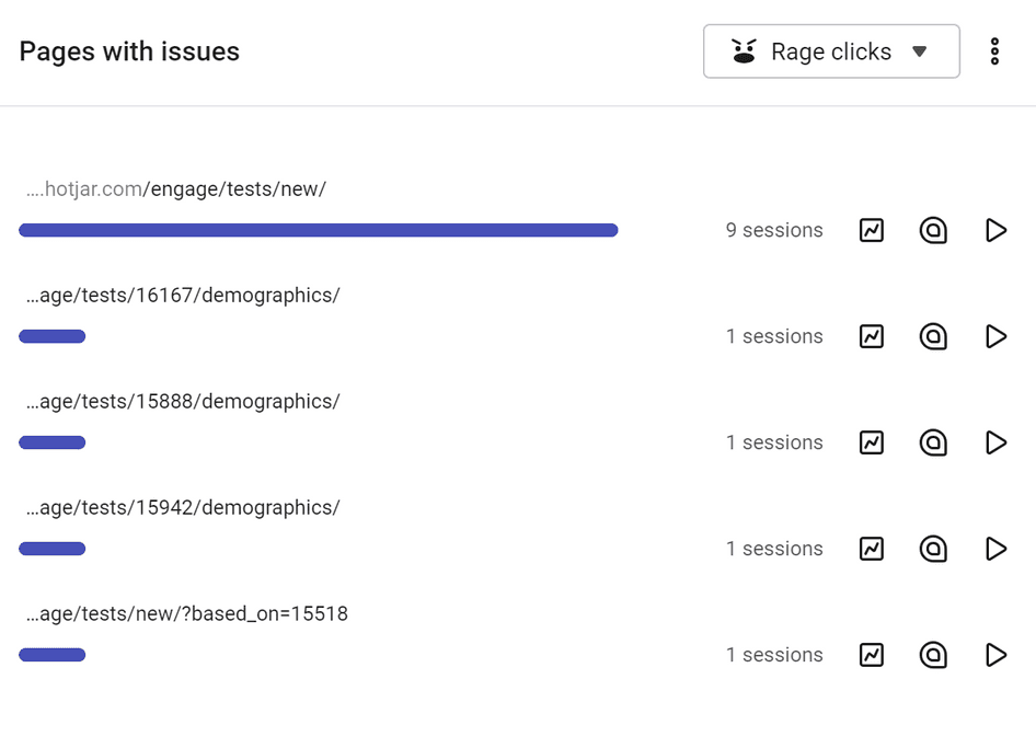
8. Pages with issues
This handy widget is your one-stop source of insights on pages that frustrate and confuse your users.
Identify the pages on your site that collect the most rage clicks, u-turns, and errors, then explore those issues in greater depth with recordings, heatmaps, and trends to understand what caused those poor user experience signals. Evaluate their impact and prioritize fixes for the issues you’ve uncovered.
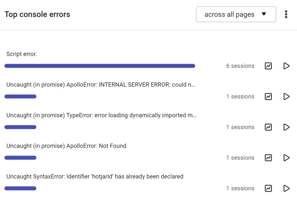
9. Top console errors
This widget sheds light on the top JavaScript errors on your site, so you can not only keep track of them, but also view recordings to help you or your developers debug and fix those issues faster.
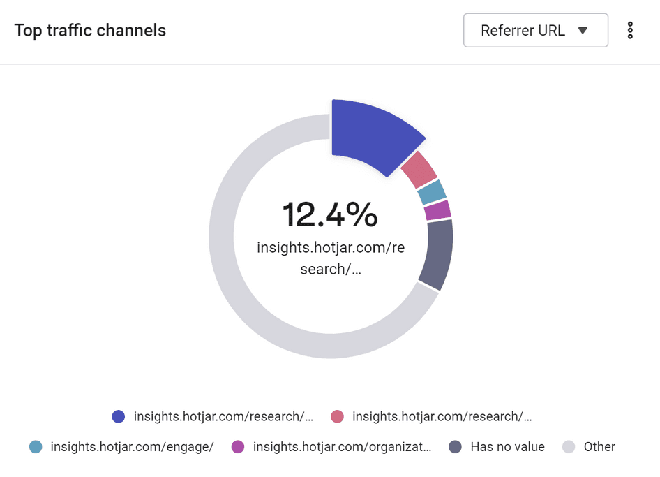
10. Top traffic channels
This widget gives you visibility on where your users come from. Marketers can use it to analyze how users find their site and which of their marketing campaigns were the most successful, by filtering by different UTM parameters.
Go one step further and watch session recordings of users landing on your site from different sources to understand what their user journey looks like and how each differs from one source to another.
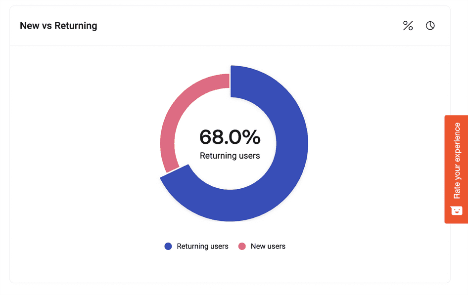
11. New vs returning
Now, let's look at the first aggregate data highlighting user preferences: New vs Returning compares sessions between your first-time and returning users, one of the most basic (but useful) forms of segmentation.
From this widget, you can compare how those two user segments interact with your site by watching recordings of new or returning users. Zoom out to Trends to get a bird’s-eye view on how the two segments evolve over time.
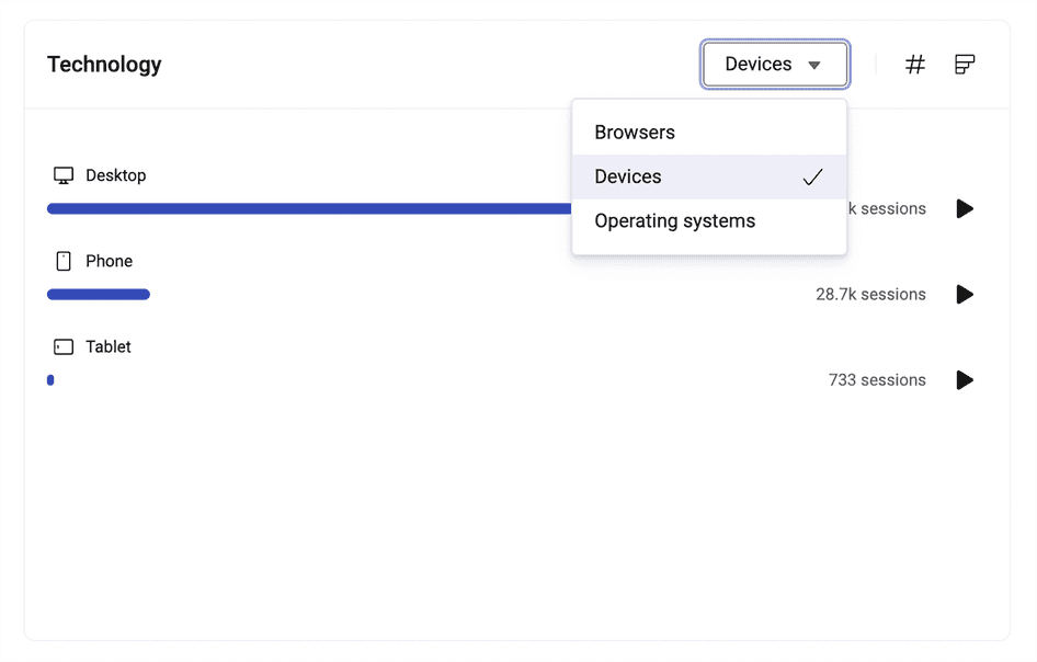
12. Technology
Explore this cool widget to learn the devices, operating systems, and browsers users rely on while visiting your site. Even better is its ability to take you to the recordings of a particular user journey, such as phone or desktop: use it to fix bugs or enable someone on your team to do so more easily.
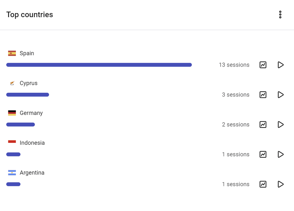
13. Top countries
Get a glimpse of the countries where your users are based and visiting from. Again, it includes recordings to assist you in digging deeper into your demographics and how they (potentially) impact user behavior.
💡Pro tip: take advantage of the filter functionality for more focused Dashboards analysis. Filters allow you to view only a specific group of sessions that match your filtering criteria. Customize your data based on the date (free on all plans) and path, session, and technology parameters available on paid plans.
What these findings will tell you
From product managers and designers to researchers, analysts, and marketers, everyone on your team benefits from having access to quantitative data and qualitative data in one place. It enables teams to find meaningful insights fast and make product-related decisions with confidence.
Get into the habit of using Hotjar Dashboards to share product metrics with your team where and when it matters:
Compare converting with non-converting users. Check average sentiment to determine relevant recordings and find out where users who don't convert are experiencing problems and why this might be happening.
See if a site redesign has improved UX. Monitor rage clicks, u-turns, device and browser types, average session duration, and bounce rate for unexpected issues.
Capture trends based on ongoing work. Look for an improvement in user sentiment and a reduction in rage clicks and u-turns.
Identify if a user’s interactions are part of a bigger issue that’s affecting more users. Let the timeline of rage clicks paint the picture for you.
Pinpoint where users are leaving your site and why they’re leaving. View your top exit pages and analyze related heatmaps, recordings, and feedback to uncover the reason.
Where fast-paced teams find valuable insights without the fuss
Organizations rely on Hotjar Dashboards for product team alignment, efficient workflow, and accurate insights. This feature provides a simple and visual way to monitor and improve the user experience. Use it to make informed decisions about your product and drive business growth.
Find your most important data in one place
Get an aggregate, visual view of user data on your Dashboards and share meaningful insights with your teammates. Best of all, this feature is free for all Hotjar users!