Learn / Guides / Ecommerce guide
Ecommerce UX: what it is, why it matters, and ways to improve
With more retailers in the online marketplace than ever before, it’s not enough to offer your customers great products. To stand out from competitors and increase conversions, you also have to make your ecommerce user experience (UX) simple and satisfying.
You need to make it easy for a customer to locate a product, add it to their cart, and click purchase—before they get distracted or have second thoughts and bounce.

This guide gives you an overview of what ecommerce UX is, its benefits, and best practices. You’ll walk away with an actionable seven-step framework to improve your overall ecommerce customer experience (CX), leading to more satisfaction, loyalty, and conversions.
Use Hotjar's product experience insights to improve ecommerce UX
Use Hotjar to understand how real users experience your ecommerce site—then optimize it for them

What is ecommerce UX?
Ecommerce UX is how an end-user experiences shopping on a website. Every touchpoint adds to a user’s perceptions of your brand, website, and product or service.
That means that from the moment users arrive on your site or app, they start to form a sense of how easy, useful, and efficient your ecommerce experience is. Every micro-interaction with a scrollbar and every form field on the checkout page contributes to the overall UX—and how likely customers are to shop at your store again.
But your ecommerce user experience extends beyond the checkout process—it also includes the way you deliver a digital download and the number of hoops a customer has to jump through to make a return.
The difference between ecommerce UI and UX
Ecommerce UI and UX aren’t the same, but they’re closely related. In fact, they’re so intertwined that people will often discuss them together, as in ‘UI/UX.’
Ecommerce user interface (UI) is how a user interacts with a website through elements like buttons or notifications. UI design also includes how aesthetics and layout influence these interactions. For example, a UI designer might experiment with different button colors and layouts for a loyalty club sign-up form.
Meanwhile, ecommerce UX is the user's thoughts and feelings resulting from their interactions with those elements. A UX designer might consider how many fields the brand should include on a sign-up form before the user decides to throw in the towel in frustration.
UX and UI go hand-in-hand: ecommerce UX design is about creating easy and enjoyable interactions, which UI elements help you achieve. Follow these seven steps to design an amazing ecommerce user experience on your online store:
A 7-step framework to create a stellar ecommerce UX
A strong ecommerce shopping UX helps your company stand out from the competition in the marketplace and lets you…
Increase customer delight and satisfaction
Improve customer retention and loyalty
Great UX is a win-win: it helps boost your sales and revenue and lets you give your users easy and enjoyable encounters with your brand and its products or services.
Let’s look at seven practical steps to refine your ecommerce store’s UX and reap the rewards:
1. Get to know your users’ wants and needs
If your desired outcome is a better user experience, you first need to determine what your user wants to experience.
Say you’re a UX designer for an online clothing retailer. Start by gathering quantitative data to identify who your users are, where they’re from, and what pages they visit. Google Analytics is the perfect starting point: it’s free and integrates with Hotjar. 👋
Then, dig deeper into why your users behave as they do. Think about behaviors like what makes them click ‘Add to bag’ on a product page—or why they might add that cashmere sweater and then abandon their cart.
The best source for this kind of data—qualitative data—is the user itself. Include a Hotjar Feedback widget on any page of your site to ask users how they feel at that moment in time and why. Or, run tests and interview real users with Hotjar Engage.
Stepping into your users’ shoes
Matt Lady is the Head of Growth at Stumptown Mattress, a local mattress retailer in Portland, Oregon, with a fledgling direct-to-consumer (DTC) arm. He also hosts two podcasts: ‘eCommerce Uncovered’ and ‘Brand Builders’ on his HighKeyGeek YouTube channel.
To provide the best UX for online shoppers, Matt recommends that businesses think from the customer’s perspective and ensure their site answers the following questions:
What is this product?
Why does it exist?
How does it benefit my life?
Why is this product the best option?
How soon can I get it if I order it right now?
If you’re unsure whether your website makes the grade, follow these tips to learn how to analyze your existing ecommerce site from the user’s perspective.
2. Focus on simple, intuitive navigation
Excellent navigation is essential for ecommerce sites. If it’s easy for users to move from one element or page to another, they’ll spend more time on your site—and the longer they stick around, the higher the odds they’ll make a purchase.
To improve navigation on your site, offer your users familiar and easy-to-use tools.
The problem? It’s easier said than done. There are countless options for navigation: various menu types for desktop and mobile, different footer styles to manage links, search bars to find specific products easily, and product categorization buttons.
Think back to your user. What do they want and need from your site? Then, consider the best, fastest, and clearest path to get them there.
For ecommerce sites, start with these best practices:
Provide optimal menus for desktop and mobile views: for example, if you offer a wide range of products, you might use an extra-large ‘mega menu’ on desktop but opt for a bottom tab navigator for simplicity’s sake on mobile
Keep design elements consistent: make all ‘add to cart’ buttons the same color and use similar layouts across your pages
Create landing pages for your top categories to organize items clearly for users. For example, your store might offer pages for ‘Women,’ ‘Men,’ ‘Kids,’ and ‘Home.’
Have a search icon visible on both desktop and mobile views so there’s always a fallback option for users who want a more straightforward journey
💡Pro tip: watch how real users navigate your site.
To get a true sense of how users experience your website, you need to observe them ‘in the wild.’
The Hawthorne effect states that people will act differently if they know someone is watching. With Hotjar Recordings, you avoid the Hawthorne effect. Instead, you can watch recordings of users’ cursor movements, scrolls, and clicks from real sessions on your ecommerce site.
You’ll see moments like a user exiting your site when they see an overly complex menu, or clicking ‘add to bag’ before selecting required inputs.
Ecommerce Warriors watched Hotjar Recordings and discovered that users kept missing the size field on product pages. Shoppers clicked the ‘add to bag’ button repeatedly but couldn’t move on in the checkout process without selecting their size, so Ecommerce Warriors explored new design and color options to communicate sizing more clearly to their users and lessen friction.
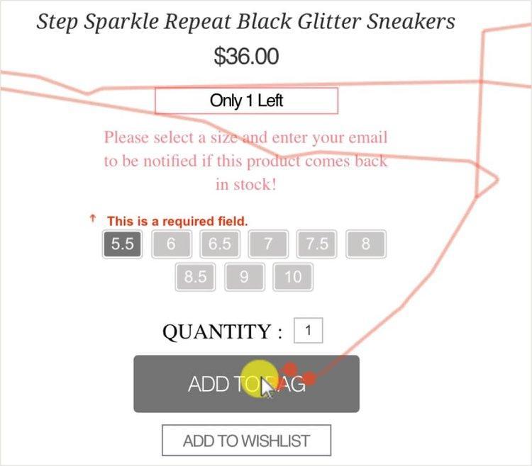
Ecommerce Warriors used Hotjar Recordings to catch an issue causing friction in the user experience.
3. Carefully consider product-page layouts
Many ecommerce website owners think of two main elements when it comes to product pages: photos and descriptions.
While high-quality images and compelling copy help convince users to purchase, the layout of these pages is just as important.
For the best ecommerce UX, present just enough information for the shopper to make a decision, but not so much that you’ll overwhelm them. Plus, you’ll need to organize that information in an intuitive way to minimize excessive scrolling or prevent users from hopping to another page.
Online printing company Gogoprint (formerly Zenprint) knew from Google Analytics that there was a problem causing dropoff on their product pages—but they weren’t sure what it was. The Gogoprint team looked at user click patterns with Hotjar Recordings and used Heatmaps to see if users were lingering in the right places.
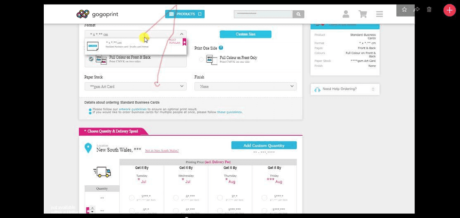
With Hotjar’s help, the team found a design problem in the pricing table that was causing users to drop-off. Then, they developed new layouts and conducted A/B testing to see which version of their pricing table was the best fit for their customers.
I’m experience-obsessed. I want the customer journey to be a steady flow from start to finish. No bottlenecks. No interruptions. Hotjar is the perfect tool for experience-obsessed people like me.
4. Optimize your checkout page
The last thing you want is for a user to drop off once they’ve made it to the checkout page. But in a 2022 study by the Baymard Institute, 17% of online shoppers in the US said they’d recently abandoned their carts at checkout.
So, how do you encourage users to follow through on this all-important process?
5. Take steps to boost speed
For the best ecommerce UX, your page load time needs to be two seconds or less. Otherwise, your users might lose patience and bounce.
Plus, page load speed is an important factor in ecommerce search engine optimization (SEO), which helps draw more organic traffic to your site.
If you aren’t sure about your load time, run a website speed audit using a tool like Google PageSpeed Insights or GTmetrix.
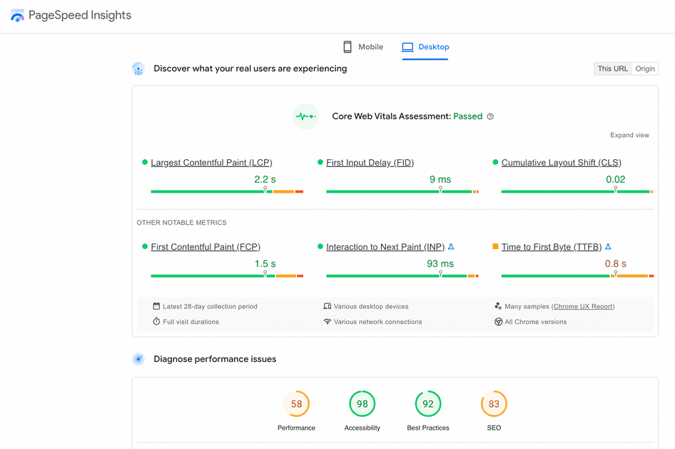
Google’s PageSpeed Insights lets you test your site speed and performance on desktop and mobile.
To get your page load time under two seconds, compress images; use a content delivery network (CDN), a network of interconnected servers; or look for a faster hosting platform.
6. Make it mobile-friendly
By 2025, mobile sales should more than double, making up 44.2% of retail ecommerce sales in the US.
With the number of mobile shoppers constantly growing, it’s essential to make the mobile version of your online store as smooth and easy to use as the desktop version.
The best principle to keep in mind to improve ecommerce UX on mobile? Keep it simple.
Some proven ways to optimize your ecommerce site’s mobile UX include:
Opt for fewer images to keep pages clean
Cut any unnecessary text to improve page readability
Simplify forms in the checkout process—or break them up into two separate pages
7. Apply user feedback and test
You’ve now created a data-driven ecommerce site design, thinking through each element of the UI design to improve the UX.
But a website owner's work is never done. In a continuous feedback loop, you need to test, collect feedback, and make improvements to keep your site fresh and responsive.
Launch a survey to ask users specific questions about a page you want to optimize. Then, once you have ideas about how to make the page better, create a second version. Finally, run A/B tests, and compare recordings or heatmaps of users interacting with both pages.
💡Pro tip: use post-purchase survey insights to improve your outreach.
Matt recommends reaching out to customers after they purchase via email, text, or a survey to ask follow-up questions. Don’t be afraid to go beyond the basic, “How did you hear about us?”
Instead, ask your customers questions like, “How/when will you be using our product?” Once you collect responses, it’s time to analyze them and see what changes you can make to your marketing plan.
Matt says, “Figure out these specifics, and make new content—emails, social media posts and ads, changes to your landing pages—to better speak directly to your end customer.”
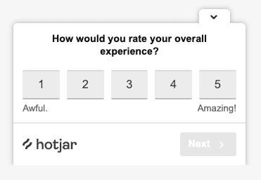
Use Hotjar to create an ecommerce post-purchase survey to find out what customers really think
Keep the customer journey top of mind for a smooth ecommerce UX
The ecommerce customer journey is the way a customer progresses through the different stages of buying—from awareness to purchase. Sometimes, that’s as simple as seeing an online ad, clicking through to the product page, and hitting ‘buy now.’ Sometimes, the customer takes a longer path, meandering slowly through your site, then to Google, and then back.
Taking the time to map the ecommerce customer journey (we’ll show you how in our next chapter) helps you develop empathy for the buyer's experience and pain points—leading you to adopt a more customer-centric mentality when making decisions about UI and UX.
When an ecommerce company makes decisions from a customer-first mindset, better user experiences and conversion rates follow.
Happier and more satisfied customers with the right data and metrics equal a profitable and growing business.
The next steps to optimize your ecommerce business
Now that you have an actionable framework to improve your customer experience, it's time to dive deeper into your ecommerce UX. Check out the next two chapters of our Ecommerce UX guide, where we break down:
Use Hotjar's product experience insights to improve ecommerce UX
Use Hotjar to understand how real users experience your ecommerce site—then optimize it for them