Learn / Guides / Ecommerce guide
14 examples of ecommerce checkout page designs that convert (and how they do it)
Your checkout page is one of the most important pieces of your ecommerce funnel. It’s a place where minor design changes can result in a satisfying boost in sales—or a disappointing drop-off.

Read on to see examples of high-converting checkout pages and learn the best practices for minimizing abandoned carts.
Discover why visitors leave
With tools like Hotjar Recordings and Surveys, you can find out what visitors are doing—and why.

Why do customers abandon carts online?
Checkout pages are ‘virtual’ versions of sales counters in physical stores. But online, customers won’t tolerate unnecessary hassle or waiting.
Numerous surveys and reports cite the three most common reasons for abandoned carts as:
Being forced to create an account: many customers just want to pay and leave without the hassle of extra steps
A lack of preferred payment options: visitors want to use payment methods that are safe, fast, and familiar to them
Long checkout times: slow page loading times, bad user experience (UX) design, and site bugs are the online equivalent of a long, snail-speed queue
As a rule of thumb, anything that confuses, distracts, or slows down your customer increases cart abandonment and raises your ecommerce bounce rate.
What’s the ideal format for checkout pages?
All checkout pages follow either a single-page or multi-page format, and both have pros and cons.
Single-page checkouts let the customer see the entire process ahead at a glance. The downside is that a page full of forms, menus, and buttons looks like hard work.
Multi-page checkouts break down the journey into smaller steps that appear less overwhelming. However, they leave customers uncertain about what’s coming next and how long the process will take.
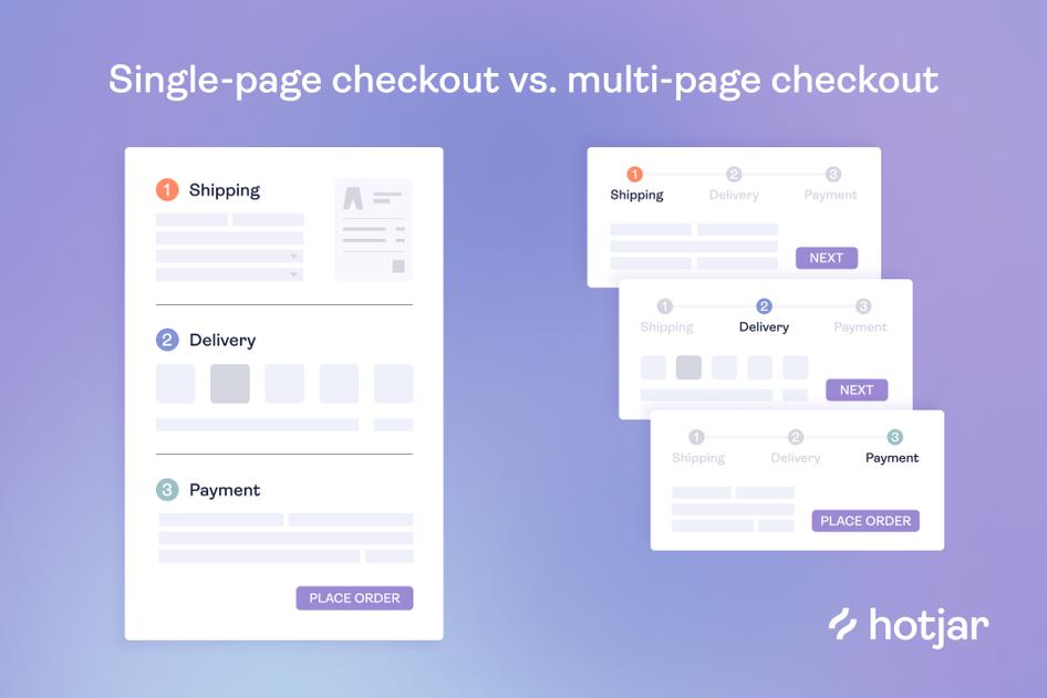
Ultimately, there’s no ‘best’ format—the right choice will depend on the information you need and whether you want to offer upsells.
14 examples of ecommerce checkout page designs that convert
Each of these examples contains great ideas and best practices you can take inspiration from.
To help you find the examples most relevant to your funnel, we’ve grouped them into four categories: multi-page, single-page, mobile-optimized, and checkouts with upsells.
Multi-page checkout examples
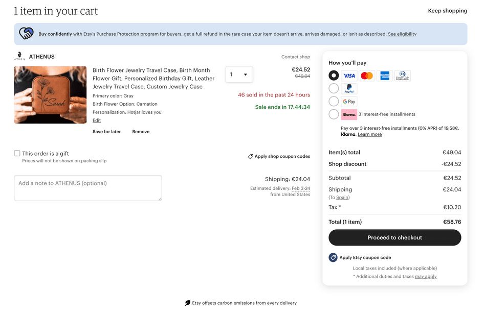
1. Etsy
Etsy is a popular marketplace empowering arts and crafts creators to sell products to an international audience.
The website’s shopping cart functions as a ‘pre-checkout’, directing shoppers to different checkout flows depending on their preferred payment method.
Offering these varied payment methods helps Etsy appeal to shoppers who desire express checkout or pay-later options.
Upon entering the multi-page checkout flow, Etsy prominently displays a security logo and progress bar at the top of the screen.

Frequently seen in multi-page checkouts, progress bars help shoppers see where they are, reducing uncertainty. Meanwhile, the security logo reassures shoppers that Etsy has taken steps to protect their data.
When it comes to entering details, Etsy keeps its forms clean and simple:
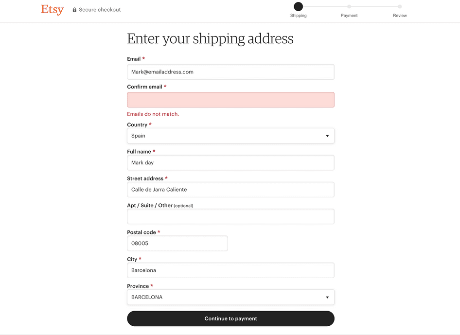
Note: the only potential distraction here are the asterisks, which may not be necessary considering the page already highlights which forms are optional.
💡Pro tip: when you want to learn what your visitors need on your checkout page, why not ask them directly? By strategically using Hotjar Surveys at key moments, you find out if visitors have doubts around shipping, security, and more.
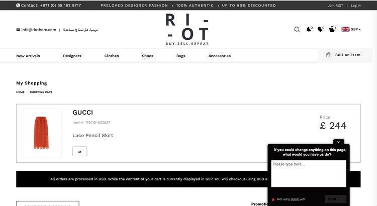
A one-survey question from ecommerce site Riot shown to customers with high purchase intent
2. Glossier
Beauty retailer Glossier makes purchasing easy with a well-structured multi-page checkout flow. It provides options for logging in and opting in to marketing communications, but the minimalist design keeps the page uncluttered.
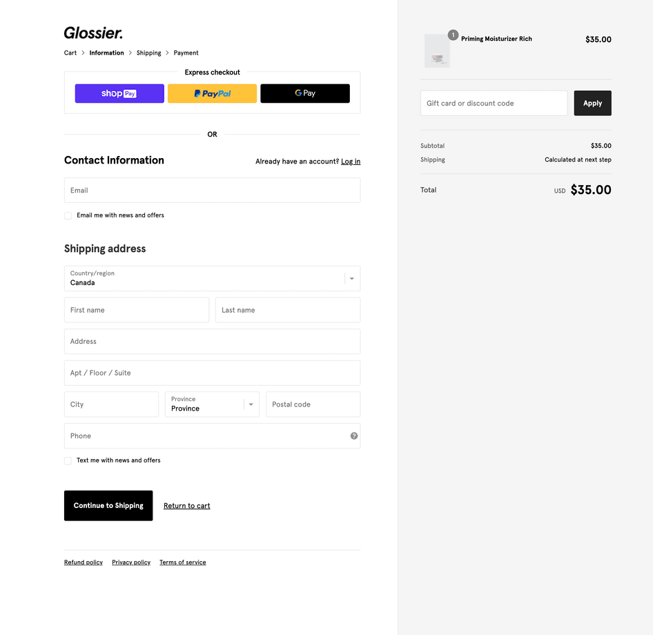
Cleverly, the page also includes ‘Continue to Shipping’ and ‘Return to cart’ links. These are present on all checkout pages so shoppers can move backward and forward without abandoning the ecommerce conversion funnel.
🔥 Convert like a pro
The addition of a free gift is a nice touch from Glossier, working as an incentive to keep customers moving forward.
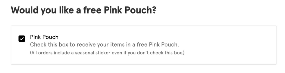
Consider whether a gift would appeal to your own customers in the checkout stage. Although it would increase your costs, the resulting conversion boost could be well worth it.
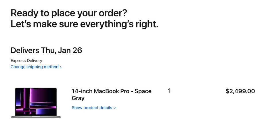
3. Apple
Unsurprisingly for the innovative electronics brand, the Apple checkout is as sleek and convenient as it gets.
While there’s no progress bar, Apple walks customers through the multi-page process with minimalist design. In the delivery options screen, separate tabs for pick-up and delivery keep the experience simple.
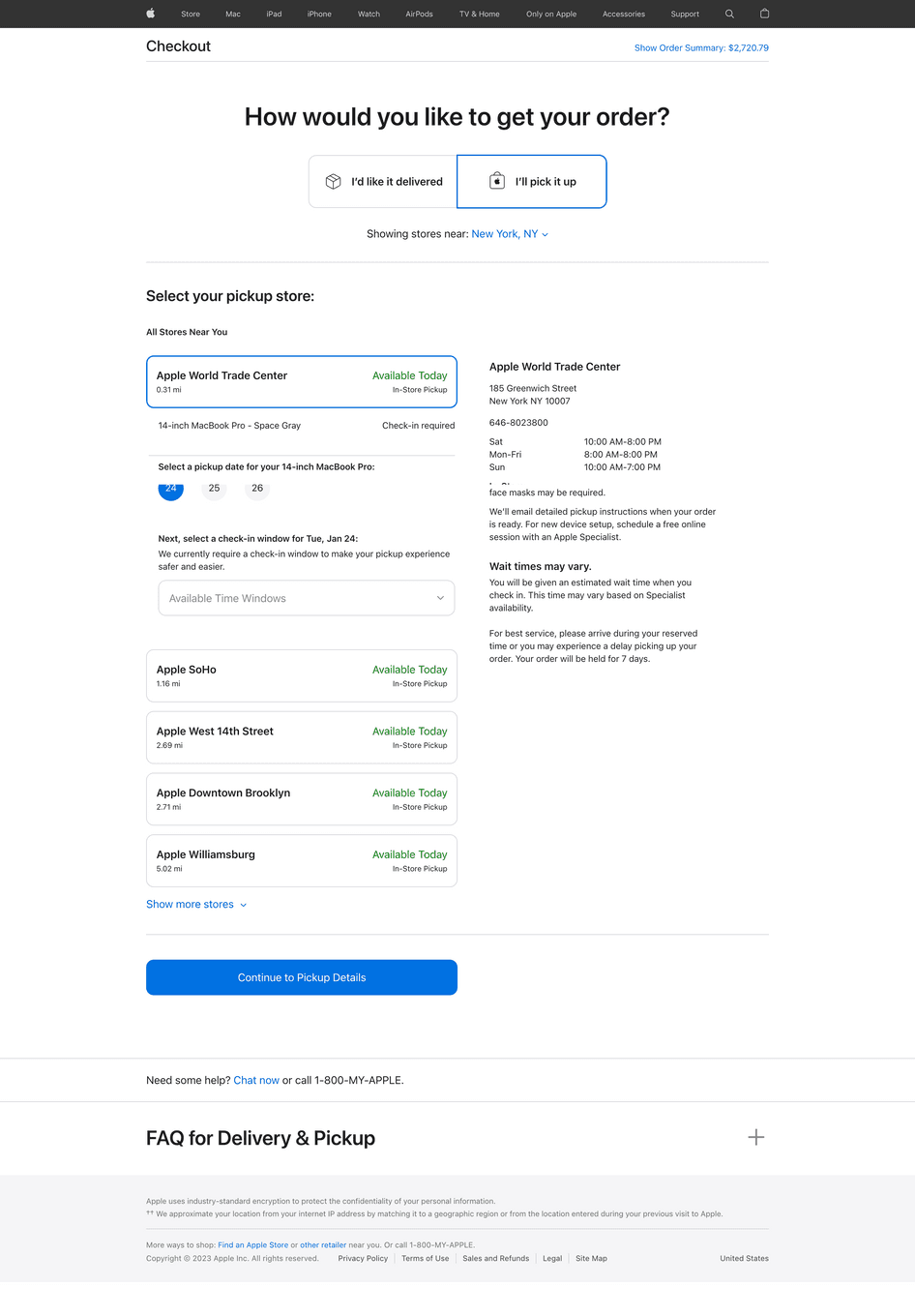
The tech-driven checkout even allows customers to select time-specific slots for pick-up, providing Apple’s textbook premium service.
🔥 Convert like a pro
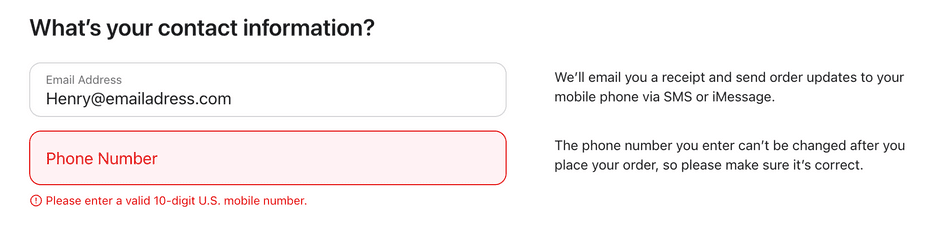
Apple skillfully uses copy to guide visitors and explain why it’s asking for information. By indicating what’s happening next, you can create a better checkout experience and win shoppers’ confidence.
Apple continues with its helpful, human tone even on the final screen. The experience represents the service you might expect from a friendly sales assistant in a physical store.
4. Forge & Foster
UK-based ecommerce business Forge & Foster sells stylish watches to customers around the world. Its multiple-page checkout is hosted on Shopify and starts off with express payment options.
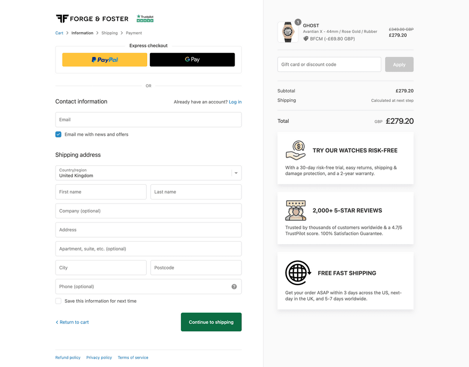
Ninety percent of our traffic comes from mobile, so we work hard to optimize for customers using smartphones. On our checkout page, the biggest improvement came when we added express payment options—that change alone boosted our sales by 10%.
🔥 Convert like a pro
Forge & Foster adds some last-minute selling points to increase trust in its service. What’s interesting is the level of detail the store gives here:
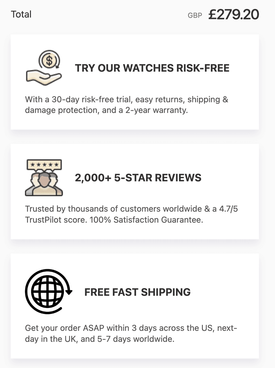
Adding this much text on your store could arguably be a distraction. However, it can also provide vital reassurance to ad-clicking shoppers who are totally new to your brand.
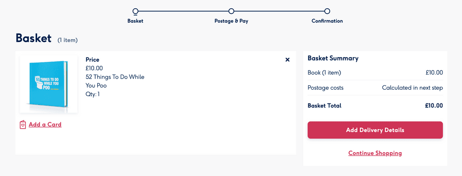
5. Tatami Fightwear
Tatami sells its line of martial arts attire through a multi-page Shopify checkout.
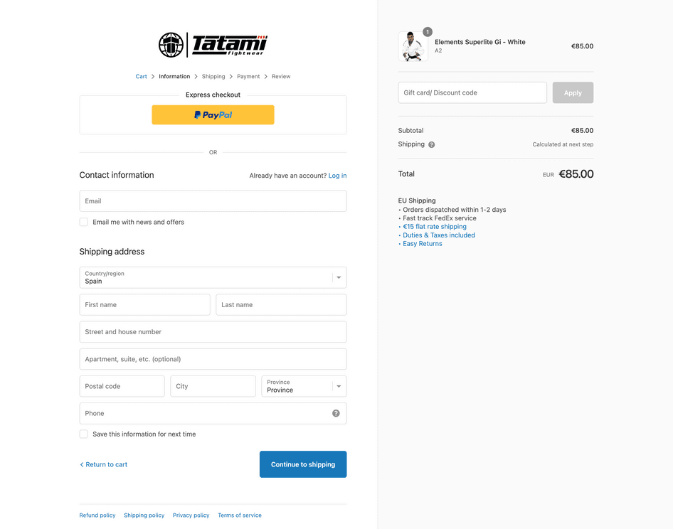
While it’s a common element on many checkout pages, we shouldn’t overlook the well-placed order summary: by reminding customers of what they’re buying, the store reduces uncertainty—and keeps the excitement of shopping going.
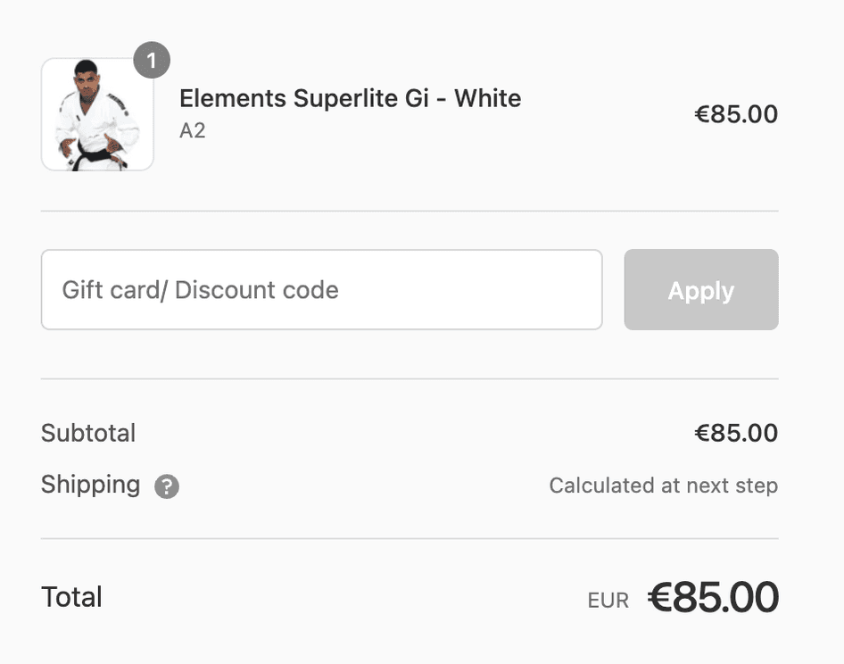
As shoppers move through the form, the checkout page provides instant clarification around anything that’s wrong or missing.
This clear guidance means customers can easily correct any errors, avoiding frustration that could otherwise lead them to abandon the purchase.
Single-page checkout examples
6. Amazon
Amazon still makes frequent changes to its checkout pages, which suggests that conversion rate optimization (CRO) is an ongoing endeavor.
The current checkout page format uses an accordion format that ‘unfolds’ in four stages, keeping everything on a single page while showing customers where they are in the process.
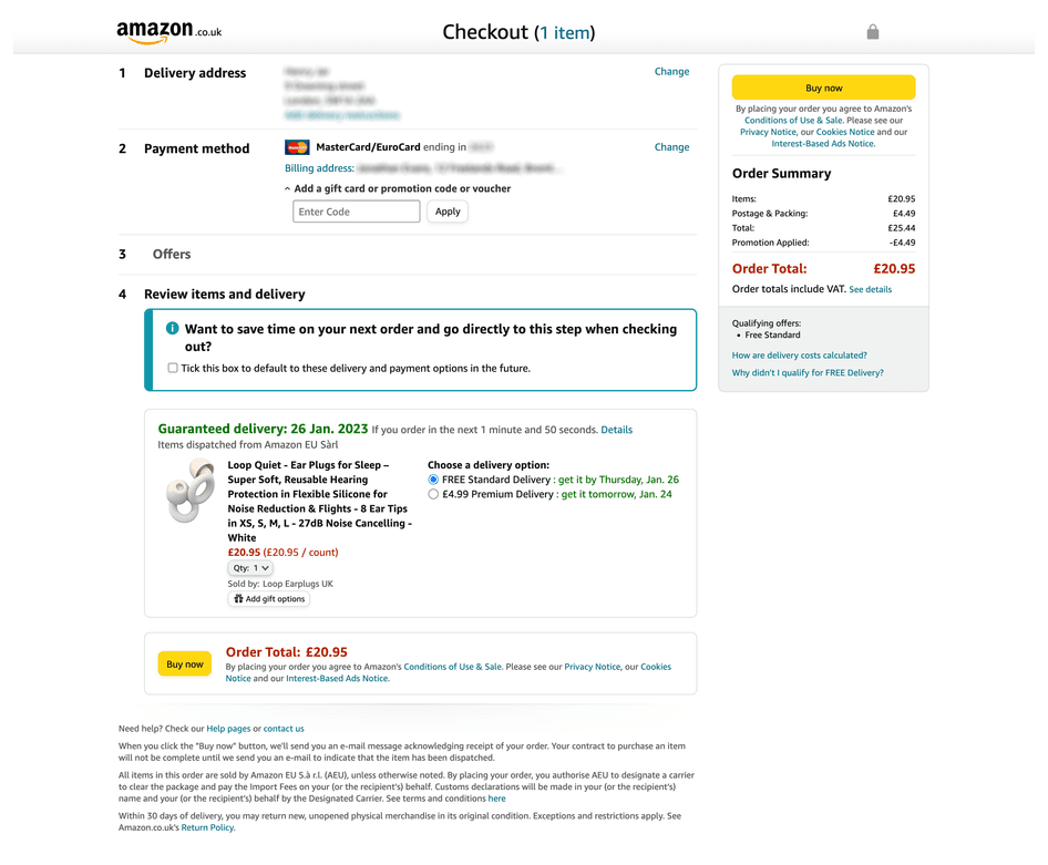
What’s interesting here is the inclusion of two ‘Buy now’ buttons. As the master of convenience, Amazon even shortens your mouse’s journey!
Even the button copy, ‘Buy now’, is no doubt a careful decision driven by Amazon’s ecommerce CRO initiatives. Where others might say ‘complete purchase’, Amazon uses down-to-earth, direct wording—which we can safely assume the company has found to convert better.
🔥 Convert like a pro
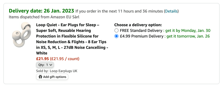
Amazon cleverly highlights its delivery timelines—tapping into the shopper’s ‘I want this now’ instinct while using a countdown timer to incentivize action.
While you may not be able to deliver your service like Amazon does, consider how you can incentivize shoppers to act immediately.
7. Forge To Table
Forge To Table is an ecommerce store offering Japanese-style kitchen knives and cutlery. While its checkout page caters to guests, it also allows repeat customers to log in and have their details auto-filled.
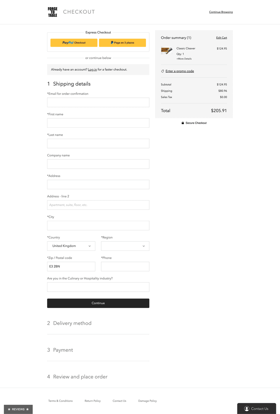
Note that the page asks a question at the end of the delivery section:

While gathering this data can improve marketing efforts, it’s important to remember that unnecessary questions add a further distraction—and potentially lengthen the checkout journey.
💡Pro tip: set up a survey to ask your visitors questions at key moments without adding extra fields to your forms. With Hotjar, you can trigger surveys to appear after specific time intervals or actions, and your customers can decide whether they want to engage further.
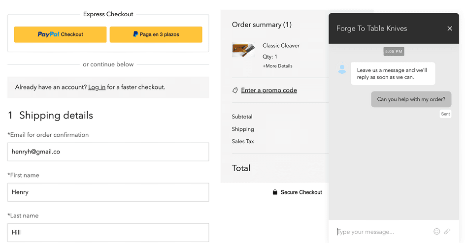
Forge To Table also optimized its checkout page by offering live support chat. Being available to answer questions provides vital reassurance to customers—particularly when you’re selling internationally.
In the payment stage, Forge To Table also provides a pay-in-installments option. This tactic is useful for winning over shoppers who are in ‘can I really afford this?’ mode.
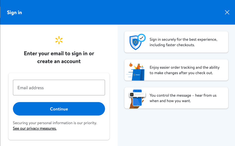
8. Walmart
Walmart starts its checkout flow by asking shoppers to create an account. Be warned: this practice is one of the most common abandoned cart reasons and may not be ideal for all businesses.
However, Walmart has the advantage of being able to offer huge savings, which in part makes up for the inconvenience of having to sign up.
What’s more, the site does a good job of explaining why it’s worth creating an account.
After this pre-checkout step, Walmart brings shoppers to a single-page checkout page, giving a helpful advance estimate of delivery dates.
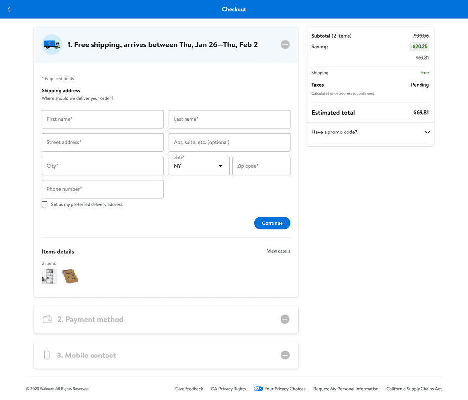
🔥 Convert like a pro
Walmart’s order summary box does a great job of highlighting the savings made through its special offers—plus the free shipping.
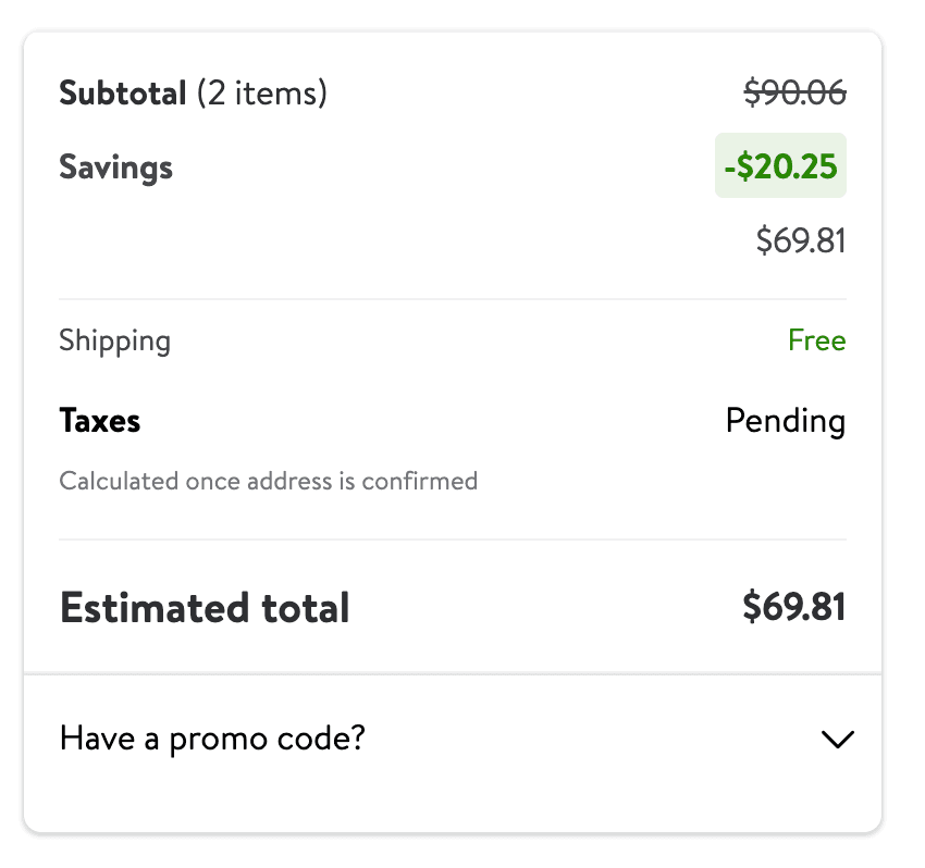
Reminding customers of the money they’re saving can give them the extra reassurance they need to cross the finish line.
Notice that the summary also states taxes are pending—Walmart recognizes customers don’t like surprises when it comes to costs: it’s always better to be upfront when more charges are coming.
Checkout pages with upsells examples
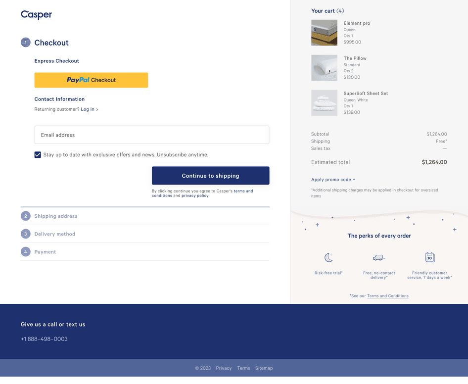
9. Casper
Bed store Casper presents a single-page checkout that’s clean and simple whilst reflecting the company’s branding.
For shoppers who want to move quickly, it also gives the option of PayPal express checkout.
🔥 Convert like a pro
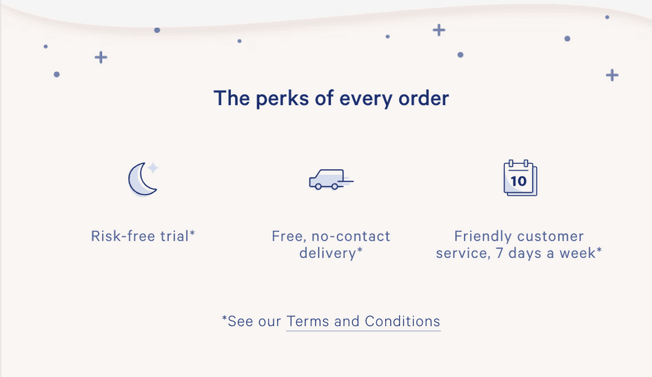
Casper includes key service benefits like ‘risk-free trial’ and ‘free, no-contact delivery’ in the corner. Highlighting such benefits offers extra reassurance to shoppers, and the minimalist design ensures this section isn’t a major distraction.
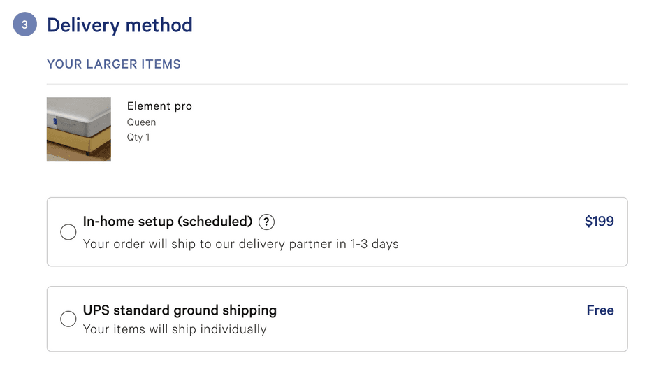
The shipping section also contains a subtle (but helpful) upsell: customers can pay extra to have their bed constructed. Framing this as a delivery option softens the blow of this potential extra cost.
10. Moonpig
Quirky UK gift store Moonpig sells a range of customizable cards and gifts, along with flowers and food hampers.
Cunningly, the Moonpig site starts the checkout flow as soon as you visit your basket—no ‘Go to checkout’ button here. This demonstrates how removing steps in the checkout process can be a tactic for improving conversions.
🔥 Convert like a pro
Moonpig cleverly sneaks upsell offers in its checkout flow—this page appeared after we clicked ‘add delivery details’.
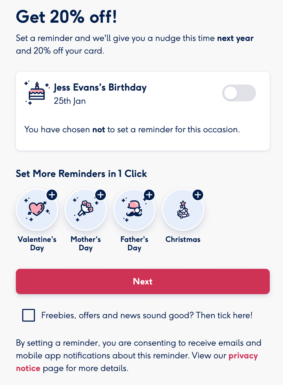
It’s well established that adding distractions increases cart abandonment. However, Moonpig knows people often forget to buy birthday gifts until the last moment, so it uses an upsell to solve a common problem. And to incentivize the customer further, it offers a 20% discount.
Offering upsells during your checkout process could boost revenue, but be certain that they improve the customer experience or solve a problem.
11. Boldking
Boldking sells male grooming products to European customers on a subscription basis.
The site starts its checkout flow by asking new customers to create an account. But Boldking doesn’t use the words ‘register’ or ‘create account ', instead saying ‘New Customer’—a clever psychological tactic to keep the visitor moving forward.
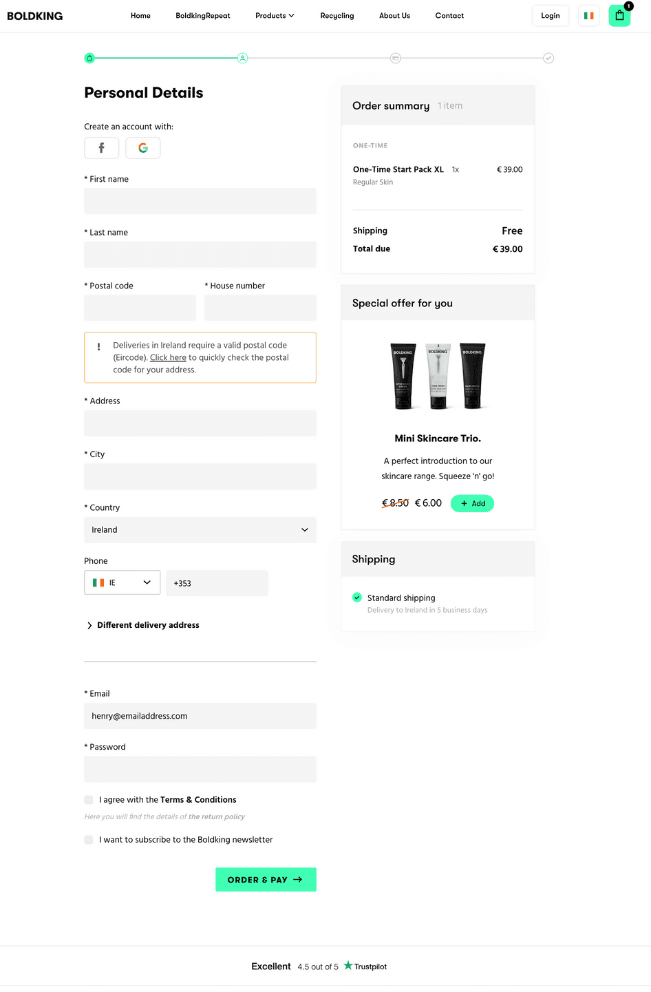
This page contains three other key tactics:
The order summary box reminds customers what they’re buying while highlighting free shipping
The delivery estimate leaves shoppers with no doubts as to when their purchase will arrive
The product upsell box allows customers to accept an upsell with just a single click—a great way to serve impulse buyers!
🔥 Convert like a pro
Boldking skilfully adapts its checkout page to different countries. Pick a different country from the dropdown menu, and the language—and currency—immediately update.
Localizing your checkout page like this gains trust while helping customers understand the costs in their own currency.
Mobile-optimized checkout pages examples
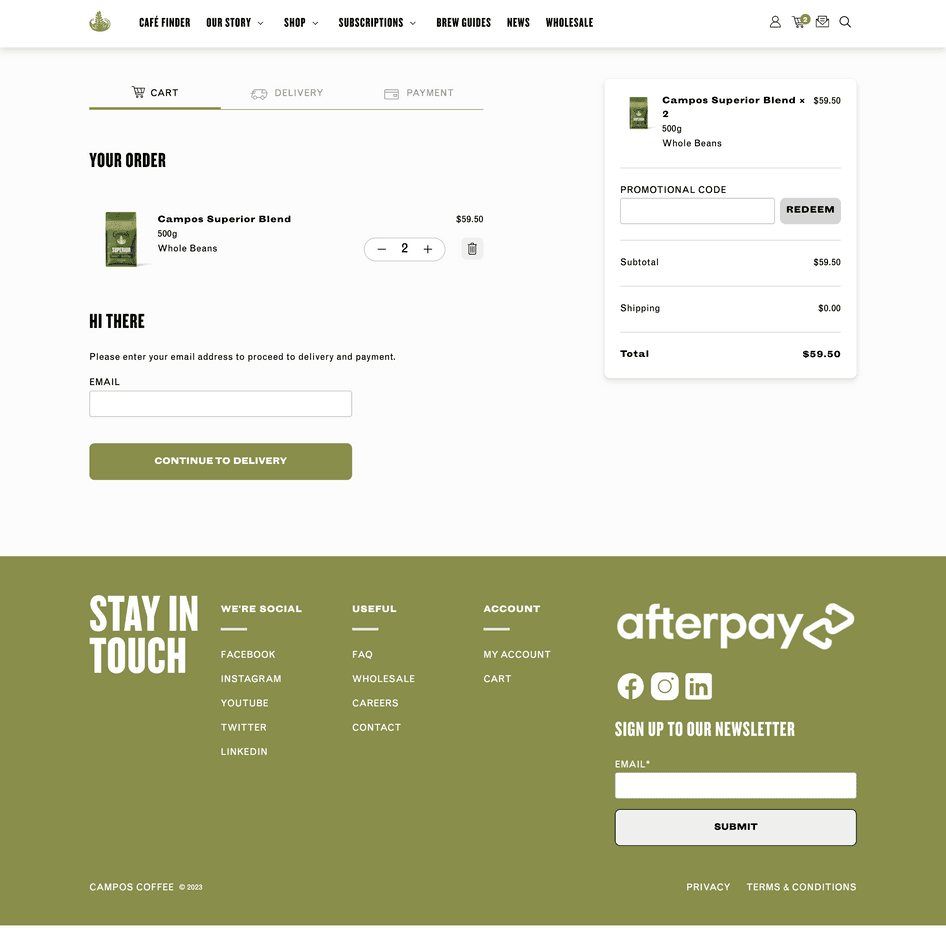
12. Campos Coffee
Australian coffee brand Campos Coffee sells premium coffee through a multi-page checkout built with WooCommerce.
While the checkout flow is multi-page, this initial page only asks for an email address, easing customers into the journey. However, the ‘Hi there’ line doesn’t add any guidance and could serve as a distraction here.
🔥 Convert like a pro
This checkout page has a feature that’s not yet standard practice: an auto-completing address bar.
Using Google’s Place Autocomplete service, the form field displays matching addresses that the user can select from. The feature shaves a few seconds off the checkout journey—which can make a big difference across thousands of customer journeys.
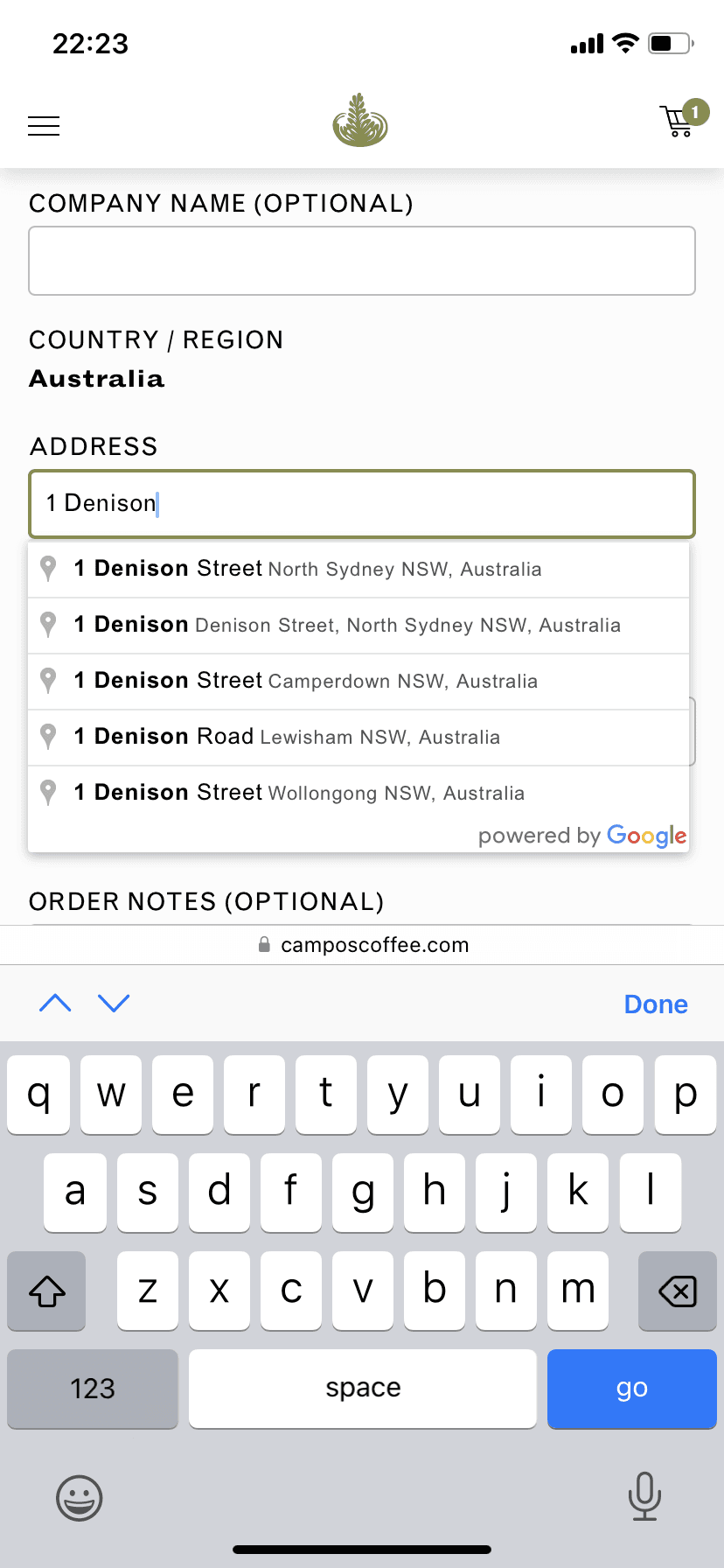
This feature worked well on Campos Coffee’s mobile site—and customers who dislike typing on smartphone screens will certainly appreciate it.
❗️Room for improvement
When it comes to selecting a payment method, shoppers choose among three tabs to select their preferred method.
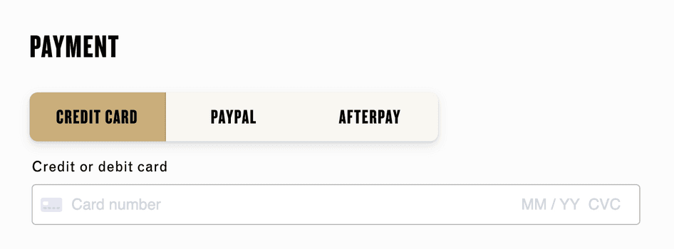
On one hand, this format is in line with the minimalist feel of the page. But without displaying the logos of popular payment services, the shop misses an opportunity to win trust.
💡Pro tip: using Hotjar? With Heatmaps, you can see exactly where visitors are clicking on your page—perfect for gauging whether customers are selecting ‘hidden’ tabs.
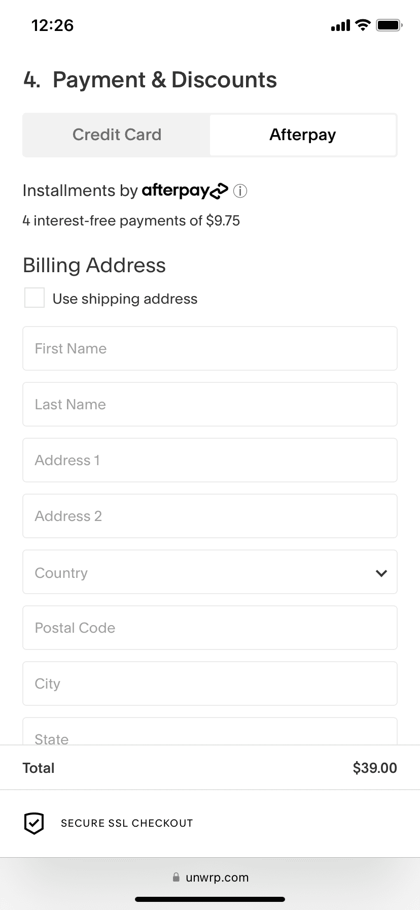
13. Unwrp
Gift wrap store Unwrp sells its fun and eco-friendly products through an accordion-style checkout page with a floating ‘Secure SSL checkout’ logo.
The extra security assurance is important for this niche store, which may not generate instant confidence like a big brand would.
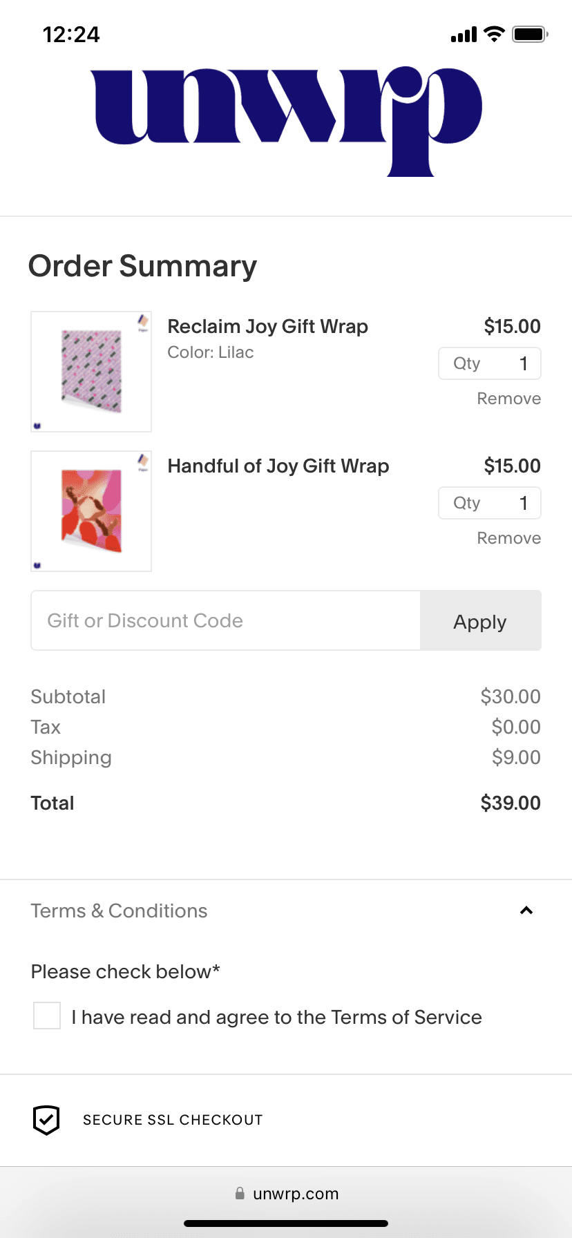
🔥 Convert like a pro
When it comes to payment, Unwrp offers customers the ability to pay upfront with a card or in installments.
With this structure, the customer doesn’t see the credit card form until they click the tab—keeping the journey simple and distraction-free.
❗️Room for improvement
On mobile, a key button on the checkout has incomplete text that reads ‘Continue with’. Mistakes like this can lose customers’ trust and cause them to abandon carts.
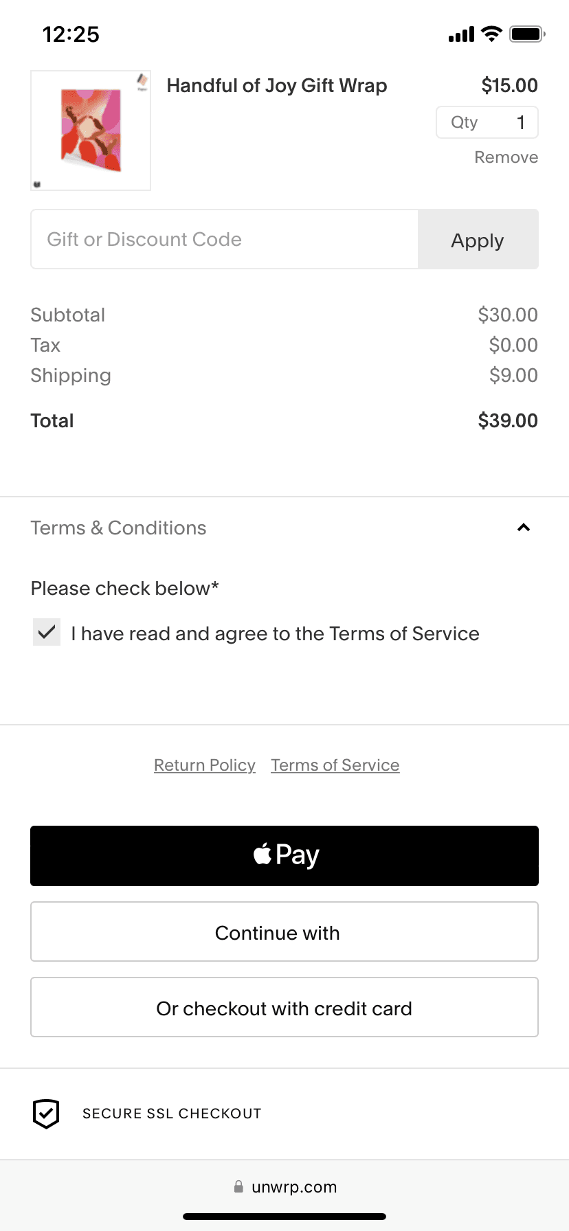
When optimizing your site for mobile shopping, check these small but important details on your checkout page to avoid confusing your customers.
💡Pro tip: behavior analytics tools empower you to find mobile usability issues quickly. With Hotjar, you can use Events to filter for Recordings where visitors abandoned their carts. Next, rewatch user journeys to see the page through your visitors’ eyes.
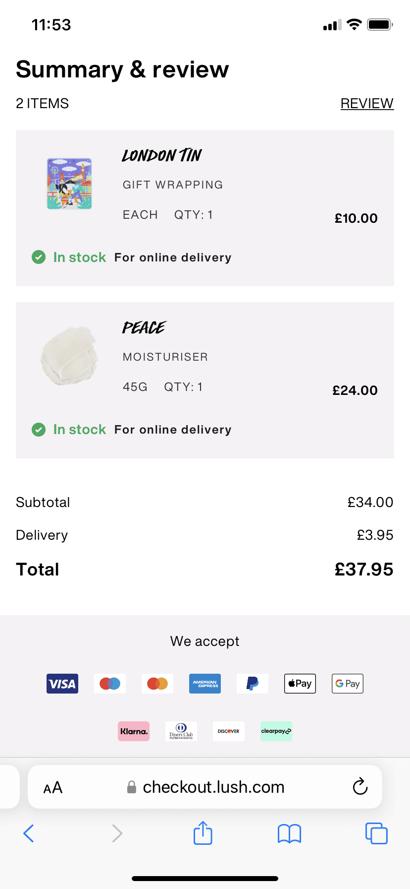
14. Lush
UK retailer Lush is famous for its ever-changing range of natural soaps, shampoos, and bathtime goodies. While the company uses fun and vivacious branding online, its mobile checkout is stripped-down and simple.
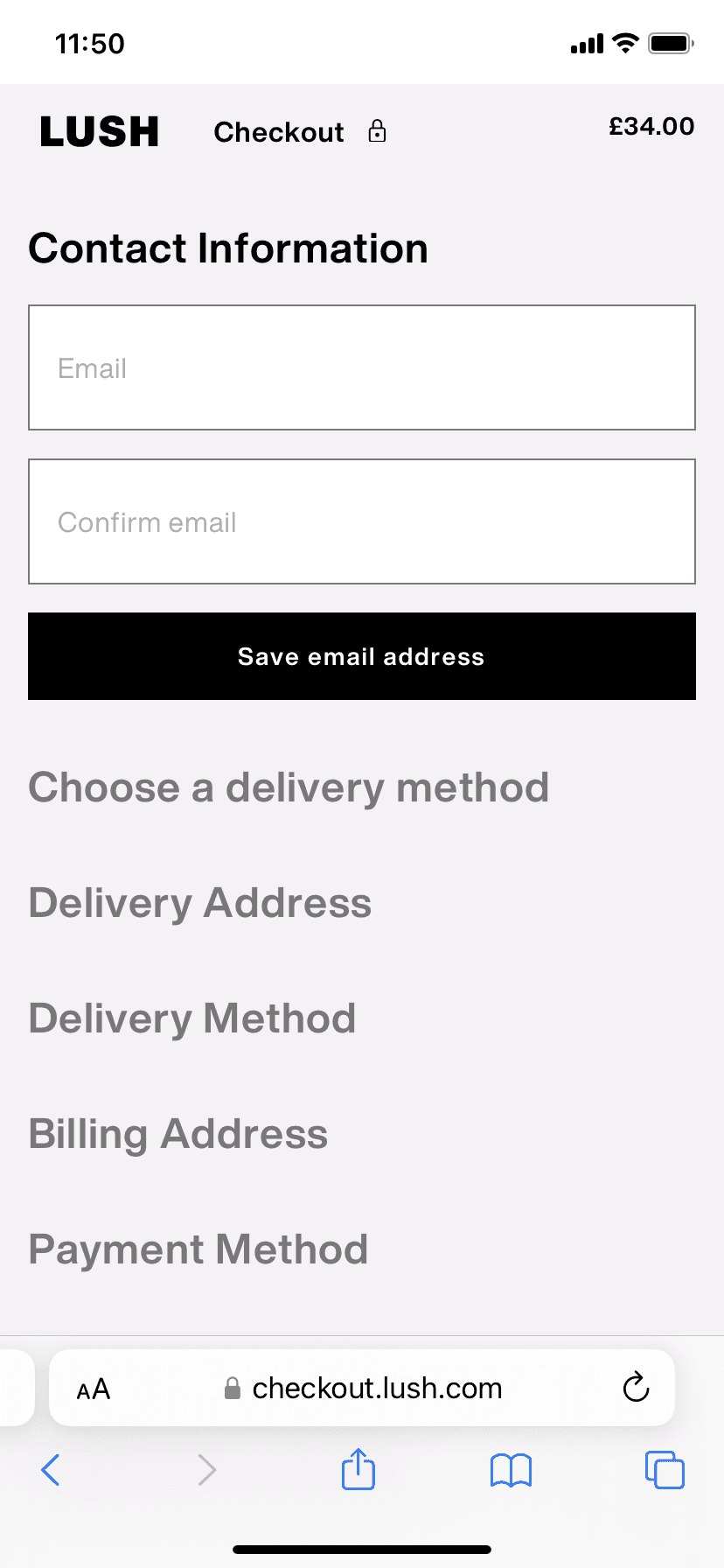
The Lush checkout form uses in-field instructions that tell the visitor what details to enter. By keeping this guidance within the form fields, Lush keeps the page uncluttered, reducing friction on both mobile and desktop.
🔥 Convert like a pro
At the bottom of the checkout page, the order summary shows that the products are in stock. This is an ideal feature considering that many Lush customers buy their products as gifts.
Best practices for creating checkout pages that convert
Follow these proven practices to create a conversion-friendly checkout page. With your checkout fundamentals in place, you can then make further improvements using CRO for ecommerce tactics.
Note: don’t forget to optimize for mobile. Cater to smartphone shoppers by creating mobile-friendly forms, optimizing button sizes, and implementing auto-fill address fields.
Finally, carry out usability testing to ensure your checkout page works well across devices and browsers.
💡Pro tip: using Hotjar? Apply filters to find recordings featuring signs of frustration, such as rage clicks, on your checkout page. Then replay the users’ journeys to find out what went wrong.
To get more conversions, go beyond best practices
As we’ve seen here, there are numerous well-established conventions in ecommerce checkout pages. It’s now commonplace to have multiple payment options, accordion-style layouts, and minimalist form design.
But every business is different—and every customer journey is too. When you want to take your conversions to the next level, look beyond best practices and gather reliable data about your visitors. By learning how they behave on your checkout page and why, you can tailor your optimization attempts to your own audiences.
Understand what your visitors need
Hotjar gives online businesses the tools to capture, analyze, and understand the behavior of every audience segment.