Learn / Guides / Ecommerce guide
Design a better shopping cart UX (and skyrocket sales) in 8 simple steps
Do your customers add a bunch of items to their cart, but then mysteriously drop off the page? Or do they get to the very last stage of checkout on your ecommerce store before seemingly changing their minds?
If you answered ‘yes’ to either of these questions, you’re not alone. According to research, the average cart abandonment rate is almost 70%, and shopping cart UX has a big role to play.
You don’t need to be an expert to design an amazing shopping cart user experience (UX) that encourages your customers to buy your product and positively impacts business growth.
This guide covers how a well-designed shopping cart UX creates happier customers and increases conversions, with an eight-step framework and actionable tips to get you started.
Use Hotjar to improve your shopping cart experience today
Delight your customers and increase conversions by uncovering invaluable user insights.

A step-by-step guide to designing an amazing shopping cart UX
Shopping cart user experience design (or shopping cart UX design) is the process of making it as easy, efficient, and enjoyable as possible for people to buy products from your online store.
Unlike shopping cart UI, or user interface (UI) design, which is more about making sure your cart looks good, shopping cart UX focuses on identifying and solving problems users face when checking out.
When you make the shopping cart experience the best it can be, you lower cart abandonment rates and, ultimately, boost sales. Use our eight-step process to design a shopping cart that helps you increase conversions on your ecommerce store:
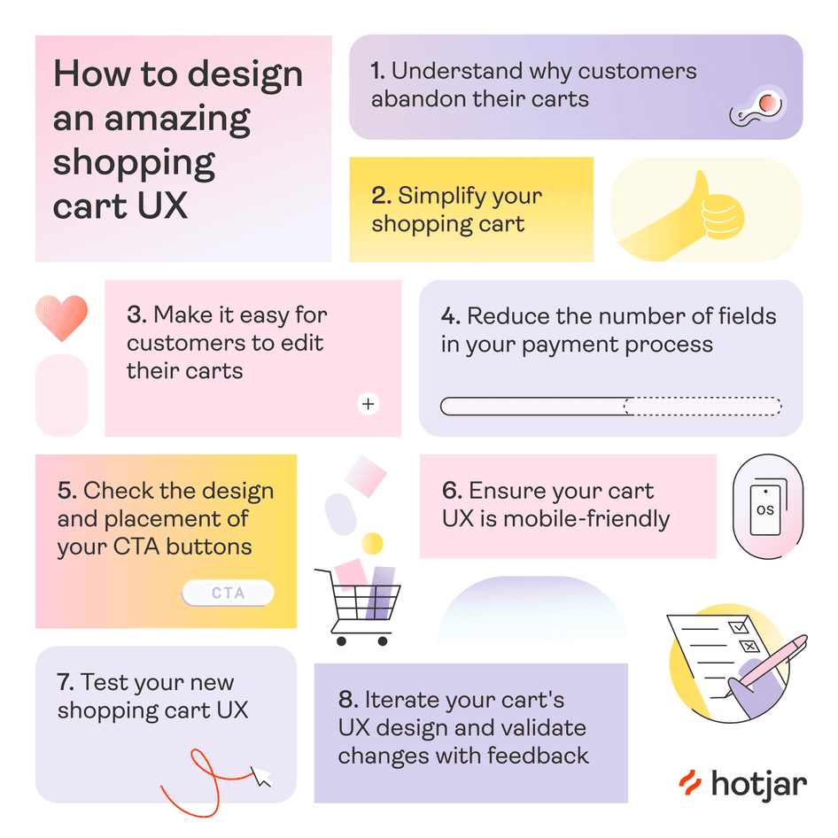
1. Understand why customers abandon their carts
The first step to building a strong shopping cart UX is to learn about your customers, their desires, and expectations. Once you understand the root cause of your customers’ frustrations, you can take action to resolve their pain points and create a shopping cart UX that meets and exceeds user expectations.
Taking the time to do this puts you in a better position to make website changes that truly matter (with the data to validate them).
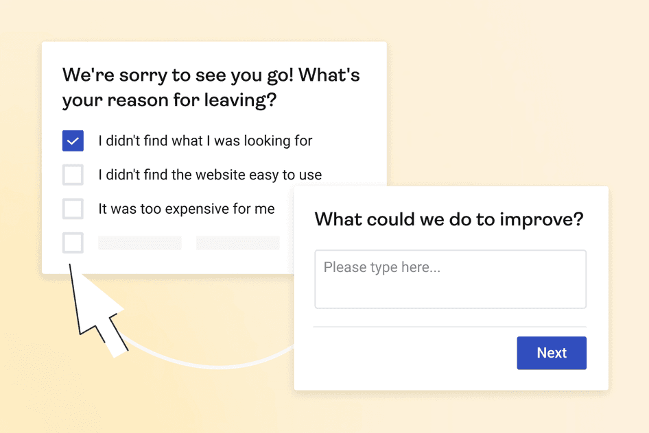
Use surveys to gather customer insights—with an on-site exit intent survey or in a cart abandonment email—and ask questions targeted specifically toward the shopping cart experience to get the best results.
This might include:
On a scale of 1 (very difficult) to 5 (very easy), how easy was it to complete checkout?
What’s one thing you'd change about the checkout process?
What prevented you from completing your purchase?
2. Simplify your shopping cart
Does your shopping cart page include any sections like these?
Top products
Product categories
Offers
A newsletter sign-up form
Social media links
You may think that page elements encourage extra purchases or earn you a new follower. But the truth is that any additional visuals at this stage only serve to distract website users from completing their purchase.
Customers crave simplicity, so get rid of any ‘extras’ that aren’t part of the checkout process. Instead, move any promotional sections to your home page or product pages.
3. Make editing your shopping cart easy
A good rule to remember in shopping cart UX is that the customer should always feel in control. Make it as easy as possible for them to add, remove, and edit items in their cart. If it’s too difficult to do any of those things, your customers will feel frustrated and may even abandon the process altogether.
Use ‘+’ or ‘-’ buttons, a dropdown menu on the item quantity, or a simple ‘Edit’ button to ensure your customers can easily see and alter their purchases. The best option for your ecommerce store will depend on your customers’ behavior and preferences (we’ll dive into how to understand that a little later).
You also need to think about the kind of items you sell. For example, say you own an ecommerce shoe store. As well as making it easy to add another item to cart, how about adding an option so customers easily change their shoe size? This small addition improves the user experience for customers wanting to order two different sizes to see which one fits.
4. Reduce the number of fields in your payment process
When customers are through to the payment stage of their journey, you need to ensure the process is as simple as possible. This means cutting the information you request from customers down to the bare necessities, minimizing friction, and asking them to make less effort to check out.
That’s exactly what online trade construction store, Materials Market, did. By watching Hotjar Recordings—playbacks of exactly what users do on your site—they realized that one in four customers were abandoning their cart because there were too many steps to complete. After cutting down the process from seven steps to four, Materials Market reduced the number of abandoned carts to only one in 25.
Our conversion rate went from 0.5% to 1.6% for visitors making a payment in just one month. We were really surprised it happened that quickly—it was like night and day.
Feeling inspired? Here are a few things you might want to delete or modify in your checkout process:
Asking for a phone number (unless you use it for delivery notifications, it can go!)
Separate fields for first and last names: it may seem insignificant, but even one extra click can make all the difference
Enabling checkout without registration: mandatory signup is one of the biggest contributors to cart abandonment during checkout
Introducing an address finder so customers can just type their house number and zip code instead of their whole address
5. Check the design and placement of your CTA buttons
It may seem obvious to you, but do your customers always know where to click next? Calls to action, or CTA buttons, are an essential part of any checkout experience. They help customers navigate from screen to screen and complete a desired action.
Once at the checkout, you should have only two CTAs: a primary CTA to take customers to checkout, and a secondary CTA so they can continue shopping. There should be a visual hierarchy here, so it’s obvious at a glance which CTA is which.
Your checkout CTA should be the boldest element on the page, with plenty of white space and an accent color. Your secondary CTA should also be clear, but demand less attention on the page than your primary CTA.
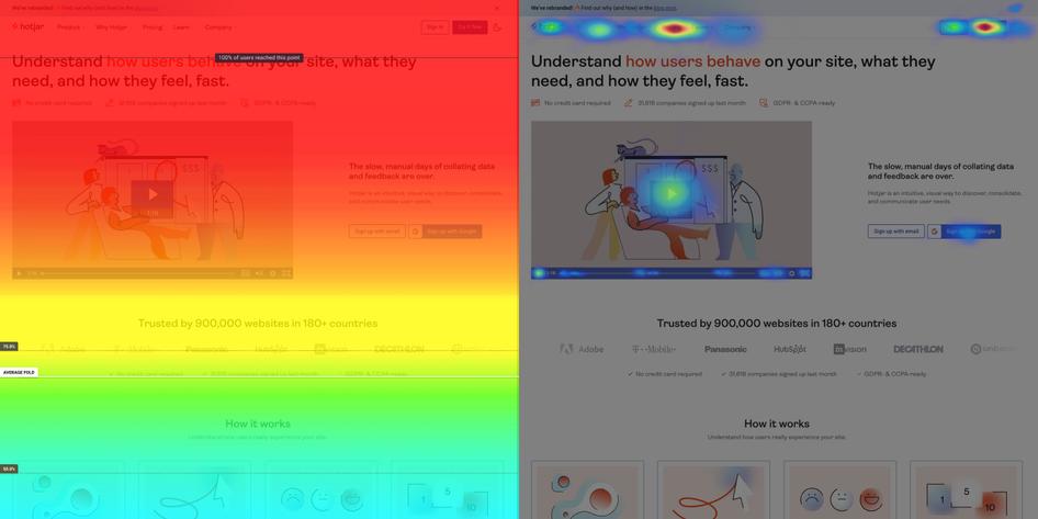
For CTA placement, standard practice is to put your checkout button on the right side of the screen (or on the top for mobile), above the fold. Research shows that a checkout CTA gets more clicks when it’s in the same spot as the order summary. If you want to see if it works for you, heatmaps are a great way to see which elements of your ecommerce site attract attention on your checkout page.
6. Ensure your cart's UX is mobile-friendly
When was the last time you ran through your checkout experience on a mobile device? More and more users are shopping directly from their phones, and a poor mobile experience is enough to turn customers away.
When checking your mobile design, don’t just scroll through the site. Actively go through the checkout process yourself to see if everything is working as it should, including using different payment methods, editing the cart, and navigating back to a product page. This also helps you discover any website bugs that could be frustrating customers and causing them to drop off your site.
7. Test your new shopping cart UX
Once you make changes to your cart, you’ll want to ensure they have an impact on your ecommerce CRO.
One way to do this is A/B testing: this is where some visitors to your online store will see and interact with version A of your shopping cart (your previous design) while others will interact with version B (your updated design), so you can make a direct comparison between your two shopping carts, and get more customer insights along the way.
💡How to use Recordings to get the most out of your A/B tests💡
Hotjar’s Recordings tool shows you exactly how your customers work their way through each version of your checkout process. See the user flow, identify any new pain points, and check if you’ve successfully reduced rage clicks, all through the eyes of your customers.
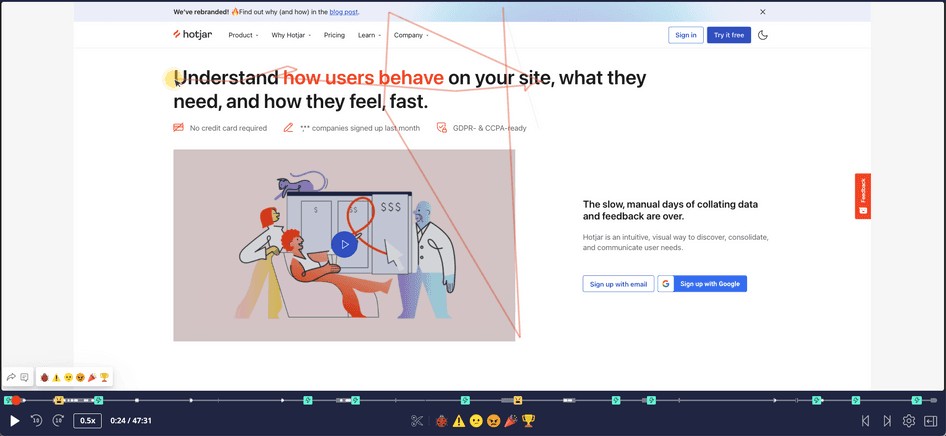
Hotjar Recordings lets you see users scrolling, moving, u-turning, and rage clicking on your site.
8. Iterate your cart's design and validate changes with feedback
Customer behavior and expectations change all the time. That’s why it’s so important to iterate your shopping cart's UX design.
Iteration is to regularly validate your shopping cart UX with your customers and then refine the design according to their needs. This helps you ensure you’re constantly improving while proactively preventing conversion rates from slipping.
For example, let’s say customers were having trouble finding your checkout CTA, so you changed its position from below the fold to above the fold with the order summary. This improves not only the customer experience (CX) but also your cart abandonment rates.
But, perhaps, for some customers, the button color isn’t enough of a contrast, or the font makes it too hard to read. Unless you keep asking for customer feedback, you’ll never find out, and you’ll miss out on the chance to make even bigger improvements.
💡 Pro tip: place a Hotjar Feedback widget on your checkout page to improve your customers’ shopping cart user experience.
A feedback widget lets your customers highlight the parts of your shopping cart UX that they love (as well as parts they don’t), so you can identify any pain points or website bugs early on and make design changes that impact your bottom line.
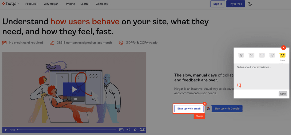
Hotjar's Feedback widget lets customers give you their opinions of your checkout process while they experience it.
The next step in crafting an amazing shopping cart experience
As we’ve covered, there are several ways to enhance your ecommerce website’s checkout experience. Whether you implement all of these changes or just a few, what’s most important is that you always put your customers’ needs first when optimizing your online shopping experience.
As long as you keep collecting feedback, quickly identify pain points, and iterate your design choices, you’ll create a delightful shopping experience that keeps customers coming back for more.
Learn what your customers love and hate with Hotjar
Use Hotjar’s tools to get customer insights and create an unforgettable shopping cart experience.