Learn / Guides / Heatmaps guide
How to use heatmaps to improve your site and boost user experience
Heatmaps show up in various places, from weather reports to Wimbledon aces' playing patterns to website analytics. They help us understand complex data at a glance and make informed decisions.
In this blog, we'll focus on web analytics and explore how heatmaps improve site design and user experience (UX), leading to enhanced sales and conversions.

Equipped with a user behavior analytics tool like Hotjar, you can start creating heatmaps and unearthing valuable insights into where visitors focus their attention, what engages them, and where they get stuck.
Let’s dig in.
Set up your heatmap today
Sign up for a free Hotjar account, add the tracking code, and start using heatmaps to improve your site or product.

What is a heatmap, and why is it the ultimate UX optimization tool?
Heatmaps are a powerful tool for analyzing and visualizing data, using a color-coded representation of values ranging from red to blue. They make it easy to see the most popular (warm) and unpopular (cold) areas of your web pages.
Using a heatmap gives you a deep understanding of how people interact with your website as it tracks:
Clicks
Scrolls
Mouse movements
Heatmap analysis follows once you have this visual view of user interaction and behavior data. And from it, insights will emerge and impact any future UX-related change, decision, or strategy. So, it's true—you can accomplish a lot when you create a heatmap:
Test and iterate: A/B test, update, or (re)design your site based on cold, hard facts and data
Uncover bugs and blockers: deeply investigate and fix an issue like a reduced conversion rate
Get buy-in instantly: convince team members and stakeholders using visual proof for better prioritization
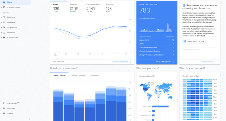
💡Pro tip: add Hotjar's Heatmaps to your toolbox to fill in the gaps left by traditional website analytics tools like Google Analytics (GA). Quantitative data can only go as far as to tell you, for example, that users are reaching the checkout page and exiting without purchasing. But it won't tell you what's wrong and why users behave the way they do. This is where heatmaps work wonders.
How to use heatmaps to improve your site and increase conversions
It may sound simple, but believe it: you'll take your online business to new heights when you add heatmaps to your arsenal. Below are some practical tips you can try right away if you're looking to improve your site UX.
Add context to traditional website analytics
If you're new here, you might wonder if Hotjar is intended as a replacement for traditional analytics tools like Google Analytics. We’ll take this opportunity to say definitely not!
GA's not just a fan favorite; it's an industry leader. Many users, like ecommerce brands and product teams, use it to get invaluable insights into what's happening on their websites, such as:
Which pages are the most popular?
How long do people stay on our product pages?
Where do drop-offs occur?
But Google Analytics is specialized—it's not supposed to do everything for everyone. One of the things it cannot do is reveal the actual behavior behind the usage. Now that's a job you can hire Hotjar for.
With Hotjar Heatmaps as a complement, you can get to the bottom of those GA numbers and find out the following:
Why is our conversion rate down?
Do users see important content on this top page?
Why are people getting stuck?
❓Did you know?
Hotjar seamlessly integrates with Google Analytics, making it easier than ever to discover specific user behaviors behind data analytics and prioritize the right fixes fast. Find out what’s happening in GA, and understand why it’s happening in Hotjar—a match made in UX heaven!
Once you've identified areas of your website that could do with some improvement, use the insights from your heatmaps to make changes. For example, suppose users are having trouble finding a particular button or link. You could move it to a more prominent location on the web page or make it stand out more with bold color or other design elements.
The best part is that gathering website heatmap insights definitely isn’t rocket science. Grab a cup of coffee and spend 20 minutes studying some heatmaps—you’d be amazed at what you’ll find. Later, you can show your findings in a sprint and resolve an issue with your team in record time.
Tap into the right type of heatmap to achieve different objectives
To truly empathize with your users, familiarize yourself with the different heatmap types and how they can help you understand their experience better.
Remember: users do not visit your site and see it as viewing this page or that. They experience it as a journey.
Click maps
A click map shows where users click their mouse on desktop devices or tap their fingers on mobile devices. The map displays the most-clicked web page elements in warmer shades, i.e. red, orange, and yellow.
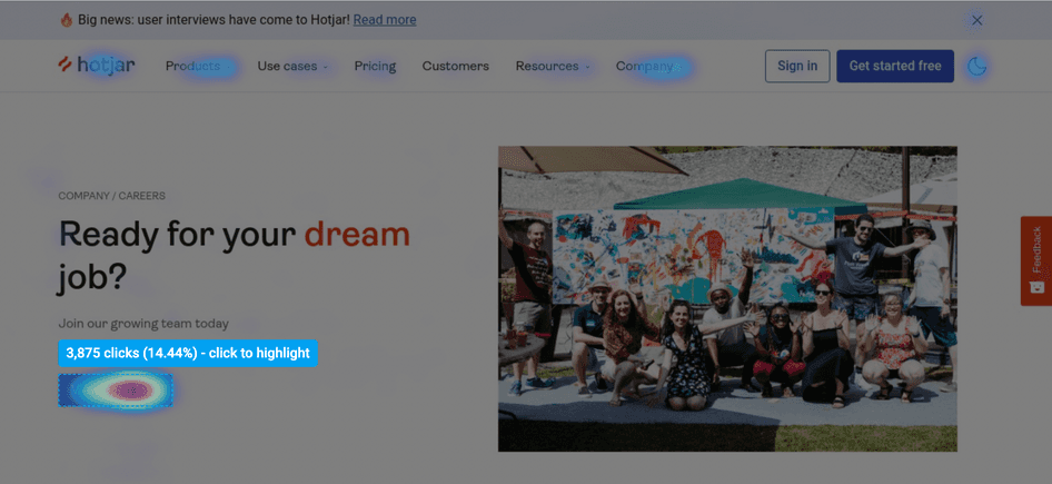
You’ll want to know if key elements like primary calls-to-action (CTA), links, and buttons are getting clicks or taps as intended. You can answer questions like:
How much interaction are they receiving?
Are people ignoring a product feature you want to popularize?
Do links work as they're supposed to?
This investigation powered by click maps enables you to:
Monitor the effectiveness of main CTAs
Pinpoint areas with possible navigation issues
Identify and remove elements/areas causing friction
Further, you can make design changes to deliver quick wins to customers and your teams, or use visual insights to justify the need for in-depth user research.
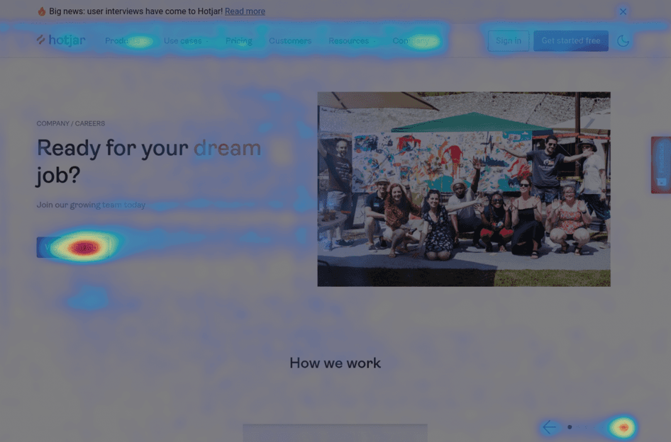
Scroll maps
If you want to see how far users scroll down specific pages, scroll maps are your best friend. This type of website heatmap lets you visualize your visitors' scrolling behavior.
Typically, the color-coded scroll map gradually changes from the warmest to the coldest. These represent the percentage of users who scrolled to each portion of your page, with the areas at the top being the 'hottest'.
This characteristic of scroll maps makes them one of the best analytics tools to employ when you conduct conversion rate optimization (CRO).
Are users seeing important content?
CRO is a widespread practice for enhancing web page content and elements. Those who benefit the most from CRO include digital marketers, ecommerce professionals, and product teams. And Hotjar, particularly Heatmaps, tops lists of most preferred CRO tools (don't take our word for it; here are heatmap case studies to reveal what our customers think).
You can rely on scroll heatmaps to determine if your content is really driving conversions—that is, the actions you want users to take, such as downloading an ebook, clicking a link to the product page, and completing a purchase.
Here are some steps to get you started:
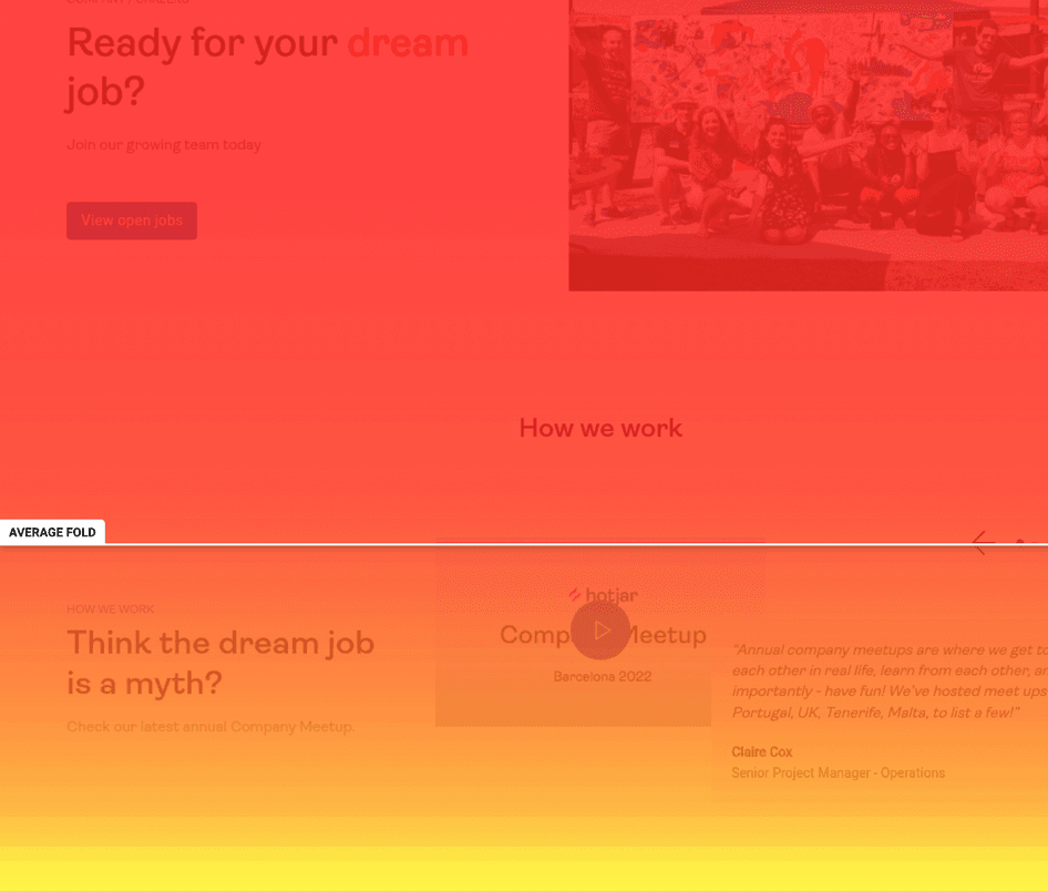
Check your site's average fold—the area users see upon landing before any scrolling happens. Knowing where your average fold lies is crucial to learning whether visitors can access valuable information like product offerings and campaign announcements.
Review the entire heatmap to view the percentage of visitors who make it (or don't) to specific page points. This data proves useful in longer pages, with lots of information you want people to see.
Look out for sharp color changes, which mean that a significant number of users stopped scrolling. Use this as a springboard to investigate if these people thought they had reached the end of the page.
Scroll map analysis might indicate that the information users need is not immediately visible. Maybe you have to move important content up or make it clearer that there's more content to explore further down the page. And who knows? This insight alone could be the thing to skyrocket your conversions.
Move maps
Instead of tracking mouse clicks, move maps track mouse movement—where desktop users move their mouse while navigating a page. In particular, the hot spots tell you where they are hovering. Research suggests an association between where people are looking and where their cursor is, and this could point you to high-attention areas and, conversely, low-interaction ones.
Consult move maps to check if cursor activity is spread all over the page instead of being focused on its key messages, CTA buttons, and links. It could be that multiple page elements compete for people's attention. If this is the case, you’ll have to rearrange things or create actionable slogans to drive user attention toward elements and content that drive conversion.
See the big picture of how users behave on your key pages
Organize your user-centric analysis by looking at the heatmaps of certain pages, including:
The homepage
Landing pages
Top pages
Underperforming pages
New pages
Let's tackle a few more website heatmap examples and scenarios based on some of the groupings above:
The homepage
You already know conversions can be affected negatively when a visitor coming to your page leaves without checking out the bottom area. But what if you've put your important content above the fold and still nothing?
We experienced this ourselves a few years ago, after placing a video above the fold of our homepage. Upon consulting a click map, we noticed people weren't clicking to watch the video. In fact, the video got only three clicks out of the 7,000 recorded clicks! 😬
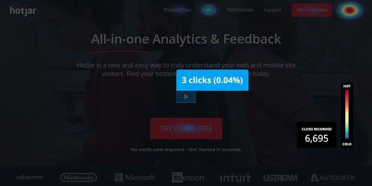
The visual data hinted at what needed to be fixed on our website. So we decided to create and perform A/B testing on a set of homepages, many of which no longer showed a video above the fold, to fix the issue.
Landing pages
Let's say Brand X published a lead capture form, a standalone landing page designed to collect lead information from prospects. They have since then generated very few conversions (signups).
With the help of a move map, they find out that the area where the form is placed has little to no user activity. This insight leads them to redesign the landing page, reducing the number of form fields, increasing their size, adding an image to the left, and making the main message readable. Problem solved!
Underperforming pages
Heatmaps also reveal if the opposite is happening to pages you expect to perform well, like the pricing page. If you observe that after spending a considerable time on this page, people navigate away to the case studies page, it's worth figuring out how to aid them in their decision-making. Adding customer testimonials to the pricing page would be your logical next step in increasing conversions.
Dive into issues across devices
Record heatmaps for desktop and mobile to compare how far users scroll on various devices. This way, ecommerce, marketing, or product teams can:
Determine if people are consuming more or less content depending on the device
Pair scroll maps with click maps to contrast users' clicking behavior and page interaction on desktop and mobile
Propose changes that need to be made with confidence
In the spirit of cross-functional collaboration, you can then work hand-in-hand with your UX designer to apply quick-win changes or restructure and redesign pages altogether.
Complement other behavior analytics tools in Hotjar
Heatmaps are just one tool for understanding how users interact with your website. We already mentioned the Hotjar and Google Analytics power-combo. To get a complete picture of user behavior, you should also consider other quantitative and qualitative data sources, such as non-GA website analytics and user feedback.
💡Pro tip: session recordings (also known as visitor recordings or session replays) are renderings of user browsing sessions that help you bring more clarity to some of the insights you pick up from a heatmap. Instead of making assumptions about the clicking, tapping, and/or scrolling you see on a heatmap, try viewing some session replays and see how your users actually interact with your site.
Curious about how to combine heatmaps and highlights? Watch this video:
Visualize user behavior with heatmaps
Heatmaps offer a visual representation of aggregate visitor behavior data. They also complement various analytics tools, including traditional ones like Google Analytics and customer-centric ones like Hotjar’s Recordings and Feedback.
Waste no time and start maximizing heatmaps by following the practical tips and tricks shared in this article. And if you need to create and launch a click map, scroll map, or move map now, look no further than Hotjar.
Set up your heatmap today
Sign up for a free Hotjar account, add the tracking code, and start using heatmaps to improve your site or product.