Learn / Guides / Heatmaps guide
How to use rage click maps to reduce friction and increase conversions
Users don’t always tell you when they experience frustration on your website or product, but they often show you. With repeated mouse clicks, they signal that they’re trying (unsuccessfully) to take action.
Rage click maps let you visualize problem spots that irritate your visitors, helping you find simple solutions to improve your user experience (UX) and conversion rates.
Rage clicks are no fun for the user, and they can be painful for you, too: they represent points of friction on the user’s path to conversion. But to eliminate these problem zones, you first need an efficient way to spot them.
Enter rage click maps, visualizations that show you exactly where rage clicks occur on a page. In this guide, we walk you through four ways to use them to improve the product experience and boost engagement, conversions, and retention.
TL;DR
A rage click map is a behavior analytics tool that shows you where on a page users experience friction so you can make improvements to increase conversions.
Using rage click maps helps your team:
Find your website’s frustration hotspots
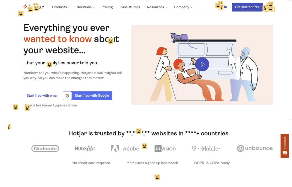
Hotjar Heatmaps lets you view rage click maps to minimize friction and boost conversions.

4 ways to use rage click maps to improve your site
In the past, if you wanted to uncover points of frustration, you’d head straight to Hotjar Recordings, which captures real users’ mouse movements, clicks, and scrolls. Then, you’d apply a rage click filter, watch the relevant sessions for trouble spots, and roll up your sleeves to solve the problem.
This approach still works great, but sometimes you want a big-picture overview before you dig into the details. And that’s where rage click maps come into play.
A rage click map is a type of heatmap—a visualization of aggregate user behavior—that shows you all the rage clicks on a page, helping you quickly spot patterns and trends, so you know which improvements to prioritize.
We don’t want to toot our own horn, but it’s a game-changer. Let’s look at four ways rage click maps make your life easier, lead to a better user experience, and increase conversions.
1. Reduce friction in the customer journey
Say you’re a product manager at an online travel agency, and you’re responsible for the ever-important search results listings that show travelers relevant hotel options.
The page seems simple, but a lot can go wrong for the user. Filters galore line the left-hand side and top of the page. Each results page shows 20 hotels, and each hotel listing has five clickable links.
With rage click maps, you quickly see where confused and frustrated searchers might head for an alternative provider. Minimizing those ‘ugh’ moments keeps them on their path to ‘aha’ moments and a purchase.
If conversions are down—or if you just want to get proactive—try these three steps:
Open Heatmaps in Hotjar
Click on Rage Clicks in the Map Types side panel
Look for angry face icons—these show where repeated clicks occurred on the page

💡Pro tip: use Recordings to dig into the why behind the rage clicks on your map. Seeing the moments right before and after the dreaded rage click can reveal what a user was thinking. You might realize that the page is loading slowly—or even discover that there isn’t any problem at all, and the rage click was accidental.
With Hotjar’s Observe Business plan, it’s easy to go from rage click maps to recordings. Click any angry-face icons on the map to view relevant sessions.
Hotjar Recordings lets you see users’ mouse movements, scrolls, and, yep, rage clicks
2. Optimize your checkout flow
Ah, checkout. A pivotal point in any ecommerce customer journey. If you’re a product designer or conversion rate optimization (CRO) specialist, you’re determined to get this part right.
But every so often, you discover shoppers are just inches away from the finish line—when they abruptly abandon checkout. A recent report revealed the average cart abandonment rate hovers right around 70%. The key to reclaiming those lost conversions? Optimizing your checkout flow.
Rage click maps give you an at-a-glance overview of what’s wrong, so you can fix checkout issues like:
A form field that doesn’t work due to a bug
Problems with payment, such as a broken digital wallet link
Unclear ‘required’ fields, so the shopper keeps clicking on the ‘Next’ button but can’t move forward
💡Pro tip: for an even better understanding of checkout issues, set up an exit-intent survey on your checkout page. Ask shoppers their reason for leaving and how you can improve.
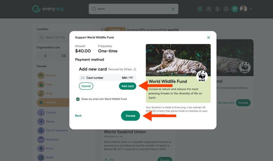
How rage clicks helped Every.org increase conversions
Donation platform Every.org used rage click data to improve their checkout flow—and boosted conversions a whopping 29.5%. Rage clicks pointed to a problem spot: a form with two conflicting call-to-action (CTA) buttons. Users who hadn’t yet entered their credit card information couldn’t progress to the next screen, causing confusion and frustration.
Adding an additional page to the checkout flow—a rare move in the optimization world—made users happier and increased donations. Win-win.
3. Improve the product experience (PX)
Imagine you’re a UX researcher at a software-as-a-service (SaaS) company. Your organization provides an incredible customer relationship management (CRM) platform, but you need to create a seamless experience to retain customers.
Rage click maps are a quick way to remove speedbumps in the SaaS customer experience.
For example, once you release a new product version, use a rage click heatmap to spot common PX and UX issues like:
Form fields with unclear input hints
Buttons that are too small and difficult to click
Icons, images, or words that look clickable, but aren’t
Then, for an even deeper dive into the user experience, run a UX audit, a screen-by-screen evaluation of your website or web app from the user’s perspective. You’ll develop empathy for your users, and discover ways to delight them.
💡Pro tip: creating a smooth product and user experience is a team effort. When you spot a problem on your rage click map (or any type of heatmap), create a Hotjar Highlight to share with your team.
Just click on a noteworthy area on the map, and hit the 'Save' button. From there, you can add the highlight to a Collection to store similar user issues or share it with team members to start working on fixes.
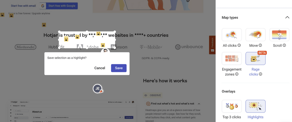
The Highlights feature in Hotjar lets you capture and share your findings to get buy-in and assistance from your team
4. Optimize layouts to satisfy user expectations
Business blogging is on the rise—from small-to-medium businesses (SMBs) to global enterprises. And for good reason: content marketing revenue totaled 63 billion dollars in 2022.
Blogs can highlight your product offerings, establish your authority, and draw search engine traffic to your site. But to get the most bang for your blogging buck, you need more than just sparkling content—you need an optimized blog design. Rage click maps help you get there, letting you spot issues like:
Areas above the fold with too much white space, causing confused visitors to think something’s missing
A visually appealing section divider that users really want to click
A drop-down menu that unfurls when users try to navigate the filters at the top of the page, blocking their view
If problems like these pop up, it’s time for a little reorganizing. Make sure your blog—or any other page on your site—has a layout that aligns with your users’ expectations.
💡Pro tip: combine insights from Engagement Zone maps with rage click maps when optimizing your layout.
Engagement Zone maps let you combine click, move, and scroll data (or taps and scrolls on mobile and tablet) to see the parts of a page that get the most interaction.
With engagement zones, you can discover:
An image that stops users in their tracks
An external link that distracts your visitors and lures them away
A blog post at the bottom of the page that’s rarely seen—but when people do see it, they engage with it
This helps you understand what your users find most valuable, so you can hypothesize which elements need a new home on the page to improve your UX and boost conversions.
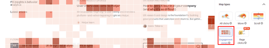
Engagement Zone maps lay a colored grid over your page. Darker boxes indicate more user interaction—clicks, scrolls, and movements—in that area.
Reduce friction and frustration to create happier customers
Rage click maps help you develop more empathy for your users’ needs and make customer-centric decisions. By finding—and quickly resolving—product experience problems, you earn your customers’ trust and loyalty. They know they can count on you to fix bugs, slow-loading pages, and confusing design elements every time. 💪
Find your website’s frustration hotspots
Hotjar Heatmaps lets you view rage click maps to minimize friction and boost conversions.