Learn / Guides / Website problems guide
5 major website design problems and how to solve them
Designing a successful website is a blend of art and science. The goal is to make your site look appealing while guiding visitors to take specific actions—like signing up for your email list or making a purchase.
But because there are so many steps involved in the process, like mapping out the user flow and building dozens of product pages, it’s not unusual to end up with website design problems.
It might not seem like a big deal, but poor design can cost you your users’ trust and significant revenue.

In this guide, you’ll learn about five website design problems—why they matter, how to spot them quickly, and the simplest ways to solve them while putting your visitors first. The result? A website that turns visitors into customers, and customers into loyal brand ambassadors.
Dive right in, or skip to a specific web design problem:
1. Poor navigation and flow
Your website visitors would call this problem: “Where do I look or go next?”
Telltale signs of unclear navigation and a confusing user flow include:
A navigation bar that’s in an unusual spot, or laid out in an unconventional way
A main call to action (CTA) that doesn’t stand out or isn’t visible during the user journey
A navigation menu and other links with names that were supposed to be creative or funny, but actually confuse the visitor (like ‘magazine’ instead of ‘blog’)

Zara, a fashion retailer, has its navigation bar hidden behind the hamburger button at the top-left, which makes it challenging to navigate
The consequence of poor navigation and flow? Visitors, even when they’re your ideal customer profile, won’t know what to do—and they’ll exit before your website can make an impact.
How to spot it?
First, take note of what your navigation bar and CTAs look like right now. Are they in a place your visitors would expect them to be? Are they clear, visible, and straightforward?
Then, check your quantitative website analytics for these indicators of confusing buttons, links, and next steps:
High bounce rate: many visitors abandon your website without taking any action or viewing other pages
Low session duration: a potential indicator that visitors aren’t sure how to proceed
Low conversion rate: a low percentage of traffic that takes the action you want them to (signing up to your email list, downloading a resource, making a purchase)
Keep in mind that what high and low mean in this context depends on your business, industry, and expectations. Industry benchmarks can be useful, but they don’t take the specifics of your business and your customers into account.
🔥 If you’re using Hotjar: use the Dashboard tool to easily monitor your most clicked buttons and links, top pages, and metrics like average session duration, pages per session, and bounce rate.
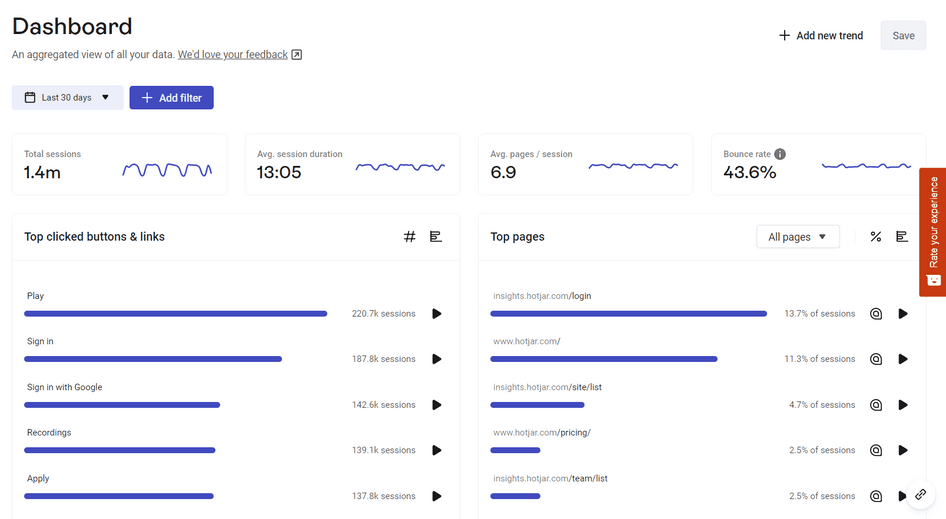
Example of a dashboard in Hotjar
How to solve it?
Tap into a digital experience and behavior analytics platform (like Hotjar 👋) that gives you more context about a navigational issue, with tools like:
Recordings: look at what visitors do right before they leave, why they rage click (i.e. click repeatedly on the same element), and for other signs of confusion
Surveys: ask visitors a question like “What’s stopping you from taking the next step?” on pages they linger on
Heatmaps: explore what’s visible to visitors as they navigate a page—maybe a key link or button is hidden from view
Heatmaps showed us that very few users scroll down beyond our hero, so when redesigning our landing pages, we used this information to redesign only that section. This reduced our costs in terms of design and engineering overhead whilst delivering a 15% increase in our conversion rate.
After you've done all of the above, make a list of design elements that seem to be a bottleneck and work through that list to implement improvements. These can include:
Moving a CTA button
Tweaking copy and colors
Redesigning your navigation bar layout
Changing how your page renders on different devices and screen sizes (more on that later)
2. Visuals that don’t resonate
Folks who visit your site might call this one: “Am I in the right place?”
You have this common website design problem if your website features photos, illustrations, or other visuals that don’t align with your target customer—their needs, goals, pain points, lifestyle, and how they describe themselves.
Here are a few examples:
Your offer serves adults with ADHD, but your website only features images of children
Your product is a modern software solution, but your website design is outdated
Your site features visuals that suggest hobby use of a product—like wall paint—but you’re targeting a professional audience and your products are for commercial use
The consequence of visuals that don’t resonate? A new visitor will immediately bounce from your website because they believe they’re in the wrong place. Simple as that.
How to spot it?
Be on the lookout for indicators like:
High bounce rate: the majority of visitors leave almost instantly
Low time on page for key pages: for example, check if users stay on your landing pages for only a few seconds before leaving
🔥 If you’re using Hotjar: check out the feedback you’ve received through the Feedback widget as it lets users highlight elements of the page they don’t resonate with. The challenge with this approach, of course, is that a visitor may never get to the point of wanting to give feedback because your site looks like it’s not for them.
Think about wanting to buy towels for your guest bathroom, but walking into a bakery instead. “Oops, wrong door,” you think to yourself, and exit so you can look for the correct store. That’s how it feels to view a website that doesn’t look like it’s intended for you.
How to solve it?
Rely on your user personas to drive your web design. If you already have user personas, revisit them and ensure that designers, developers, and writers use them in their work.
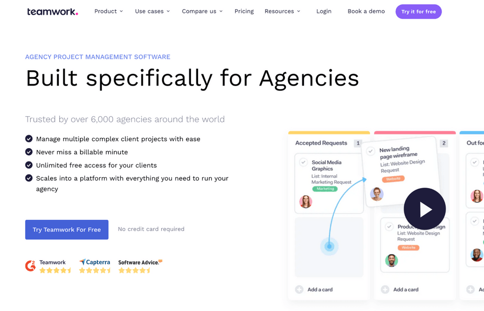
Teamwork, a project management software solution, is a strong example of a company that knows its user persona
If you don’t already have user personas, this is your sign to create them. It can be as simple as defining these elements:
Who they are: the core demographic or a job title, like ‘accountant in a fast-growing startup’
Their goals: what they want to achieve, and how your product or service might fit into their life
Barriers and concerns: pain points and challenges that prevent them from achieving their goal
The best part is, you don’t have to come up with these elements out of thin air—you can lean on real data about real humans. Here’s how:
Survey your audience: use a pop-up on your most-visited pages, like your homepage and product pages. Hotjar makes this super easy—find all the steps, tools, and questions you need in our user persona guide.
Run market research: Hotjar Engage lets you recruit and interview the right users based on the criteria you set—so you can turn what you’ve learned into actionable insights and useful user personas.
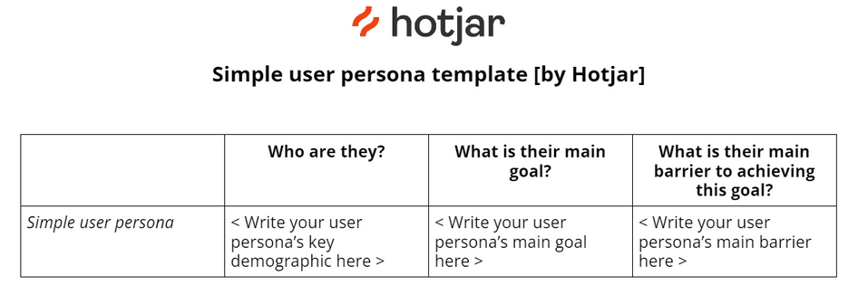
Build your findings into this simple user persona template, and use it to update your website visuals to match what your ideal customers want to see.
3. Esthetics over information
In your website visitors’ words, this web design problem could be called, “It looks beautiful, but doesn’t help me get to where I want to go!”
In short: you’re prioritizing eye-catching design and layout at the cost of clear copy and flow of information.
Here are some potential causes of this:
Using a beautiful but inflexible website template, which forced you to cram information into predefined boxes and layouts
Following ‘best practices’ that don’t take into account your specific audience or use case (because it’s someone else’s experiment, opinion, or recommendation)
Designing your website before defining the flow of copy and messaging throughout
Basing your website design on a journey you think your users take

The consequence of prioritizing esthetics over information? Your ideal customers and target visitors drop off your page because they’re not finding the info they need—where they need it—quickly enough.
So even though they were a potential customer, you’re losing them—and leaving revenue on the table.
How to spot it?
This isn’t a typical poor design issue—it doesn’t necessarily look bad—but it means a page isn’t serving the purpose it’s supposed to.
That’s why it’s trickier to spot it as there are no obvious signs, like sky-high bounce rate with some other design problems, to instantly indicate the issue. You need to dive deeper with tools like:
Google Analytics flow report, so you can see the order of pages people view and where they drop off
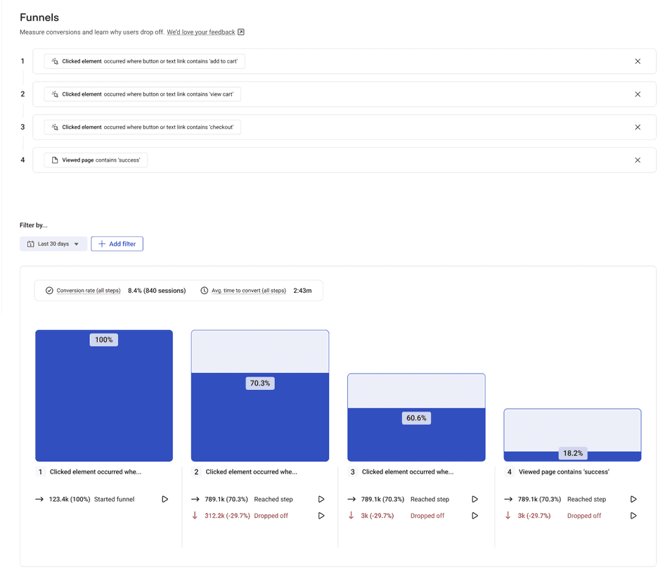
Hotjar Funnels, which lets you visualize conversion flows based on pages users viewed, the action you wanted them to take (like completing an order), the buttons they clicked, and even details like the average order value
Once you identify the pages where you seem to lose the most visitors, scan them for any obvious user experience (UX) issues that would stop people from progressing, like hidden buttons or weirdly sized text.
If there are no clear reasons for users dropping off, there’s a chance they aren’t finding the details and answers they need to keep going.
How to solve it?
Imagine you have a software-as-a-service (SaaS) website and a visitor is on the pricing page preparing to sign up, but they can’t figure out whether they need a credit card to get a free trial. Your page doesn’t clarify, and this detail is somewhere on your FAQ page, which users can’t access from the pricing page, so they drop off.
The way to get these deeper insights and concerns is by asking your users, so you can understand and empathize with them, and make the necessary design and copy tweaks to improve their experience. Here’s how:
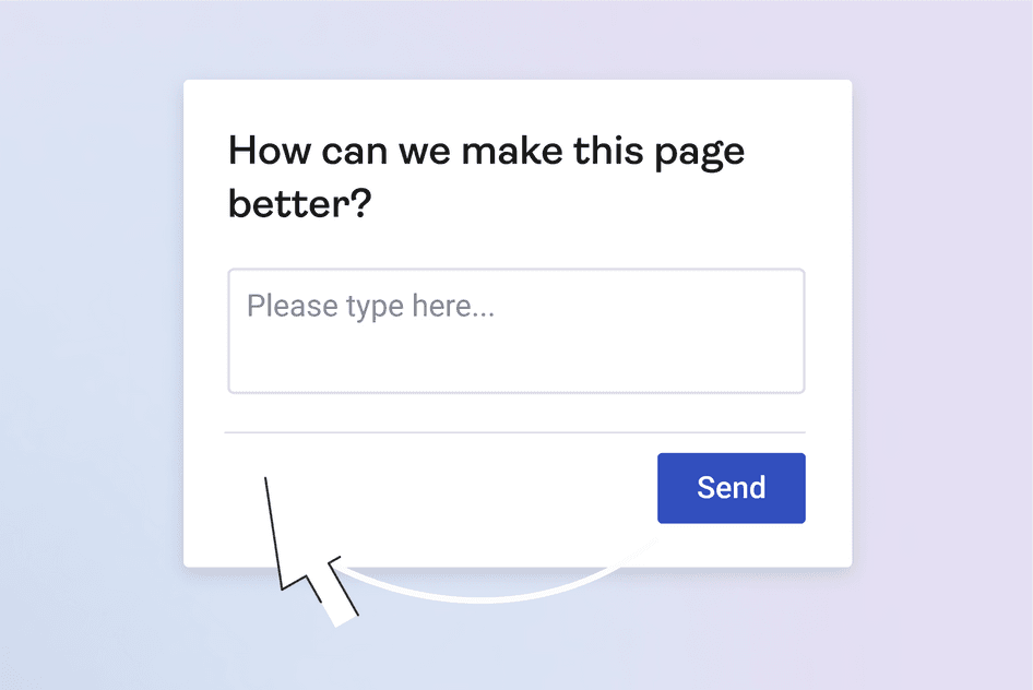
Place surveys on these key pages with questions like:
What’s stopping you from [taking X action] today?
What are your main concerns or questions about [name]?
What can we do to make this page better?
4. Prioritizing the desktop experience
Your website visitors would name this one: “I know exactly what to do when I’m on my laptop, but I struggle on my smartphone.”
Because of their smaller screen or working surface, building a mobile and tablet experience brings two risks:
You either take away key elements or hide them, which then makes it harder for a user to progress
Or you cram too much on the screen, creating clutter and a frustrating experience, so actions like tapping on a small button become frustrating
The consequence of only focusing on desktop experiences? Frustrated users who leave your site without doing what they wanted to do—meaning they might never return because they just can’t be bothered. What’s more, it impacts your SEO—search engines like Google use mobile-first indexing, which means they use your website’s mobile performance to decide on its ranking—even for desktop users.
Check out this web design example from Mango that doesn’t translate well to mobile:
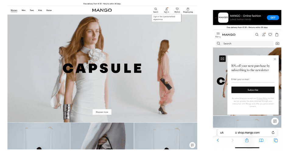
Mango, a fashion retailer, features multiple CTAs (newsletter pop-up and the app bar at the top) fighting for visitors’ attention, taking up over half the screen
How to spot it?
First, use tools like Google’s Mobile-Friendly Test and HubSpot’s Website Grader to check if your mobile site is responsive.
Then, check your website analytics for desktop users and mobile users, and compare them. If mobile experience is an issue, you’ll see:
Higher bounce rate
Shorter sessions
Lower conversion rate for mobile sessions compared to desktop sessions
Mobile users may not have the same goal as desktop users; for example, they may not be ready to just whip out their credit card and make a purchase, but they might want to research all of their options and sign up for a discount or a valuable piece of content while they’re on their phone during a commute.
It's crucial to make your user's journey through your mobile site seamless and their goals easy to achieve.
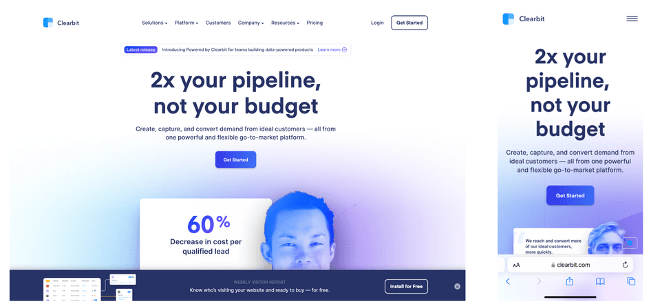
Clearbit, a data activation platform, strips some information (latest release at the top, weekly visitor report bar at the bottom) to make sure the mobile website isn’t overwhelming visitors
How to solve it?
Once you learn mobile experience is an issue, dig deeper into the experiences of mobile users.
For example, analyze how users behave when they’re on specific pages that seem to be the issue—what they ignore and what they focus on.
Here are three ways to do that:
Watch mobile session recordings to see whether users scroll up and down in confusion or frustration, where they tap, what they overlook, and what’s completely out of their view due to how your website renders on mobile (in Hotjar, you’ll find mobile sessions through the Device > phone filter)
Pro tip: mobile session recordings aren’t revealing an obvious issue? Prioritize watching those with high frustration scores.
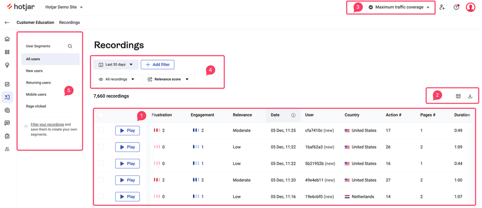
Save time analyzing session recordings in Hotjar by filtering by Relevance, Frustration, or Engagement score
Analyze mobile heatmaps to see how far down users scroll on average, whether they tap on elements that aren’t links or buttons, and which sections get the most attention
Run page- and device-specific surveys to get more context behind mobile users' behavior
Then, use these insights to outline the potential barriers you’ve uncovered in the user journey on mobile. These might be:
A navigation bar behind the hamburger icon that’s too small to tap
Text that’s too long for a small smartphone screen to invoke action
Links that don’t display correctly on mobile (aka don’t look clickable), so users miss them
Once you have a list of users' pain points on mobile devices, bring designers, developers, and writers together to build and implement changes. These might range from small layout changes to copy rewrites that help you create a responsive design.
🔥 How Time4Sleep improved the mobile experience for their customers
Time4Sleep, an online retailer that sells beds and mattresses, partnered up with CRO agency Epiphany to uncover the troubles their visitors had on mobile and fix them.
They used data from Google Analytics and layered it with Hotjar Recordings, Heatmaps, and Surveys, as well as in-person user testing to define several friction points in their customers’ flow through the mobile site.
Once they built several variations and tested them, they ended up with a 63% boost in mobile conversions. With 70% of Time4Sleep’s traffic coming from mobile, this was a massive win.
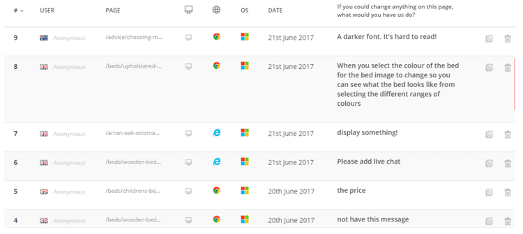
Some of the survey responses Time4Sleep collected through website surveys
5. The white space conundrum
Your site visitors might call this one “There’s too much happening at once” if you don’t have enough white space, or “Why are things floating so far from everything else?” if there’s too much white space on the page.
In web design, white space (aka negative space) is the space left around and between elements on a page that helps important elements stand out, giving visitors a chance to rest their eyes and focus on a specific CTA or copy.
When you don’t have enough white space, there’s clutter on the page—a surefire way to confuse and frustrate visitors. And when there’s too much of it, your pages become hard to navigate.
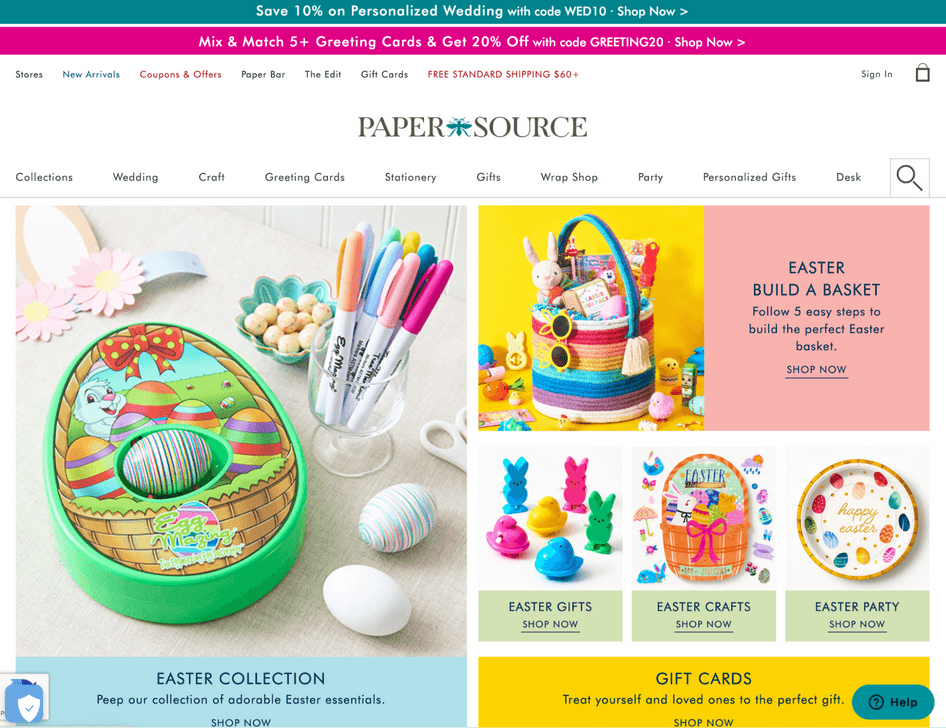
The Paper Source homepage with minimal white space, which doesn’t let the images and colors breathe
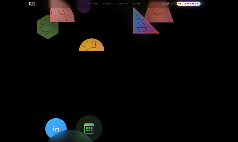
One of several blank areas on the homepage of Clay, a personal CRM tool, that requires lots of scrolling to see the copy and visuals
The consequence of insufficient white space, or too much of it? Either option can be a point that confuses users and drives them away before they give your content and offers a chance.
How to spot it?
This is essentially impossible through quantitative data and regular website monitoring.
Besides looking at your website design with an unbiased eye, your best bet is digging into qualitative clues. Here’s how:
Analyze responses to surveys that you launch right before visitors leave
Note the issues users run into during support conversations
Conduct interviews and ask users about your website’s design: whether they think your page is too cluttered (too little white space), or if they can find the info they need without having to scroll down a lot (too much white space)
How to solve it?
With the help of a designer and developer, solving the white space issue is simple and quite quick: you either add more or less of it.
The trick is in tracking the impact of those changes. Your best option is to run a split test on the pages you’re tweaking. When you integrate your testing tool with Hotjar, you can see whether these tweaks helped by:
Showing a feedback widget or survey on a variant
Comparing heatmaps for your control and variant
Watching recordings of users exposed to the variant
Pro tip: use Hotjar to run a concept test (aka preference test) survey with your visitors, letting them pick between two images that showcase your pages with different degrees of white space—so you can see which one they prefer.
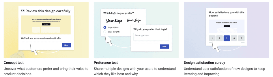
Run a concept testing survey to see which version of your web design users prefer
Avoid web design problems by putting users first
Nailing your web design means your visitors feel like they’re exactly where they should be every time they visit your site. They might be researching, buying from you for the tenth time, or just passing the time—their experience matters in all of those cases and beyond.
Your website isn’t there just to look good—it’s to help users find what they need by leading them to the logical next step, and keep them coming back. That’s what keeps them happy, and your business healthy.
Find and fix your website design issues with Hotjar
Track what your users do—and why they do it—to find any web design problems on your site and drive your traffic and conversion rate through the roof.
