Learn / Guides / Performance reporting guide
7 best performance reporting tools and software for marketing, UX, and product teams
You can’t manage what you can’t measure, but too much data can lead to information overload. The right performance reporting software makes it easier for you and your team to track what matters, identify areas for improvement, and share wins with clients and stakeholders.

This guide takes you through seven performance reporting tools perfect for marketing, user experience (UX), and product teams. Choose the right tool to help you collect, analyze, and display qualitative and quantitative insights that drive company-wide growth.
Go beyond traditional performance reporting with Hotjar
Hotjar’s tools help you measure the ‘what’ and the ‘why’ of your product’s performance so you can grow by putting customers first.

What is performance reporting software?
Performance reporting software is a tool that lets you collect data and create dashboards of business insights, so you can identify areas for optimization and share progress with clients, teams, and stakeholders.
What performance reporting software measures
You can measure almost any business metric or key performance indicator (KPI) with reporting software, but your focus should be primarily on the KPIs most relevant to your role.
For example, marketing, UX, and product teams may use performance reporting tools to measure and understand:
Website and search engine optimization (SEO) traffic: organic sessions, keyword rankings, and backlink acquisition
User and customer behavior: navigation patterns, clicks on specific page elements, and satisfaction rates
Ad campaigns: profitable keywords, click-through rates, and conversions
A/B tests: winning variations and statistically significant results
Conversion rates: purchases, subscriptions, and sign-ups
Churn and retention rates: lost and loyal users and customers
💡Pro tip: many performance reports focus on numerical (i.e. quantitative) data because it’s simpler to display it in a graph or chart. But, when your business relies on real—human!—customers, numbers only tell part of the story.
User behavior and preferences cannot fully be captured or explained by quantitative data alone. Always pair quantitative data points with qualitative insights—by surveying your users after they make a purchase or asking for their feedback on a specific part of your website—to get a complete picture of what your users want and need.
Top 7 performance reporting tools for teams
The software and tools below help marketers and UX and product teams collect and showcase performance data so that valuable insights rise to the top, making it easier to spot opportunities and report on what’s really driving results.
Some of these tools help you integrate data from multiple sources (data connectors), while others create dashboards and visualizations for you (dashboard tools), and the rest have built-in performance reports. You don’t need to use them all: pick the ones that suit your budget and business goals and look for a free trial to get started.
1. Hotjar
What it is: Hotjar (that’s us 👋, hi there!) is a freemium behavior analytics platform with website tracking tools that measure how real visitors and customers use a website or product, including:
Heatmaps: see where visitors click, scroll, and move on any page
Recordings: watch real users navigate your site from page to page
Surveys and Feedback: capture in-the-moment opinions on a specific page or via email
Interviews: talk to customers about their needs 1-on-1
How to use Hotjar to create performance reports: once you add the tracking code to your website, Hotjar starts tracking user behavior across your pages. You can integrate data from other sources using the Events API, custom User Attributes, and integrations with other popular tracking and reporting tools like Google Analytics, Segment, and Optimizely.
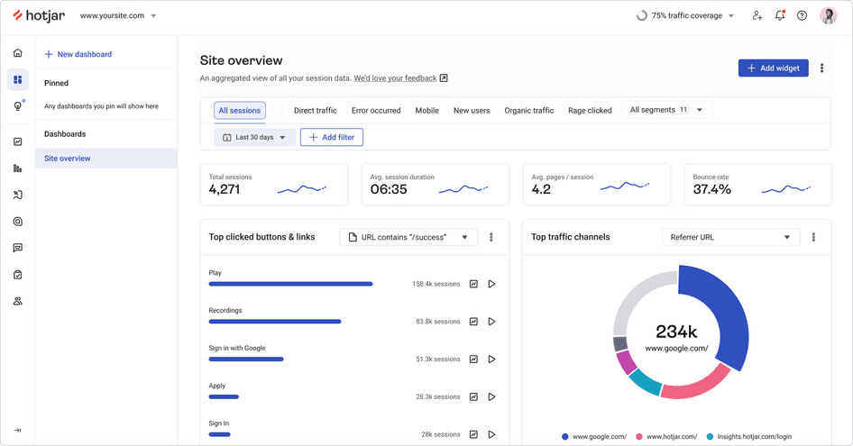
You can then go to Dashboards to view performance reports that combine Hotjar’s user behavior insights with any other data you’ve integrated. By customizing and filtering your dashboards, you can report on your website’s top pages, quantify users who might be experiencing an issue via rage clicks and u-turns, and monitor user sentiment over time.
These visual overviews help you spot UX trends, quickly identify areas for improvement, and share your wins with clients or stakeholders.
💡Pro tip: use Hotjar Trends to add custom metrics and comparisons to your dashboards. This way, you can visually see progress over time and click through to related session recordings to investigate the why behind the numbers straight away.
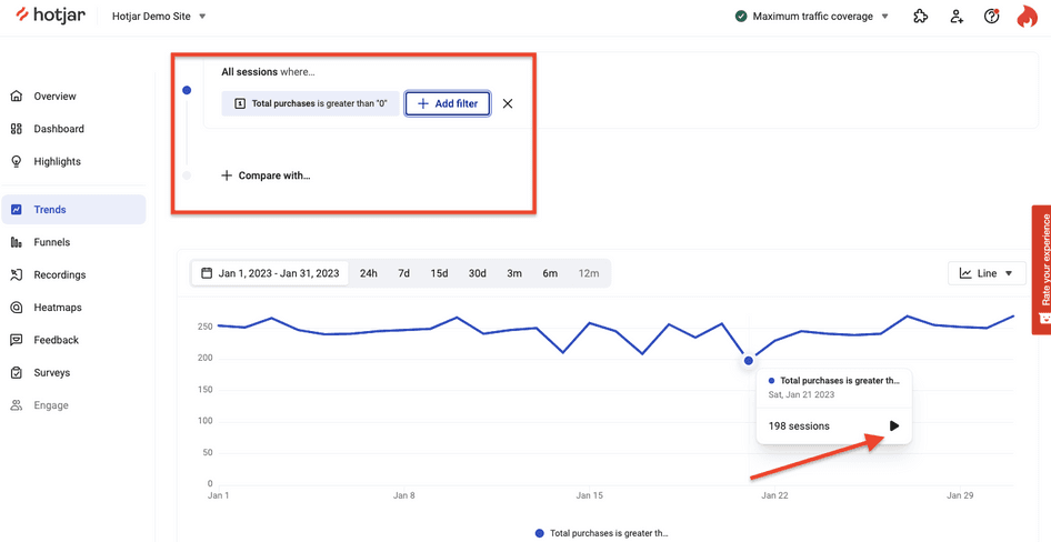
Creating a custom metric widget in Hotjar Trends: click the play button to go straight to relevant session recordings
2. Looker Studio
What it is: Looker Studio, formerly known as Google Data Studio until late 2022, is a free business intelligence data dashboard that lets you connect data and transform it into interactive reports and visualizations.
How to use Looker Studio to create performance reports: Looker Studio connects with other Google properties (like Google Ads, YouTube, and Google Sheets), SQL databases, BigQuery tables, and over 700 third-party apps like Mailchimp, Shopify, and Matomo. You can use Looker Studio’s free performance report templates to get started.
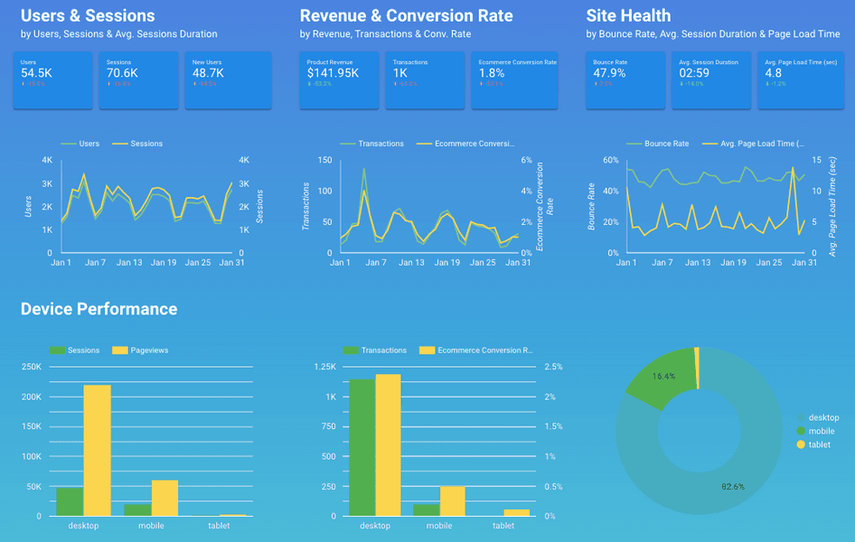
💡Pro tip: the team at Matalan, a UK fashion retailer, integrated the Hotjar Feedback widget with Google Data Studio to monitor the user experience on their website and quickly identify issues as soon as they were reported. You can do the same by syncing Hotjar's Feedback tools to Google Sheets via Zapier and then pulling the sheet straight into Looker Studio.
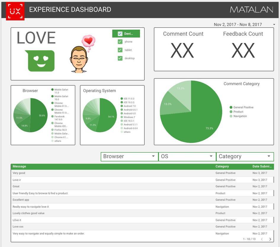
Matalan’s performance report pulled data from Hotjar Feedback tools into Google Data Studio (now Looker Studio)
3. Ahrefs
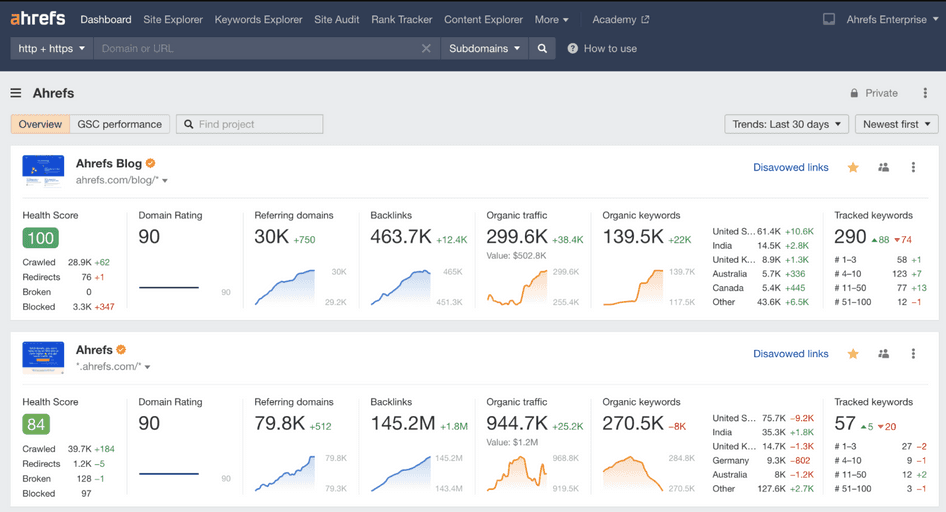
What it is: Ahrefs is a premium SEO platform with various tools that measure and report on SEO performance. You can even use the Ahrefs Webmaster Tools to access Ahrefs’ Site Audit and Site Explorer tools for free if you verify website ownership first.
How to use Ahrefs to create performance reports: the Ahrefs Dashboard generates an overview of any website’s SEO performance, including the number of backlinks, estimated organic traffic, and organic keyword rankings.
There’s not much to customize, but if you’re tracking custom keyword rankings, these will show up in the dashboard overview. You can also pull additional data from Google Search Console and visualize it within Ahrefs.
💡Pro tip: unlike most performance reporting software, you can also use Ahrefs to view reports on competitors’ websites using the Site Explorer tool. This comes in handy if you’re part of a brand or content marketing team and need competitor and market research for your performance reports.
4. Segment
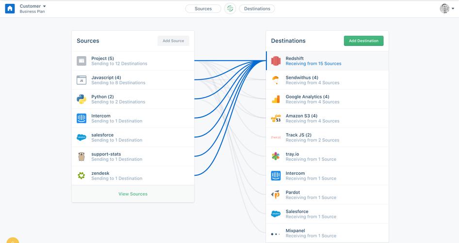
What it is: Segment, also known as Twilio Segment after its 2020 acquisition, is a freemium customer data platform for marketing, product, and engineering teams. Segment makes it easier to connect tools to your product or website and send data to any destination for analysis, reporting, and personalization.
How to use Segment to create performance reports: on its own, Segment is not a reporting tool, but it does help you collect data from multiple sources and send it to performance reporting software like Serenytics, SegMetrics, and Cruncher for analysis.
For example, the product team at Hotjar used Segment in-house to pull responses from Hotjar Surveys and the Feedback widget, and combined them with product analytics data to focus on feedback from the ideal customer profile (ICP). The team also used Segment to report on customer acquisition costs (CAC) by pulling in data from Google and Facebook ads.
💡Pro tip: use Hotjar’s Segment integration to connect behavior analytics with your other analytics data. For example, you can filter Hotjar Session Recordings by specific User Attributes and target on-site surveys and feedback requests to specific users.
5. Tableau
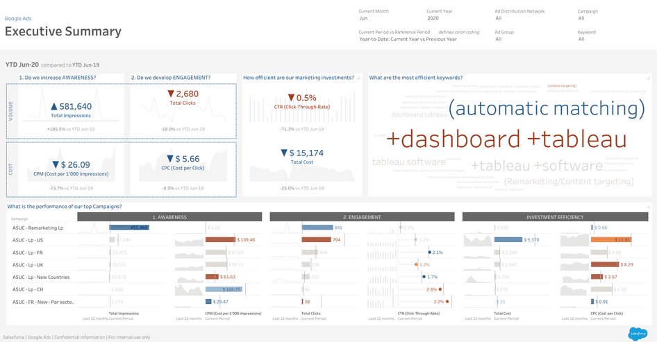
What it is: Tableau is a premium business intelligence and data visualization software for creating interactive dashboards, charts, and graphs that help teams spot trends in data and product usage.
How to use Tableau to create performance reports: Tableau imports data from many third-party tools and software—think Google Analytics, Salesforce, and Google Ads. You can also pull in data from documents like Microsoft Excel, PDFs, and Google Sheets, as well as databases and any web or product data that’s accessible over HTTP.
From this data, you can build charts and custom dashboards. The Tableau Exchange marketplace has expert-built dashboard templates, automatic data connectors, and extensions to make performance report creation a whole lot easier.
To make good product and design decisions, I look to data from all different sources. Tableau helps glue it all together.
💡Pro tip: view Hotjar Survey responses in Tableau by connecting them to a Google Sheet via our Zapier integration.
6. Supermetrics
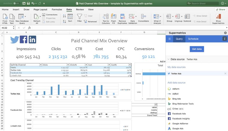
What it is: Supermetrics is a premium marketing data integration platform that syncs data from several platforms and sends it to popular reporting and analytics tools.
How to use Supermetrics to create performance reports: Supermetrics pulls data from around 100 sources, including SEO, web analytics, social media, email, advertising, ecommerce, sales, and review tools. While many popular tools (like Mixpanel, Airtable, or Hotjar) aren’t officially integrated with Supermetrics, new integrations are frequently added. Check out their product roadmap to see which tools might be coming soon.
To create reports, Supermetrics sends data to reporting apps (including Looker Studio, Monday.com, and Snowflake) and documents like Google Sheets and Microsoft Excel. The Supermetrics API can also create custom output formats that work with Microsoft Power BI, Tableau, and Qlik.
7. Analytics Canvas
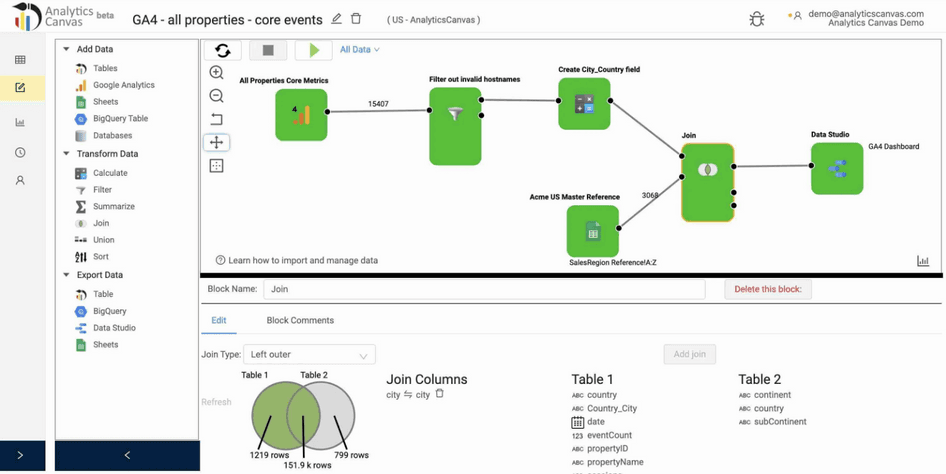
What it is: Analytics Canvas is a premium analytics data connector and reporting tool that specializes in importing Google Analytics UA (Universal Analytics) and GA4 reports.
How to use Analytics Canvas to create performance reports: Analytics Canvas reads data to and from popular tools and documents, including Google Analytics, AdWords, Looker Studio, CSV, Microsoft SQL Server, Oracle, MySQL, Google BigQuery, and Google Sheets.
Analytics Canvas’ workflow builder allows you to extract data, combine data sets, and clean and transform data before sending it on to the tools we mention above. Its drag-and-drop editor makes it easy to design workflows, and you can automate your routine data tasks to save time.
Analytics Canvas also integrates with Tableau to create data dashboards and visualizations, and sends data to Google Sheets, BigQuery, or Looker Studio to create reports.
Choose performance reporting software that tells the whole story
Traditional performance reports are key to deciding where to invest resources and what projects to prioritize—but even the most polished dashboard leaves plenty of room for assumptions, guesswork, and leaps of faith. Whichever reporting tools you choose, make sure your data always paints a complete picture—not just of what is happening on your website or product, but why.
And that’s why (!) we recommend adding qualitative insights—from tools like session recordings, survey responses, and feedback ratings—to your performance dashboards. These insights add color to your data and come directly from your most important business asset: your customers.
Go beyond traditional performance reporting with Hotjar
Hotjar’s tools help you measure the ‘what’ and the ‘why’ of your product’s performance so you can grow by putting customers first.