Learn / Guides / LP optimization
A comprehensive landing page optimization checklist to increase your conversion rates
If you want to be a successful digital marketer, you need to keep your eyes on the forest without getting lost in the trees—that means focusing more broadly on your message, product, or offer, and the users you're trying to reach before launching a marketing campaign.
A landing page optimization (LPO) checklist helps you focus on what matters—your customers’ needs—so you can give them the best experience possible and deliver value at every step.

Landing pages should be user-friendly, attractive, accurate, interesting, and easy to navigate. That’s a lot of boxes to check. 😮💨
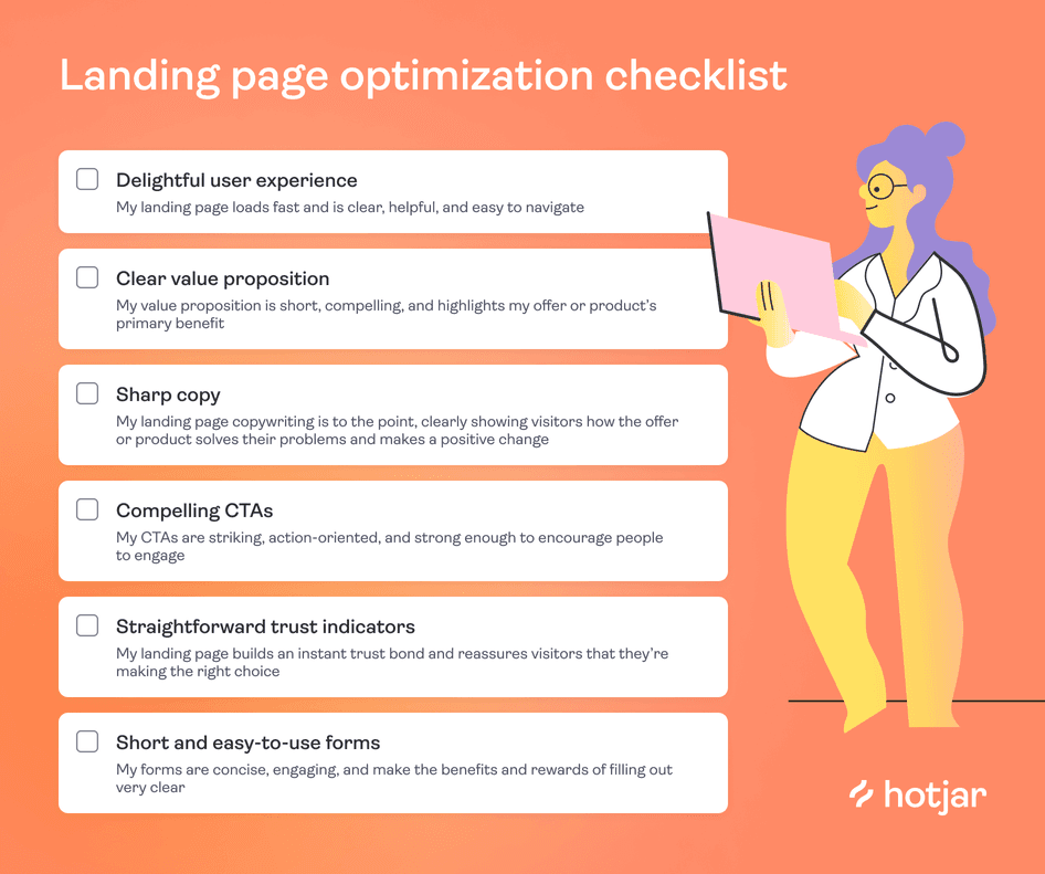
This simple, 6-step landing page optimization checklist ensures you won't miss a thing:
Download and save your landing page optimization checklist here
A 6-step landing page optimization checklist for higher conversion rates
Having an itemized optimization checklist gives you the full picture of what an effective, high-converting landing page should include. Use this list as inspiration, and feel free to add or remove items to tailor it to your needs.
1. Delightful user experience (UX)
Even the best landing page design won’t convert a visitor if your page loads too slowly, your forms don’t submit, or your images don’t render.
To optimize landing pages for performance, delivering a great user experience must be a top priority. A pleasant UX ensures visitors stay on the page longer and persuades them to complete a specific action—like filling out a form or completing a purchase.
Optimize your landing pages to supercharge your UX
Use Hotjar to understand what the landing page user experience looks and feels like for real users—then improve it for them!

When it comes to nailing landing page UX, check the following best practices:
Analyze your current performance
Start by getting a baseline of where your user experience currently stands. This preliminary picture of your landing page performance paves the path toward better UX—showing you how you’re doing and what you can improve.
A thorough analysis involves multiple aspects that focus on user experience:
Page speed: your load time, or how quickly and smoothly your website loads, determines your landing page's impact on the user experience. Use Hotjar Session Recordings to see your load speed from a user’s perspective and identify friction areas for improvement.
Mobile friendliness: making your landing page design responsive for mobile users minimizes bounce rates. Test your design on different browsers and devices to ensure it’s working the way you need it to.
User behavior: this type of user-driven analysis helps you identify the drivers that bring people to your landing page, the barriers that might stop them or make them leave, and the hooks that persuade them to convert.
Collect user feedback to identify improvement areas
Seeking direct and unbiased feedback is the easiest way to create an experience that truly meets users' needs.
Use Hotjar Feedback, conduct surveys, and perform user tests to continuously collect user feedback on individual elements of your landing page without disturbing the browsing experience.
Without collecting feedback, we can’t learn what our users need or feel is missing from our landing pages. Not giving our visitors the ability to provide us with feedback could mean that we miss something imperative to the success of a landing page, which is key—especially when you're paying to drive traffic to it.
Make your landing page more user-centric
Once you've collected research and feedback, you can use those insights to make your optimization strategy more user-centric rather than gut-driven—making landing page UX decisions from the end-user's perspective.
Here’s how to make your website's landing pages more user-friendly:
Optimize your landing page content for your users’ key pain points
Create a responsive design for both mobile and desktop users
Factor in your target audience's perspective when choosing typeface and colors
Strategically place your calls to action (CTAs) across the landing page
Pro tip: keep testing your landing page to measure UX optimization performance.
Landing page optimization is an ongoing effort—standing still is moving backward.
Use Hotjar’s digital experience insights tools to ensure your UX changes continuously produce results. With tools like heatmaps, recordings, surveys, feedback widgets, and user interviews at hand, there’s a wealth of data to collect from visitors, helping you piece together a puzzle that answers questions like:
What catches users' interest, and what do they ignore?
Where on your landing page do users encounter difficulties or get stuck?
What actions do users take just before leaving your landing page?
What are users searching for or not finding on the page?
Bring the voice of the customer to your decision-making with on-site and external surveys
2. Clear value proposition
Your value proposition is a short and compelling summary of the main benefit that your brand or product offers to customers. You probably know what that is by heart, but is it clear to your visitors? Do they understand your product's value the way you do? And will it convince them to take the action you want them to?
Here are three things to get right before you publish your value proposition statement on your landing page:
Know your ideal customer: the best way to optimize your landing page is to really understand your customers. What’s driving them to your page, convincing them to stay on it, and stopping them from finding what they need? Their language, struggles, and major pain points should guide what you offer on your landing page and how that translates into your value proposition.
Address specific and concrete benefits: what tangible benefits do users associate with your offer? The answer to this question helps you craft a more targeted value proposition statement on your landing page. Focus on one primary benefit and include your product's qualitative or quantitative results.
Detail unique strengths: what makes your brand different from competitors? And how is that beneficial to your users? Use your unique strength to convince your visitors to stay longer and take action on your landing page.
Pro tip: dive deeper into your results with Hotjar.
One of the best ways to grow your business is to understand what brings people to your landing page—and then deliver it in the smoothest way possible.
Leverage the Hotjar platform to gain even more insights into what visitors and users expect from your landing page:
Use Hotjar Ask to set up surveys, or conduct user interviews with Hotjar Engage, to collect qualitative feedback from your users and analyze their experiences to identify needs and expectations
Use heatmaps and recordings—with a Hotjar Observe plan—to see how users interact with your landing page and identify areas for further optimization
Use Hotjar Trends to visualize user behavior insights, track changes in key metrics over time, and identify patterns (trends)
These tools, combined with traditional website analytics data from tools like Google Analytics, give you a holistic understanding of how your changes impact UX and user behavior.
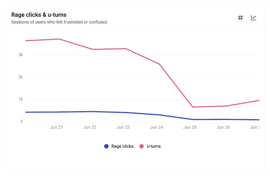
Hotjar Trends shows you whether you’re improving the user experience
3. Sharp copy
Landing page copy is the easiest thing on the landing page checklist to change—but the hardest thing to get right.
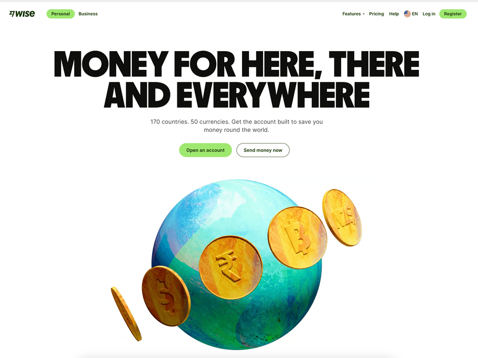
Your copy needs to grab attention, communicate your value proposition, and motivate action quickly. This landing page from Wise is an excellent example of sharp copy:
When optimizing your landing page copy, check the following:
Headlines: headings and subheadings should grab attention and communicate your value proposition. Craft SEO-friendly copy that focuses on one topic, relates directly to your offer and CTA, and describes a clear benefit.
Readability: ensure your landing page content is easy to read—for visitors and search engines. Don't overwhelm your audience with too much information or a disorganized page.
Urgency: your landing page copy should motivate visitors to act now. Tap into the fear of missing out (FOMO) with compelling incentives like countdown timers, limited-time offers, and exclusivity.
Conversational tone: depending on your offer and product, your copy’s tone of voice can make a real difference in landing page conversion rate. Swap out stuffy language for a more conversational tone using short sentences, active voice, and informal transition words.
4. Compelling CTAs
When people visit your landing page, your CTA opens the door to conversion and walks visitors right through it. Just take a look at the CTA on Shopify’s landing page:
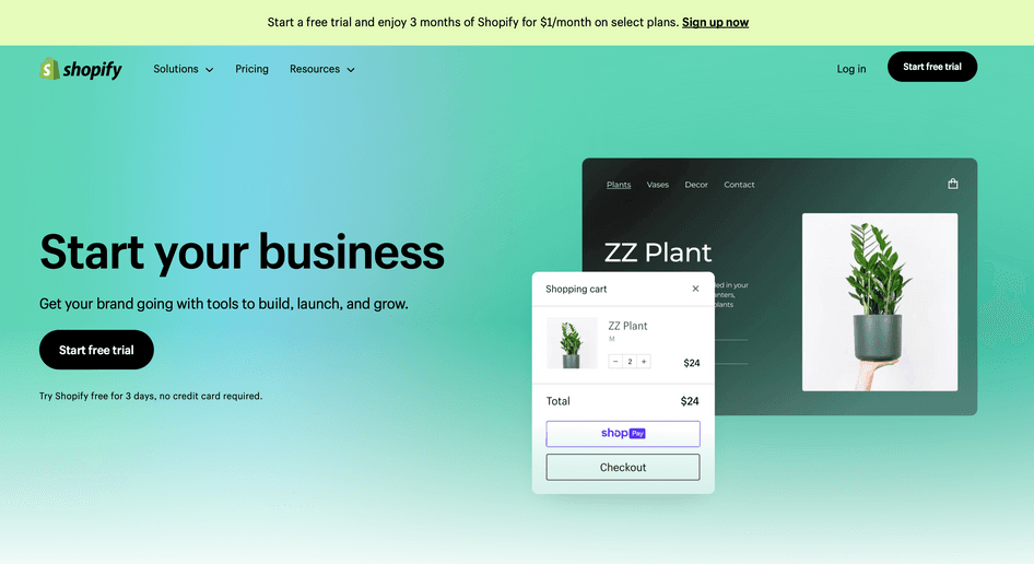
When optimizing your landing page CTAs, check the following:
Consistency: a good CTA uses action-oriented copy that communicates a clear benefit across the entire landing page by directly supporting your value proposition and reminding visitors what’s on the other side of a click
Copy: make your CTA resonate with the rest of the content on the page to entice visitors to click the button. Know your audience and speak to their pain points or ‘jobs to be done’ (JTBD) to transform each CTA into a valuable asset.
Colors: CTAs need to be prominent on the page so visitors don't overlook them. Use a contrasting color that stands out from the background, and make the button a few font sizes larger than the rest of the copy.
Placement: feature your CTA button prominently above the fold—the top section visitors first see when they arrive on your landing page, so they don't need to scroll down to notice it. Try to also feature it on other parts of your landing page, keeping consistency in mind.
Pro tip: learn how to strategically use and position your CTAs through A/B testing.
Changing the placement of your CTA button could be the secret to an optimized conversion rate. Use an A/B testing tool like Optimizely to create landing page variations with different CTA placements—in headers, above the fold, closer to your benefits, and at the bottom of the page.
Then, look at key metrics like click-through rate (CTR), bounce rates, and conversion rates to determine whether your changes increase engagement and revenue.
You can also analyze session recordings—which capture a video of a user's session on your website, including their clicks, scrolls, and mouse movements—for even more relevant insights about your CTAs.
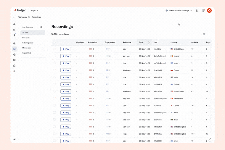
Those recordings at the top of the list will likely have the answers you need to make informed decisions and prioritize a fix on your landing page
5. Straightforward trust indicators
From the moment a visitor lands on your page, you have about five seconds to ensure they trust your brand enough to invest in the product.
It’s important to use these few seconds to communicate your message and build trust with your potential customers. Casper does this well on their landing page:
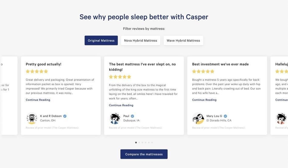
Here are four ways to build trust on your landing page:
Social proof: customer reviews are a shortcut to creating an instant trust bond between your brand and website visitors. Including social proof on landing pages proves to potential customers that your product is worth their money.
Trust badges: strategically placed trust badges from reputable sources help create a sense of security
Case studies: potential customers are more motivated to take the next step when they see that others have used your product to solve problems similar to theirs
Stats: adding statistics from research studies gives your landing page more credibility. Use stats to support your points and help potential customers understand what you’re selling.
6. Short and easy-to-use forms
Adding a short form at the top of your page or as a pop-up is an easy way for visitors to take action. But just like any other important element on your landing page, forms must be optimized to be effective.
A good landing page form design streamlines the user experience—setting you up for better conversions and reduced bounce rates. Check the following to make sure your forms capture leads instead of driving them away:
Form length: when designing a signup form, remember to keep it as short as possible while keeping fields essential to your campaign. Eliminate unnecessary form fields and A/B test everything else before making additional changes.
Thank you page: while often overlooked, thank you pages are the perfect place to restate the value proposition, make an upsell, or deliver a second CTA
Autofill: having your form fields auto-populate can help users take action up to 30% faster. For example, a service like Google One Tap lets visitors use their Gmail credentials instead of creating a new username and password.
Pro tip: use Hotjar Ask to optimize your landing page forms and ensure the benefits and rewards of completing a form are very clear.
Use a feedback widget or an exit survey to gather insights from visitors who leave your landing page without completing the form. Ask what’s stopping them from providing their details: is the form too long? Too short? Too complicated? Too intimidating?
Use this visitor feedback to optimize your landing page forms and increase lead generation.
Use Hotjar Feedback to learn which changes to make to your landing page
Next steps to landing page optimization
The more methods you have in your toolkit, the better you get at creating effective and delightful landing pages. Use this optimization checklist to get your mind off repetitive details and free up space to think about what matters most: your landing page visitors.
Dive into these other chapters of our LPO guide to continue learning and optimizing your landing pages:
What is landing page optimization: the basics of landing page optimization and what it entails
Landing page optimization best practices: a list of steps and actionable best practices for LPO
Landing page optimization mistakes: a list of the biggest LPO mistakes, along with tips to avoid each one
Landing page optimization examples: the effects of LPO in the wild
Landing page optimization tools: a listicle of useful tools to help with LPO
Optimize your landing pages to supercharge your UX
Use Hotjar to understand what the landing page user experience looks and feels like for real users—then improve it for them!