Learn / Guides / Quantitative data analysis guide
8 quantitative data analysis methods to turn numbers into insights
Setting up a few new customer surveys or creating a fresh Google Analytics dashboard feels exciting…until the numbers start rolling in. You want to turn responses into a plan to present to your team and leaders—but which quantitative data analysis method do you use to make sense of the facts and figures?

This guide lists eight quantitative research data analysis techniques to help you turn numeric feedback into actionable insights to share with your team and make customer-centric decisions.
To pick the right technique that helps you bridge the gap between data and decision-making, you first need to collect quantitative data from sources like:
Fuel your quantitative analysis with real-time data
Use Hotjar’s tools to collect quantitative data that helps you stay close to customers.

Then, choose an analysis method based on the type of data and how you want to use it.
Descriptive data analysis summarizes results—like measuring website traffic—that help you learn about a problem or opportunity. The descriptive analysis methods we’ll review are:
Multiple choice response rates
Response volume over time
Mode
Median
Mean
Net Promoter Score®
Inferential data analyzes the relationship between data—like which customer segment has the highest average order value—to help you make hypotheses about product decisions. Inferential analysis methods include:
Cross-tabulation
Weighted customer feedback
You don’t need to worry too much about these specific terms since each quantitative data analysis method listed below explains when and how to use them. Let’s dive in!
1. Compare multiple-choice response rates
The simplest way to analyze survey data is by comparing the percentage of your users who chose each response, which summarizes opinions within your audience.
To do this, divide the number of people who chose a specific response by the total respondents for your multiple-choice survey. Imagine 100 customers respond to a survey about what product category they want to see. If 25 people said ‘snacks’, 25% of your audience favors that category, so you know that adding a snacks category to your list of filters or drop-down menu will make the purchasing process easier for them.
💡Pro tip: ask open-ended survey questions to dig deeper into customer motivations.
A multiple-choice survey measures your audience’s opinions, but numbers don’t tell you why they think the way they do—you need to combine quantitative and qualitative data to learn that.
One research method to learn about customer motivations is through an open-ended survey question. Giving customers space to express their thoughts in their own words—unrestricted by your pre-written multiple-choice questions—prevents you from making assumptions.
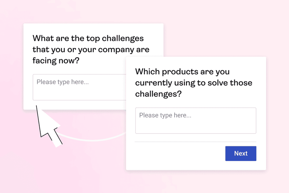
Hotjar’s open-ended surveys have a text box for customers to type a response
2. Cross-tabulate to compare responses between groups
To understand how responses and behavior vary within your audience, compare your quantitative data by group. Use raw numbers, like the number of website visitors, or percentages, like questionnaire responses, across categories like traffic sources or customer segments.
Let’s say you ask your audience what their most-used feature is because you want to know what to highlight on your pricing page. Comparing the most common response for free trial users vs. established customers lets you strategically introduce features at the right point in the customer journey.
💡Pro tip: get some face-to-face time to discover nuances in customer feedback.
Rather than treating your customers as a monolith, use Hotjar to conduct interviews to learn about individuals and subgroups. If you aren’t sure what to ask, start with your quantitative data results. If you notice competing trends between customer segments, have a few conversations with individuals from each group to dig into their unique motivations.

Hotjar Engage lets you identify specific customer segments you want to talk to
3. Mode
Mode is the most common answer in a data set, which means you use it to discover the most popular response for questions with numeric answer options. Mode and median (that's next on the list) are useful to compare to the average in case responses on extreme ends of the scale (outliers) skew the outcome.
Let’s say you want to know how most customers feel about your website, so you use an on-page feedback widget to collect ratings on a scale of one to five.
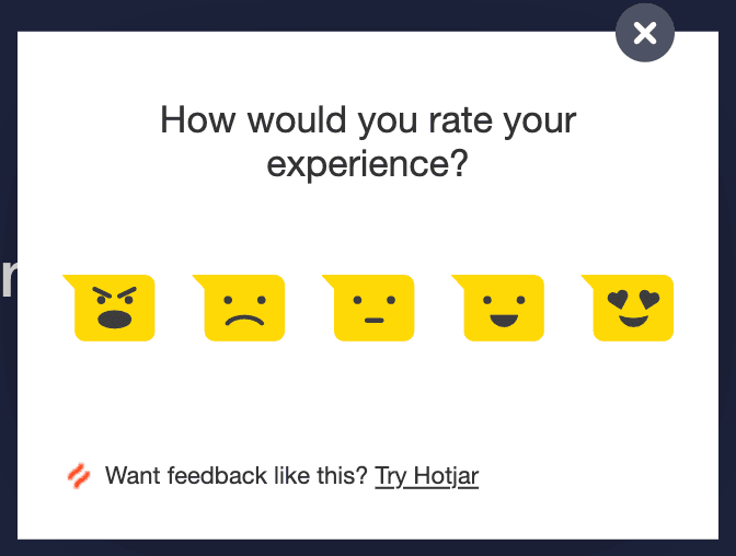
If the mode, or most common response, is a three, you can assume most people feel somewhat positive. But suppose the second-most common response is a one (which would bring the average down). In that case, you need to investigate why so many customers are unhappy.
💡Pro tip: watch recordings to understand how customers interact with your website.
So you used on-page feedback to learn how customers feel about your website, and the mode was two out of five. Ouch. Use Hotjar Recordings to see how customers move around on and interact with your pages to find the source of frustration.
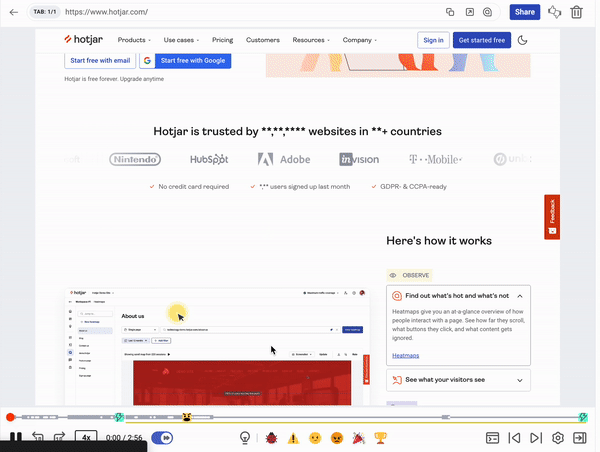
Hotjar Recordings lets you watch individual visitors interact with your site, like how they scroll, hover, and click
4. Median
Median reveals the middle of the road of your quantitative data by lining up all numeric values in ascending order and then looking at the data point in the middle. Use the median method when you notice a few outliers that bring the average up or down and compare the analysis outcomes.
For example, if your price sensitivity survey has outlandish responses and you want to identify a reasonable middle ground of what customers are willing to pay—calculate the median.
💡Pro-tip: review and clean your data before analysis.
Take a few minutes to familiarize yourself with quantitative data results before you push them through analysis methods. Inaccurate or missing information can complicate your calculations, and it’s less frustrating to resolve issues at the start instead of problem-solving later.
Here are a few data-cleaning tips to keep in mind:
Remove or separate irrelevant data, like responses from a customer segment or time frame you aren’t reviewing right now
Standardize data from multiple sources, like a survey that let customers indicate they use your product ‘daily’ vs. on-page feedback that used the phrasing ‘more than once a week’
Acknowledge missing data, like some customers not answering every question. Just note that your totals between research questions might not match.
Ensure you have enough responses to have a statistically significant result
Decide if you want to keep or remove outlying data. For example, maybe there’s evidence to support a high-price tier, and you shouldn’t dismiss less price-sensitive respondents. Other times, you might want to get rid of obviously trolling responses.
5. Mean (AKA average)
Finding the average of a dataset is an essential quantitative data analysis method and an easy task. First, add all your quantitative data points, like numeric survey responses or daily sales revenue. Then, divide the sum of your data points by the number of responses to get a single number representing the entire dataset.
Use the average of your quant data when you want a summary, like the average order value of your transactions between different sales pages. Then, use your average to benchmark performance, compare over time, or uncover winners across segments—like which sales page design produces the most value.
💡Pro tip: use heatmaps to find attention-catching details numbers can’t give you.
Calculating the average of your quant data set reveals the outcome of customer interactions. However, you need qualitative data like a heatmap to learn about everything that led to that moment. A heatmap uses colors to illustrate where most customers look and click on a page to reveal what drives (or drops) momentum.
Hotjar Heatmaps uses color to visualize what most visitors see, ignore, and click on
6. Measure the volume of responses over time
Some quantitative data analysis methods are an ongoing project, like comparing top website referral sources by month to gauge the effectiveness of new channels. Analyzing the same metric at regular intervals lets you compare trends and changes.
Look at quantitative survey results, website sessions, sales, cart abandons, or clicks regularly to spot trouble early or monitor the impact of a new initiative.
Here are a few areas you can measure over time (and how to use qualitative research methods listed above to add context to your results):
7. Net Promoter Score®
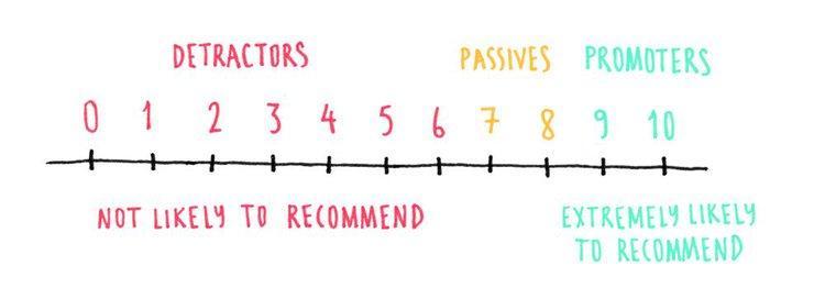
Net Promoter Score® (NPS®) is a popular customer loyalty and satisfaction measurement that also serves as a quantitative data analysis method.
NPS surveys ask customers to rate how likely they are to recommend you on a scale of zero to ten. Calculate it by subtracting the percentage of customers who answer the NPS question with a six or lower (known as ‘detractors’) from those who respond with a nine or ten (known as ‘promoters’). Your NPS score will fall between -100 and 100, and you want a positive number indicating more promoters than detractors.
💡Pro tip: like other quantitative data analysis methods, you can review NPS scores over time as a satisfaction benchmark. You can also use it to understand which customer segment is most satisfied or which customers may be willing to share their stories for promotional materials.
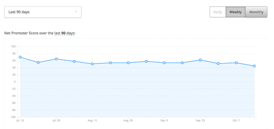
Review NPS score trends with Hotjar to spot any sudden spikes and benchmark performance over time
8. Weight customer feedback
So far, the quantitative data analysis methods on this list have leveraged numeric data only. However, there are ways to turn qualitative data into quantifiable feedback and to mix and match data sources. For example, you might need to analyze user feedback from multiple surveys.
To leverage multiple data points, create a prioritization matrix that assigns ‘weight’ to customer feedback data and company priorities and then multiply them to reveal the highest-scoring option.
Let’s say you identify the top four responses to your churn survey. Rate the most common issue as a four and work down the list until one—these are your customer priorities. Then, rate the ease of fixing each problem with a maximum score of four for the easy wins down to one for difficult tasks—these are your company priorities. Finally, multiply the score of each customer priority with its coordinating company priority scores and lead with the highest scoring idea.
💡Pro-tip: use a product prioritization framework to make decisions.
Try a product prioritization framework when the pressure is on to make high-impact decisions with limited time and budget. These repeatable decision-making tools take the guesswork out of balancing goals, customer priorities, and team resources. Four popular frameworks are:
RICE: weighs four factors—reach, impact, confidence, and effort—to weigh initiatives differently
MoSCoW: considers stakeholder opinions on 'must-have', 'should-have', 'could-have', and 'won't-have' criteria
Kano: ranks ideas based on how likely they are to satisfy customer needs
Cost of delay analysis: determines potential revenue loss by not working on a product or initiative
Share what you learn with data visuals
Data visualization through charts and graphs gives you a new perspective on your results. Plus, removing the clutter of the analysis process helps you and stakeholders focus on the insight over the method.
Data visualization helps you:
Get buy-in with impactful charts that summarize your results
Increase customer empathy and awareness across your company with digestible insights
Use these four data visualization types to illustrate what you learned from your quantitative data analysis:
Bar charts reveal response distribution across multiple options
Line graphs compare data points over time
Scatter plots showcase how two variables interact
Matrices contrast data between categories like customer segments, product types, or traffic source
Use a variety of customer feedback types to get the whole picture
Quantitative data analysis pulls the story out of raw numbers—but you shouldn’t take a single result from your data collection and run with it. Instead, combine numbers-based quantitative data with descriptive qualitative research to learn the what, why, and how of customer experiences.
Looking at an opportunity from multiple angles helps you make more customer-centric decisions with less guesswork.
Stay close to customers with Hotjar
Hotjar’s tools offer quantitative and qualitative insights you can use to make customer-centric decisions, get buy-in, and highlight your team’s impact.