Learn / Guides / Quantitative data analysis guide
How to analyze quantitative data in 5 steps for better customer insights
Quantitative data analysis is all about making sense of the numbers you get from sources like surveys, A/B tests, and website analytics. But many marketers and ecommerce managers find it challenging to extract meaningful information from all this raw data.
With a little know-how and the right framework in place, you can turn those perplexing numbers into actionable insights that drive better decisions for your business.

This chapter walks you through a step-by-step process of analyzing your quantitative data, helping you get a clear view of what's happening with user behavior by spotting patterns, trends, and relationships in your data.
Are you ready to swap data overwhelm for data mastery? Stick around.
Collect quantitative data fast with Hotjar
Use Hotjar’s tools to understand your customers better with quantitative (and qualitative!) data.

A 5-step guide to conducting effective quantitative data analysis
Unlocking the power of quantitative data analysis can have a huge impact on your business. It helps you:
Make informed decisions: quantitative data analysis provides you with hard numbers for precise measurement and objective analysis, enabling you to make fine-tuned improvements
Understand user behavior: pinpoint where users face difficulties and what drives their actions
Optimize your website: use insights from A/B testing and conversion funnels to improve your website design and flow, so you elevate the user experience (UX) and increase conversion rates
Track progress and performance: consistently collecting and analyzing quantitative data allows you to monitor progress over time, measure the success of changes you've implemented, and set measurable goals for the future
Identify trends: spot emerging trends in user behavior and preferences, which is instrumental in creating viable strategies for the future
Reaping the benefits of quantitative data analysis isn’t as complicated as it sounds. Here’s how to make sense of your company’s data in just five steps.
1. Choose your objectives
Before you jump into the sea of data, you need to know what you're fishing for:
Do you want to spot trends in how users interact with your site?
Are you trying to find connections between specific user actions and conversions?
Do you want to predict what changes could boost your site's performance in the future?
Setting clear goals right from the start helps steer your data analysis in the right direction. Remember: objectives can be broad or specific, but they must be measurable and relevant.
Use the SMART (Specific, Measurable, Achievable, Relevant, Time-bound) framework to set robust objectives. For example, instead of a vague objective like ‘Improve the user experience (UX)’, consider something more specific and measurable like ‘Reduce the checkout process drop-off rate by 15% in the next quarter’.
❗Caveat: don’t set too many objectives at once. While it can be tempting to gather as much data as possible, focusing on a few key areas allows for a deeper, more meaningful analysis, helping you stay focused and dig up the insights that truly matter to your site’s or product’s success.
2. Collect and organize your data
To get your data, you need to do some quantitative research. There are many different ways to do this (and chances are, you’re using some of these methods already). Popular quantitative data collection methods include:
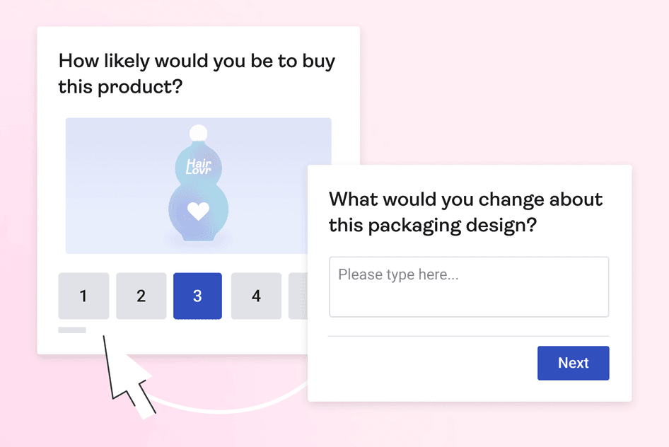
Surveys, which let you collect data by asking close-ended questions to different user segments. Metrics like the Net Promoter Score® and Customer Effort Score are perfect for capturing quantitative data through surveys.
A/B testing, which helps you compare two versions of a web page or ad to see which performs better. It gives you quantitative data like conversion rates, click-through rates, and time spent on page.
Heatmaps, which show you where activity is highest on your website so you can better understand the user experience. They give you data like click frequency for page elements and the percentage of users who scroll to the bottom of the page.
Session recordings, which enable you to capture user sessions to see how people interact with your website. They give you data like the session duration, how many pages the user visited, and how many actions (like clicks or text input) they performed.
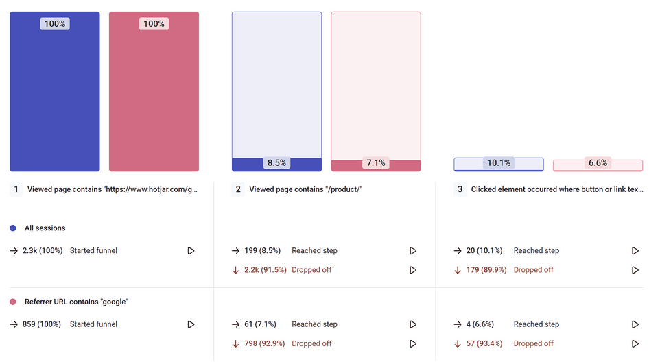
Conversion funnels, which let you track user steps toward a specific goal, providing you with conversion rates at each step of the funnel
Website analytics, which give you insights into visitor behavior and the user experience so you can optimize your site. Tools like the Hotjar Dashboard and Google Analytics provide quantitative data such as website traffic, bounce rates, and session duration.
Start by using spreadsheets, data visualization software such as Tableau, or tools like Hotjar to get all your data in one place. Remember, the goal is to organize your collected data in such a way that makes analysis smoother and more effective.
Then, group similar types of data together to make it easier to analyze. For example, you might group all data related to website traffic—like page views, bounce rates, and session duration. Your specific needs might also dictate using filters, charts, or different types of categorization. This way, when it’s time for analysis, you can focus on meaningful insights rather than get lost in a sea of numbers.

💡 Pro tip: by clicking on a data point in your Trends graph, you can jump straight to the relevant session recording and heatmap to uncover the ‘why’ behind your metrics.
3. Clean your data
Ensuring your data is clean is crucial for the accuracy of your analysis.
During this stage, you need to carefully sift through your data to check for any errors such as incorrect entries, duplicates, or inconsistencies. You can use data cleaning tools like OpenRefine, or something more basic like Google Sheets. If you can’t easily fix the error, you should remove it from your data so it doesn’t skew your analysis.
You might find some data that seems wildly different from the rest—outliers—or data that's irrelevant to your current objectives. Say you're analyzing session recordings to understand user behavior on your website and you notice that most visitors spend between two to five minutes on your site.
However, you spot a few instances where visitors browse for an unusually long time, say, more than an hour. These instances could be outliers, possibly due to users leaving a browser tab open and stepping away from their device.
It's best to remove these to keep your data set clean and focused, so you can set yourself up for reliable results in your analysis.
4. Analyze your data
Once you have your clean data, you're all set to start analyzing it. This stage is all about making sense of the numbers. You might be observing trends, investigating correlations, or predicting future outcomes based on the data.
There are two main types of quantitative data analysis methods:
Descriptive analysis helps you get a bird's-eye view of your data. It includes basic calculations such as the average (mean), most common (mode), or middle (median) values.
Inferential analysis lets you go beyond just describing your data, so you can start making educated guesses. You might see how different data points are linked, or even predict future trends with methods like t-tests, cross-tabulation, or factor analysis. (Keep an eye out for our upcoming guide on quantitative data analysis methods to get a closer look at each of these techniques.)
But there's something else you need to consider: data triangulation. This is where you pair quantitative and qualitative data, like website analytics and user feedback. Combining these two types of data gives you a complete picture of what's happening on your website.
See it in action
Suppose your quantitative data shows a high bounce rate on a particular product page. You can see the 'what' here—people are leaving the page quickly. But the 'why' is not clear:
Is the product description unclear?
Are images not loading quickly enough?
Are visitors searching for more information that's missing from the page?
This is where qualitative data analysis comes in handy. By looking at session recordings or analyzing feedback from user surveys, you can dive into the reasons behind the observed behavior. For example:
Maybe session recordings reveal that users are having trouble with a particular feature of the product page, such as a slider not functioning properly
Or perhaps when you analyze qualitative survey data, it indicates that the product descriptions aren't detailed enough
By using quantitative data (the high bounce rate) and pairing it with qualitative data (from user surveys and watching session recordings), you've achieved data triangulation.
5. Share your learnings and put them into action
The power of quantitative data analysis lies in its ability to guide decisions and actions. By presenting your findings effectively, you ensure that your team not only understands the data but also knows how to use it to improve and grow.
Start by creating a clear and concise report of your analysis. Highlight key insights, trends, and patterns you've discovered. Use data visualization tools to make your findings easier to understand. Graphs, charts, or heatmaps help you effectively communicate the story behind the numbers.
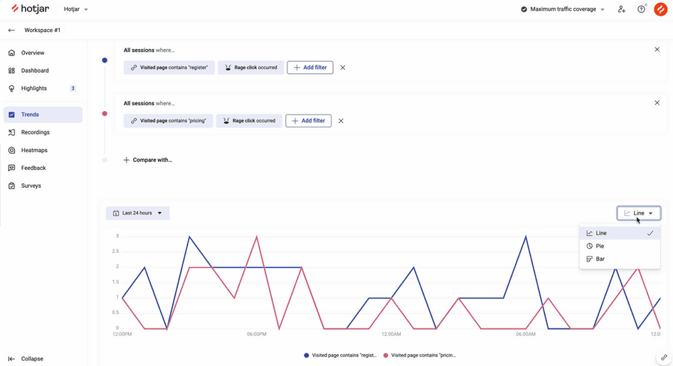
For example, the Hotjar Dashboard lets you create automatic bar graphs for all your key metrics. With one click, you can go to the Trends page to compare metrics for various segments, all neatly presented in one chart. This type of data visualization helps make your insights clear and comprehensible for everyone involved.
When sharing your findings, remember that not everyone will be as data-savvy as you are. Avoid jargon and explain your findings in simple, relatable terms. Your goal is to ensure everyone understands what the data says and why it matters.
Finally, suggest actionable steps based on your findings:
If you've found a high bounce rate on a particular page, recommend a review of its content or design
If a certain product category is doing well, suggest capitalizing on its success with targeted marketing campaigns
Get focused, actionable insights with quantitative data analysis
Mastering quantitative data analysis gives you the power to convert raw numbers into meaningful insights and well-informed action plans. From defining your objectives, gathering and organizing data, through to cleaning, analyzing, and finally, presenting your findings, it allows you to unlock valuable trends and patterns.
This knowledge helps you improve UX, get buy-in from your team, and boost your business growth. So, equip yourself with the right tools and start turning your data into actionable insights.
Start making sense of your quantitative data today
Use Hotjar’s tools to understand your customers better with quantitative (and qualitative!) data.