Learn / Guides / UX design
7 UX design fails we learned from in 2023 (and how we fixed them with Hotjar)
When you’re continuously iterating your product, you’re bound to get certain things wrong. At Hotjar, we’re lucky enough to have our very own suite of tools to help us reverse our UX design mistakes. This article shares seven of our team’s biggest facepalm moments from 2023—plus how we found, fixed, and learned from them.
Summary
Here are the seven biggest UX mistakes our team made. Click through or keep scrolling to see how these mistakes looked in action (and how we fixed them).
Redesigning a button, making it invisible to users: we thought a sparkly button icon would attract users’ attention, but Hotjar data revealed that nobody understood it
Overcomplicating an interface: Mixpanel and Hotjar Recordings revealed our surveys had too many form fields, causing extra friction
Inviting users to write, but not giving them enough space: users tried to write prompts for the AI survey generator, but Hotjar data showed that the form field was too short
Accidentally hiding survey results from users: we changed the way survey results and responses appeared, but users sent us feedback saying they couldn’t find their data
Generating 3X more survey questions than users needed: our AI survey tool generated three questions by default, but Hotjar data showed that most users only need one
Launching a popover on top of another popover: we accidentally launched an onboarding guide on top of a survey, and Hotjar data showed that users ended up closing both
Hiding a vital setup ingredient from new users during onboarding: we made it too difficult for users to find their tracking code, so new users struggled to finish setting up Hotjar
7 UX fails we made in 2023 (and how Hotjar helped fix them)
We hope that by seeing our failures, you can learn from them, too. Here are seven of our biggest blunders to date.
1. Redesigning a button, making it invisible to users
🤦♀️ What happened?
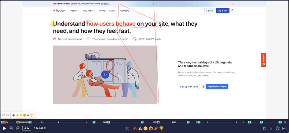
A little while back, Hotjar released a brand-new feature—Hotjar AI, our AI-powered survey question generator. When creating a survey, simply tell Hotjar AI your research goals, and it writes targeted questions for you. Clever, huh?
Well, we tried to be a bit too clever when iterating the feature.
Wanting to optimize the user interface, we changed our original copy from ‘Add question’ to ‘Add questions’. We also replaced a ‘+’ icon next to the text with our AI sparkle icon.
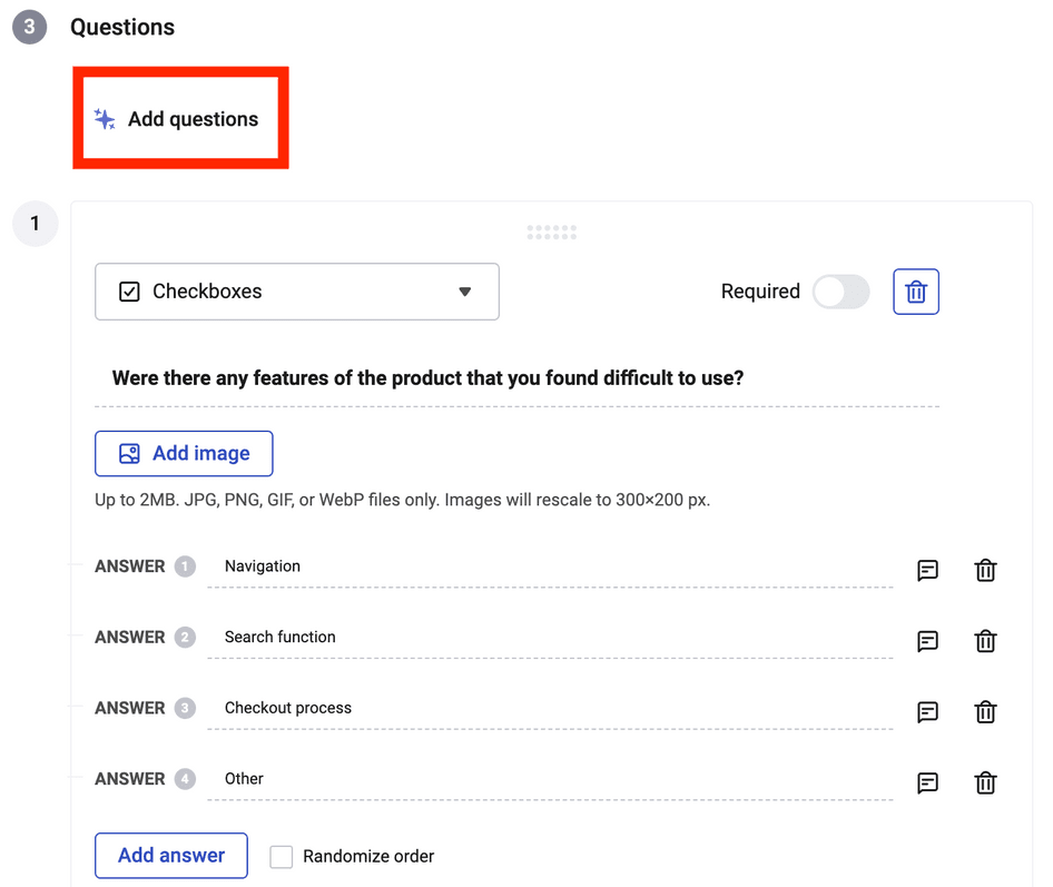
Naturally, we thought our users would see the icon and understand what it meant. But nobody did. In fact, barely any users clicked the button after we changed it.
🕵️♂️ How we discovered this UX fail
Tools and features used:
Surveys
Interviews
Events in Hotjar
As with any change at Hotjar, big or small, we wanted to get user feedback when launching the new button.
We used Events in Hotjar to set up a popover survey that launched any time a user clicked the ‘Add question’ button.
Normally, we’re able to get hundreds of survey responses in just a few days. But this time, after nearly two weeks, we had a grand total of…
Two.
We immediately knew we needed to speak to users, so we set up interviews using Hotjar Engage.
In total, we interviewed six users—three who had used the tool and three who hadn’t. These conversations revealed that they couldn’t find the ‘Add questions’ button unless prompted.
We took our button back to the drawing board:
The new ‘Add question’ button is much clearer—and, bonus, we didn’t have to part ways with our beloved sparkle icon
📝 Our takeaway
Our major learning here is not to rely on assumptions. In this case, we assumed users would understand exactly what our new button instructed them to do. Whenever possible, test prototypes before launch to validate assumptions and find out if your designs resonate with users.
Our second lesson is to monitor metrics that let you know when something’s not working. We spotted this issue because we were tracking the number of users clicking the button and thus triggering the surveys. In the end, proactively gathering feedback from the get-go meant we could spot and resolve the issue before it seriously impacted engagement.
And one final takeaway:
Targeting surveys on events is actually quite cool.
💡 Pro tip: want to track ‘triggered’ Surveys the same way we did? Set up custom events to launch surveys when users complete specific actions. You can even go one step further by using Trends to plot a graph of the completed actions—then pin it to your Dashboard for easy access.
Trends lets you create handy visualizations of specific actions, like when users click a button or complete a survey
2. Overcomplicating an interface
🤦♀️ What happened?
When designing our Surveys interface, we wanted to help users avoid making mistakes—like accidentally publishing the survey to all their pages. So, we added a few mandatory fields that users had to fill in before they could launch a survey.
The extra fields overcomplicated the survey setup process. Users were confused, switching between screens, and saving surveys without finishing them.
🕵️♂️ How we discovered this UX fail
Tools used:
Recordings
Interviews
Mixpanel
Fortunately, we regularly evaluate our pages to spot issues like these. Upon reviewing session recordings via Hotjar Recordings and carrying out usability testing in Hotjar Engage, we noticed a trend: users frequently went back and forth between the different screens in the survey interface.
We also analyzed our Mixpanel data to see how many users converted when setting up surveys from scratch and compared this with the conversion rate of our survey templates, which pre-populate the settings so users have fewer form fields.
The data revealed that the templates had much better conversion rates. This was a clear sign that our survey process was too complex, and we needed to pre-populate the fields on all surveys.
📝 Our takeaway
One of the rules of great UX is keeping things as simple as possible. So, if you’re adding more steps to a process, make sure it’s absolutely necessary. Also, remember to prioritize gathering insights into your users.
By gaining deep insights into user behavior and preferences, you can create user-centric solutions that resonate with your audience.
💡 Pro tip: want to run your own usability tests? Try Engage, our user interviews tool, to recruit specific personas from our global pool of 200,000+ people—or invite participants from your network. Host your testing sessions directly in Engage to record the call and get an instant, AI-powered transcript.
3. Inviting users to write, but not giving them enough space
🤦♀️ What happened?
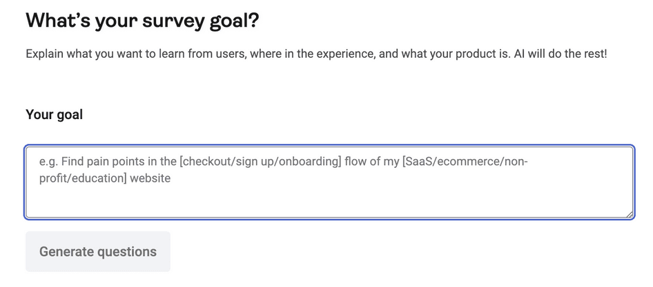
If you’ve tried out Hotjar Surveys, you’ve likely noticed that our AI survey generator includes a field for users to write in. The idea behind building this field was that users would enter a quick description of their research goal, and the tool would generate survey questions for them based on their goal.
The feature works a treat—but we quickly learned users want to write much longer goal descriptions than anticipated. We’d made the form field way too short, and after inputting a few words, users couldn’t see what they’d written.
Our form field didn’t allow users to write the detailed prompts they wanted to
This made the tool difficult to use for most users—not exactly ideal for a shiny new feature that we were excited to launch!
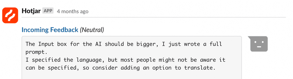
Feedback via our dedicated Slack channel from one user suggesting a bigger form field
🕵️♂️ How we discovered this UX fail
Tools and features used:
Feedback
Recordings
Interviews
Mixpanel integration
Slack integration
Mixpanel data revealed users were inputting longer goals than we’d anticipated.
To investigate further, we viewed Hotjar session recordings and saw that the short form field obscured users’ view of their own text. We then held interviews in Engage to learn why users added longer goals and what they expected to achieve.
Even though this mistake was a pretty major hiccup, we ended up with valuable insights about user needs and goals.
📝 Our takeaway
As in one of our earlier examples, the takeaway is clear:
Relying on assumptions instead of validating them beforehand can result in various usability mistakes.
At the same time, we also learned the immense value of diving that little bit deeper to learn more. By carrying out interviews, we uncovered what users really wanted from the tool, and became better positioned to give it to them.
💡 Pro tip: you’ve probably noticed that we love using Hotjar and Mixpanel together. Want to replicate our results? Set up Hotjar’s Mixpanel integration to immediately view session recordings for any event you track in Mixpanel. Recordings show you a video-like replay of an individual user’s journey, so you can see everything they experienced.
Recordings show every click, scroll, and tap users made in real time
4. Accidentally hiding survey results from users
🤦♀️ What happened?
We recently ran an experiment to merge two aspects of our Surveys tool: responses and results.
Responses are individual answers that users give to questions, while results are aggregated data scores—like the total NPS® scores that users generate.
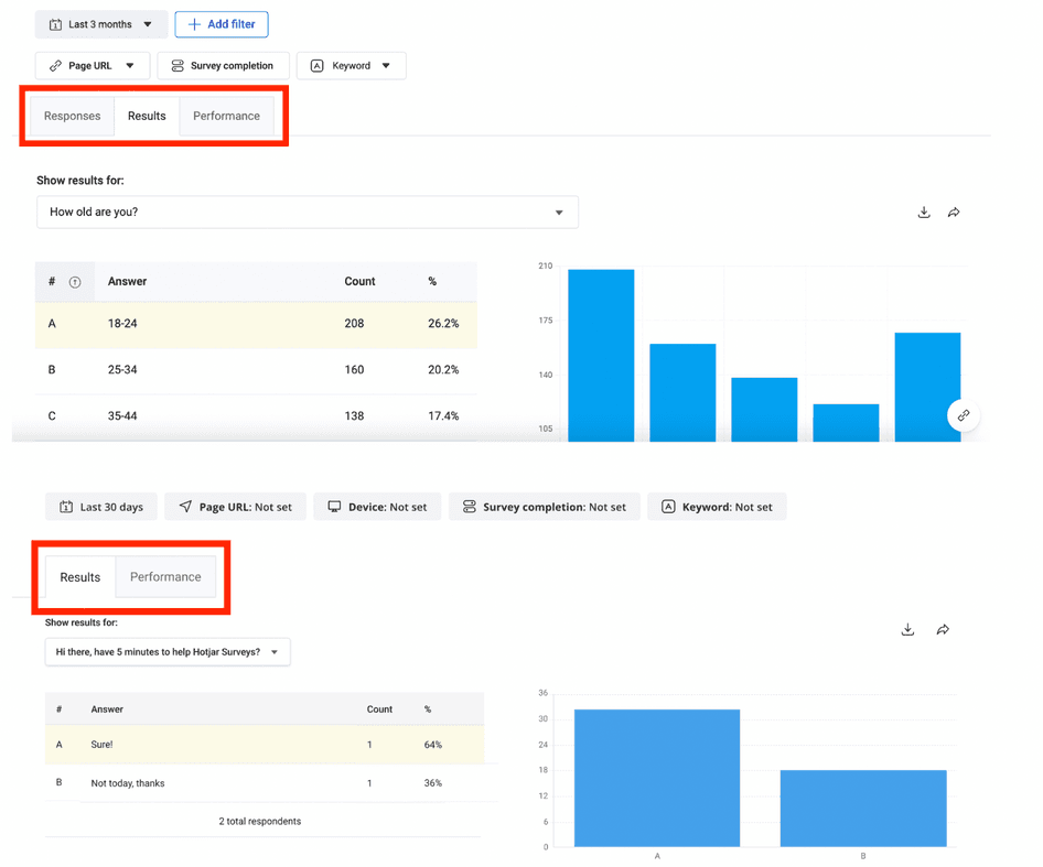
The experiment control (top), with individual tabs for ‘responses’ and ‘results’, vs. the experiment variant (bottom), which merges them into a single ‘results’ tab
In the original layout of the survey dashboard, users could easily find their results and responses. However, we experimented with a new layout we thought would improve user journeys—in this version, users had to use a question selector menu to view their results.
As it turned out, users simply didn’t see the question selector, meaning their survey results were effectively hidden from them.
🕵️♂️ How we discovered this UX fail
Tools and features used:
Feedback
Slack integration
Recordings
After launching the new variant, users started contacting us through our Feedback tool (it’s that little red button to the right of your screen 👉). Some were annoyed they couldn’t find the quantitative data they had been trying to gather with the tool.
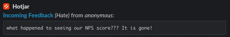
To follow up, we watched recordings of users navigating the Surveys tool. These sessions proved that users were confused and frustrated at being unable to see data that was previously right in front of them.
In the end, we fixed our mistake by introducing an Appcues tooltip highlighting the changes to users. It worked—we immediately stopped receiving negative feedback from users.
Our Appcues tooltip gave users the clarification they needed
💡 Pro tip: before an issue gets out of control, give your users the opportunity to tell you about it. Feedback is an always-on widget that lets users share their sentiment about your page and then add optional comments or screenshots for more context.
If you’re using our Microsoft Teams or Slack integration, Hotjar sends feedback responses directly to your preferred channel so you can identify problems faster.
Feedback is ever-present on your website, helping you gather user insights round the clock
📝 Our takeaway
Be aware that breaking a familiar design or structure can be risky. Most websites and apps are structured a particular way because users are familiar with certain design ‘archetypes’ and will intuitively use them.
Users are sometimes set in their ways, with predefined mental models and ways they use your tools.
Any time you deviate from established designs, make sure you have a good reason to—and that you signpost users towards any changes you make.
Make smarter UX decisions
Use Hotjar to spot trends, run interviews, and get user feedback—all from a single suite of tools.

5. Generating 3X more survey questions than users needed
🤦♀️ What happened?
When we launched Hotjar AI, we were as excited as a kid in a candy store. So when designing the interface, we added a button—‘Add questions’—that would generate three questions at once. The more the merrier, we thought.
As it turns out, most users want to keep their surveys short and sweet; three questions were too many. We also found that the tool sometimes repeated a question, which precisely zero users wanted.
Lastly, when users clicked the ‘Add questions’ button, it wasn’t always clear which new questions had been generated by the tool.
🕵️♂️ How we discovered this UX fail
Tool used:
Interviews
When running usability tests in Hotjar Engage, we observed users struggling to identify the new questions being added to their surveys.
What’s more, our usage metrics revealed that this button had a usage rate lower than 1%. In other words, users hated it.
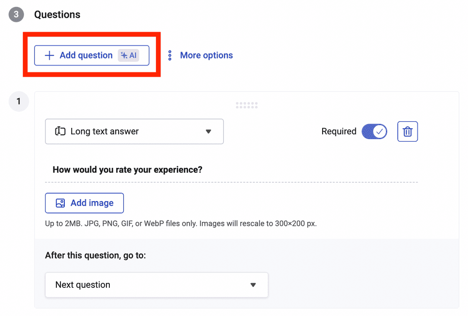
We quickly prioritized updating the feature so it would only add one question at a time.
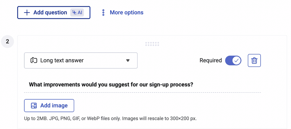
Our new ‘Add question’ button introduces new questions one at a time, making it easier for users to control their survey-building process
📝 Our takeaway
Look into the data before releasing new features. What made this fail a little extra embarrassing is that we already knew our users prefer short surveys.
We know that, in general, our users like to create short surveys. So if we’d had that in mind from the start, we never would have thought to add three questions at a time.
The moral of the story? Above all else, make user-led decisions. Even when you’re excited about a new tool or feature, stay focused on what your audience actually needs and wants, not what you want to give them. 😬
6. Launching a popover on top of another popover
🤦♀️ What happened?
Onboarding is a vital process for any software company—if your users can’t quickly learn how to use your tools, they won’t stick around. With this in mind, we launched what we call our ‘getting started guide’ that appears when users access Hotjar for the first time, introducing them to key tools and features.
We initially designed the guide as a popover that would appear on top of the Hotjar UI, immediately grabbing users’ attention. However, we overlooked that we had also set up a popover survey to appear at the same time and place.
The issue meant that users saw double popovers at the same time, with one appearing over the other—not a great first impression. Of course, this completely went against UX principles, which stress simplifying users’ tasks and decisions, not overwhelming them with distractions.
🕵️♂️ How we discovered this UX fail
Tools used:
Feedback
Recordings
Thankfully, users reached out via Hotjar Feedback to alert us to the issue. Some used the screenshot feature to send us images of the double popovers in action, so we could clearly see the problem.
To investigate further, we watched recordings of user journeys to see users’ reactions. These sessions showed us that users closed one (or both) of the windows before continuing on their journeys.
Key metrics also revealed the double popovers reduced both our survey responses and the number of users engaging with the guide. We knew that lower engagement with the guide would ultimately leave more users struggling to get started with Hotjar.
As a company with ‘Put our customers at the heart of everything’ as one of our core values, that’s definitely not what we want.
💡 Pro tip: want more context on an individual user’s comments? With Hotjar, you can zoom out to find recordings related to any individual survey or feedback response.
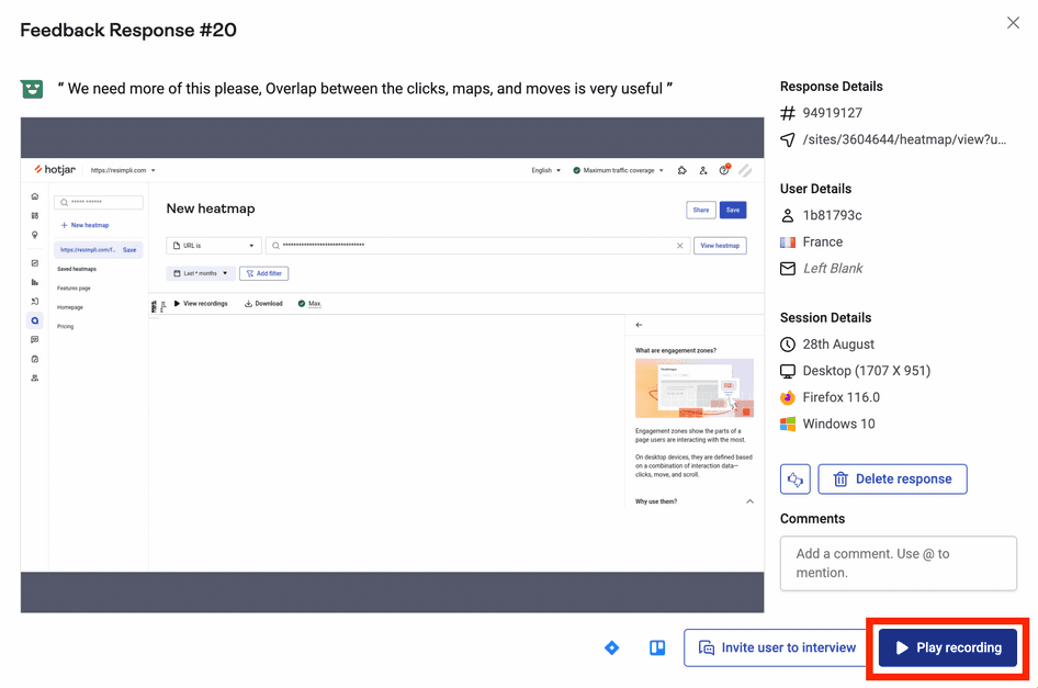
Zoom out to relevant recordings that reveal precisely what happened before users submitted their feedback—just click the ‘Play recording’ button
📝 Our takeaway
Don’t let your teams work in silos. Even at Hotjar, where cross-functional collaboration is part of our culture, mistakes like this happen.
It’s easy to get wires crossed if your UX and marketing teams (or sub-teams) aren’t communicating with others.
Once this issue was solved, we saw a 10% lift in users converting to a paid plan. We also got more feedback from users via the adjusted popover survey, and discovered where users need more help. So, our second takeaway is that solving issues like this can make a huge difference—both to your user experience and your business results.
7. Hiding a vital setup ingredient from new users during onboarding
Setting up Hotjar isn’t difficult, but it still involves tasks that non-technical people don’t do often. For example, users need to copy the Hotjar tracking code and paste it into their analytics dashboard, which can seem a bit fiddly.
We optimized the setup flow that walks users through the process to make things easier and less daunting for our users. Over several design sprints, we made large-scale and micro-improvements to the setup flow—but we overlooked a crucial issue.
While we presented the user's tracking code in the signup flow along with a clear ‘copy’ button, we didn't design an easy way for users to return to the code page later. Now, new users took longer to set up Hotjar and needed more help from our support team.
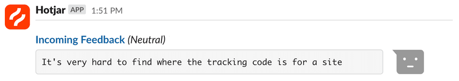
Feedback from one of many users struggling to locate their tracking code
🕵️♂️ How we discovered this UX fail
Tools used:
Feedback
Interviews
Recordings
We learned about this through a mix of user interviews and Feedback responses. And when looking at recordings, we saw users frantically clicking around, trying to find the installation code.
We also saw a number of support tickets from people trying to find their tracking code.
To remedy the issue, we added new, highly visible ways for users to find the tracking code within their dashboard. Recordings showed us that users frequently searched the ‘Sites & Organizations’ page when looking for the code, so we added it to that page—done!
📝 Our takeaway
This failure reminded us of one critical UX lesson:
Give the people what they want: shortcuts.
This is particularly important for a task like copying the tracking code, which is absolutely vital to the user’s journey with our product.
Also, remember that users won’t always navigate your site or product in the way you expect them to. Plan for all scenarios so they can complete important tasks from any possible starting point.
👉 Get more advice on avoiding common mistakes in our UX research guide.
The right data turns your UX fails into wins
We’ve been doing this for a long time, and our team is made up of fantastic designers—but we still make mistakes. It goes to show that UX is complicated, and you won’t always get everything right the first time.
The good news is that mistakes like these often lead to better product design in the long run. As long as you’re learning more about your users, you can harness human-centered design thinking to drive continuous improvements.
And by using a software suite like Hotjar, you’ll have access to everything you need to know about your users' preferences, needs, and behaviors—and turn those fails into massive wins.
Spot website issues faster
Get to the bottom of UX issues with in-depth insights from Surveys, Feedback, Recordings, Interviews, and more.