Learn / Guides / A/B testing guide
6 A/B testing examples to inspire your team’s experiments
A/B testing seems simple: put two different product versions head-to-head to see which one works better for your users.
But in reality, A/B testing can get complicated quickly. Your website has so many different elements—buttons, inputs, copy, and navigational tools—and any one of them could be the culprit of poor conversion rates. You want to ensure you have the right tools and processes to solve the case.
That's why you need to analyze A/B testing examples—to see what kind of strategies and tools other companies used to successfully carry out their experiments.

This article looks at six A/B testing examples and case studies so you can see what works well for other businesses—and learn how to replicate those techniques on your own. You’ll walk away with new ways to test website improvements that boost the user experience (UX) and your conversion rates.
Conduct A/B tests with confidence
Use Hotjar’s tools to see how users experience different versions of your product

6 brilliant A/B testing case studies to learn from
Product and website design is not just an art; it’s also a science. To get the best results, you need to conduct A/B testing: a controlled process of testing two versions of your product or website to see which one produces better results.
A/B testing, also known as split testing, follows a predictable structure:
Find a problem
Create a hypothesis of how you could solve it
Create a new design or different copy based on your hypothesis
Test the new version against the old one
Analyze the results
But within this structure, you have many choices about the A/B testing tools you use, the types of data you collect, and how you collect that data. One of the best ways to learn and improve is to look at successful A/B testing examples:
1. Bannersnack: landing page
Bannersnack, a company offering online ad design tools, knew they wanted to improve the user experience and increase conversions—in this case, sign-ups—on their landing page.
Unsure where to start, Bannersnack turned to Hotjar Heatmaps to investigate how users interacted with the page. With heatmaps, the company could visualize the areas with the most clicks and see spots website visitors ignored.
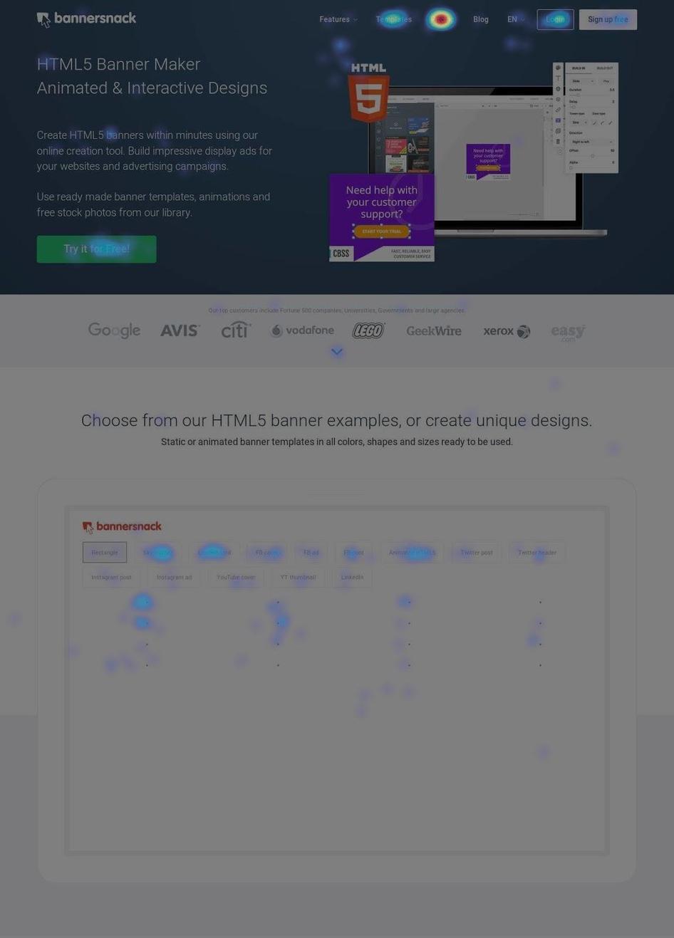
With A/B testing, Bannersnack discovered that a larger, higher-contrast call-to-action button made a huge difference. Check out the heat difference on these before-and-after click maps!
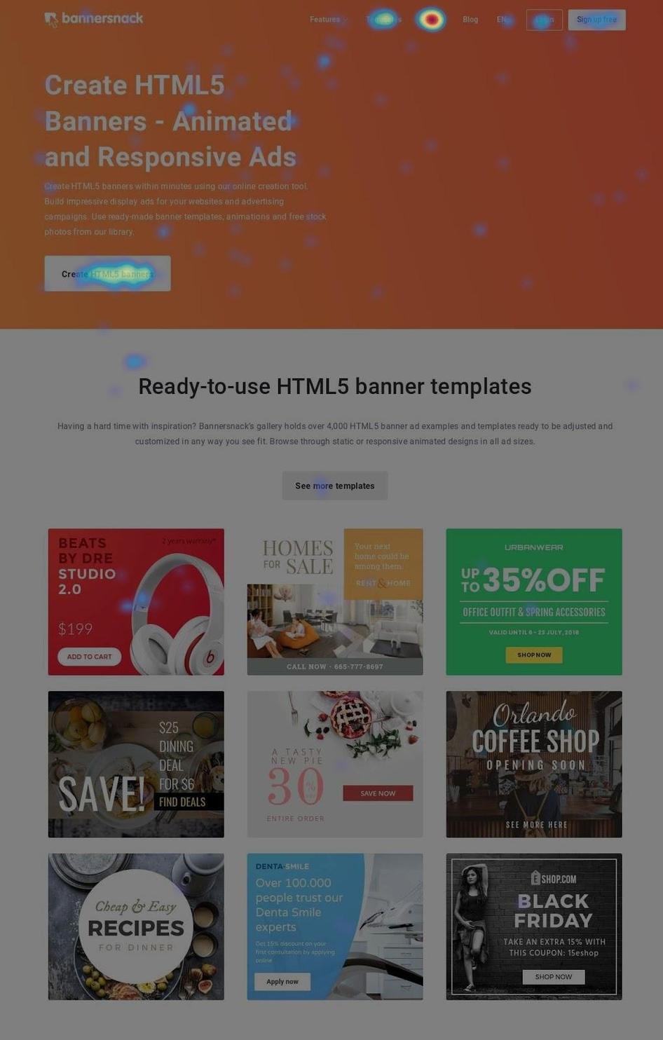
With A/B testing, Bannersnack discovered that a larger, higher-contrast call-to-action button made a huge difference. Check out the heat difference on these before-and-after click maps!
With this data, Bannersnack could hypothesize how to improve the experience and then create an alternate design, or variant, to test side-by-side with the original.
Bannersnack completed multiple rounds of testing, checking heatmaps each time and getting incrementally closer to their desired results. Ultimately, they realized they needed a larger call-to-action (CTA) button with a higher contrast ratio—and sign-ups increased by 25%.
💡Pro tip: optimize your landing page by breaking down drivers, barriers, and hooks.
Drivers are the reasons a lead came to the page
Barriers are the reasons they’re leaving
Hooks are the reasons they convert
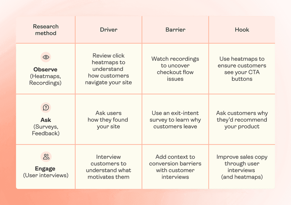
Once you fully understand customer behavior on your landing page, you can develop—and test—ideas for improving it.
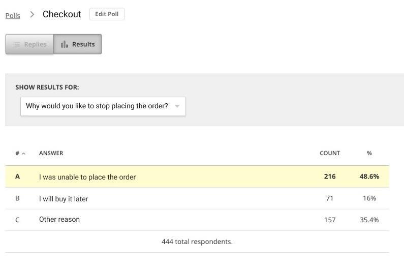
2. Turum-burum: checkout flow
Digital UX design agency Turum-burum aimed to optimize conversions for their customer Intertop, an ecommerce shoe store based in Ukraine.
In the UX analysis phase, Turum-burum used Hotjar Surveys—specifically, an exit-intent pop-up—to gather user insights on Intertop’s checkout page. When a user clicked to leave the page, the survey asked, “Why would you like to stop placing the order?” Out of the 444 respondents, 48.6% said they couldn’t complete the checkout form.
The next step was to develop hypotheses and A/B test them. Turum-burum tested changes like reducing the number of form fields, splitting the webpage into blocks, and adding a time-saving autofill feature.
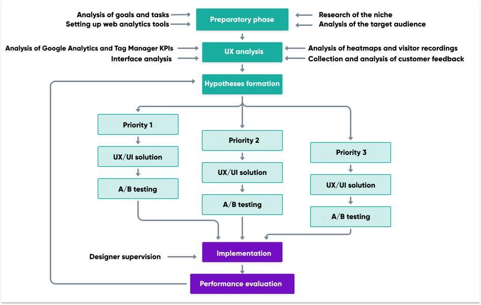
Each time they tweaked a page, the company used Hotjar Recordings and Heatmaps to see how users experienced the change. Heatmaps revealed trends in users’ click and scroll behavior, while Recordings helped the team spot points of friction, like rage clicks, users encountered during the checkout flow.
The final result? Intertop’s conversion rate increased by 54.68% in the test variant. When they officially rolled out the changes, the average revenue per user (ARPU) grew by 11.46%, and the checkout bounce rate decreased by 13.35%.
Hotjar has flexible settings for heatmaps and session recordings, which is especially useful when you’re A/B testing and want to see how users experience each version of your design.
3. Spotahome: new features
A/B testing doesn’t have to be stuffy or stressful. Online booking platform Spotahome keeps it casual and fun with Hotjar Watch Parties.
Right now, people in product and engineering at Spotahome use Hotjar on a daily basis. We’re always running A/B tests and using Hotjar to see how the new feature performs.
Developers gather virtually, over a video call, and watch recordings of users interacting with new features.
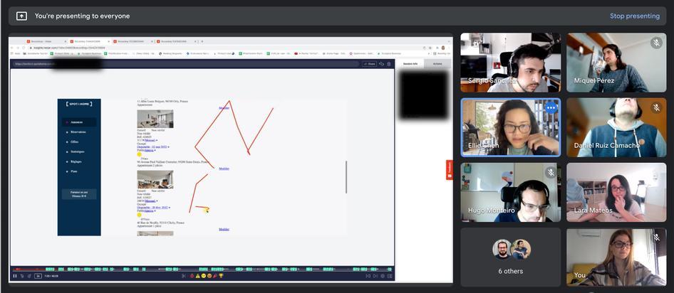
For example, when watching recordings of users experiencing their new sign-up flow, developers noticed a broken button.
While they might have grimaced and groaned when they spotted it, the moment allowed them to catch a problem that would’ve cost them conversions.
💡Pro tip: don’t be afraid of negative results when running A/B tests.
Johann Van Tonder, CEO at ecommerce CRO agency AWA digital, says, “A test with a strong negative result means you’ve identified a conversion lever. You’ve pulled it in the wrong direction, now just figure out how to pull it in the opposite direction.”
Johann says he often gets even more excited about negative results because they showcase how valuable A/B testing actually is.
“We tested a redesigned checkout flow for a famous car rental company,” he says. “It would’ve cost them £7m in annual revenue if they’d just made it live as is.”
Even though negative results are sometimes inevitable, there are some common A/B testing mistakes you need to be aware of, so you can get maximum results from your experiments. Check out the top A/B testing mistakes chapter of this guide (coming soon!) to learn more.
4. The Good: mobile homepage
Ecommerce CRO experts The Good took on the task of achieving higher conversion rates on mobile for client Swiss Gear, a retailer of outdoor, travel, and camping supplies.
To uncover any existing issues or bottlenecks, The Good turned first to Google Analytics to determine where, when, and why visitors left the website.
With this quantitative data as a starting point, the company cued up Hotjar Heatmaps, which are free forever, to highlight users’ click and scroll patterns. Then, they used Hotjar Recordings to determine the why behind user behavior—the qualitative data—and form their hypotheses about how to make improvements.
The Good tested their hypotheses, using heatmaps and recordings again after each test to see how changes impacted user behavior.

The Good used Hotjar Heatmaps to understand how users interacted with content filters, and used this data to redesign client Swiss Gear’s mobile menu to be more user-friendly.

The Good used Hotjar Heatmaps to understand how users interacted with content filters, and used this data to redesign client Swiss Gear’s mobile menu to be more user-friendly.
The Good discovered that users were getting confused by the iconography and language on Swiss Gear's mobile site. The process led the team to design a simple, visually appealing menu-driven user interface (UI) for the mobile homepage.
This interface streamlined the browsing experience by promoting top filters—a move that led to big results: Swiss Gear’s mobile bounce rate dropped by 8% and time on site increased by 84%.
💡Pro tip: use Hotjar Engage for even more insights when optimizing your mobile site.
Engage lets you source and interview real users about how they experience your site on their phones. Then, you can filter these interviews by type of phone, like Android or iPhone, to look for usability trends.

Recruit from Hotjar’s pool of 175,000+ verified participants and automatically screen to make sure you’re speaking to the right people
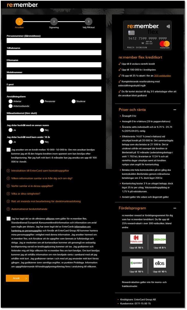
5. Re:member: application form
Re:member, a Scandinavian credit card company, knew something was wrong with their funnel. Google Analytics showed that many qualified leads arrived from affiliate sites—and quickly left before they signed up for a credit card.
Using Hotjar filters, re:member’s Senior Marketing Specialist, Steffen Quistgaard, pulled up recordings and click maps of sessions from affiliate sites only.
While studying these sessions, Quistgaard noticed users scrolling up and down, clicking to the homepage, and hovering over—and attempting to click on—the benefits section.
Putting together these behavioral trends, Quistgaard hypothesized that leads were hesitant and needed more persuasive information on the form.
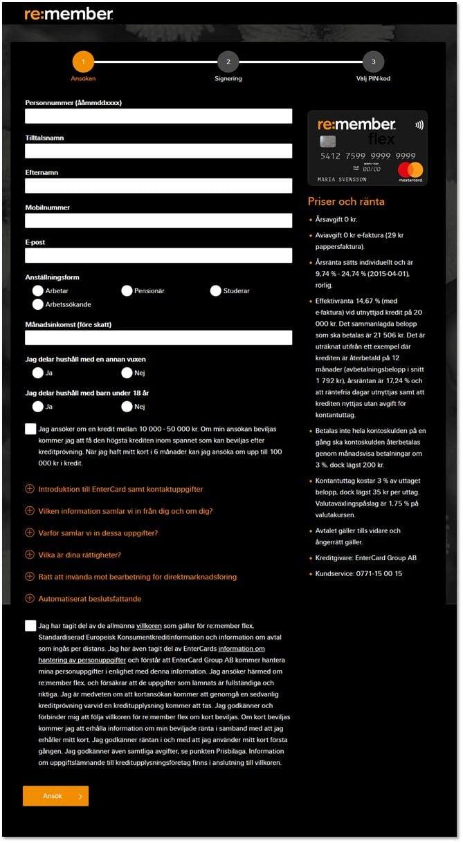
Re:member redesigned their credit card application form with more visual organization on the right side for users: three distinct content sections, checkmarks instead of bullet points, and icons in the rewards program section.
Re:member redesigned their credit card application form with more visual organization on the right side for users: three distinct content sections, checkmarks instead of bullet points, and icons in the rewards program section.
Re:member’s team redesigned the form, using visual and web design hierarchy cues to call attention to the credit card’s features and benefits. Then, they conducted split testing.
The result? Form conversions went up 43% among users from affiliate sites and 17% overall.
💡Pro tip: use filters to spend less time searching and more time analyzing.
If your site experiences high traffic volume, you could rack up many recordings in a short time. (No worries! You get 1,050 session recordings for free every month on the Hotjar Basic ‘free forever’ plan. 💪)
To make the most of your time, you need to sort through your recordings in the most efficient way.
Hotjar offers several filters that you can use, depending on your goals:
Finding broken elements or bugs: sort recordings by rage clicks, errors, or u-turns (when a user returns to the previous page in under seven seconds).
Test a new feature: verify your assumptions about how a new button or link is performing with the clicked element filter. This lets you refine your sessions to only see those sessions where users actually clicked on the featured element.
Compare two versions of your page: filter by events to better understand your A/B test results. By setting up each page variant as a separate event, you can easily separate the recordings before watching them.
6. Every.org: donation flow
Dave Sharp, Senior Product Designer at charity donation site Every.org, was watching session recordings when he noticed something interesting: a surge of rage clicks, or a series of repeated clicks in a short time, on their donation form.
After watching many sessions, Dave hypothesized that the form’s two CTAs were confusing and frustrating visitors.
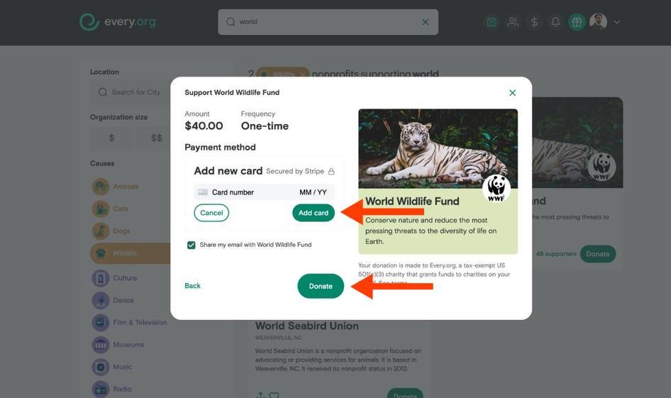
Every.org created a new version of the donation flow, splitting it into two pages, each with only one CTA button. Then they tested it against the original version.
By the end of the A/B testing process, conversions had increased by a whopping 26.5%.
💡Pro tip: when running tests, save time with Hotjar features and integrations.
While fine-tuning Every.org’s donation flow, Dave used three time-saving tricks to narrow down the number of recordings he was watching:
Filter by URL: this filter meant Dave could focus on user activity on certain pages—he could skip sessions of users on the blog, for example, and focus on activity closer to the point of conversion
Sort by relevance: instead of watching users’ sessions chronologically, Dave chose to sort them by relevance. That meant Hotjar’s algorithm did the heavy lifting, finding the most insightful recordings for him.
Set up alerts: to save even more time, Dave used Hotjar’s Slack integration to get an alert each time new recordings surfaced of users trying the updated donation flow.
Every.org gets thousands of visitors each month, but with these strategies, Dave made quick work of a task that could otherwise seem daunting.
Get closer and closer to what users need
You can’t just rely on gut instinct when making changes to your website. To create a site visitors enjoy (and one that gets results), you need to collect real evidence and user insights.
By looking at A/B testing examples, you’ll have a clear roadmap of how to identify a problem, create a hypothesis, and test variants of your site. In time, you’ll have a site that delivers exactly what your target audience wants—and keeps them coming back for more.
Conduct A/B tests with confidence
Use Hotjar’s tools to see how users experience different versions of your product