Learn / Blog / Article
7 top UX analytics tools to enhance the user experience
Success in a crowded digital landscape lies in one key element: which companies provide the most outstanding user experience (UX)? As more businesses tap into user insights, those with an advanced UX analytics approach set themselves up to win. How do the best in the game do it? With the right tools for creating a website or product that truly resonates with users.


UX analysis focuses on collecting, evaluating, and organizing data on how users experience your app or website. Having best-in-class UX analytics tools in your tech stack helps you gain a competitive edge and eliminate guesswork from your team’s high-impact decisions.
This guide provides a roundup of the top UX analytics tools to help you harness the power of user data. Add them to your tech stack to boost your digital product or business—and deliver exceptional, empathetic experiences that make your users the ultimate winners.
Data-driven UX design
See how real users experience your site and deliver changes that delight them.

7 exceptional UX analytics tools to try
One tool can’t do it all, but the right combination of UX analytics tools should easily tick all your boxes. Here’s a shortlist of the best UX analytics software to help you deliver optimal experiences.
1. Google Analytics
Why add this to your toolkit: Google Analytics (GA) points UX design teams to potential issues based on quantitative data—and it’s a tool most of us already know and love.
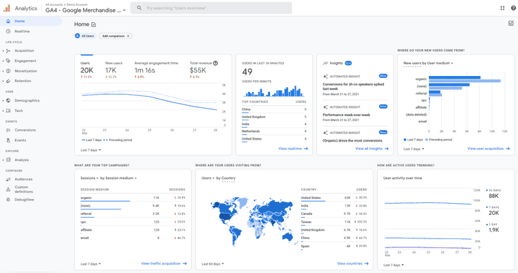
As a traditional analytics solution, GA is great at telling you what is happening on your site. Many online businesses rely on it to track site-performance metrics like pageviews, sessions, and bounce rates.
GA lets you go beyond pageviews to track specific user actions or events, such as clicking a button, submitting a form, or completing a purchase.
🔎 Get the other side of the story
Despite the abundance of metrics and statistics in GA, the platform doesn’t tell you why something happens on your site. This is where connecting GA with user behavior analytics platforms, such as Hotjar (hello there 👋), comes in.
Combining traditional analytics and digital experience insights gives you a robust mix of:
Quantitative data: numerical and measurable metrics, such as success rate, error rate, Customer Satisfaction (CSAT), Net Promoter Score® (NPS), and Customer Effort Score (CES)
Qualitative data: subjective and non-numerical metrics, including user behavior, feedback, and digital experience insights
For instance, use GA to check where users frequent and what they skip to surface problem areas. Then, view session recordings and heatmaps of these specific user sessions in Hotjar (more on this in a sec) to see for yourself how people experience your site—where they get stuck, what they ignore, or why they leave.
2. Hotjar
Why add this to your toolkit: Hotjar offers valuable insights into how users interact with your product or website, helping you establish a deeper connection with them.
Delve into the qualitative insights you need with the Hotjar Surveys tool, and uncover hidden gems in your quantitative data with Hotjar Recordings and Heatmaps. The Hotjar platform consists of several UX analytics tools:
Surveys

Hotjar's NPS Survey lets you ask users how likely they are to recommend your product
Let users tell you—in their own words—what they think, feel, or experience when navigating your product or site.
Launch surveys at critical moments in their customer journey, such as before they exit a page or when they abandon their cart. This is your best bet for identifying and addressing pain points.
📝 Note: you can also collect direct feedback to learn if you’re successfully creating customer delight. Try our Net Promoter Score® (NPS®), Customer Satisfaction (CSAT), and Customer Effort Score (CES) surveys to find out.
💡Pro tip: to glean actionable insights, ask a mix of open-ended and close-ended questions. Open-ended questions reveal more detailed and nuanced responses, while close-ended questions yield specific answers (think yes/no or multiple-choice).
Session recordings
Observe how individual users work their way through your website via session replays.
Recordings uncover roadblocks in your user experience. If Google Analytics shows people leaving your site at checkout, pull out relevant recordings to investigate the cause.
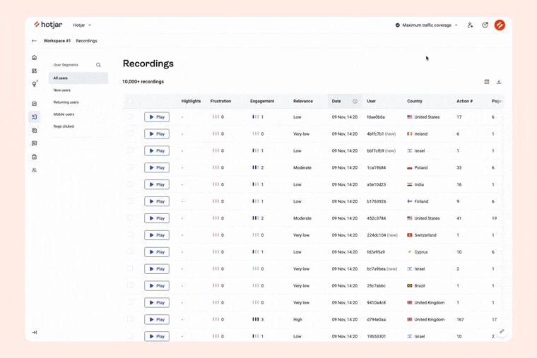
Seeing patterns like users rage-clicking (repeatedly clicking or tapping) on a link or call-to-action (CTA) button are possible signs of frustration—and that either element is broken.
Use insights from recordings to uncover different issues, solve them, deliver customer delight, and, ultimately, increase conversions.
Heatmaps
Hotjar’s heatmaps are a powerful visual tool using color to represent data, providing a clear and intuitive means to analyze user behavior. It shows, in general, where visitors click, how far they scroll, and which areas they pay attention to or ignore.
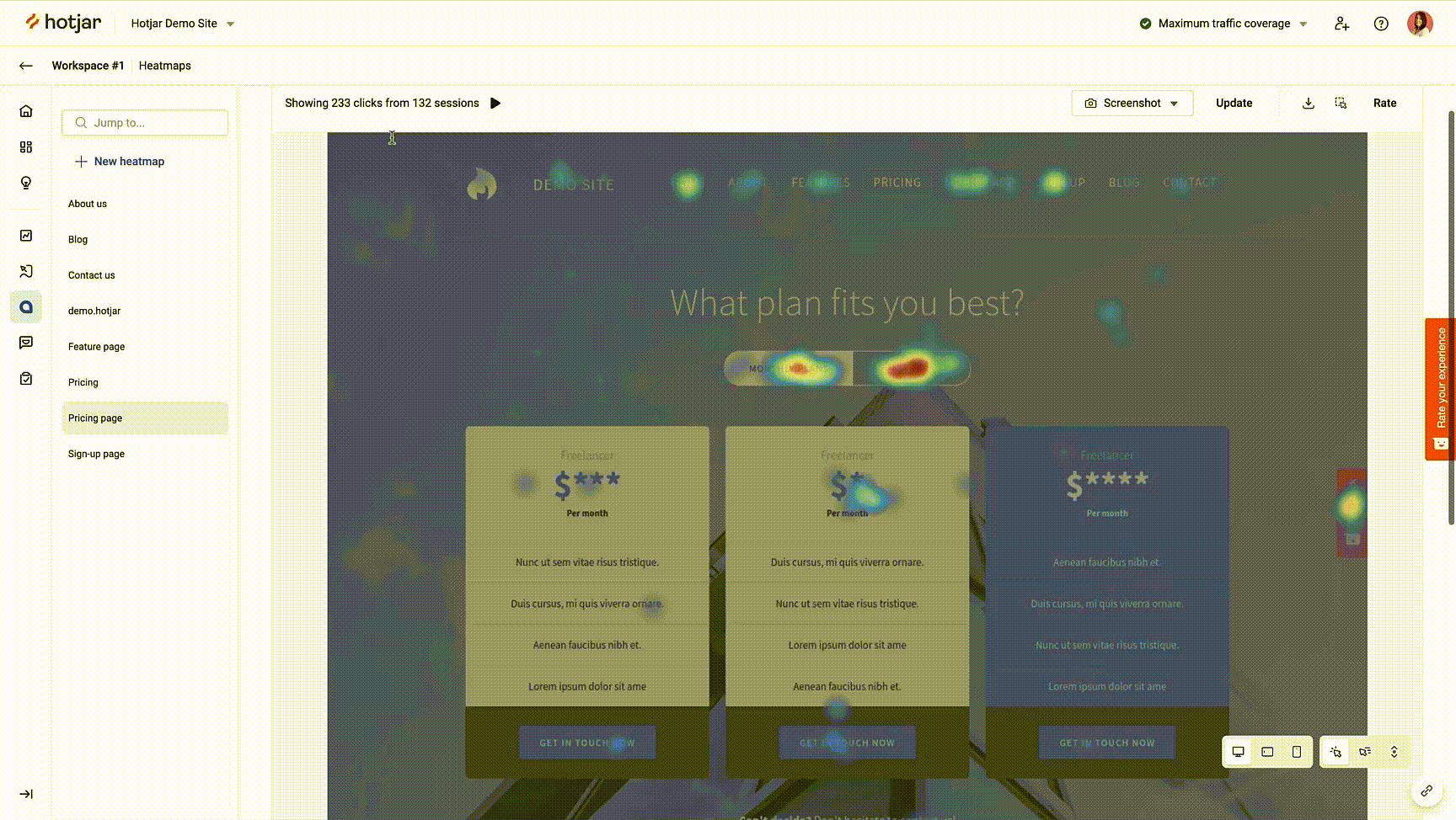
Study heatmaps to spot opportunities: what and where you can improve on your most important pages. Elements you could change include the page copy, layout, messaging, and CTA placement.
🔥 Which heatmap do you need?
Different types of heatmaps offer unique perspectives on website performance and user behavior:
Scroll heatmaps: these display the percentage of users who scroll down to different points on the page. See if users reach the area where you placed valuable content and CTAs—and change accordingly.
Click heatmaps: know where and how often users interact with page elements (clicks on desktop and taps on mobile devices). Analyzing this data helps optimize button placement and reduce clicks on non-clickable elements.
Move heatmaps: learn where users move their mouse while navigating a web page on a desktop. This visualization shows whether they spend time on sections you want them to reach.
Engagement zones: see all interaction data (the scroll, clicks, and move we just mentioned) at a glance. Engagement zones in Heatmaps quickly reveal the most engaging parts of your site in the form of grid overlays.
Rage click maps: discover exactly where users get frustrated on the page. This type of heatmap highlights which elements on the page received repeated clicks, possibly indicating a discrepancy between how users expect your site to behave, and how it actually does.
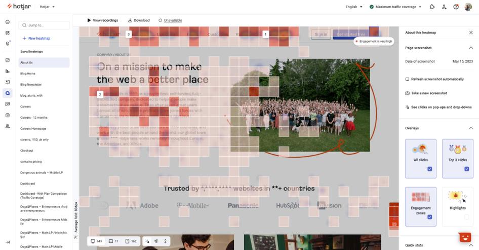
Find the areas of your pages users can’t get enough of with engagement zones in Hotjar Heatmaps
3. Mixpanel
Why add this to your toolkit: follow user journeys, including their path to purchase, with an events tracking tool like Mixpanel.
We mentioned events earlier—these are specific tasks or actions users perform on your site or product. Mixpanel tracks a range of different events, such as a completed purchase or signup, allowing you to measure every step leading to engagement and conversion.
Get reports on events across user journeys, from users creating an account, logging in, and engaging with content about your product to adding the product to the cart and completing a purchase.
Further, enrich your UX analysis by blending qualitative and quantitative insights. Through the Hotjar and Mixpanel integration, for instance, you can create recordings, heatmaps, and surveys based on Mixpanel events:
Filter recordings and heatmaps by Mixpanel events to dig deeper behind the numbers. Know the real issues and make informed decisions so that you can move forward with your changes confidently.
Trigger surveys to appear when users complete a key action on your site or product. Discover their needs, sources of friction, and ways to improve.
Sort your Trends, Funnels, and Dashboard data in Hotjar by Mixpanel events for a more detailed understanding of the user behavior.
💡Pro tip: send all your Mixpanel events to Hotjar with our one-click, no-code setup. It’s the fastest route to consolidating your data sources and capturing insights into what happens behind the numbers. Here’s how to integrate Hotjar with Mixpanel.
4. Contentsquare
Why add this to your toolkit: Contentsquare—Hotjar’s sister company and partner in best-in-class digital experience insights—covers a lot of bases to help you fine-tune and fuel your users’ digital experiences.
Aimed at enterprises, the platform automatically captures the customer journey and surfaces data for you to analyze. What you get are digital experience insights—a well-rounded view of users’ unique behavior, feelings, and intent—that drive you to make smarter, faster decisions.
For instance, Contentsquare allows you to overlay UX metrics on your website in one fell swoop through Zoning Analysis. Here, you can easily understand what a particular user segment finds engaging and helpful, and then assess if you can model your UX design for other segments based on these results.
With Contentsquare digital experience analytics solutions, you can also:
Optimize your testing throughout the entire design cycle. A/B test different versions of your website or mobile app before rolling out changes. Conduct a post-test analysis to see how those changes impact the user experience.
Showcase users’ actual experiences to build your case and align with stakeholders on improvements
Get a custom view of the usability metrics that matter to your team and monitor them regularly through Journey Analysis
💡Pro tip: Contentsquare works seamlessly with other tools in your tech stack. Use Hotjar Surveys to add the voice of the customer to your analysis. Then quantify negative feedback in Contentsquare to understand what common or unique issues plague your customers. (Integration coming soon! 👀)
5. Optimizely
Why add this to your toolkit: Optimizely lets you blend A/B testing and personalization seamlessly to ensure efficient updating of your site’s or product’s UX design.
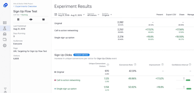
Optimizely is another platform that supports A/B testing, split testing, and multivariate testing. But it also draws designers' and developers' attention with its website personalization feature.
Running personalization tests lets you tailor two or more versions of your entire website (vs. just a page or element in A/B testing) based on your users' contexts and interests. These include crafting separate landing pages for different audiences.
Personalization, coupled with A/B testing, empowers you to dish out unique experiences, so you can cater to users' needs and desires.
💡Pro tip: deepen your insights by viewing recordings and heatmaps or triggering surveys for your Optimizely experiments when you integrate Optimizely with Hotjar.
Make data-driven decisions on improvements, such as a homepage redesign, before rolling them out to a broader audience. This saves valuable time, resources, and effort while ensuring your changes are effective and resonate with your users.
6. Omniconvert
Why add this to your toolkit: tap into Omniconvert to gather user behavior insights and focus on building user-led solutions—resulting in increased conversions and higher revenue.
With features such as A/B testing, personalization, surveys, segmentation, and behavioral targeting, Omniconvert is an excellent option for CRO. It also checks every item on the list of must-haves: intuitive, reliable, and compatible with other tools (Hotjar included!).
Learn how your visitors interact with your website by testing various designs, copy, and CTA on different devices. To add a layer of detail, segment your Omniconvert testing based on factors like geolocation, traffic source, behavior, UTM parameters, and custom parameters.
📝 Note: product and ecommerce teams stand to benefit from Omniconvert the most when using it to improve customer experience, boost loyalty, and increase conversion rates.
💡Pro tip: use recordings and heatmaps to gain valuable insights into user behavior on your website. Hotjar saves your Omniconvert session recordings as events and uses them to trigger session capture, display feedback widgets or surveys, and filter collected data. Check out this guide to get started with the Omniconvert and Hotjar integration
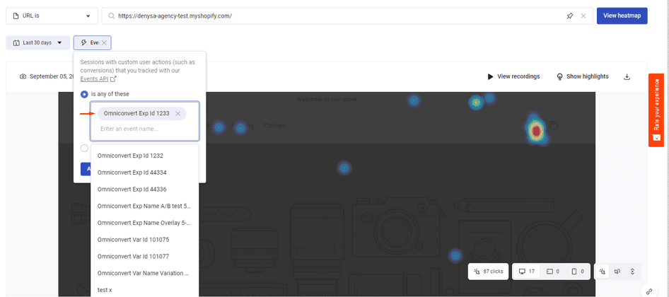
Using Hotjar and Omniconvert together provides even deeper insights
7. Adobe Analytics
Why add this to your toolkit: identify opportunities to elevate the user experience through Adobe Analytics’ ability to predict future trends and events.
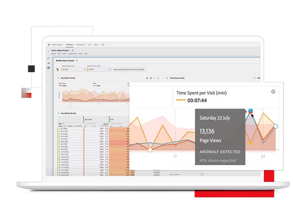
Adobe Analytics in action
Adobe Analytics employs multi-channel analysis, data visualization, machine learning, and artificial intelligence (AI) to analyze UX. It works best for product manager and UX designer tasks requiring quantitative data collection and predictive analytics.
Get more granular in your analysis of user behavior, identifying crucial patterns and trends. This includes determining the most popular pages or features, locating where users drop off, and tracking actions that drive or block conversions.
For example, pinpoint areas on your website or digital product where users drop off, such as during checkout or when filling out a form. Then, use this information to make targeted improvements to those areas, aiming to reduce drop-offs and increase conversion rates.
🏆 What makes a winning UX analytics tool?
Building and maintaining a product isn’t easy for the stakeholders involved. So choose software and tools that make analysis a delight for everyone in your team: UX researchers, designers, product managers, and marketers.
Consider these three characteristics when selecting UX analytics tools for your team:
Reliable and easy to use: provides clear and concise reporting, data visualization, and actionable insights in a user-friendly and intuitive way
Practical and cost-effective: accurately captures real users’ actions on your site or product while requiring less time and fewer resources to set up
Complementary and compatible: integrates well with other tools in your tech stack, such as collaboration, testing, and marketing platforms
Powering UX design decisions with data
You can’t go wrong in prioritizing the delivery of exceptional user experiences. And the right UX analytics tools can be the game-changers you need to dominate the competition.
If you’re keen to look into the ones we shared, keep in mind you can mix and match them—blending qualitative and quantitative data sources is the key to a more accurate and in-depth analysis.
Now, there’s one more thing left to do: add your preferred tools to your tech stack, and get started creating unrivaled, unforgettable experiences for your users.
Data-driven UX design
See how real users experience your site and deliver changes that delight them.
UX analytics tools FAQs
Related articles

UX design and analysis
Design a homepage that delights your users in 9 easy steps (with tips and examples)
While product, UX, and marketing teams help shape a website or app’s homepage, a more powerful group holds the reins: the users. Their needs and preferences are key deciding factors in locking in an effective homepage design.

Shadz Loresco

UX design and analysis
The anatomy of a stellar website: the dos and don’ts of design
Over the past five years, buyers have largely shifted their shopping habits to be primarily online. For brands wishing to remain competitive in the digital marketplace, this means an accessible and attention-grabbing website has become more important than ever before.
Consumers agree: respondents to Hotjar’s Coming in Hot report told us that they have higher expectations for brands’ websites than they did five years ago.
Hotjar team

UX design and analysis
Coming in hot: the power of first impressions
Consumers have more than their fair share of vendors to choose from when shopping online. When attention is split between different brands and devices, ensuring your online presence stands out from the crowd hinges on first impressions.
But catering to the ever-changing habits and preferences of digital buyers is no small feat. That’s why Hotjar surveyed hundreds of US-based consumers—to reveal the insights you need to guarantee your website exceeds user expectations.
Hotjar team