Learn / Guides / Heatmaps guide
Heatmap analysis: 5 strategies for quick results
The practice of heatmaps originates back to the early 1900s, when manual gray-scale shading was used to depict data patterns. Now they're a time-tested, effective product experience (PX) insights tool that help you visualize people’s behavior on your site, so you can learn how to make changes that improve the user experience and drive growth.
🚀 Summary
How do successful businesses and start-ups analyze heatmaps to make choices that help them reach company goals?
Heatmap analysis, the process of reviewing and analyzing heatmap data to gather insights about user interaction and behavior, leads to improved site designs with lower bounce rates, reduced churn, fewer drop-offs, more pageviews, and better conversion rates.
This page takes you through five heatmap analysis strategies for quick results, presented as five questions:
Keep reading to learn how analyzing heatmaps can help you provide a better user experience—and reach company goals.
Sign up for a free Hotjar account, add the tracking code to your website, and start using our free heatmap software today.
A 5-question checklist for successful heatmap analysis (and a very handy bonus tip)
1. Are users seeing important content?
To understand if people are seeing significant content elements or sections on your product page, look at a scroll map—a heatmap that shows you how far down the page people scroll.
Follow these steps to determine if your content is actually selling your product and getting the point across:
👷 Edit content above and below your website’s average fold. Start by reviewing the position of your website’s average fold, which is the portion of the page people see on their screen without scrolling as soon as they land on your site. Knowing where the average fold lies helps you confirm whether people are accessing the most important information on a page—like product offerings, campaign announcements, and more.
🧑💻 Evaluate how visitors interact with page elements. Continue the analysis by reviewing the entire scroll map and looking at the percentage of visitors who make it (or don’t) to specific page points. This data can be particularly useful on long pages, such as a landing page that has a lot of information you want customers to see.
🕵️ Investigate why users drop off your page. Look out for sharp changes in color on your scroll heatmap. This indicates a significant percentage of people who stopped scrolling—they might be thinking they have reached the end of the page and can’t figure out, from context, that there is more content on the page.
💡 Pro tip: the fold line is automatically calculated and displayed for desktop and mobile devices when you use a Hotjar scroll map.
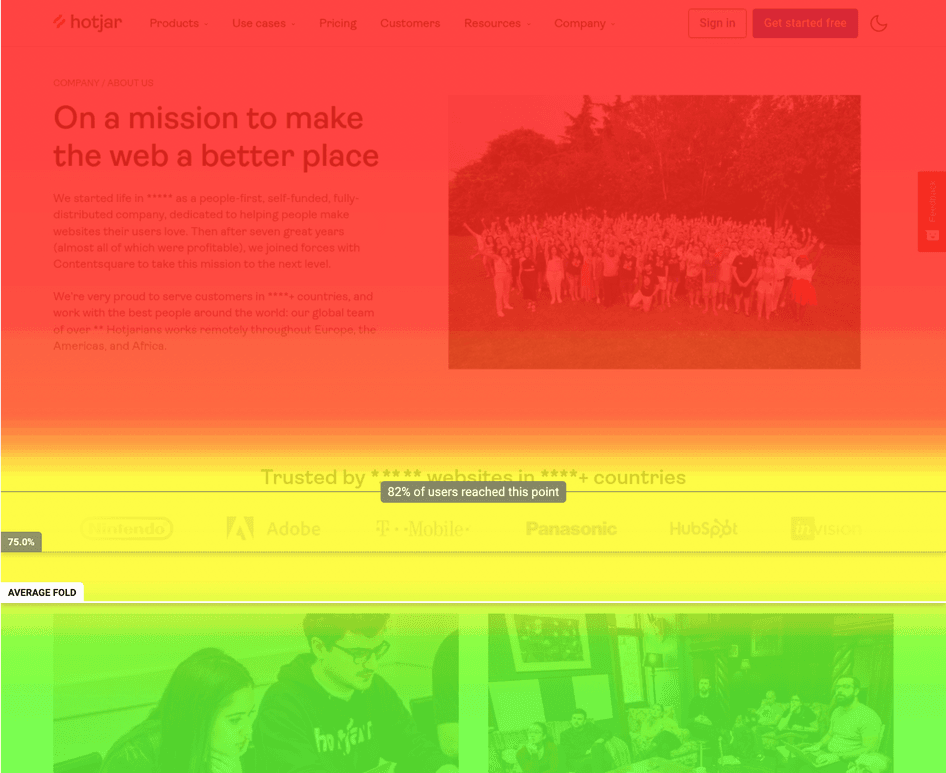
Heatmaps show you where users scrolled to, with blue representing the least viewed area
2. Are users clicking on key page elements?
While a scroll map helps you understand if people are seeing specific content elements, a click map quickly confirms if users are clicking on them or not.
Your website exists so people can fulfill a goal—they want to find information, sign up for a service, or buy a product. When reviewing a click map, look at elements like calls to action (CTAs), buttons, and links that are there to help visitors fulfill their goal. Are these elements being clicked on—or, in the case of a mobile heatmap, tapped? How much interaction are they receiving? Are users ignoring a product feature you want to popularize?
Use this product experience insight to make quick-win design changes or justify the need for more in-depth user research. If and when you end up changing the product page, referring back to the click map will help you compare behaviors and understand if your new design is successful.
Heatmaps helped me identify where users spend most of their time and assess if they should be spending time there or not.
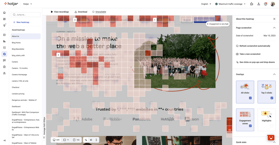
3. Are people confused by non-clickable elements?
Non-clickable elements that look like they might be clickable can cause confusion and frustration for users.
Review click maps and look for non-clickable elements like images, titles, or graphical shapes that show evidence of rage click and tap activity.
If you see this type of user behavior, you might need help from your tech or devs department, or a freelance software developer or web designer who can make a few visual changes to differentiate your clickable and non-clickable elements, and add links where previously there were none.

Hotjar rage click maps expose points of user frustration
4. Are visitors getting distracted by unnecessary content?
When multiple web page elements compete for people’s attention, they can cause visitors to lose focus on the most important action(s) they need to take.
Analyze move heatmaps to observe whether cursor activity is spread all over the page instead of being focused on key messages and call-to-action buttons and links. Also, check if there are areas of product pages that receive no or low interaction: you may need to redistribute your content or replace content that is taking up valuable space on the page.
Create a collection of heatmaps with Hotjar Highlights to emphasize a particular heatmap snippet, and easily share it with teammates or colleagues, executives, and stakeholders. Hotjar Highlights allows you to build a strong business case and generate stakeholder buy-in for making changes to your product or website pages.
5. Are people experiencing issues across multiple devices?
Your website or product page can look quite different across different devices.
Important content that is immediately visible on a desktop could end up well below the fold on a cell phone, where fewer users see it. Or the opposite could be true: your pages could look very compact and well-structured on a mobile device, but sparse and poorly organized on very large screens.
Make web traffic comparisons of the same page on mobile and desktop scroll maps to see if people are consuming more or less content depending on the device they're on. Pair scroll maps with click maps to see if clicking behavior changes, or if people interact differently on desktop versus mobile.
If you spot any glaring differences, the next step is to make UX or UI improvements—from applying quick-win changes to completely restructuring and redesigning your page(s) for maximum optimization.
View heatmaps across desktop, mobile, and tablet devices
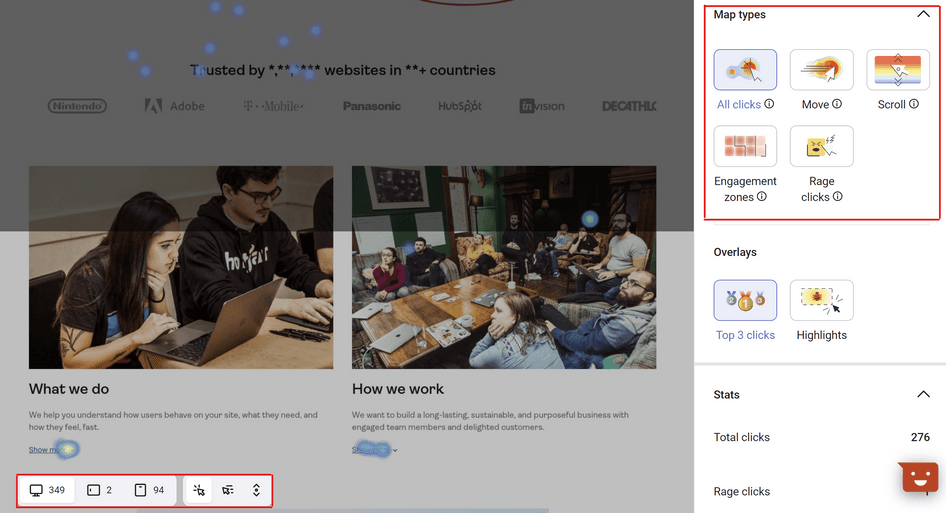
💡 Bonus tip: use Engagement Zones to combine data from click, scroll, and move heatmaps into a single view
Analyzing the data from individual heatmap types takes time and requires you to switch between each of them (in addition to switching between desktop and mobile views).
That’s where Hotjar Engagement Zones come in.
In Hotjar, enable the Engagement Zones overlay in the panel on the right side of your heatmap, and a grid will appear on top of it. This view aggregates data from three heatmap types—scroll, click, and move—so you can analyze which elements of the page users engage with, and those they neglect.
Engagement Zones make the process of analyzing heatmaps faster and easier, so you can spend more time on what actually matters: improving the layout, content, and usability of your website pages.
Super-charge your heatmap insights
In the process of analyzing heatmaps, you might find that they raise additional questions. For example, if you discover that people move their mouse around the page a lot but don’t click on anything, you will naturally want to find out why.
Super-charge your heatmap insights by combining them with other behavior and feedback tools that take you one step closer to understanding the why behind your users’ actions.
Sign up for a free Hotjar account, add the tracking code to your website, and start using our free heatmap software today.