Learn / Guides / Quantitative data analysis guide
The ultimate guide to quantitative data analysis
Numbers help us make sense of the world. We collect quantitative data on our speed and distance as we drive, the number of hours we spend on our cell phones, and how much we save at the grocery store.
Our businesses run on numbers, too. We spend hours poring over key performance indicators (KPIs) like lead-to-client conversions, net profit margins, and bounce and churn rates.
But all of this quantitative data can feel overwhelming and confusing. Lists and spreadsheets of numbers don’t tell you much on their own—you have to conduct quantitative data analysis to understand them and make informed decisions.

This guide explains what quantitative data analysis is and why it’s important, and gives you a four-step process to conduct a quantitative data analysis, so you know exactly what’s happening in your business and what your users need.
Collect quantitative customer data with Hotjar
Use Hotjar’s tools to gather the customer insights you need to make quantitative data analysis a breeze.

What is quantitative data analysis?
Quantitative data analysis is the process of analyzing and interpreting numerical data. It helps you make sense of information by identifying patterns, trends, and relationships between variables through mathematical calculations and statistical tests.
With quantitative data analysis, you turn spreadsheets of individual data points into meaningful insights to drive informed decisions. Columns of numbers from an experiment or survey transform into useful insights—like which marketing campaign asset your average customer prefers or which website factors are most closely connected to your bounce rate.
Without analytics, data is just noise. Analyzing data helps you make decisions which are informed and free from bias.
What quantitative data analysis is not
But as powerful as quantitative data analysis is, it’s not without its limitations. It only gives you the what, not the why. For example, it can tell you how many website visitors or conversions you have on an average day, but it can’t tell you why users visited your site or made a purchase.
For the why behind user behavior, you need qualitative data analysis, a process for making sense of qualitative research like open-ended survey responses, interview clips, or behavioral observations. By analyzing non-numerical data, you gain useful contextual insights to shape your strategy, product, and messaging.
Quantitative data analysis vs. qualitative data analysis
Let’s take an even deeper dive into the differences between quantitative data analysis and qualitative data analysis to explore what they do and when you need them.
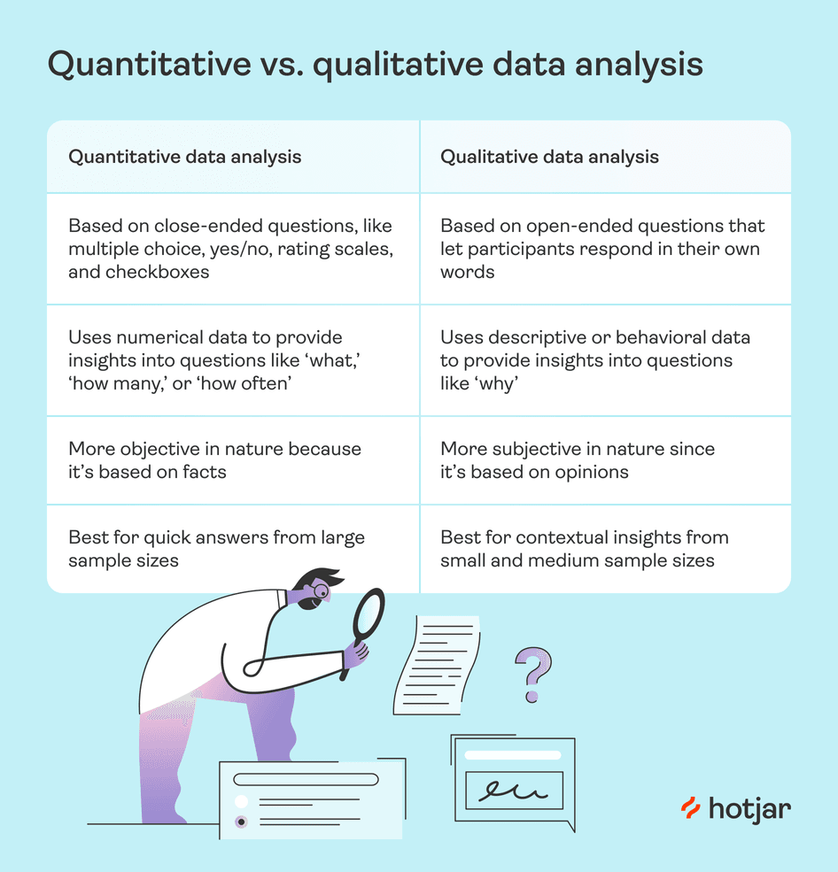
The bottom line: quantitative data analysis and qualitative data analysis are complementary processes. They work hand-in-hand to tell you what’s happening in your business and why.
💡Pro tip: easily toggle between quantitative and qualitative data analysis with Hotjar Funnels.
The Funnels tool helps you visualize quantitative metrics like drop-off and conversion rates in your sales or conversion funnel to understand when and where users leave your website. You can break down your data even further to compare conversion performance by user segment.
Spot a potential issue? A single click takes you to relevant session recordings, where you see user behaviors like mouse movements, scrolls, and clicks. With this qualitative data to provide context, you'll better understand what you need to optimize to streamline the user experience (UX) and increase conversions.
Hotjar Funnels lets you quickly explore the story behind the quantitative data
4 benefits of quantitative data analysis
There’s a reason product, web design, and marketing teams take time to analyze metrics: the process pays off big time.
Four major benefits of quantitative data analysis include:
1. Make confident decisions
With quantitative data analysis, you know you’ve got data-driven insights to back up your decisions. For example, if you launch a concept testing survey to gauge user reactions to a new logo design, and 92% of users rate it ‘very good’—you'll feel certain when you give the designer the green light.
Since you’re relying less on intuition and more on facts, you reduce the risks of making the wrong decision. (You’ll also find it way easier to get buy-in from team members and stakeholders for your next proposed project. 🙌)
2. Reduce costs
By crunching the numbers, you can spot opportunities to reduce spend. For example, if an ad campaign has lower-than-average click-through rates, you might decide to cut your losses and invest your budget elsewhere.
Or, by analyzing ecommerce metrics, like website traffic by source, you may find you’re getting very little return on investment from a certain social media channel—and scale back spending in that area.
3. Personalize the user experience
Quantitative data analysis helps you map the customer journey, so you get a better sense of customers’ demographics, what page elements they interact with on your site, and where they drop off or convert.
These insights let you better personalize your website, product, or communication, so you can segment ads, emails, and website content for specific user personas or target groups.
4. Improve user satisfaction and delight
Quantitative data analysis lets you see where your website or product is doing well—and where it falls short for your users. For example, you might see stellar results from KPIs like time on page, but conversion rates for that page are low.
These quantitative insights encourage you to dive deeper into qualitative data to see why that’s happening—looking for moments of confusion or frustration on session recordings, for example—so you can make adjustments and optimize your conversions by improving customer satisfaction and delight.
💡Pro tip: use Net Promoter Score® (NPS) surveys to capture quantifiable customer satisfaction data that’s easy for you to analyze and interpret.
With an NPS tool like Hotjar, you can create an on-page survey to ask users how likely they are to recommend you to others on a scale from 0 to 10. (And for added context, you can ask follow-up questions about why customers selected the rating they did—rich qualitative data is always a bonus!)
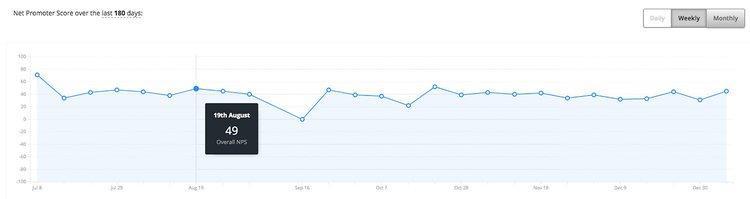
Hotjar graphs your quantitative NPS data to show changes over time
4 steps to effective quantitative data analysis
Quantitative data analysis sounds way more intimidating than it actually is. Here’s how to make sense of your company’s numbers in just four steps:
1. Collect data
Before you can actually start the analysis process, you need data to analyze. This involves conducting quantitative research and collecting numerical data from various sources, including:
Interviews or focus groups
Observations, from tools like heatmaps or session recordings
Questionnaires, like surveys or on-page feedback widgets
Just ensure the questions you ask in your surveys are close-ended questions—providing respondents with select choices to choose from instead of open-ended questions that allow for free responses.
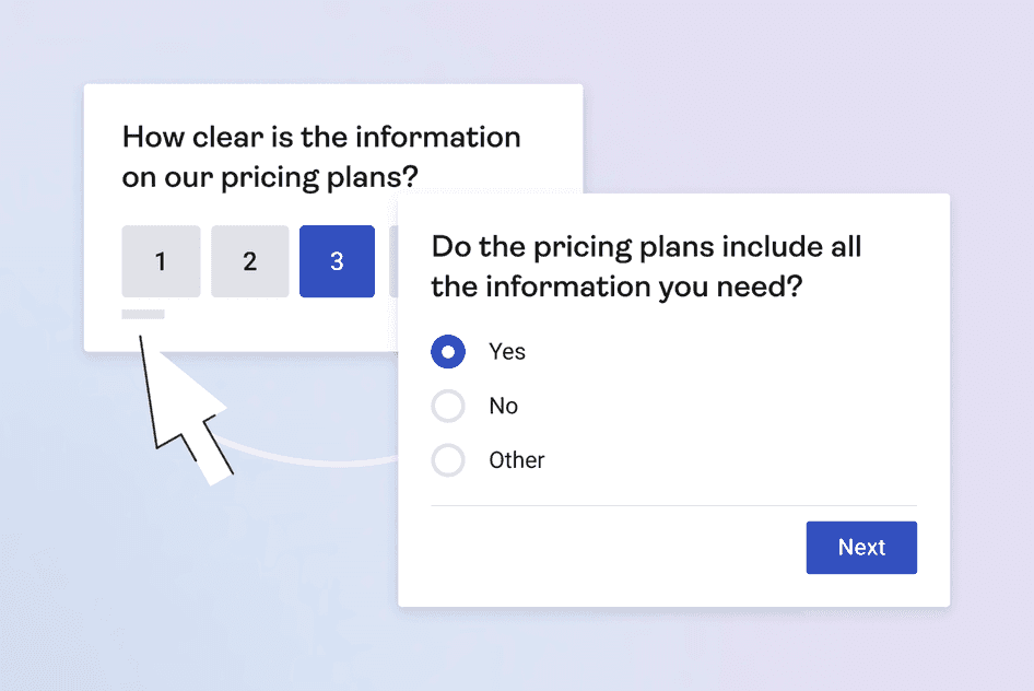
Hotjar’s pricing plans survey template provides close-ended questions
2. Clean data
Once you’ve collected your data, it’s time to clean it up. Look through your results to find errors, duplicates, and omissions. Keep an eye out for outliers, too. Outliers are data points that differ significantly from the rest of the set—and they can skew your results if you don’t remove them.
By taking the time to clean your data set, you ensure your data is accurate, consistent, and relevant before it’s time to analyze.
3. Analyze and interpret data
At this point, your data’s all cleaned up and ready for the main event. This step involves crunching the numbers to find patterns and trends via mathematical and statistical methods.
Two main branches of quantitative data analysis exist:
Descriptive analysis: methods to summarize or describe attributes of your data set. For example, you may calculate key stats like distribution and frequency, or mean, median, and mode.
Inferential analysis: methods that let you draw conclusions from statistics—like analyzing the relationship between variables or making predictions. These methods include t-tests, cross-tabulation, and factor analysis. (For more detailed explanations and how-tos, head to our guide on quantitative data analysis methods.)
Then, interpret your data to determine the best course of action. What does the data suggest you do? For example, if your analysis shows a strong correlation between email open rate and time sent, you may explore optimal send times for each user segment.
4. Visualize and share data
Once you’ve analyzed and interpreted your data, create easy-to-read, engaging data visualizations—like charts, graphs, and tables—to present your results to team members and stakeholders. Data visualizations highlight similarities and differences between data sets and show the relationships between variables.
Software can do this part for you. For example, the Hotjar Dashboard shows all of your key metrics in one place—and automatically creates bar graphs to show how your top pages’ performance compares. And with just one click, you can navigate to the Trends tool to analyze product metrics for different segments on a single chart.
Hotjar Trends lets you compare metrics across segments
Discover rich user insights with quantitative data analysis
Conducting quantitative data analysis takes a little bit of time and know-how, but it’s much more manageable than you might think.
By choosing the right methods and following clear steps, you gain insights into product performance and customer experience—and you’ll be well on your way to making better decisions and creating more customer satisfaction and loyalty.
Collect quantitative customer data with Hotjar
Use Hotjar’s tools to gather the customer insights you need to make quantitative data analysis a breeze.