Learn / Guides / User testing guide
6 user testing examples to help you create better products (with a free checklist)
User testing is often that ‘must-do’ task on your product checklist that gets ignored because there are so many different opinions on exactly what to test, which methods to use, and the different steps involved.
For example, how do you know which challenges warrant a full-blown A/B test and which just need a customer interview? And what are the results you can expect from a user test?
Analyzing successful user testing examples helps you answer all these questions.

This chapter looks at six real-life examples of how businesses successfully conducted user testing and the results they achieved. We also give you advanced tips on how you can emulate their practices to overcome your product optimization challenges.
Plus, we give you a free downloadable user testing checklist so you can align your objectives, assign tasks, and get started right away.
Learn how to improve your product with user testing examples
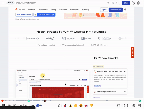
Hotjar’s user testing tools show you how users respond to your website or product.

6 real-life user testing examples to learn from
Seeing user tests applied to real-world challenges helps you understand the depth of your own user experience (UX), so you can validate assumptions about user behavior and preferences and make effective product decisions.
Before we dive into the examples, let’s first take a look at the most popular user testing methods and tools out there today:
Surveys: directly ask your users how they feel through strategically crafted survey questions and polls
Interviews: conduct one-on-one interviews to understand the nuances behind your users’ opinions
Focus groups: gather a group of users together to discuss and provide feedback on your product or service
A/B tests: test two different versions of your product to see which performs better with your users
Heatmaps: analyze user behavior on your website or web app by visually mapping where they click and spend time
Recordings: record and analyze user interactions with your product to identify pain points and opportunities for improvement
Now, let's explore how six companies used Hotjar’s digital experience insights tools to conduct user testing and improve UX.
1. How Bannersnack increased landing page sign-ups and feature adoption
Bannersnack, an online banner-making tool, was in a tough spot: web analytics had alerted them to low conversions, so they knew they needed to do something to boost their metrics, but had no insight into how people were using their tool and why they weren’t taking action.
Tool 1: heatmaps and A/B testing
Bannersnack turned to Hotjar (👋), a user testing and digital experience insights platform, to make sense of their quantitative data.
They first analyzed heatmaps to understand which elements users were engaging with or ignoring on their landing pages. They learned that the majority overlooked their main call to action (CTA), so the team enlarged and added contrast to the button to capture people’s attention more.
They then A/B tested the different CTAs and confirmed that users responded better to the landing page with the bigger and more prominent button.
By implementing the changes heatmaps and A/B tests highlighted, the team increased sign-ups by 25%.
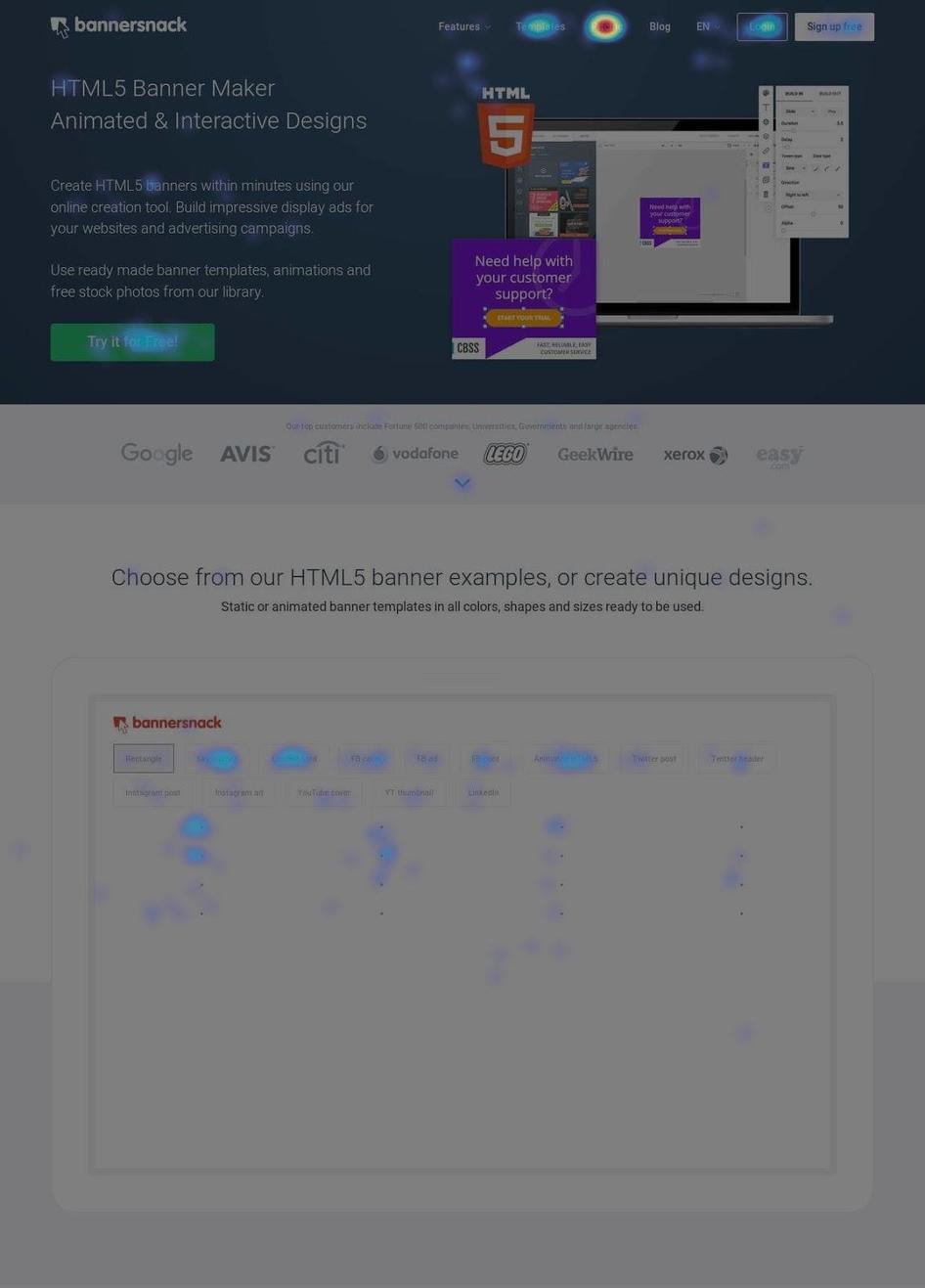
Before
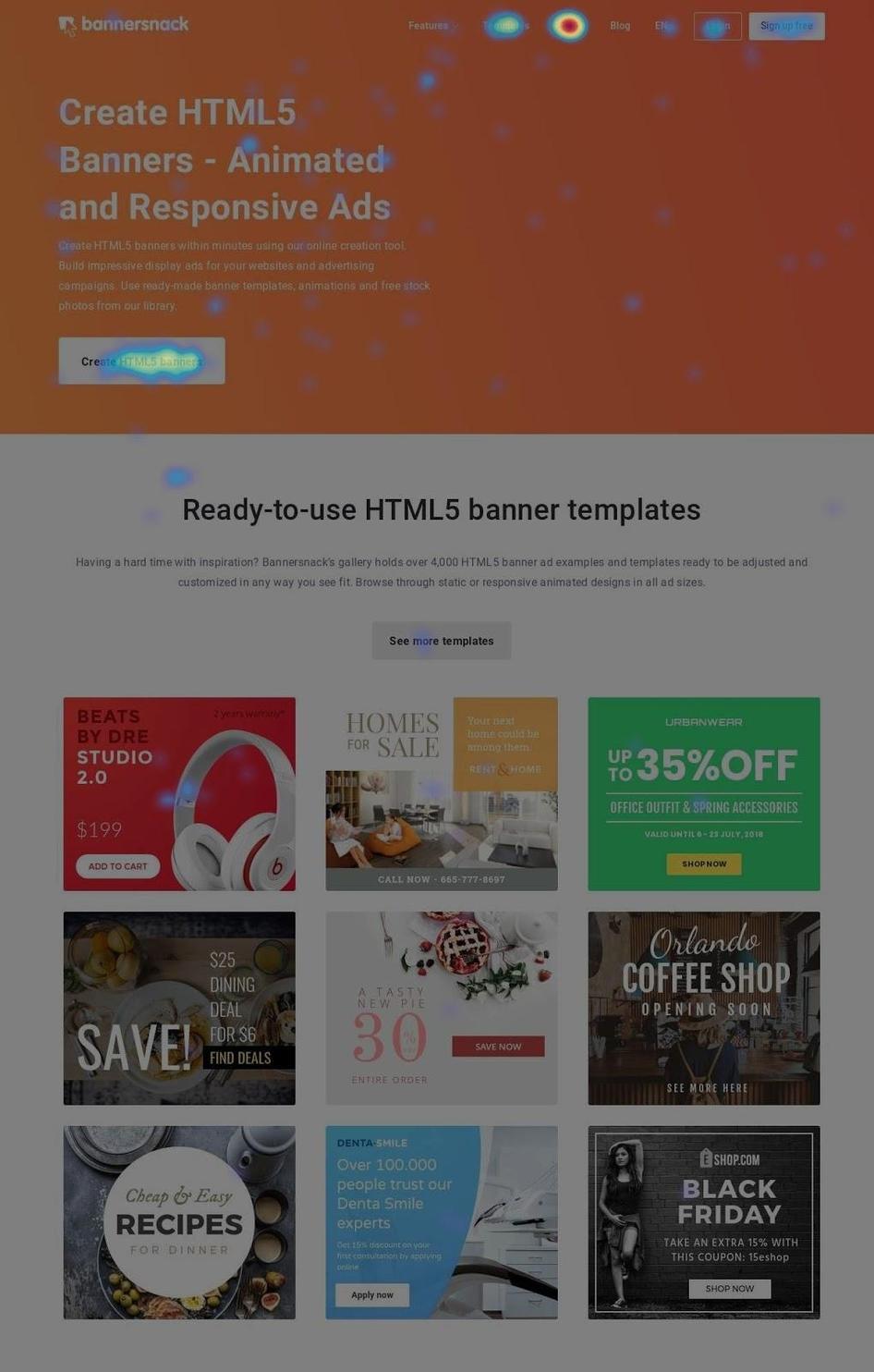
After
Tool 2: recordings
After watching several session recordings with the Hotjar Recordings tool, the Bannersnack team realized many customers were overlooking their new ‘Timeline’ feature—it wasn’t quite as visible to users as the designers had initially hoped.
The fix was simple: they added the word 'Timeline' to a button and repositioned it slightly.
This easy change drove up signups by another 12%.
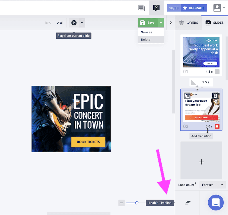
Before
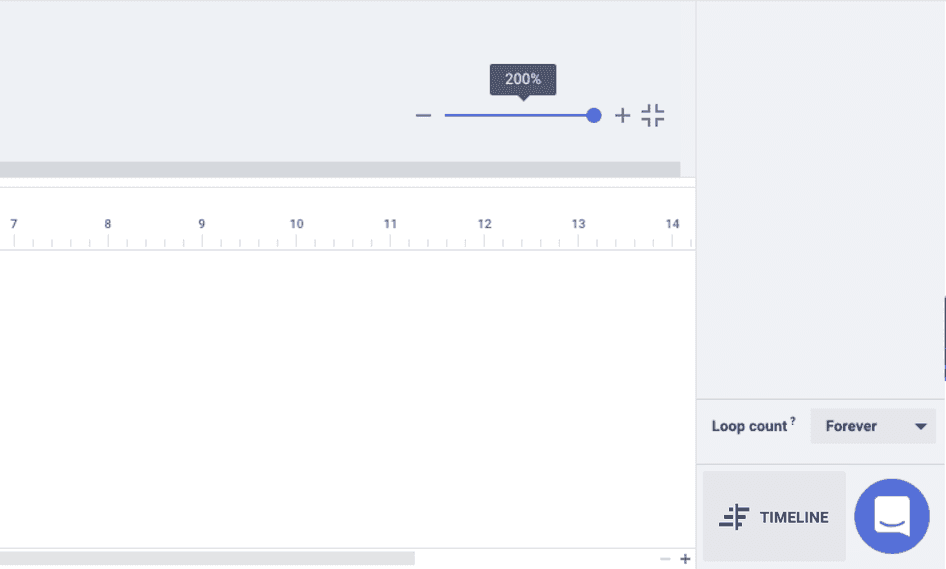
After
🚨Key takeaway: observe how your users engage with your product by using tools like session recordings and heatmaps to ensure important elements like CTA buttons and features are crystal clear and visible.
💡Pro tip: apply filters to your recordings to discover user frustrations or pain points. For example, you can filter Hotjar recordings by:
Rage clicks: users repeatedly clicking over an element that could indicate a website bug, a broken link, or an image that they think is clickable but isn't
U-turns: people who navigate to a page then quickly return back to the previous one

Frustrated customers take their anger out on text, image, or button elements that don’t work how they expect
2. How Doodle boosted conversions by 300%
Doodle, a meeting scheduling tool, was suffering from inconclusive and often misleading in-tool data, which frustrated the team because they didn’t know how to optimize the product to increase adoption. So they decided to conduct user tests and see what their tool was missing.
Tool 1: recordings
Using Hotjar Recordings, Doodle’s team observed users connecting empty calendars instead of real ones to their accounts—an insight that was absent in Doodle’s data.
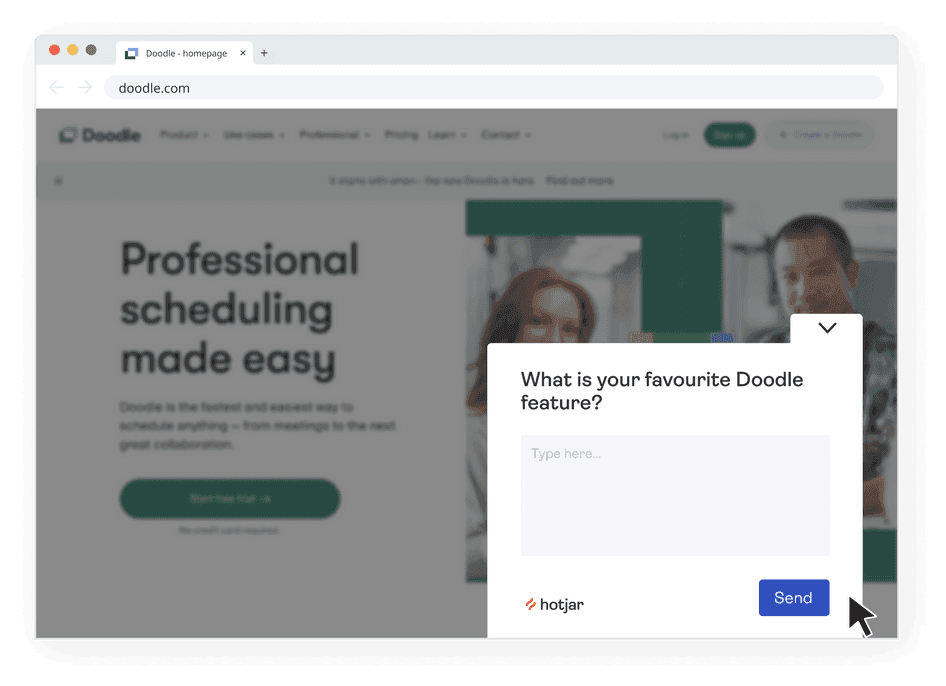
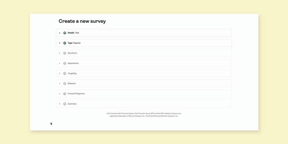
Tool 2: surveys
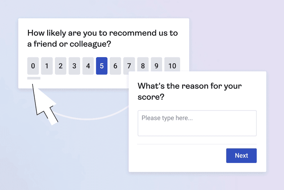
Doodle also used Hotjar Surveys to ask open-ended questions about their features and the overall user experience, so they could understand what their customers truly loved about the tool.
Acting on the insights from user testing by making it easier for people to connect calendars and focusing on popular features, Doodle increased conversions by 300%.
🚨Key takeaway: instead of relying on your gut and making assumptions about what your users want, ask them—and validate your product decisions.
💡Pro tip: use Hotjar Feedback and Surveys to gather real-time feedback from users as they interact with your website and directly ask them questions like:
How easy was it to navigate our website and find what you were looking for?
How satisfied are you with your overall shopping experience on our website?
What could we do to improve your experience?
What questions or concerns were not addressed during your shopping experience?
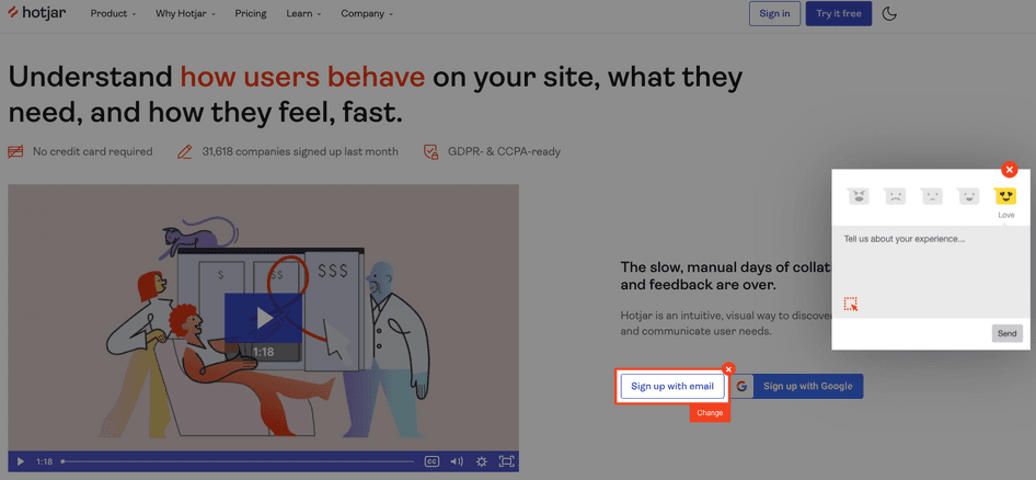
The Hotjar Feedback widget lets users highlight parts of your website or product they have trouble with or enjoy
3. How Every.org increased donations to charities by 29.5%
Every.org, a donation platform making it easy for people to donate and for nonprofits to collect their donations, had a problem: donors were struggling with the process of making donations, and abandoned the site as a result. Dave Sharp, Every.org’s Senior Product Designer, set out to discover exactly what was causing friction, turning to user testing for assistance.
Tool 1: 1-on-1 interviews
Dave first sat down with users to ask them questions about how they felt about different website elements.
While he learned a lot through these in-person discussions with users, he was aware of potential bias: users tend to try to 'say the right thing' to please the interviewer, skewing results. To complement and validate these insights, he needed objective data.
Tool 2: recordings
Dave then turned to Hotjar Recordings, filtering his session recordings by URL and then watching them by relevance to gain clarity on the qualitative insights from interviews.
He saw that:
Users were rage-clicking on the ‘donate’ button
Very few users were first adding their card details and then proceeding to donate (which was the intended user flow) because the two buttons were parallel
Since adding the card was a regulatory requirement, Dave redesigned the flow to proceed to the ‘donate’ page only after users uploaded their card details. He also added an FAQ section to help users understand what donating with Every.org meant in terms of fees and taxes.
Tool 3: A/B tests
Dave then A/B tested the new flow against the previous one to see the impact of the redesign.
Recordings from the A/B test showed that users had stopped rage-clicking and were actively interacting with the FAQs before proceeding to donations.
Both changes were successful, leading to a 29.4% increase in conversions for Every.org.
🚨Key takeaway: ensure your user flows and customer journey are obvious and that users know what they have to do next to complete an action—like checking out. Don't just assume everything is going well—conduct a 1:1 interview where you watch users navigating your website, so you can see exactly where they stumble and ask follow-up questions.
💡Pro tip: use Hotjar Engage to schedule and run interviews with your own users or access Hotjar's pool of more than 175,000 testers. For example, you can use Hotjar to schedule interviews with users from different nationalities and job titles.

Automatically screen and filter users with Hotjar Engage to make sure you’re speaking to the right people
4. How re:member increased affiliate conversions by 43%
Steffen Quistgaard, Senior Marketing Specialist for re:member, a credit card company, noticed visitors from affiliate pages abandoning their credit card application form more often than usual.
Steffen wanted to find out exactly why the application was confusing people, so he conducted user tests.
Tool 1: recordings
After reviewing session recordings in Hotjar, Steffen noticed users were:
Repeatedly hovering over the benefits section
Scrolling up and down instead of filling out the form
He concluded users were behaving this way because they wanted to learn more about the benefits but didn’t know how. So he turned to click heatmaps for more insight.
Tool 2: click maps
After Steffen examined click maps, a category of heatmaps that show the number of clicks in a specific spot, he saw that users were:
Tapping repeatedly on the benefits section even though it was unclickable
Trying to expand the bullet points (to reveal more details)
Navigating back to the homepage to get more info
Putting together all these insights from recordings and click maps, Steffen realized that users (especially those from affiliate links) wanted more information about the application’s benefits before they could make a decision.
Steffen and his team then redesigned the forms to add information in a way that was visible, accessible, and referable:
On mobile, they moved the ‘benefits’ section to the very top
On the desktop version, they created expandable fields for more details on features
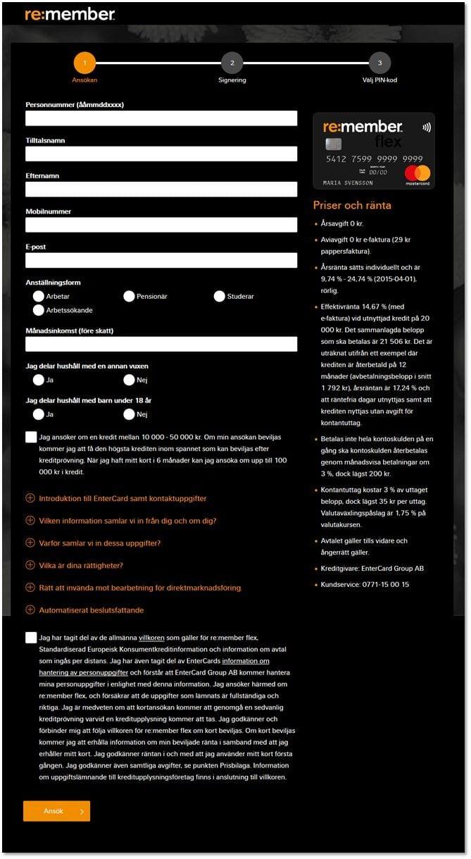
Before
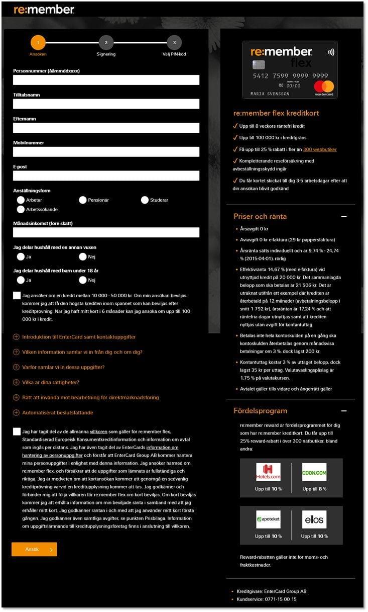
After
Tool 3: A/B tests
Steffen’s team then A/B tested the new and old pages to validate their insights. With Hotjar, they could watch recordings of the pages they were A/B testing, which revealed that visitors had more clarity and moved faster on the new version.
As a result of the redesign, re:member’s conversions from affiliate links improved by 43% and 17% overall.
🚨Key takeaway: ensure your users understand your product’s value—the benefits they’ll get from adopting it—and place that information in prominent locations on your page. Use scroll maps and click maps to ensure users are seeing this key information.
💡Pro tip: use Hotjar Heatmaps filters to segment visitors by criteria such as by country or new vs. returning to develop a nuanced understanding of user behavior.
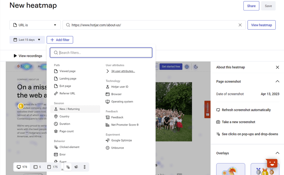
Filter your heatmaps with Hotjar to dig deeper into specific users' behavior
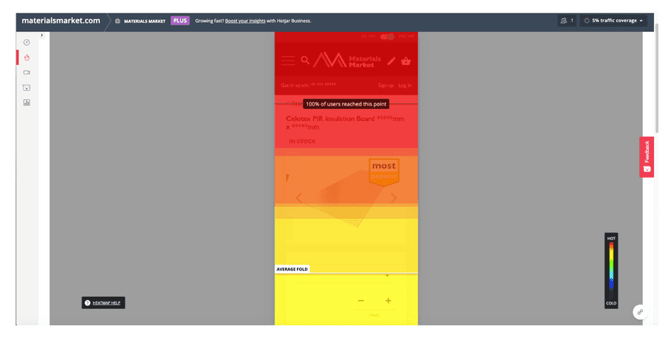
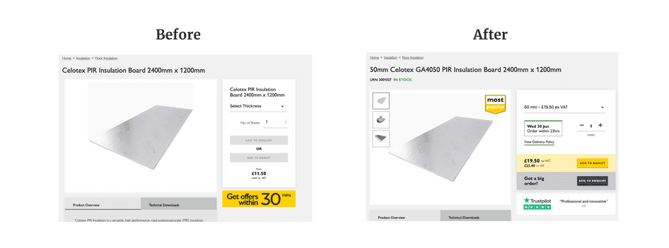
5. How Materials Market improved CTA clicks
The team at Materials Markets, a portal for material buyers and suppliers, noticed they had a high bounce rate and wanted to identify blockers in the user experience.
In particular, they wanted to see how their customers were interacting with the newly released ‘Instant Purchase’ option.
Tool 1: recordings
Andrew, the co-founder, watched Hotjar Recordings every day for 20 minutes to see how users were behaving on the site and realized people were:
Confused by multiple CTAs as they were hovering over the buttons uncertainly before dropping off
Navigating to checkout to see delivery times and then back
Tool 2: heatmaps
The team also reviewed heatmaps for both desktop and mobile devices. The heatmaps for mobile users showed that people didn’t scroll far enough down the page to see their CTA.
With the knowledge from heatmaps and recordings, Materials Market:
Changed the color of the two CTAs so they looked different
Moved the estimated delivery date to the page before checkout
Raised the CTA higher up the page on mobile
As a result, their conversions increased from 0.5% to 1.6%.
🚨Key takeaway: ensure your primary CTA is above the average fold on your website, so users don’t have to scroll down the page to see it. Also, don’t neglect your mobile experience when testing your product—60% of all internet users access the web through their mobile devices—to ensure your design is responsive.
💡Pro tip: use Hotjar concept testing to validate your new initiatives and designs, without spending money on A/B tests. Do this by adding images to surveys across your web pages and invite user feedback on elements like logos, messaging, color palettes, homepage layouts, or ads.
Hotjar Concept Testing showing an ‘add image’ option for survey questions
6. How DashThis increased customer satisfaction by 140%
DashThis, an online report-making tool, was losing customers in the onboarding flow, but they didn’t have a clue as to why.
This was the precursor to an even bigger problem: if users didn’t complete the first two steps, their reports showed up empty—shattering customer satisfaction.
The team turned to user tests to find exactly why users were struggling.
Tool: surveys and recordings
DashThis used Hotjar Surveys to ask people questions about the onboarding flow and then analyzed the relevant recordings of the users who had responded. They learned:
Users didn’t know where to click to add integrations (buttons were either not prominent or completely invisible)
The list of integrations was unsegmented and confusing
To fix these issues, the team added a search bar to the integrations’ list and incorporated pop-ups, videos, and different types of content to guide the user step-by-step through onboarding. They also redesigned buttons, making them bolder and more visible on small screens.
As a result, 50% more users completed onboarding and DashThis’s customer satisfaction saw a 140% increase, according to results from a Net Promoter Score® survey.
🚨Key takeaway: is your website really as clear as you think it is? Do people have the resources they need to easily complete tasks with your product? Ensure your users have all the information they need to complete their jobs to be done by asking them with interviews, a feedback widget, or surveys.
A 10-step checklist to successfully conduct user testing
Since user tests have multiple moving parts, we’ve created a handy step-by-step task checklist so you know exactly how to conduct user testing.
Simply download the PDF version of our checklist here and share it with your team.
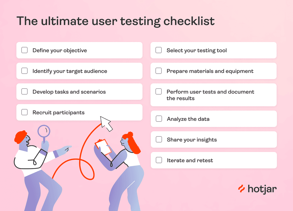
Define your objective: what exactly are you hoping to learn from your users? Is it how they navigate your landing page or why they’re abandoning carts? Get crystal clear.
Identify your target audience: who are your users? What are their demographics? What’s their experience with your product?
Develop tasks and scenarios: create tasks and scenarios that reflect real situations your users might encounter when interacting with your product
Recruit participants: identify potential users and recruit them using survey or interview tools. Consider using a user testing platform to find participants who match your target audience.
Select your testing tool: find one that fits within your budget while also meeting your goals. Hotjar has a free forever Basic plan that gives you access to unlimited heatmaps and 35 session recordings every day.
Prepare materials and equipment: prepare any materials or equipment, such as survey questions, consent forms, or recording equipment
Perform user testing sessions and document the results: follow your test plan and document any issues you find
Analyze the data: review the data and look for patterns or trends. Consider using a spreadsheet to organize and analyze your data.
Share your insights: create a summary of your findings and share them with your team. Use your user testing results to improve your product or service.
Iterate and retest: adapt your product based on user feedback, then test again. Celebrate your successes and use what you've learned to continue to improve your product.
Make user testing an integral part of your workflow
User tests strengthen your relationship with your audience in multiple ways: you understand what they like (the quantitative) and why they like it (the qualitative).
But user testing is not a done-once-dusted-forever kind of exercise. As your users evolve, so do their needs. So make user tests a cyclical part of your product optimization process, and watch your product stickiness, customer satisfaction, and retention soar.
Use Hotjar to see how customers respond to your product updates
Want to understand where your customers stand?