Learn / Guides / Web design guide
12 brilliant examples of web design to inspire you in 2024
Great website design helps users achieve their goals and keeps them coming back. But unless you have the nine muses of Greece at your beck and call, getting inspiration and ideas can be tricky.
Summary
Truly experienced website builders ensure user needs are front and center when designing sites. We’ve created a handy list of the 12 best website design examples so you can get inspired and emulate great design practices on your own website.
When you draw inspiration from the website design ideas we provide, remember to adapt them to your unique users and product, and validate your changes with key customer groups (let our web design checklist guide you along the way).
In this chapter, we walk you through the best examples of
Use Hotjar’s tools to get direct insight into user behavior to guide your website design decisions.
The best website homepage designs
A well-designed homepage builds trust, communicates value, and steers users toward their next steps by showcasing your product’s unique ability to solve their problems.
Let’s explore a few excellent examples of website homepage design.
1. Airbnb
Airbnb is a popular short-term vacation rental company with hosts and properties worldwide.
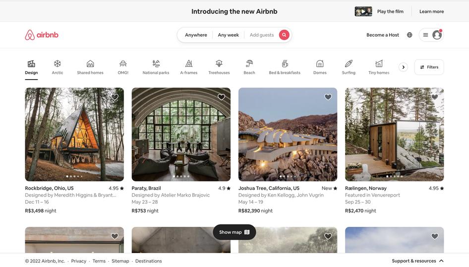
Airbnb’s homepage immediately greets users with the destination and date search form they came to find, guiding them to the next logical step in their customer journey. The navigation bar has eye-catching icons that segment listings into various easy-to-find categories.
The design also includes a smart search form, which auto-fills the user’s last search to minimize friction when they use the site. It’s a good example to emulate for websites with a diverse product offering that want to give users a fast and reliable way to perform searches. Adding an intuitive and findable search bar function with filter options allows users to quickly find what they’re looking for.
Airbnb’s homepage also displays stunning, high-quality graphics of rentals all over the world to create urgency and inspire users to book their Airbnb and start traveling. Media elements—like a video right above the navigation bar—engage users to convert.
Its user-centric and inviting visual design has helped it connect with more customers, attract more bookings, and increase brand awareness.
💡 Pro tip: read how to create a homepage that delights people the moment they land on your site and gain indispensable insights with a freemium user behavior analytics suite like Hotjar, part of the Contentsquare group.
2. Dropbox
Dropbox is a file hosting service that offers cloud storage, file synchronization, and client software.
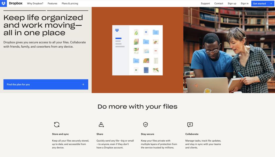
Dropbox’s site design features eye-catching geometrical shapes filled with slideshow examples of what users can accomplish with their product. The simple, catchy subheading, 'Do more with your files,' clearly states what Dropbox helps users achieve. Dropbox also lists its best features in a bar below the subheading to quickly summarize their value in a visually appealing and easily digestible way.
As well as helping users understand the product’s unique selling proposition (USP), the Dropbox homepage clearly guides users on what to do next. The navigation bar stands out in white against the darker shapes below to highlight its ‘Get started’ and ‘Find the plan for you’ call-to-action (CTA) buttons—helping users complete their desired actions and contributing to conversion rate optimization (CRO).
These techniques are especially useful for feature-heavy websites like interactive video conferencing web apps. Start by using segmenting techniques to ‘chunk’ information in ways that are aesthetically pleasing and easy to understand. This helps you guide users through key features, letting them dynamically interact with the information presented.
3. Freshbooks
Freshbooks is a cloud-based accounting software company.
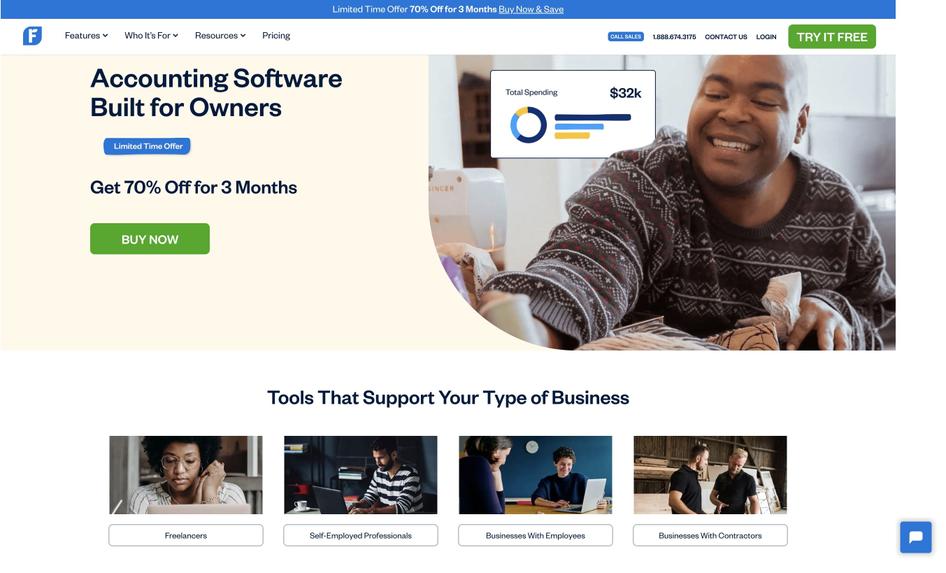
Freshbooks’ homepage design is clear and straightforward with minimal copy, a simple beige background, and strategic use of white space.
They’ve used color contrast to their advantage, with blue and green CTA buttons that stand out against the background color scheme, making it clear what actions they want users to take when they arrive.
Freshbooks’ sub-navigation section is well-categorized, with labels like ‘Tools to support your type of business’ that easily help visitors find solutions for a variety of use cases, clearly prioritizing accessibility and showing empathy for their users’ particular pain points.
This design is especially useful for websites such as SaaS companies that offer a simple solution to complex user problems. Start by defining clear navigation categories and using labels that highlight key use cases. This will increase users' likelihood of exploring your site and converting into paying customers.
💡 Pro tip: use Hotjar Heatmaps to observe where users click, scroll, and move on your homepage, and see which parts of your UX design compel them to convert. Uncover points of friction and usability issues with rage click maps, then consult visual data from Engagement Zone heatmaps to identify which elements users interact with the most. Then, you can use the insights you collect to guide your homepage design decisions and delight users.
The best responsive website designs
Responsive websites give users a streamlined, consistent, and adaptable experience across various devices and screens, whether they're using a mobile phone, desktop, or tablet.
Let’s check out some great examples of companies that put cutting-edge web design trends and techniques to good use in creating responsive sites.
4. Shopify
Shopify is a global ecommerce platform that helps users easily set up online stores.
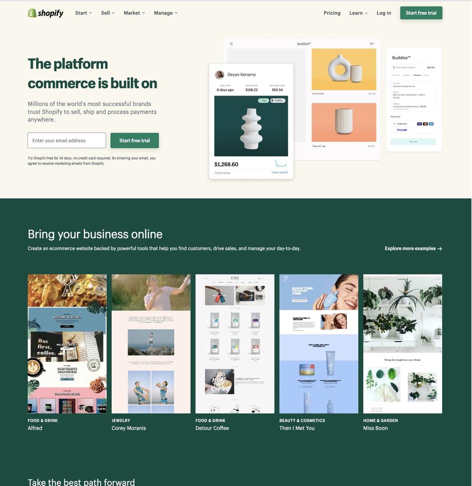
Shopify offers a consistent user experience (UX) across all devices by adapting its CTAs and illustrations for users browsing from desktop vs. mobile devices.
On personal computers and tablets, Shopify’s main CTA button is to the right of the form field. On smaller mobile displays, it’s underneath, so it displays clearly and provides an intuitive experience for users scrolling down on touchscreen devices.
The mobile version also collapses the email sign-up field into a small icon that expands when clicked, driving users to convert without crowding the screen.
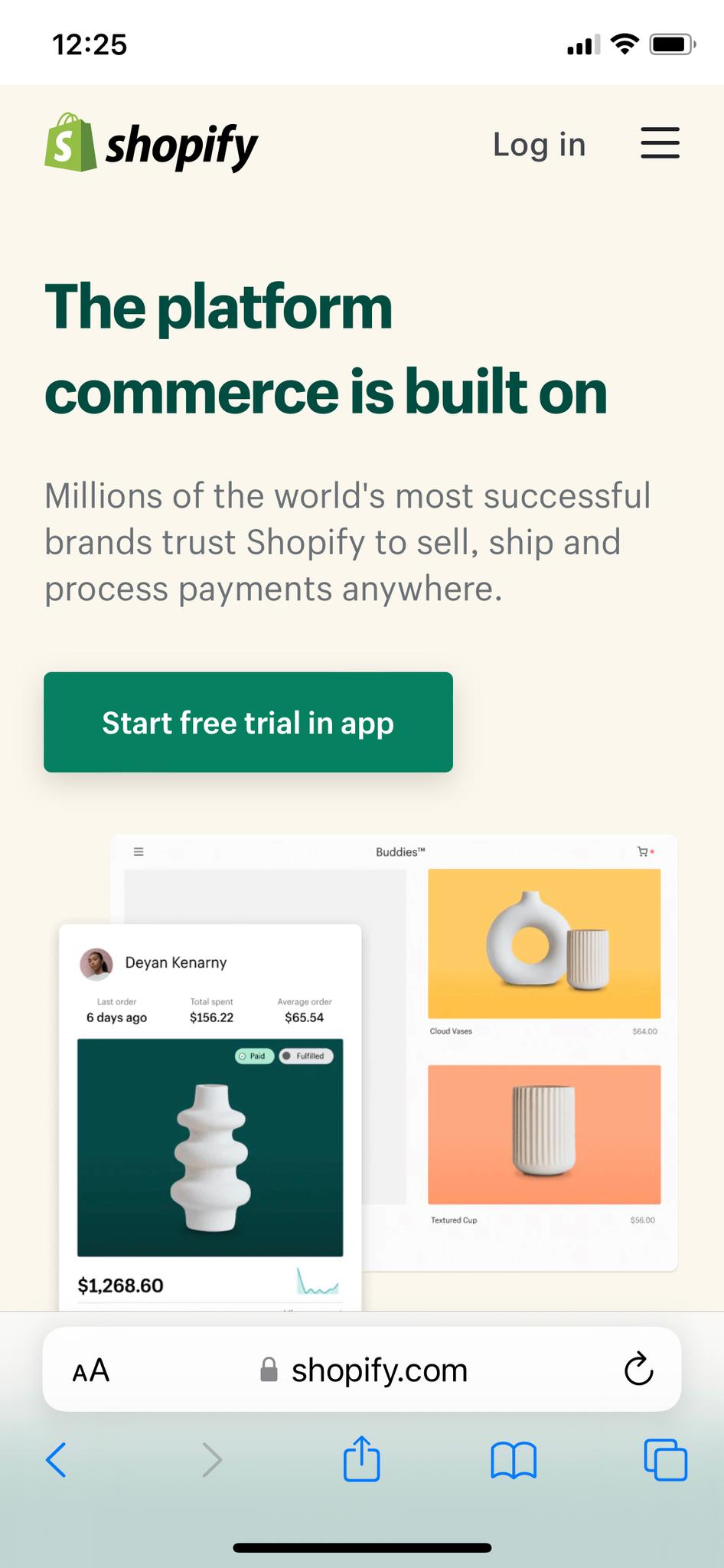
Shopify’s design is great for ecommerce sites looking to inspire users to adopt their product or service. Start by adapting CTA placements for device-specific use and streamlining menus and images to remove unnecessary steps and offer a responsive, consistent experience.
💡 Pro tip: the way people interact with your mobile and desktop sites will vary, so you’ll need to test and fine-tune each version separately. To supplement your responsive web design strategy, use Hotjar’s web optimization tools to leverage user insights and perfect your mobile UX design.

Hotjar’s tools help you ensure your site looks good and is user-friendly on any device
5. Slack
Slack is a workplace-based messaging platform.
Slack integrates its playful, empathetic brand values into its quirky and responsive web design. For example, their navigation menu shrinks to a ‘hamburger icon’ on mobile, with the search icon highlighted to facilitate intuitive user browsing.
Slack’s flexible, responsive grid layout also quickly adapts to various device sizes. They use a three-column layout on desktop and a single-column layout on mobile for elements like customer logos.
The layout highlights and personalizes the website’s CTA buttons, depending on where the user accesses the site from: on desktop, it’s 'Try for free', and on mobile, it’s 'Get Slack for iOS'. This customized experience encourages users to take action on the device they’re currently using.
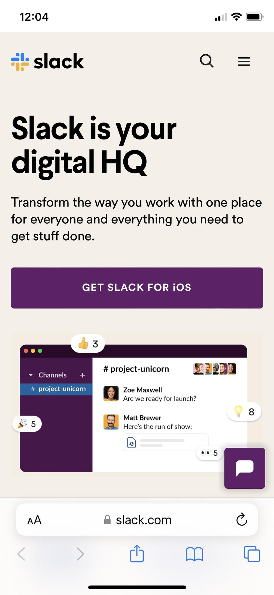
Take inspiration from Slack if you want a responsive, user-friendly design that stays true to your brand’s core values. Emulate their responsive design by focusing on key navigation elements, like adaptable menus, CTAs, and grid layouts.
6. WIRED
WIRED is an American magazine focused on the impact of emerging technology.
WIRED’s website has a dynamic layout featuring several columns and a sidebar on desktop devices, which changes to a single column on mobile devices for easy user navigation.
Image ratios are also adapted to the device—rectangular sizing on desktop becomes a 16:9 ratio on mobile.
For added simplicity on mobile, they’ve collapsed icons for search and newsfeed filter functionality into a single expandable button. Their navigation menu is streamlined, with only their logo, a menu icon, and a link to subscribe visible.

If you plan to include a lot of content on your website, look to WIRED for inspiration. Their site is a great reminder of the importance of responsive, flexible design. Ensure you adjust all media elements—images, videos, text boxes, typography, fonts, and headlines—for different screen sizes.
Use Hotjar’s tools to get direct insight into user behavior to guide your website design decisions.
The best checkout page designs
A well-designed checkout page helps users enter their information, complete their order, and select options like 'shipping method' without any friction. Poorly designed checkout pages can deter customers from completing their purchases, increasing cart abandonment rates and churn.
Let’s explore some great examples of checkout page design to inspire you to create your own seamless checkout experience for users.
7. Walmart
Walmart is a multinational retailer that operates a chain of hypermarkets.
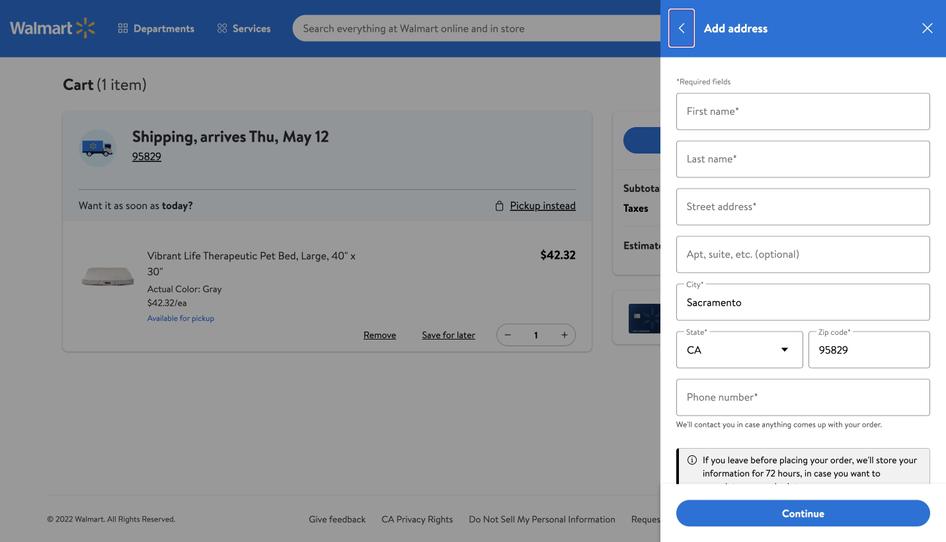
Walmart’s checkout page design prioritizes clarity: it limits distractions, only displaying the checkout form and the item(s) in the cart, making it easier for customers to move smoothly through the checkout process.
Its streamlined three-step checkout journey doesn’t lead the user to a new page for every step, where they might click away. Instead, Walmart uses an on-page checkout sidebar to simplify the process, letting you complete your purchase without signing up for an account, which makes for a frictionless user experience.
They also include a 'cart storage' option: users are told that their information is stored for up to 72 hours so they can complete their checkout later. Cart storage gives customers the option to return when it’s convenient for them without having to start over—and potentially add more items to their cart.
Walmart’s a great case study of a retail giant with a frictionless checkout design. Build an easy, intuitive checkout process by minimizing steps, including cart storage, and using on-page sidebars so users don’t have to load a new page at every stage of the buying process.
💡 Pro tip: if your checkout flow is failing to convert visitors into customers, ask them directly about their experience. Use Hotjar Surveys to get user feedback and find out which checkout process features work best for your audience and market.
Place a pop-up poll in the corner of a checkout screen, or seamlessly embed a customer effort survey anywhere on the shopping cart page. Get started with one of our templates for a cart abandonment or post-purchase survey, or get to the heart of what users think about your web design in no time at all with Hotjar AI for Surveys to fast-track and automate the entire process, from survey creation to response reporting.

A Hotjar cart abandonment survey
8. Nike
Nike is a world-renowned sportswear company, with an ecommerce website that showcases several different products.
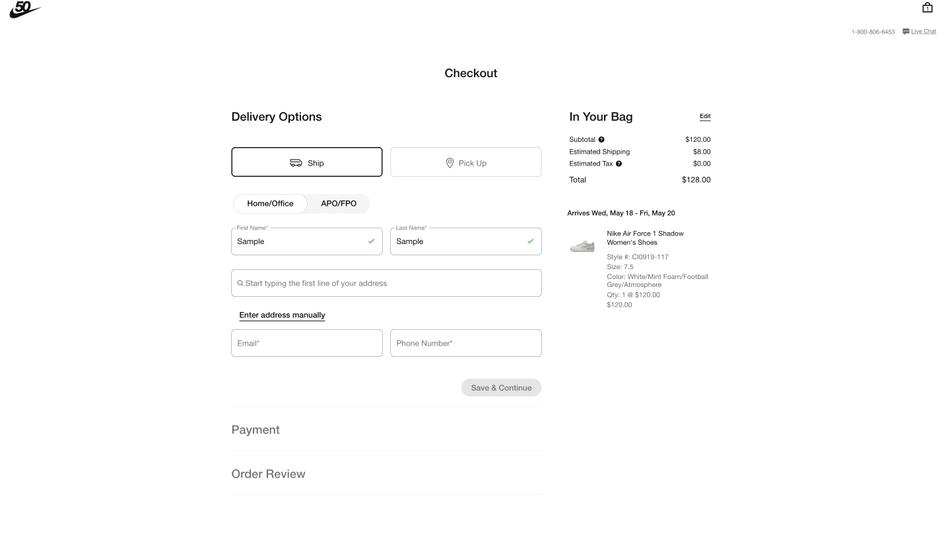
Nike's checkout page uses minimalist design and copy, letting users complete their purchases in three simple steps without logging in.
The checkout user interface is reactive to input: a green checkmark appears when users correctly enter their information, so they know what’s been registered and what to do next.
Nike’s checkout page also auto-fills addresses so the user doesn’t have to input their details multiple times, lessening the likelihood of abandoned carts.
This is a great example of a minimal design with optimal efficiency. To emulate it, simplify your checkout process by auto-completing time-consuming steps, and make sure every element reacts to user input, so users can see their information has been logged.
9. ASOS
ASOS is an online fashion and cosmetics retailer.
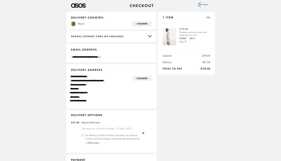
ASOS proves that the best checkout pages aren’t necessarily the flashiest: they use a simple design with streamlined copy, including clear, specific information boxes for the user to fill out.
Their simplified form reminds users of what’s in their cart while clearly displaying the price, any additional costs, and available shipping options, so all the information users need is in one place. The trust badges on their checkout page also reassure users that their financial information is secure.
If you want to create an intuitive checkout process like ASOS, limit on-page distractions and display all of your key checkout information in one place, so users can scroll through and see exactly what data they’ve provided at every stage.
💡 Pro tip: use Hotjar Recordings to watch users as they interact with your checkout page. Track where they get stuck, where they drop off, or where they u-turn to quickly fix any bugs or issues and streamline your checkout process.
Session recordings are particularly useful for web design because they let you see how users interact with individual design elements, allowing you to make fast, data-informed changes. Hotjar also lets you easily zoom in from a heatmap to investigate corresponding recordings of individual user sessions to see entire checkout journeys, or do the reverse and zoom out from a recording to the Heatmaps and Trends tools to discover checkout behavior patterns and track changing page metrics.
Award-winning website designs
Learn from the best of the best. Take a look at these award-winning website design examples and consider how you could repurpose them to fit your users’ specific needs and reach your product goals.
10. IBM
IBM is a multinational technology company that won Awwwards’ ‘Site of the Month’ prize in July 2021.

IBM’s engaging design offers visitors an immersive visual and auditory experience. Users are first prompted to put on headphones to get the full website experience—but even if they skip this step, they’ll be engaged by the responsive background that moves as they navigate through the web page.
They also use visual storytelling to explain how their tools work in the real world—turning complex tools (like AI) and their product vision into an easily understandable experience for users. Site visitors can also explore three user stories through video game-like functions to learn more about IBM’s Watson tool.
Finally, the website layout is well balanced, with a large title that grabs users’ attention and a bold blue CTA.
IBM is a great example of a streamlined website focused on a complex concept. To emulate their design, get creative: think of your site as an immersive experience and look for ways to create user delight through images, audio, and animation.
💡 Pro tip: as the saying goes, form follows function—your web design, even if it looks amazing, would be useless if it didn’t function properly. Consult our web design best practices to improve your site’s look, feel, and experience.
11. Hyer
Hyer is a private jet rental company that was awarded ‘Website of the Month (2022)’ by the CSS Design Awards.
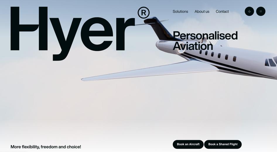
Hyer makes a strong impression on website visitors with a striking illustration that slowly moves across the screen as you scroll.
This central image tells a story, but thanks to the strategic use of white space, it doesn’t feel overwhelming. Hyer compels users to learn more about the brand without being too vague, prompting customers to look around and embark on their journey beyond the initial landing page.
The site features a simple but effective tagline, two clear CTAs, and an easily accessible navigation bar, helping users intuitively find their way around the site.
Hyer is a good example of web design based around a central image or focal point. Put their design ideas into practice by adopting a 'less is more' approach: look to spark users’ interest on your homepage, but don’t necessarily tell users everything right away. Use engaging, minimal design to let site visitors discover your brand in their own flow.
12. Superlist
Superlist is a task and project management app that changes the way teams work and collaborate. In April 2021, it won the Awwwards ‘Site of the Month award.
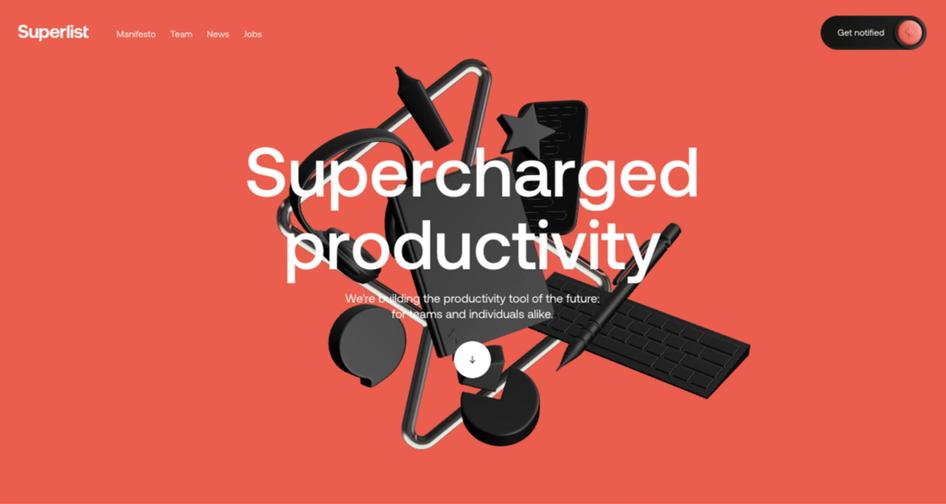
Superlist’s interactive homepage displays various workplace items that dynamically move and shift as users scroll, enticing them to keep exploring the site while delivering a unique product experience.
To help with navigation, Superlist includes a small button with an arrow icon to indicate that there’s more to see on the page. Once you scroll, unique animations, bright color palettes, and changing shapes engage users as they get to know the product. Superlist also includes playful, dynamic icons that communicate its brand identity—the site’s loading icon is a thunderbolt filling up with a charge.
Superlist’s design is a good option for SaaS companies looking for a contemporary design that guides users through interactive elements. Focus on creating a seamless scrolling experience, and add dynamic elements with clear labels and icons.
💡 More website design inspiration
Here are some other places you can look to get inspired with web design ideas to help you create an engaging experience for your users:
Behance: search for good website design examples or check out their interaction design category
Dribbble: search for web design examples or interaction design
Awwwards: look at winners to find sites and elements you like and want to emulate
Your competitors: check out your competitors’ sites for website design ideas or to see what you could do better
Your users: your users should be your most important source of inspiration—talk to users to find out what design elements they’d like to see more of on your website and gauge how well your design is currently meeting their needs
💡 Pro tip: use Hotjar tools like Surveys and the Feedback widget to get direct insights from customers while they’re browsing your site—the best website design ideas cater to your users’ needs and expectations, and it’s best to get those straight from the source.

A Hotjar design satisfaction survey
✨ Inspired web design inspires users
User-centered web design lets you connect deeply with your audience, increase brand awareness, and give users a consistent experience they can look forward to.
Adapt great examples of web design to your users’ needs to create a dynamic website and a powerful UX. If you want to know exactly what it takes to get started on your own web design, check out this guide’s web design checklist chapter for an adaptable and streamlined design strategy.
Design your website with confidence
Use Hotjar analytics tools to get direct insight into user behavior and guide your website design decisions.
