Learn / Guides / Behavior analytics guide
13 important behavior analytics metrics for websites and digital products
Behavior analytics is the key to understanding what users need from your product or website. But how do you identify the most critical trends in user behavior—or learn how they change over time?
By tracking behavior analytics metrics, which gives you insights other research methods can’t.

This guide defines behavior analytics metrics, explains why they matter, and outlines the top 13 user behavior metrics you need to track to create customer delight.
You'll also learn how to use behavior analytics metrics in combination with other analytics tools and techniques to get a complete picture of your users’ experiences, motivations, and needs.
What are behavior analytics metrics?
Behavior analytics metrics are quantitative data points that show how users behave on your website or app. They record how users scroll, where they click or tap, and what actions they complete (or don’t complete) as a group.
This is useful for answering questions like:
Where are users getting lost or frustrated?
Which parts of your funnel get the least engagement?
What percentage of your users convert to a paid subscription?
When you combine these insights with qualitative data—from tools like session recordings and survey responses—you discover exactly what users need from your website or digital product.
How is behavior analytics different from traditional analytics?
Traditional web analytics tools (like Google Analytics) were originally developed to analyze traffic and ad spend. Some metrics these tools measure help you understand user behavior—but they won’t show you everything.
For example, traditional analytics will tell you how long users stay on a page, but not the actions they tend to complete there.
Behavior analytics complements traditional analytics with strategies like:
Analyzing heatmaps to find out where users click on your product page
Replaying recordings to learn what users do before abandoning a checkout page
Using surveys to gauge how users feel about your app (and why) at different stages of their journey
These data give you valuable insights into what users want. But to understand what users need (sometimes even before they do), you need to measure behavior—and that’s where metrics come in.
Behavior analytics metrics help you identify and track behavior trends
All your users are different, and you can rarely (if ever) meet 100% of their needs. But by tracking key metrics, you’ll find out what experiences and needs they have in common.
For example:
Your ecommerce checkout has a high exit rate, but high numbers of rage clicks indicate a bug or issue on the page
Only 1% of your app’s trial users are converting—but by measuring metrics, you find that only 20% make it through your onboarding sequence
Finally, after making improvements based on these insights, metrics let you track the impact your changes made.
13 behavior analytics metrics to track and analyze in 2023
Analytics tools are highly flexible; countless metrics could help you track user activity. This list looks at the most common (and useful) ones for websites, ecommerce, and digital products.
Best behavior analytics metrics for website analysis
The following user behavior metrics are crucial for any website, regardless of size or industry. Track these metrics to ensure your online presence consistently gives your users the experience they deserve.
1. Average session duration
Average session duration tells you how long users spend on your website or app. It measures each user’s session from the moment they enter your site, until they leave or become inactive.
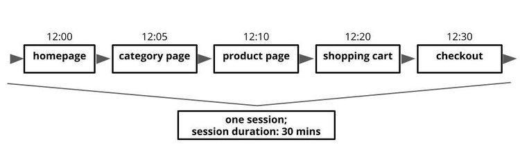
The aggregated session times are then divided by the total number of journeys to give you the average session time across all users (or a user segment).
What average session duration tells you
Checking your average session duration tells you how engaged users are with your content. As a rule of thumb, longer session duration is positive as it suggests users are getting value from your content or service.
On websites, average session duration is not an exact metric. This is because tools like Google Analytics can only measure up until your last interaction, i.e. the last time you navigated to a new page. This means they don’t ‘see’ the time you spent on your last page.
Despite this, it’s a helpful metric to measure over time to assess whether users engage more or less with your content.
Tools to track average session duration
You’ll find this metric inside Google Analytics, as well as product analytics tools like Mixpanel and Amplitude.
2. Average time on page
While average session duration measures users’ entire journey across your site, average time on page measures their average time on an individual page. This metric is particularly helpful when comparing multiple pages’ performance.
What average time on page tells you
There are two main ways to use this metric:
Gauge what users are interested in: if a specific piece of blog content has a higher score than others, it suggests your users find it particularly valuable.
Find problematic parts of your funnel: on pages where you'd expect users to stick around—like long-form support articles—short average time on page could mean the content isn’t meeting their needs.
Tools to track average time on page
Track this metric with Google Analytics and web analytics tools. (In the latest version of Google Analytics, it’s called ‘average engagement time’.)
💡Pro tip: average time on page can be hard to interpret—are users leaving quickly because they’re frustrated? Or because they got the answers they need?
If you’re using Hotjar, support your analysis by analyzing heatmaps (free forever on our Hotjar Observe plan) to see where users moved and scrolled. You can also set up a Hotjar Feedback widget to ask visitors directly what they think of your content.
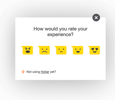
Hotjar Feedback lets you gather quantitative data on how audience segments feel about individual pages
3. Exit rate
Exit rate is a measure of how often visitors exit your website from an individual page. Each page on your website has its own exit rate, which is displayed as a percentage.
So if your product page has 100 visitors and 50 of them leave from the page, the page’s exit rate would be 50%.
What exit rate tells you
When you’re undertaking a funnel analysis, exit rates help you identify any pages that are poorly designed, buggy, or just not helpful to users.
There are some pages you’d expect to have a high exit rate—like your ‘Contact us’ page or ‘Thank you for purchasing’ page. However, if you have high exit rates on pages specifically designed to keep users moving through the funnel, a high exit rate could indicate a problem.
Tools to track exit rate
Track exit rates in Google Analytics, or with analytics tools like Amplitude and Mixpanel. For more guidance on analyzing this metric, visit our glossary page on exit rates.
🔥 If using Hotjar
To learn more about where and why users leave your site, check out the Funnels tool. View handy visualizations showing where visitors dropped off, then click to see recordings of what they did before leaving.
4. Rage clicks
Rage clicks are when a user clicks or taps multiple times in rapid succession. This behavior is generally an indicator of frustration, and rage clicks typically mean users are:
Encountering a link, button, or page element that isn’t working properly
Trying to click a page element that isn’t clickable
Getting frustrated because the website or app isn’t responding quickly enough

What rage clicks tell you
Because rage clicks indicate user frustration, they can help you identify performance issues and user experience (UX) design problems. Solving these issues enables you to improve customer retention by reducing friction across your website.
What’s more, because users sometimes rage click on non-clickable elements, rage clicks can also indicate what users want to see more of.
Tools to track rage clicks
Track rage clicks using behavior analytics platforms—like Hotjar!
🔥 If using Hotjar
Filter your Recordings to replay user journeys that include rage clicks. Then take a closer look at what went wrong.
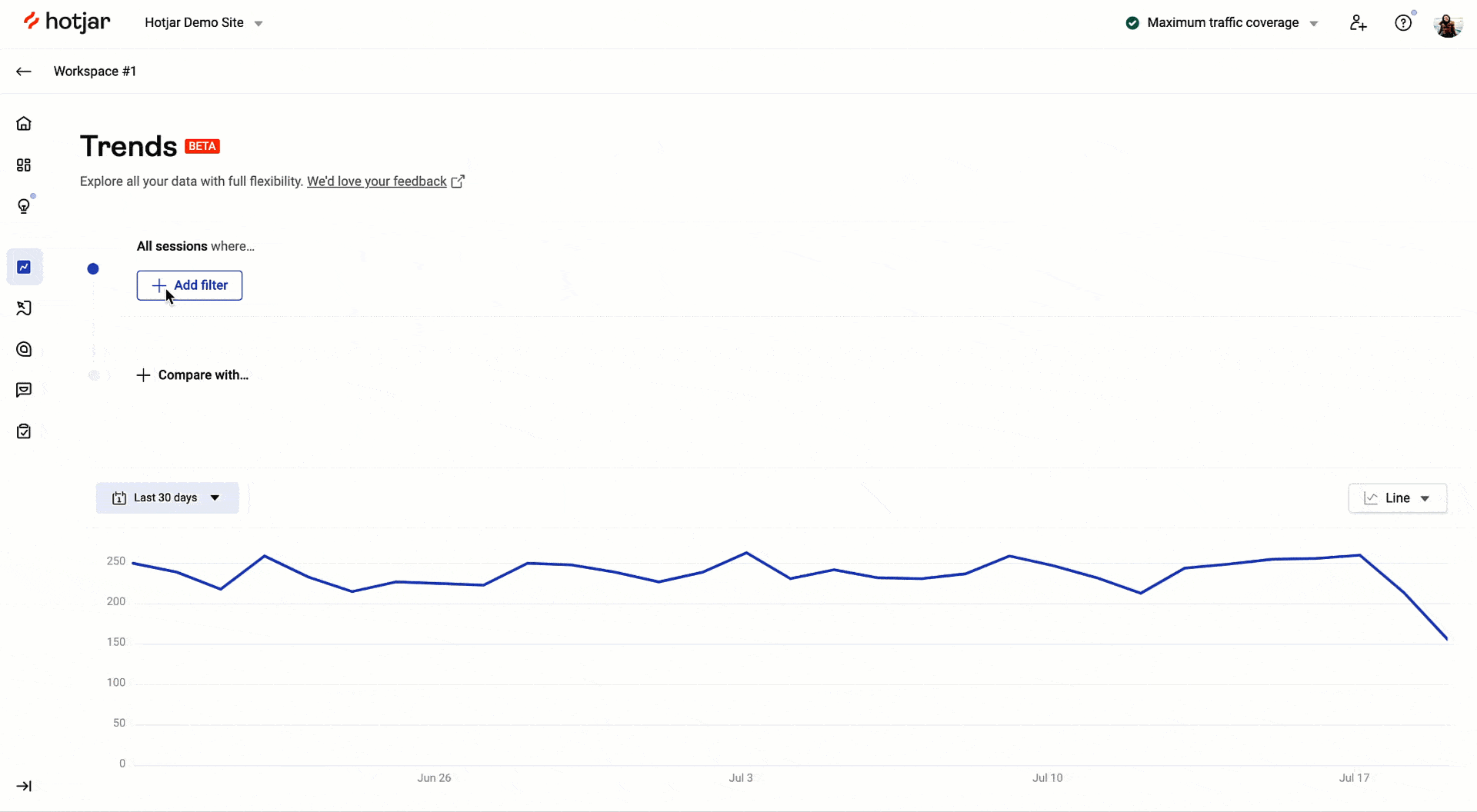
Use Trends to view a ready-made graph showing the number of rage clicks your site gets each month. Ideally, you want to see rage clicks decrease over time as you smooth out the bugs on your website.
5. U-turns
U-turns are when a user clicks through to a new part of your website before immediately returning to their previous page. This behavior suggests that the user is struggling to find what they need on your website—perhaps because of a poorly labeled menu or a broken link.
What u-turns tell you
Tracking u-turns helps you optimize your website or app in three ways:
Use session recordings to rewatch journeys featuring u-turns (so you can figure out why users were struggling)
Look out for high numbers of u-turns on specific pages to find bugs and issues
Monitor the total number of u-turns on your website as a general measure of how easily users can navigate it
Tools to track u-turns
Track u-turns with behavior analytics platforms. Hotjar, for example, lets you use filters to find recordings featuring u-turns. You can also use the Trends tool to visualize your u-turns over time.
🔥 If using Hotjar
Use the Hotjar Slack integration or Microsoft Teams integration to get an immediate notification in your team channel when there’s a new recording featuring a u-turn.
Best behavior analytics metrics for ecommerce stores
The following metrics aren’t only applicable to ecommerce, but they’re extremely helpful when trying to improve your online store’s customer experience.
6. Scroll depth
Scroll depth is a measure of how far users scroll down a specific page. This is helpful when you want to know if users scroll down to important page elements, like a call-to-action (CTA) button.
In general, you won’t look at scroll depths for individual users, but aggregated scores visualized in the form of heatmaps (specifically scroll maps). Scroll maps reveal how all visitors, or a segment of your audience, move down the page.
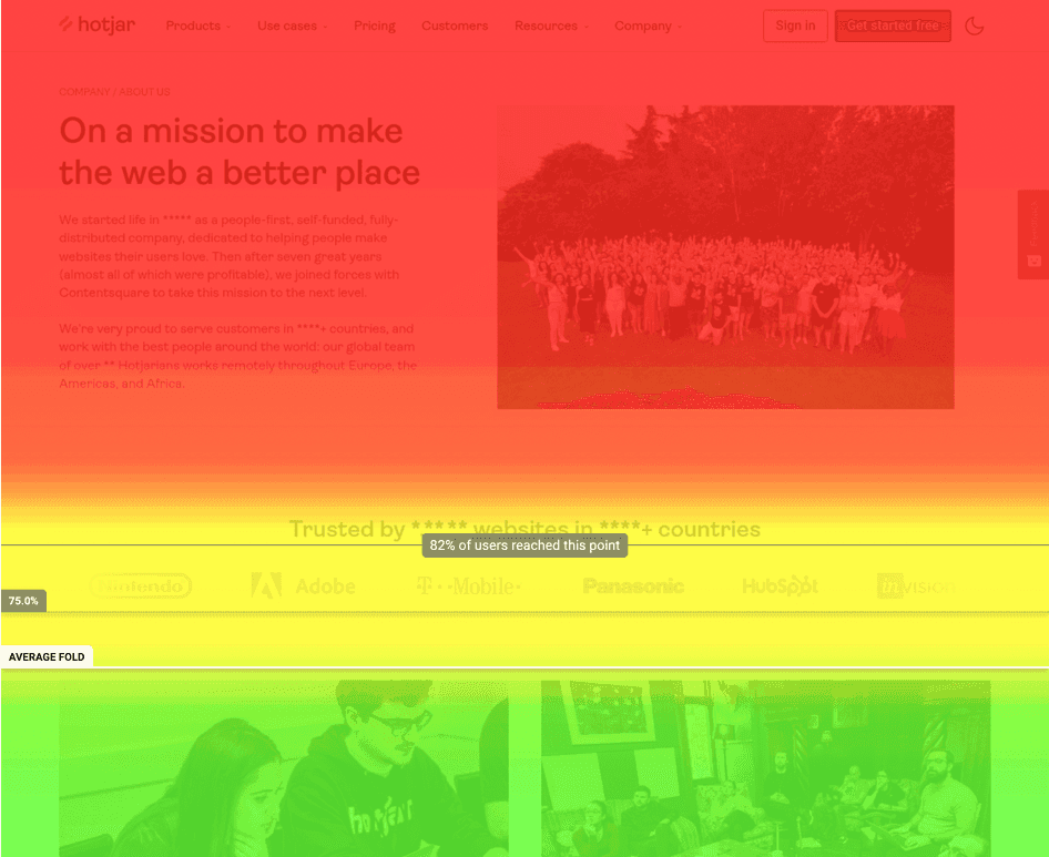
What scroll depth tells you
Scroll heatmaps are useful when you’ve identified a user behavior trend and want to learn the reasons behind it.
For example, suppose one of your product pages isn’t converting well. Looking at scroll maps, you notice most viewers aren’t scrolling down far enough to see your payment plans. Moving this element further up the page could tempt more users to convert, thereby increasing your revenue.
Tools to track scroll depth
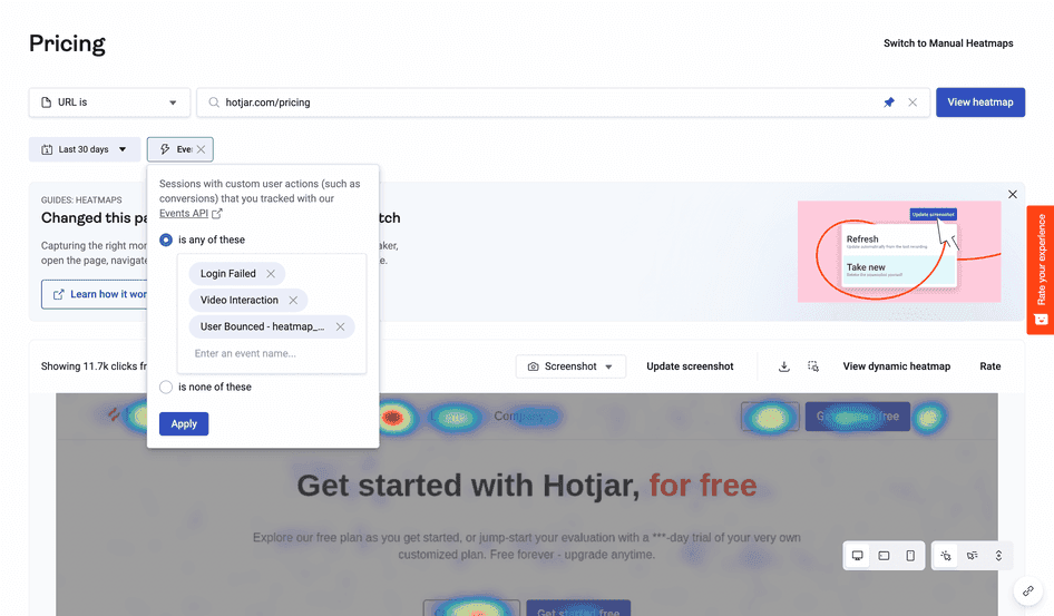
Scroll heatmaps are available in behavior analytics platforms. If you want to get insights on specific audience segments, choose a platform that lets you filter your heatmaps by specific actions users take—in Hotjar, these are called Events.
7. Bounce rate
Bounce rate is the percentage of users who visit a page and leave without taking further action.
For example, if 100 users land on your homepage and five of them exit the homepage without interacting or navigating further through your site, your homepage’s bounce rate is 5%.
While there are lots of reasons users might ‘bounce’, this metric generally indicates how engaged visitors are with your content.
What bounce rate tells you
For some content, like blogs, a high bounce rate may indicate users left because they got the answers they needed. However, it can also indicate that your users aren’t getting what they need from your page—and are going elsewhere to look for it.
For this reason, it’s helpful to track bounce rate when you’re running paid ad campaigns. If too many users are bouncing from your landing page, it suggests you have poor-fit traffic, a slow-loading website, or content that isn’t helpful to your visitors.
Tools to track bounce rate
Track this metric in Google Analytics, or with ecommerce analytics platforms like Geckoboard and Cartflows.
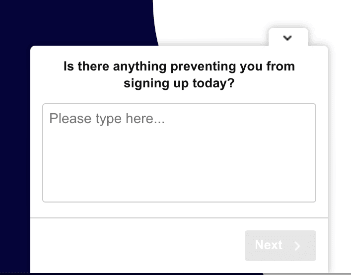
💡Pro tip: not sure why users are leaving? Scroll maps can show you how much of the page they’re actually reading. To investigate even further, set up a survey (available on any Hotjar Ask plan) to ask visitors what they want from your content.
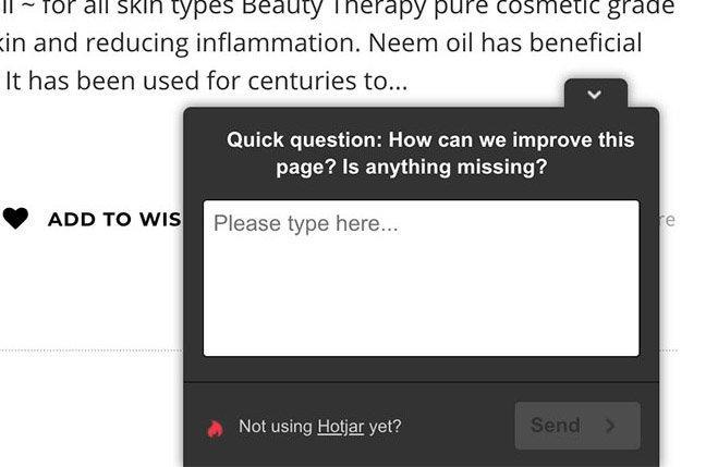
Hotjar Surveys give you qualitative data to support your behavior analytics metrics
8. Add-to-cart rate
Tracking how often visitors add items to their shopping cart can be enlightening for ecommerce businesses. Even though shoppers don’t always complete their purchases, it gives you an idea of how many visitors want to buy your products.
What add-to-cart rate tells you
This metric helps you assess whether you’re successfully optimizing the purchasing process for your users. You’ll want to compare your number of ‘Add to cart’ clicks with the number of completed purchases.
If you’re successfully removing friction from the purchasing process, the gap between the two figures should decrease over time.
Tools to track add-to-cart rate
Ecommerce platforms like Shopify and BigCommerce track this metric for you. And if you’re selling via a mobile app, product analytics platforms will track your add-to-cart rate via integration with Google Analytics.
9. Cart abandonment rate
Cart abandons are instances where a visitor adds an item to their shopping cart but leaves before completing the purchase. A visitor might abandon their cart for all sorts of reasons, but it’s often a sign they encountered friction—like a website bug or a shipping cost that took them by surprise.
What cart abandonment rate tells you
Every abandoned cart represents lost revenue, so as an ecommerce business, you’ll want to reduce them over time. Look for ways to remove friction and increase support for shoppers, then check the cart abandonment metric to see if your initiatives worked.
Tools to track cart abandonment rate
Track this metric in Google Analytics or with your ecommerce analytics platform of choice.
Best behavior analytics metrics for digital products
Most of the website metrics we looked at previously are also useful when analyzing user behavior in apps. However, the following metrics can give you additional insights unique to digital products.
10. Trial sign-ups
If you’re attracting customers through a free trial, trial sign-ups are one of the fundamental metrics you’ll track. Free trial users are this close to the final stages of your sales funnel, and each one is a potential paying customer.
What trial sign-ups tell you
Tracking trial sign-ups reveals how many people coming across your app are interested in trying it. With this data, you can see how many users convert to paying customers—and then work to improve your conversion rate over time.
Tools to track trial sign-ups
Many businesses use Google Analytics and Google Tag Manager to track specific events. Integrating this data into product analytics tools gives you additional options for analyzing and visualizing these metrics.
Note: you can also track trial sign-ups (and other important actions) using Events in Hotjar with our Google Tag Manager integration.
11. Micro-conversions
Before your visitors convert to paid customers, they'll often complete smaller milestones along the way, such as:
Watching a demo
Completing an onboarding sequence
Creating their first report
It’s helpful to think of the primary goal—converting to a paid account—as a ‘macro-conversion’, and the smaller milestones as ‘micro-conversions’.
Measuring micro-conversions helps you better understand the customer journey and track how users progress through your funnel.
What micro-conversions tell you
Tracking micro-conversions helps you with two key goals:
1. See what parts of your app users are interested in
2. Identify the weakest parts of your funnel, or the parts where users need the most help
Imagine users need to complete five actions, in sequence, before signing up for a paid account. Because you’re tracking these actions as micro-conversions, you learn that most users only complete the first two—so something’s going wrong in the third step.
Now that you’ve identified the weak link, you can conduct further investigations to find out why users are getting stuck.
Tools to track micro-conversions
Track micro-conversions in Google Analytics, or with your product analytics platform of choice. (Read more in our quick guide to micro-conversions.)
🔥 If using Hotjar
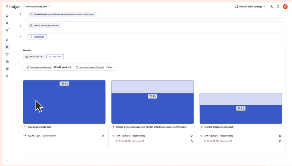
Hotjar lets you track micro-conversions—like users clicking a button—by setting them up as events. Then, use the Funnels tool to get an instant visualization of exactly where users are dropping off.
Next, view relevant recordings and heatmaps to take a closer look at what users are doing.
12. Conversion rate
In the software-as-a-service (SaaS) industry, your main conversion rate is the percentage of users signing up for a paid account. Depending on your business model, they may have come from a trial account or gone straight to a paid subscription.
To calculate your conversion rate, divide your total number of paid account sign-ups by your total number of opportunities (like trial sign-ups). Multiply that by 100 to get a percentage.
What conversion rate tells you
A high conversion rate means you’re successfully convincing visitors your app is worth paying for.
This is one of your most fundamental metrics, used to predict revenue over time. Plus, your conversion rate helps you assess parts of your funnel that impact conversions—like your pricing page and app onboarding.
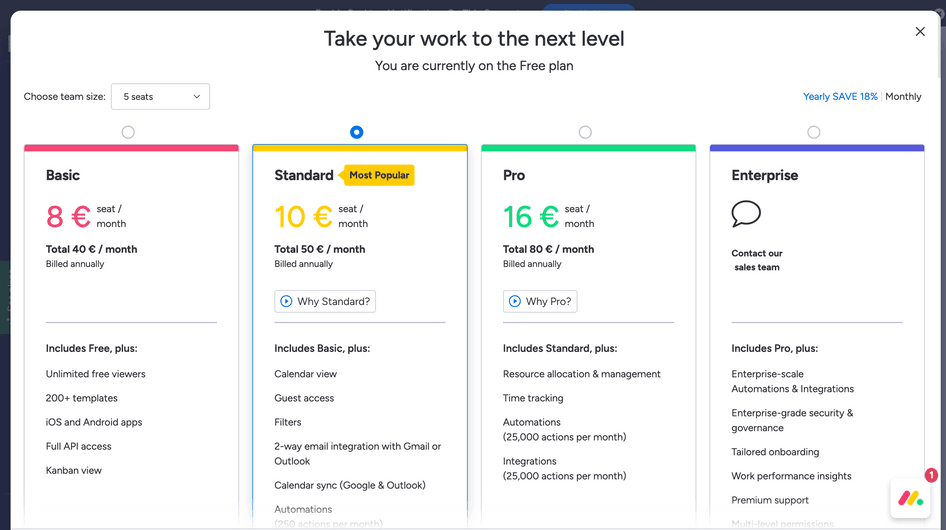
Like many SaaS companies, Monday uses an upgrade/pricing page to drive conversions
Tools to track conversion rate
Your payment processing tool will log your new subscription sign-ups. Import this data into a product analytics platform to track and visualize your conversion rate.
Some businesses use Segment to cross-reference data from several systems and check conversion rates for different audiences, channels, or marketing campaigns.
🔥 If using Hotjar
Use the Hotjar-Segment integration to understand trends you identify with other tools. If you see a drop in conversions, check which audience segments are most affected, then set up a Hotjar Survey to ask them about their experiences.
13. Daily active users
Daily active users (DAU) tracks how many users actively engage with your app each day. It’s a good way to assess how ‘sticky’ your app is—i.e. to what degree users continue engaging with your app after signing up.
However, this metric is subjective because there’s no official definition of an active user. For some companies, it’s anyone who opens their app. For others, it’s a user who completes key actions, like clicking on a core app feature.
What DAU tells you
Active users are the lifeblood of your app—the more you have, the more you can drive revenue and other growth metrics. Conversely, a drop in active users could spell disaster for your app’s success.
With this in mind, DAU helps you determine the general health of your app in terms of the value users get from it. Tracking DAU also lets you assess whether changes have improved or worsened the app experience.
Note: consider calculating weekly active users (WAU) and monthly active users (MAU) to see the bigger picture of how your app’s stickiness changes over time.
Tools to track DAU
The most appropriate tools here will depend on your definition of DAU:
If you’re defining a DAU simply as someone who visits your app, use Google Analytics for a readout of unique visitors
If you’re defining a DAU as someone who completes specific actions, it may be easier to use dedicated analytics tools like Heap or ProfitWell Metrics
Bring the right data together to get deeper insights
Tracking behavior analytics is essential when you want to understand what users need from your website or digital product. What’s more, customer expectations—and your competition—can evolve rapidly, and the right metrics show you when and where to adapt.
However, serving your users often requires looking below the surface of the metrics you track. Be sure to arm yourself with tools that gather both qualitative and quantitative data, so you can explore the reasons behind trends. It’s the smartest way to understand your users—and create experiences that keep them coming back.
Track the metrics that matter
Hotjar lets you visualize user behaviors like rage clicks, u-turns, and conversions over time.
