Learn / Guides / Data analysis for marketers
Mastering the data analysis process: a 5-step guide for marketers
Your data analysis process gives you a snapshot of who your users are, what they expect from you, and how successful your marketing campaigns are at converting them.
It also provides you with the evidence you need to demonstrate your successes and helps you understand if and when your marketing strategy needs to change.

With so many metrics and priorities competing for your attention, it can be hard to settle on a data analysis process that’s time-efficient but still gives you meaningful insights to base decisions on.
This article helps you cut through the noise with a five-step user-centric data analysis process, so you can dig deep into your customers’ needs and desires, and plan and execute campaigns that really resonate.
TL;DR
To understand the impact of your marketing efforts and get an idea of what to do next, your data analysis process should involve
Choosing relevant metrics to track based on your business goals to hone your marketing tactics
Gathering data by choosing which tools you’ll use to track your metrics and setting them up on your relevant platforms
Analyzing your insights by looking for patterns in the data you’ve collected
Sharing your findings with stakeholders, presenting them in an easily digestible format
Making plans based on your learnings to refine your marketing tactics
A 5-step data analysis process for marketers
Digging into quantitative and qualitative data helps you understand your customers on a deeper level, so you can plan campaigns that speak to them directly.
Follow these five steps to come up with a user-centric data analysis process. Regularly check in with your data, and you’ll know when to pivot your marketing tactics, and when to celebrate your wins.
1. Pick your metrics
As a marketer, there are dozens of metrics you could be tracking to get insights into who your users are, what drives them, and whether they’re responding to your campaigns.
Many marketers center their data analysis around one North Star metric—the number that’s most connected to your revenue and long-term success—such as conversions, sales, or active users. When planning which metrics to track, prioritize those connected to your North Star, and which you’ll be able to infer patterns from over time.
It’s important to track quantitative data—information that’s expressed in numbers—but don’t overlook qualitative data—non-numeric information about how your users feel and behave. It’s easy to over-prioritize hard numbers in data analysis, but if you want to understand why key figures look the way they do, subjective user insights are gold.
Study the user behavior behind your metrics
Add Hotjar’s tools to your data analysis process to dig deeper into user behavior—and observe how it influences your metrics.

Quantitative data to track
Conversion data: customer acquisition costs (CAC), average order value (AOV), customer lifetime value (CLV), customer retention rates
Ad data: ad spend, return on ad spend (ROAS), engagement rate, click-through rate (CTR), cost per click (CPC), cost per lead (CPL), return on investment (ROI)
Social media data: reach, impressions, CTR, engagement rate, follower growth rate, number of likes and comments
Email marketing data: open rate, CTR, reply rate, unsubscribe rate
Website data: traffic, bounce rate, exit rate, CTR, drop-off rate
Qualitative data to track
Customer demographics: the age, gender, geographical location, hobbies, career sector, income, likes and dislikes of your target user base
Brand awareness: the extent to which people in your target market have heard of your business, and the sentiment they feel toward it
User behavior: customer satisfaction or frustration when experiencing your site or product
💡 Pro tip: use qualitative data insights to build a clear picture of your ideal customer persona (ICP)—an imaginary best customer ever, who would adore your product or service.
Use Hotjar to easily launch a user persona survey on your website for free. Target it to appear only to users with qualities you want your ICP to have—repeat customers, for example—with the User Attributes feature.
Once you’ve compiled your survey findings to create an ICP profile, you can tailor your marketing to appeal to exactly this demographic of users—and attract superfans.
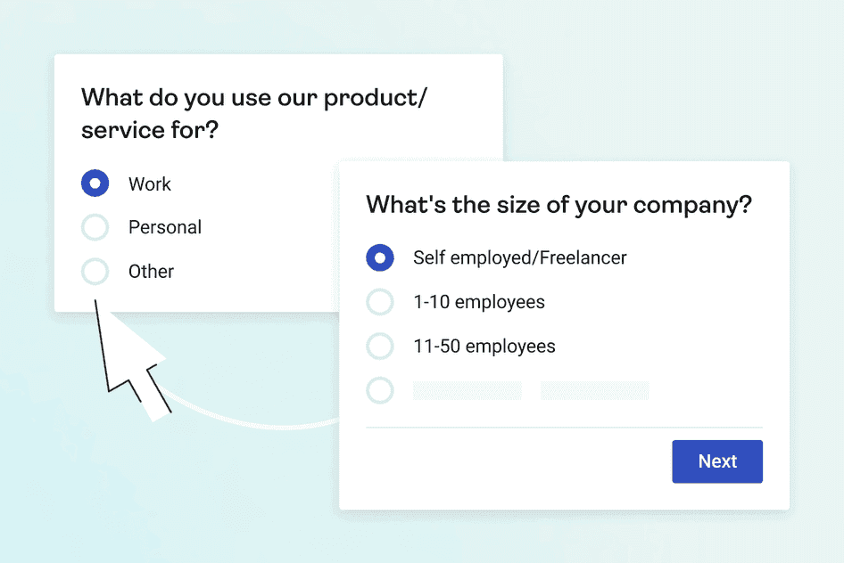
Gather essential demographic information about your customers with Hotjar’s user persona survey template
2. Select your tools and start collecting data
Whichever metrics you’re tracking, you’ll need to collate data from a number of sources. Here’s the software you’ll need to track your data points.
Analytics platforms: use platforms like Hotjar, Google Analytics, or Adobe Analytics to collect and analyze user behavior data on your site
Social media analytics: use social media platforms’ own native analytics tools or third-party ones like Hootsuite, Sprout Social, or Buffer to understand your performance on social media
Ad analytics: use the native analytics tools of advertising platforms such as Google Ads, Meta Ads, or Amazon Ads
Email marketing software: use platforms like MailChimp, Constant Contact, or Klaviyo to track email campaign metrics, like open rates and click-through rates (CTR)
Feedback tools: use a platform like Hotjar Engage to set up user interviews to investigate customer demographics and brand sentiment. Also, use the Surveys tool to gather demographic data and user opinions.
💡 Pro tip: use Hotjar to collect the data you need to make informed marketing decisions.
The Heatmaps tool creates a visualization of user behavior trends on your web pages, using colors to reveal what users click on, engage with, or ignore. Heatmaps also show whether the elements and information on a page are in the best order to help users achieve their conversion goals—or not.
The Recordings tool captures anonymized videos of users’ cursors as they navigate your site. Watch them to understand what your users’ paths to conversion look like, and spot ways to make these paths smoother.
The Dashboard tool offers a big-picture overview of your website data. This includes hard numbers—metrics such as most visited pages, bounce rate, and session duration—alongside qualitative insights—such as heatmaps, survey results, and recordings, so you can understand the qualitative reasons behind your user behavior statistics.
The Funnels tool visualizes your user journeys and shows you how many users drop off at each stage. Click on any stage to watch a recording of users’ cursors at each step in your funnel, in the moments before they drop off. This helps you understand why users decide to exit your conversion funnel at the point they do.
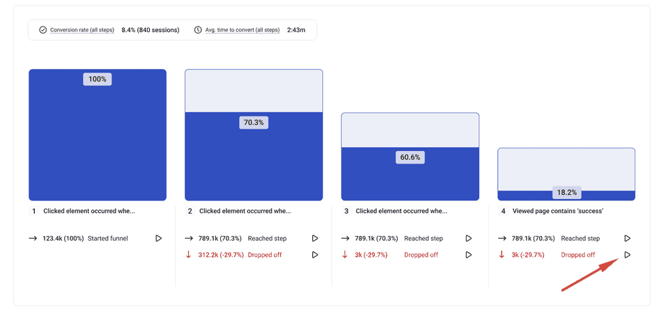
Combine Funnels and Recordings to quickly watch playbacks of users exiting your funnel and see what went wrong
3. Analyze your data
Now that you’ve gathered all the data you need, it’s time to look for patterns with data analysis techniques.
To analyze your quantitative data sets, examine how a metric has increased or decreased over time, and see if there’s any qualitative data that may account for it. For example, you might discover
Emails with an emoji in the subject line received a 20% higher open rate on average than ones without
Social media posts about the company’s mission gathered 50% more engagement on average than posts about the product
Users on mobile dropped out of the sales funnel 45% more frequently than users on desktop did
Then look for patterns in your qualitative data, by seeing whether results have elements in common and if so, grouping them together. This helps you identify trends that tell you more about your users, how to market to them, and what to fix in the user experience. For example, you might discover:
Several interview participants said they bought your product as a present
The majority of survey respondents mentioned health-related factors when asked why they chose your service
Dozens of users struggle to find the ‘Pay now’ button, as evidenced by session recordings
🔥 If you’re using Hotjar: use the Trends tool to spot patterns across the different data points you’re collecting, and cross-reference hard numbers with recordings of user behavior.
For example, if you track your conversion metrics in Trends and notice that a lower number of mobile users converted than desktop users, you can click through to watch recordings of mobile users navigating your site and see what caused them to drop off. This can help you to identify issues like UX problems or bugs that make it hard for mobile users to complete their conversion goals on your site.
4. Share your findings
Review your key marketing metrics at least once a month to assess how effective your strategies have been. Many marketing teams produce a simple, one-page performance report to share with leadership and a more in-depth analysis for their own reference.
To put your figures in context, your marketing data analysis report should include historical data going back at least three months. Leave space beside each result for a comment so that you can add your analysis.
You can also include a data visualization of an important metric—think a graph or bar chart—to make your results even more digestible.
💡 Pro tip: a session recording of real users in action helps your teammates to understand your analysis of user behavior in your report. Hotjar enables you to share recordings easily via a public link, by tagging your teammates in the comments, or even by sending the recordings to Slack or Microsoft Teams.
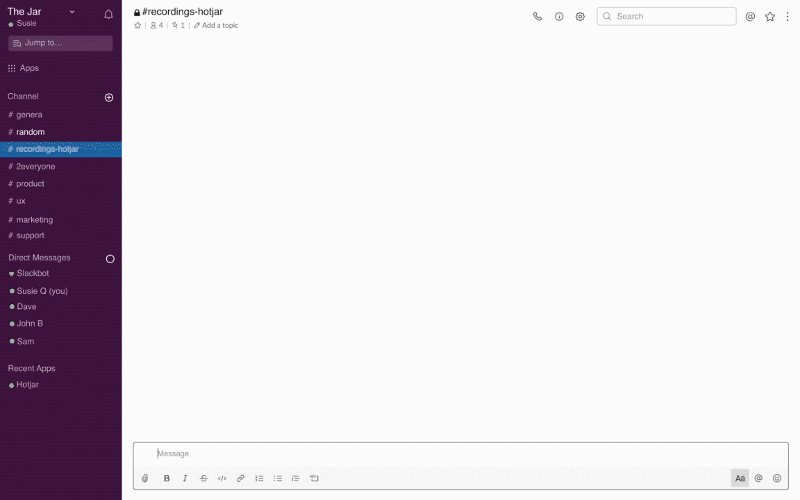
Send your Hotjar recordings to Slack, so your teammates can digest them without breaking their flow to log into a separate platform
Drive marketing success with powerful data insights
Analyze Hotjar data to understand your users and learn how to create marketing campaigns that resonate with them.
5. Plan your next steps
After interpreting your data, the only thing left to do is act upon what you’ve learned. Optimize your marketing strategy for your North Star metric by judging how effective your past efforts have been, and, if necessary, pivot your tactics. When changing tack, the insights you’ve gathered about your customers’ demographics and preferences should be your guide.
Here are three great ways to use your data analysis.
Data-informed marketing is effective marketing
Once you’ve established a data analysis process that helps you take the temperature of your progress and understand your users, the only thing left to do is keep it up.
Maintain a regular cadence of measurements and more and more patterns will start to emerge in your data. With regular check-ins and analysis, you’ll become an expert at delighting your users and meeting your marketing goals.